Animated Tabs
A physical stack of photo cards shuffled to the front by clipped tabs, with a tight image inset and copy in the footer.
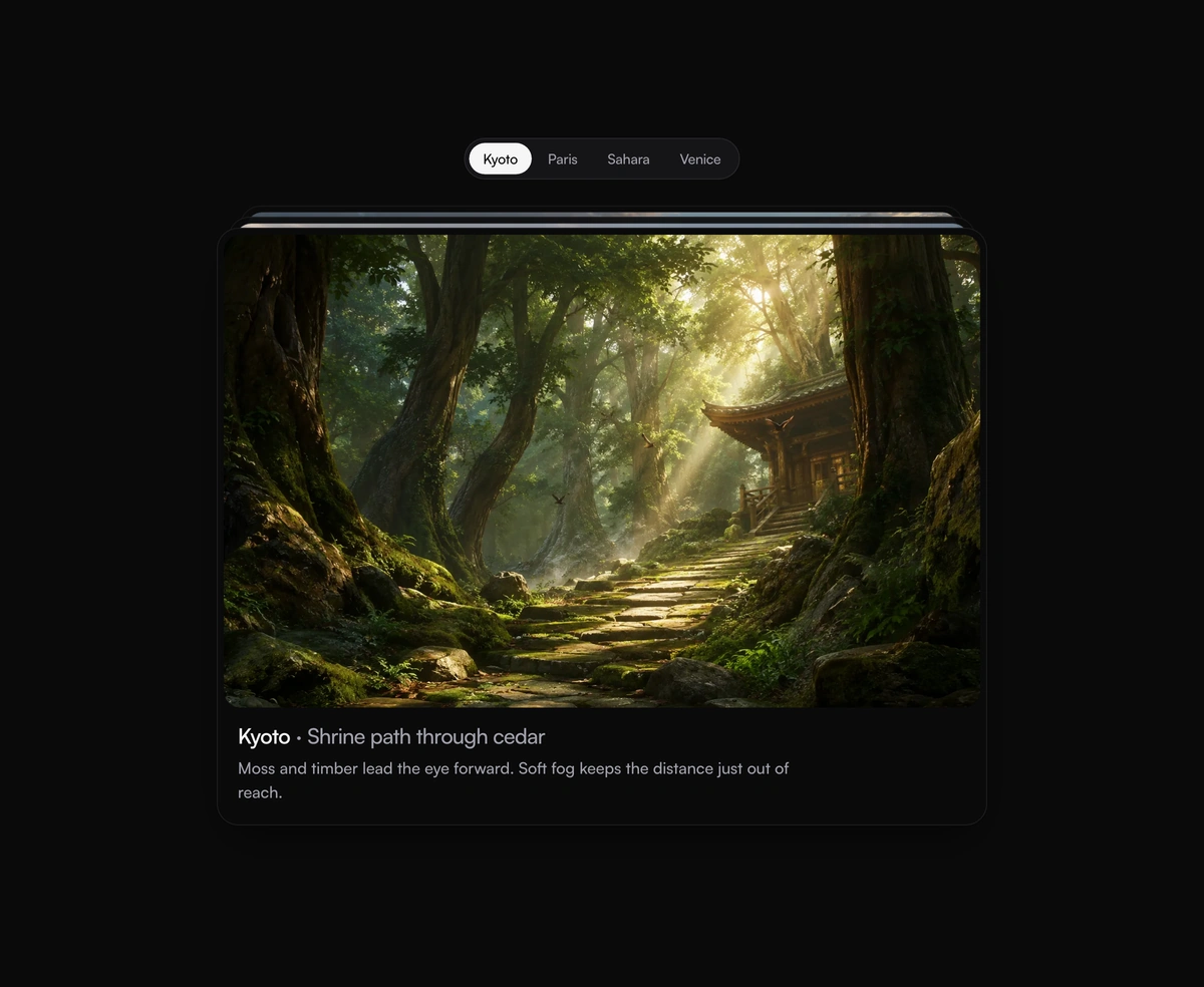
Overview
Animated Tabs is a React and Tailwind CSS tabs component where each tab shuffles a physical stack of photo cards to bring its card to the front, in Next.js or any React app, built on Framer Motion. Clipped tab labels sit above a deck with a tight image inset and the title and description in the footer. It follows the ARIA tabs pattern with arrow keys, Home, and End, works controlled or uncontrolled, and reduced motion swaps cards without the shuffle. Each tab needs a label, title, description, and a landscape image, since the inset crops to landscape.
Installation
Run the following command
pnpm dlx wensity@latest add animated-tabs
Usage
Import AnimatedTabs from @/components/wensity/animated-tabs and render it anywhere in your React or Next.js app. The source lands in your own repo, so every prop, class and animation below is yours to edit.
"use client";import { useState } from "react";import {AnimatedTabs,type AnimatedTabItem,} from "@/components/wensity/animated-tabs";const tabs: AnimatedTabItem[] = [{id: "paris",label: "Paris",title: "Iron lace at golden hour",description: "The tower holds the last light while the city softens into blue.",image: "https://assets.wensity.com/photos/landscape/eiffel-tower-sunset.webp",},{id: "kyoto",label: "Kyoto",title: "Shrine path through cedar",description: "Moss and timber lead the eye forward through soft fog.",image: "https://assets.wensity.com/photos/landscape/forest-shrine-path.webp",},{id: "sahara",label: "Sahara",title: "Dunes catching fire",description: "Wind-carved ridges glow amber, then drop into cool shadow.",image: "https://assets.wensity.com/photos/landscape/dune-sunset.webp",},];export function AnimatedTabsDemo() {const [value, setValue] = useState(tabs[0]!.id);return <AnimatedTabs tabs={tabs} value={value} onValueChange={setValue} />;}
Props
| Prop | Type | Default | Description |
|---|---|---|---|
tabs | AnimatedTabItem[] | - | Tab definitions with label, title, description, and landscape image. |
value | string | - | Controlled active tab id. |
defaultValue | string | first tab | Uncontrolled initial tab id. |
onValueChange | (value: string) => void | - | Fires whenever the active tab changes. |
Featured in React carousel components.