Gooey Dropdown Menu
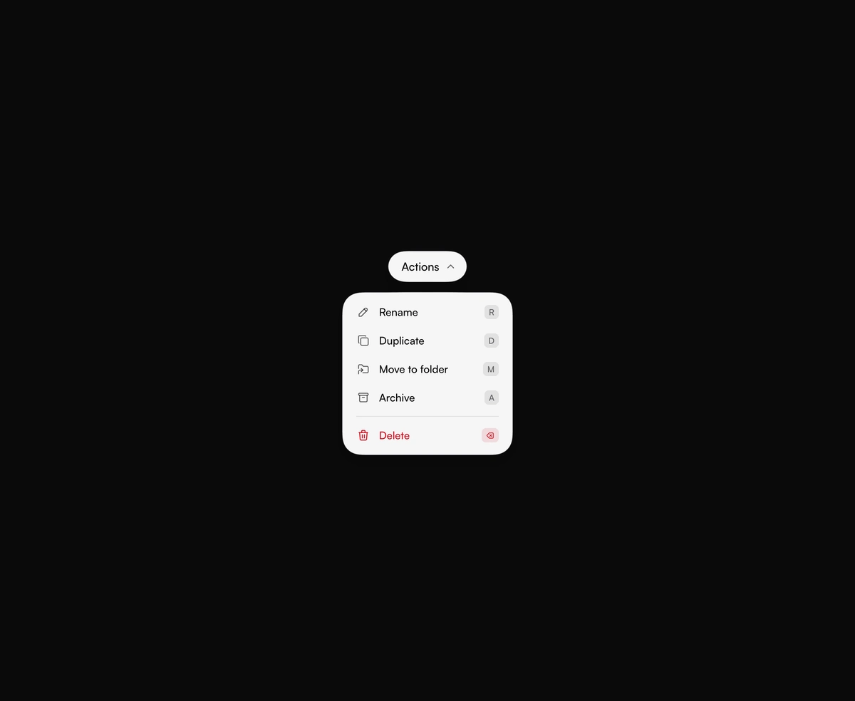
ProA capsule trigger drips a menu out of its underside. Arrow keys, live shortcuts, and a clear Delete row come built in.
Overview
Gooey Dropdown Menu is a React and Tailwind CSS animated dropdown menu with a liquid gooey effect, in Next.js or any React app, built on Framer Motion. The menu drips out of a capsule trigger through an SVG goo filter, and viscosity sets how far the blend spreads. It is a real ARIA menu: arrow keys, Home, End, and Escape work, a single letter shortcut fires its row while open, and a row with the ⌫ hint answers Backspace. Rows take icons, dividers, and a destructive style. The menu floats over the page, so avoid parents with overflow hidden.
Installation
Run the following command
pnpm dlx wensity@latest add gooey-dropdown
Usage
Import GooeyDropdown from @/components/wensity/gooey-dropdown and render it anywhere in your React or Next.js app. The source lands in your own repo, so every prop, class and animation below is yours to edit.
import { IconArchive, IconCopy, IconPencil, IconTrash } from "@tabler/icons-react";import { GooeyDropdown } from "@/components/wensity/gooey-dropdown";export default function Example() {return (<GooeyDropdownlabel="Actions"actions={[{ id: "rename", label: "Rename", icon: <IconPencil size={18} />, shortcut: "R" },{ id: "duplicate", label: "Duplicate", icon: <IconCopy size={18} />, shortcut: "D" },{ id: "archive", label: "Archive", icon: <IconArchive size={18} />, shortcut: "A" },{id: "delete",label: "Delete",icon: <IconTrash size={18} />,shortcut: "⌫",divider: true,destructive: true,onSelect: () => console.log("delete"),},]}/>);}
Props
| Prop | Type | Default | Description |
|---|---|---|---|
label | string | Actions | Text on the trigger pill. |
actions | GooeyDropdownAction[] | 5 file actions | Rows in the menu. Each needs an id and a label. detail, icon, shortcut, divider, destructive, and onSelect are optional. |
menuWidth | number | 240 | Width of the open menu, in pixels. |
anchor | "start" | "center" | "end" | "start" | Which trigger edge the menu lines up with. center drips straight down. |
gap | number | 14 | Clear space between the trigger and the open menu, in pixels. |
viscosity | number | 7 | How far the blend spreads while the menu pours. 0 keeps hard edges. |
defaultOpen | boolean | false | Open on first render. |
fill | string | theme foreground | Color of the trigger and the menu. Leave it unset and the blob follows the active theme. |
ink | string | theme background | Text color on the blob. Leave it unset and the type uses the inverse theme color. |
danger | string | theme-aware red | Text color for destructive rows. Leave it unset for a red that stays readable on both theme blobs. |