Subscription Tier Card
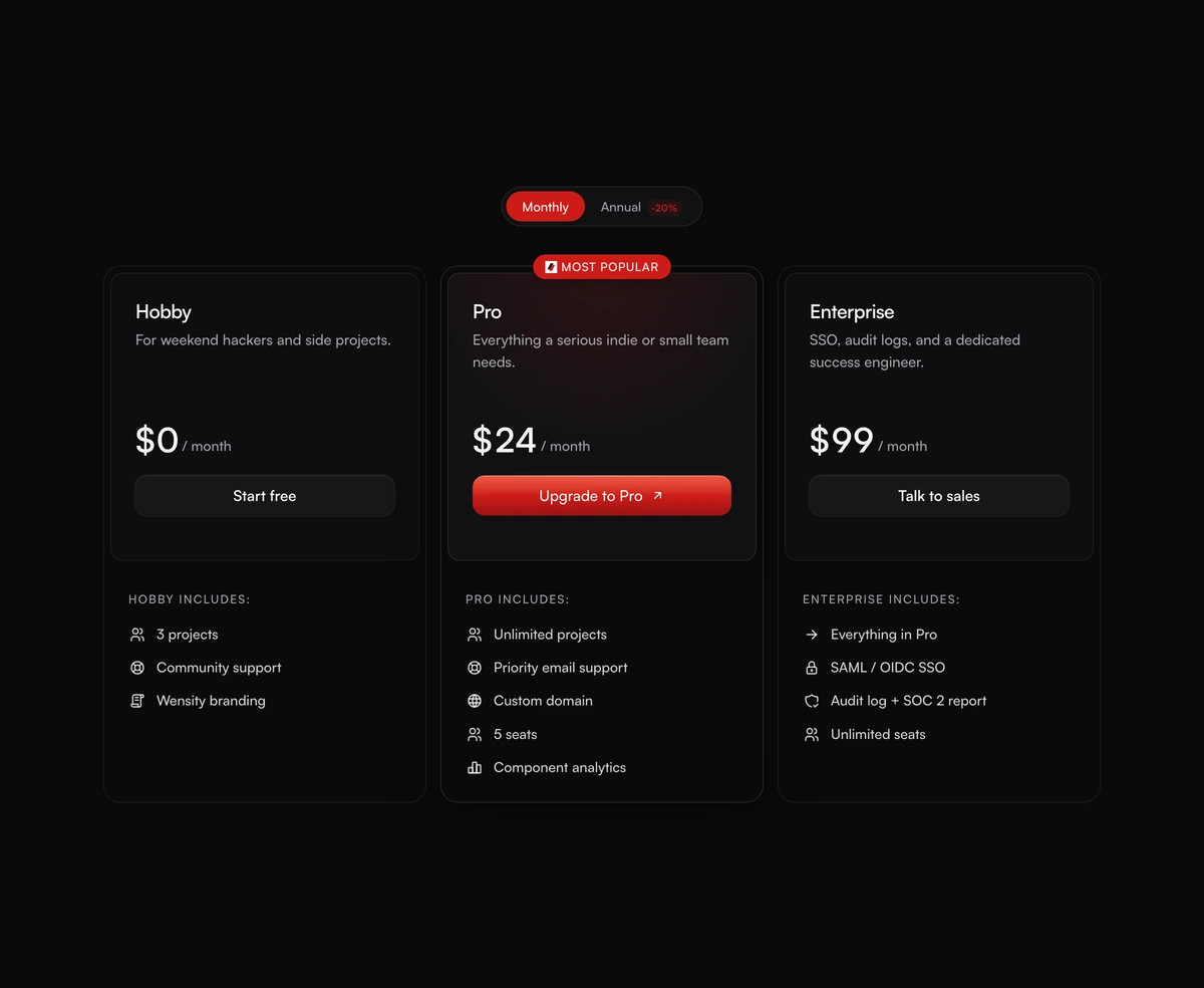
ProAn animated 1px conic-gradient border with a soft Wensity Red halo on hover and a CTA that shimmers as you approach.
heavy saas blockssubscriptiontiercardframer motiontabler icons react
Installation
Run the following command
~/your-project
pnpm dlx wensity@latest add subscription-tier-card
Usage
Import SubscriptionTierCard from @/components/wensity/subscription-tier-card and render it anywhere in your React or Next.js app. The source lands in your own repo, so every prop, class and animation below is yours to edit.
app/example.tsx
"use client";import {SubscriptionTierGrid,type BillingTier,} from "@/components/wensity/subscription-tier-card";const tiers: BillingTier[] = [{ id: "free", name: "Hobby", tagline: "For weekend hackers.", priceMonthly: 0,features: ["3 projects", "Community support"], cta: "Start free" },{ id: "pro", name: "Pro", tagline: "For serious teams.", priceMonthly: 24,features: ["Unlimited projects", "Priority support", "Custom domain"],cta: "Upgrade to Pro", highlight: true, badge: "Most Popular" },{ id: "ent", name: "Enterprise", tagline: "SSO + dedicated success.", priceMonthly: 99,features: ["Everything in Pro", "SAML SSO", "99.99% SLA"], cta: "Talk to sales" },];export function SubscriptionTierGridDemo() {return (<SubscriptionTierGridtiers={tiers}defaultCycle="monthly"// Swap the badge sparkle for your own mark:// badgeIcon={<YourLogo size={12} />}/>);}
Props
| Prop | Type | Default | Description |
|---|---|---|---|
tiers | BillingTier[] | - | Billing tiers to render. Falls back to built-in Hobby / Pro / Enterprise examples. |
defaultCycle | "monthly" | "annual" | "monthly" | Initial billing cycle for the grid toggle. |
onCtaClick | (tierId: string) => void | - | Fired when a tier CTA is clicked. |
badgeIcon | React.ReactNode | <IconSparkles size={12} /> | Icon inside the highlighted tier's badge pill. Pass your own logo or mark. |