Follow Cursor Label
ProA floating label that trails the cursor across your hover targets with an elastic pop-in and a soft spring settle.
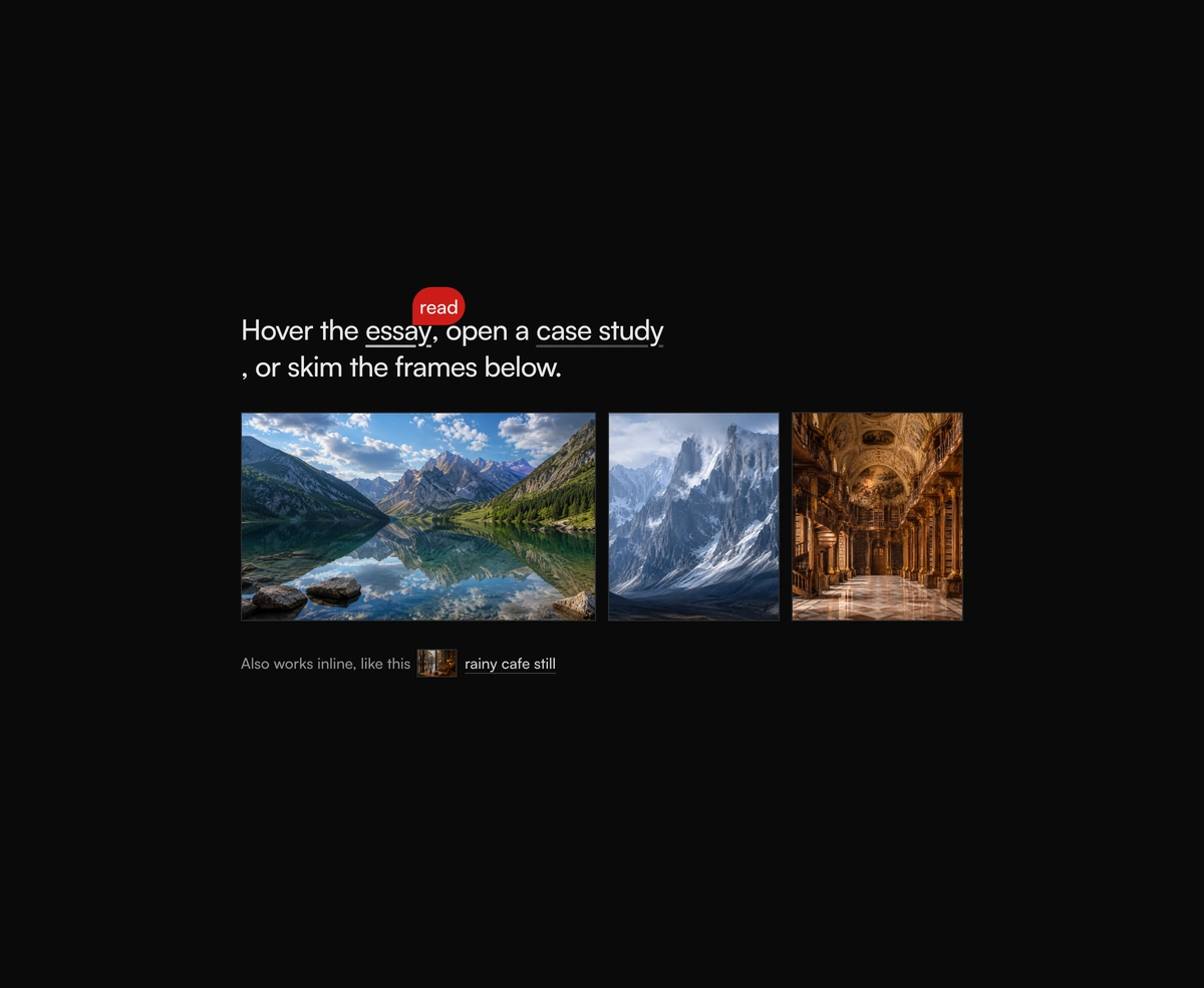
Overview
Follow Cursor Label is a React and Tailwind CSS cursor follower that trails a text label behind the pointer over links, cards, and project tiles, in Next.js or any React app, animated with GSAP. The label rides quickTo tweens for a smooth lag and pops in with an elastic scale, and each target sets its own text and color. It renders into document.body so overflow and transforms never clip it, and it switches off for touch screens and reduced motion. It is decorative and hidden from screen readers, and every FollowCursorLabelTarget must sit inside a FollowCursorLabel provider.
Installation
Run the following command
pnpm dlx wensity@latest add follow-cursor-label
Usage
Import FollowCursorLabel from @/components/wensity/follow-cursor-label and render it anywhere in your React or Next.js app. The source lands in your own repo, so every prop, class and animation below is yours to edit.
"use client";import {FollowCursorLabel,FollowCursorLabelTarget,} from "@/components/wensity/follow-cursor-label";export default function Example() {return (<FollowCursorLabel><FollowCursorLabelTarget label="view" labelClassName="bg-[#16a34a] text-white"><a href="/work">Case study</a></FollowCursorLabelTarget><FollowCursorLabelTarget label="play" labelClassName="bg-[#2563eb] text-white"><button type="button">Watch reel</button></FollowCursorLabelTarget></FollowCursorLabel>);}
Props
| Prop | Type | Default | Description |
|---|---|---|---|
labelClassName | string | - | Extra classes for the floating label chip. On FollowCursorLabelTarget, overrides the color while that target is hovered. |
label | string | "click" | Text shown while hovering a FollowCursorLabelTarget (target prop). |