Underline Animation
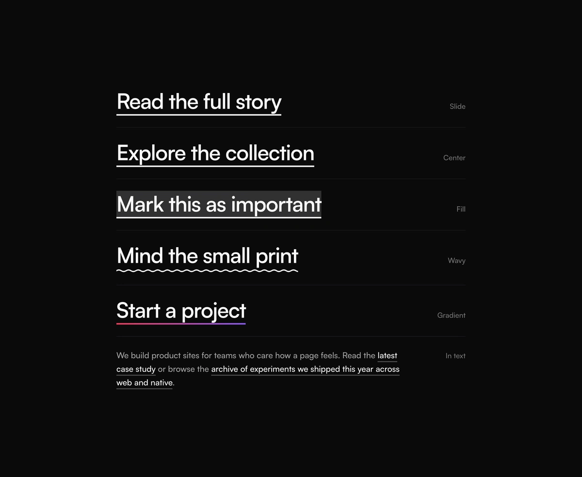
CSS hover underlines for links: slide, center, fill, wavy, and gradient.
Overview
Underline Animation is a free React and Tailwind CSS hover underline for links, in Next.js or any React app, with no dependencies. The line is a CSS background on the link itself, so it follows wrapped text onto every line. Choose slide, center, fill, a wavy underline that draws in from the left, or a two color gradient. Keyboard focus and an active prop show the line too, for the current page in a nav, and a faint resting line keeps links in body copy visible. Reduced motion shows it instantly.
Installation
Run the following command
pnpm dlx wensity@latest add underline-animation
Usage
Import UnderlineAnimation from @/components/wensity/underline-animation and render it anywhere in your React or Next.js app. The source lands in your own repo, so every prop, class and animation below is yours to edit.
import { UnderlineAnimation } from "@/components/wensity/underline-animation";export default function Example() {return (<nav className="flex gap-6 text-lg font-medium"><UnderlineAnimation href="/work" active>Work</UnderlineAnimation><UnderlineAnimation href="/studio">Studio</UnderlineAnimation><UnderlineAnimation href="/journal" variant="center">Journal</UnderlineAnimation><UnderlineAnimation href="/contact" variant="gradient">Contact</UnderlineAnimation></nav>);}
Props
| Prop | Type | Default | Description |
|---|---|---|---|
variant | "slide" | "center" | "fill" | "wavy" | "gradient" | "slide" | Motion and shape of the line. |
href | string | - | Renders a link. Without it the component renders a span, or the element in as. |
as | "a" | "span" | "button" | - | Element to render. Defaults to a link when href is set. |
color | string | currentColor | Line color, any CSS color. |
from / to | string | "#f43f5e" / "#8b5cf6" | Gradient colors for the gradient variant. |
thickness | number | 2 | Line thickness in pixels. |
offset | number | 2 | Gap between the text and the line in pixels. |
duration | number | 420 | Animation length in milliseconds. |
rest | boolean | false | Keeps a faint line visible at rest, for links in running text. |
active | boolean | false | Shows the line permanently and sets aria-current on links, for the current page in a nav. |
Featured in React hero section components.