React hero section components
Animated hero sections you can drop into any React project. One command installs the source into your repository, and every line stays yours to edit.
Built with the stack you already ship
Hero section blocks you can copy
Each React hero section is one file: markup, motion and responsive Tailwind styling. Preview it live, then copy the full source into your project.
 Hero Section With Radial GlowCentered AI-company hero with a blue radial glow overlay, letter-spaced headline, solid CTA pair, and an RTL-scrolling trust logo strip. Adapts to light and dark mode.
 Hero Section With Spotlight BeamFull-bleed dark hero with a pure-CSS diagonal spotlight beam, grain texture overlay, and an oversized bold headline anchored to the bottom-left, finished with a lime-green eyebrow label.
 Hero Section With Rotating WordsA premium bone-surface hero for a writing platform, with a concentric-ring orb radiating cyan-to-lime arcs from the bottom. Animated rotating-word headline, centered dropdown navbar, and dual CTA buttons overlaid on the glow.
 Hero Section With Eclipse GlowA centered AI-product hero set against a dimmed purple eclipse-arc background, with a small wordmark, an eyebrow badge pill, a bold two-line headline, dual CTAs, and a static trusted-by row of real company wordmarks.
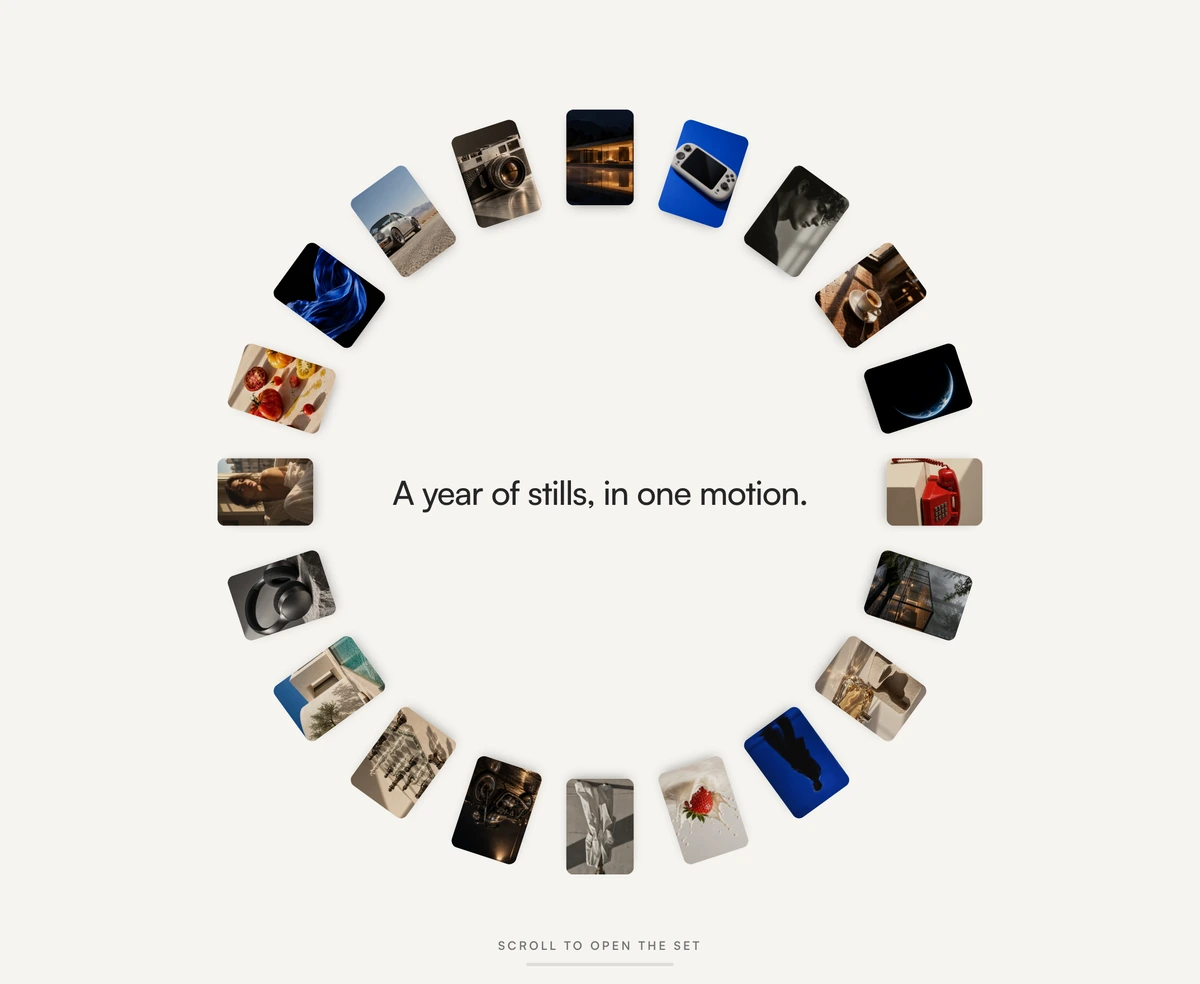 Hero Section With Morphing Photo ArcA light studio hero that opens on a ring of twenty photographs. It scrolls in its own container: that scroll morphs the ring into a bottom arc and walks the deck past a rail.
 Hero Section With 3D MonolithA dark, motion-first React hero section built around a 3D-angled monolith with neon glowing edges and orbital light rings. Pure CSS, no model file to download.
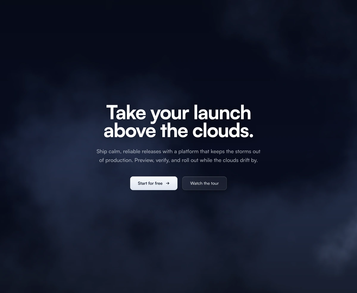 Hero Section With Animated CloudsCentered hero drifting over a WebGL cloud shader. Layered FBM noise bands blend a sky-blue-to-white daytime palette (deep navy at night), with a soft readability scrim, dual CTA buttons, and staggered content reveals. Adapts to light and dark mode.
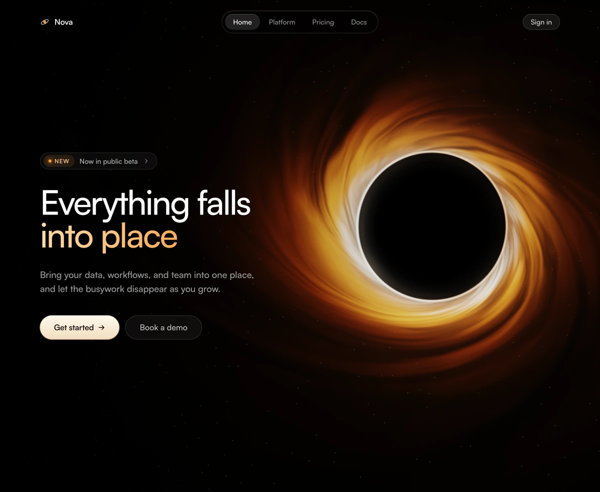 Hero Section With Black HoleReact hero section with a WebGL black hole: golden vapor spiraling into a dark shadow with a thin photon ring, beside a headline, release chip and two calls to action, on a fixed black surface.
Animated backgrounds for hero sections
Full bleed layers that sit under your own headline and call to action. Reach for these when a ready made hero is close but not quite right.
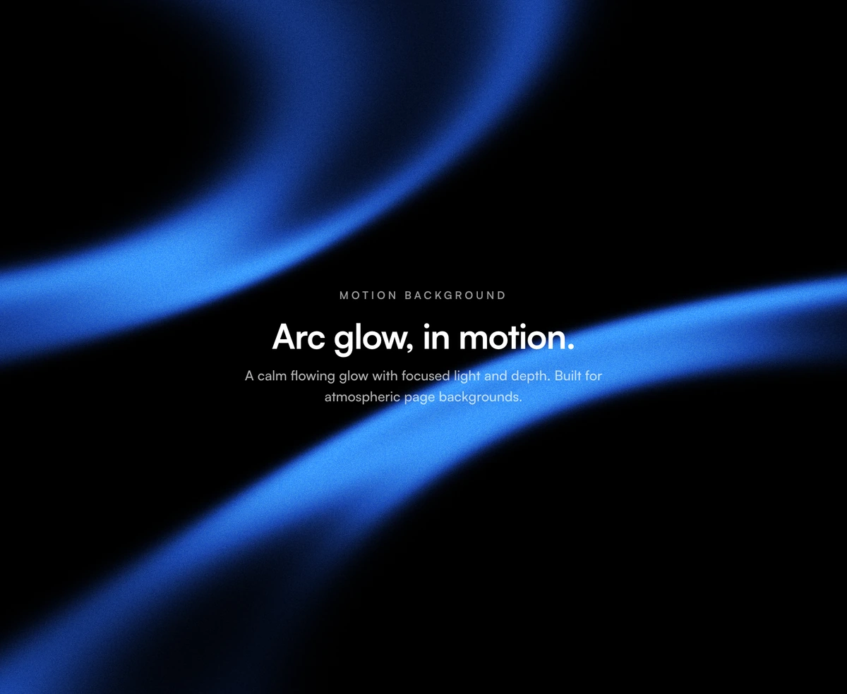
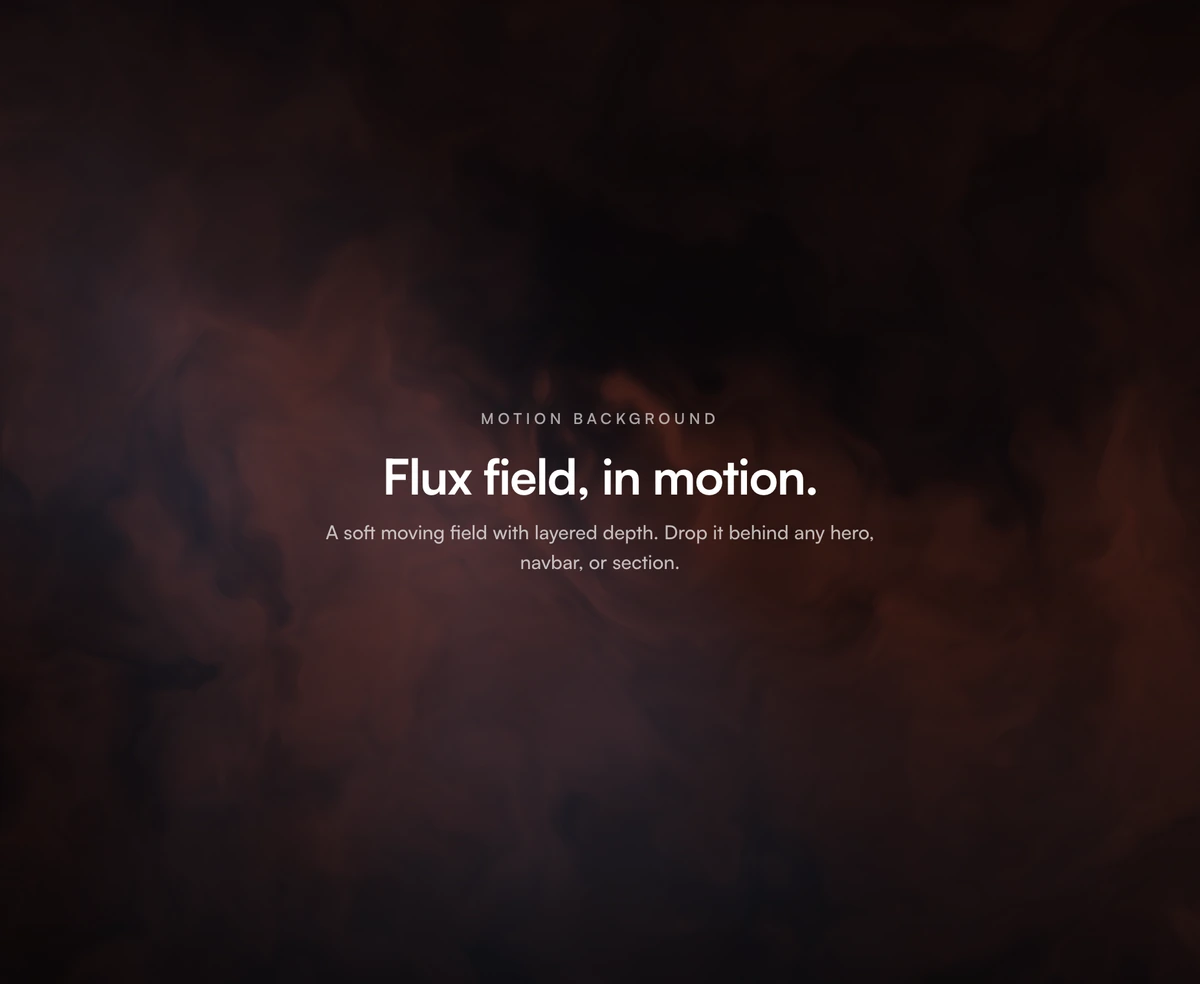 Animated Background With Noise FieldFull-bleed WebGL motion background with domain-warped FBM noise, smooth Gaussian mouse warp, film grain, and edge vignette, built on Three.js with separate light and dark palettes, fully configurable color and motion props.
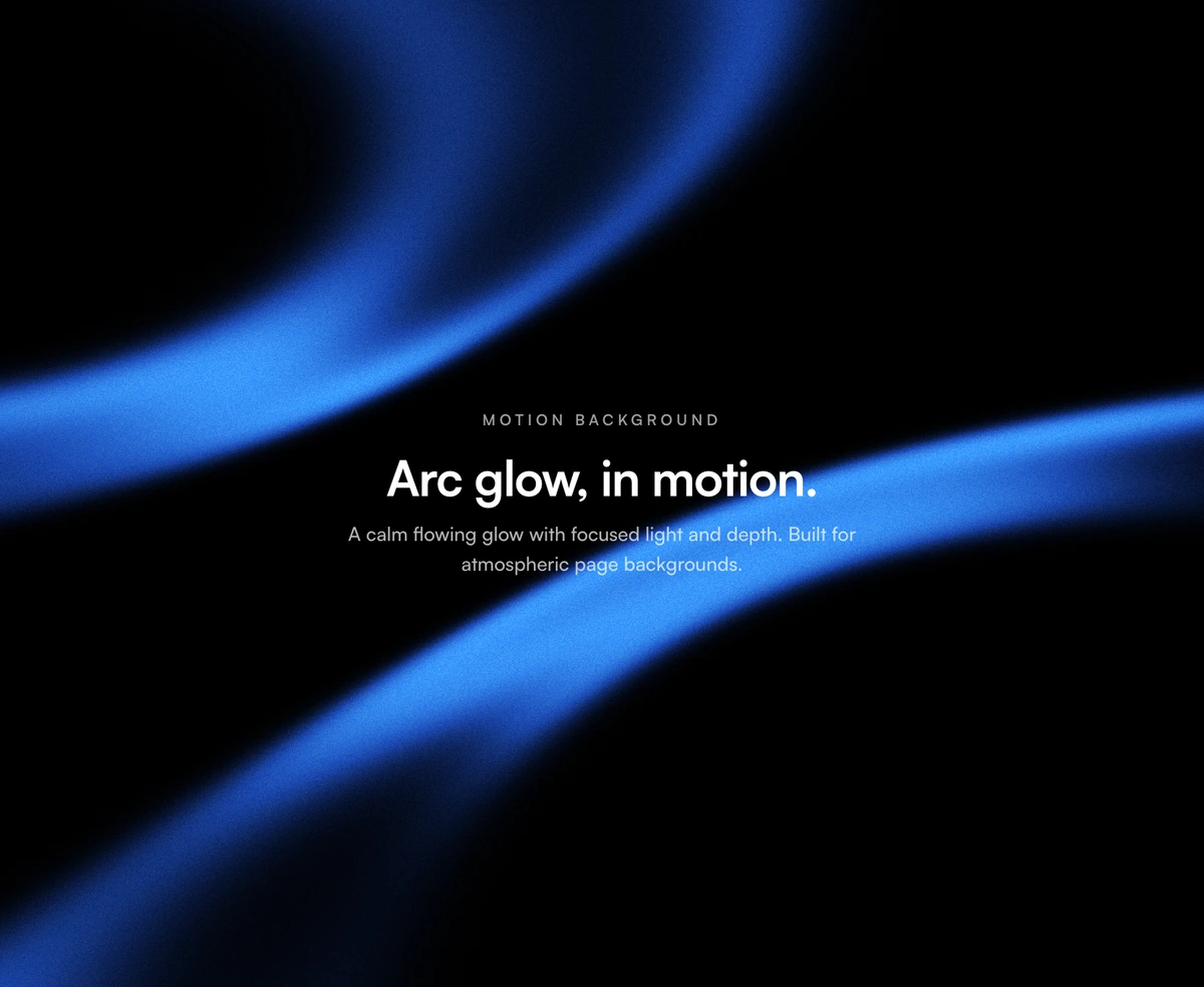 Animated Background With Color BandsFull-bleed WebGL background with flowing color bands, pointer parallax, warp strength, and configurable palette, built on Three.js with transparent compositing, film grain, and light/dark defaults.
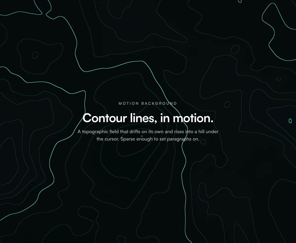 Animated Background With Contour LinesReact animated topographic background with contour lines that respond to the cursor. Built with Three.js, with light and dark color palettes.
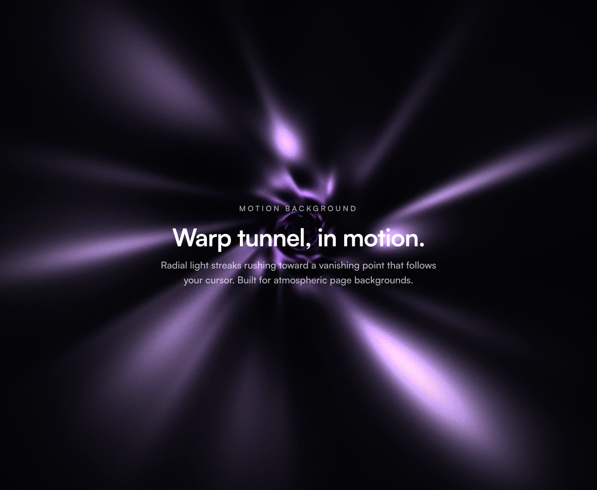 Animated Background With Warp TunnelFull-bleed WebGL background with radial light streaks rushing through a spiral tunnel toward a cursor-following vanishing point, built on Three.js with a three-stop depth gradient, fog, twist, film grain, and separate light and dark defaults.
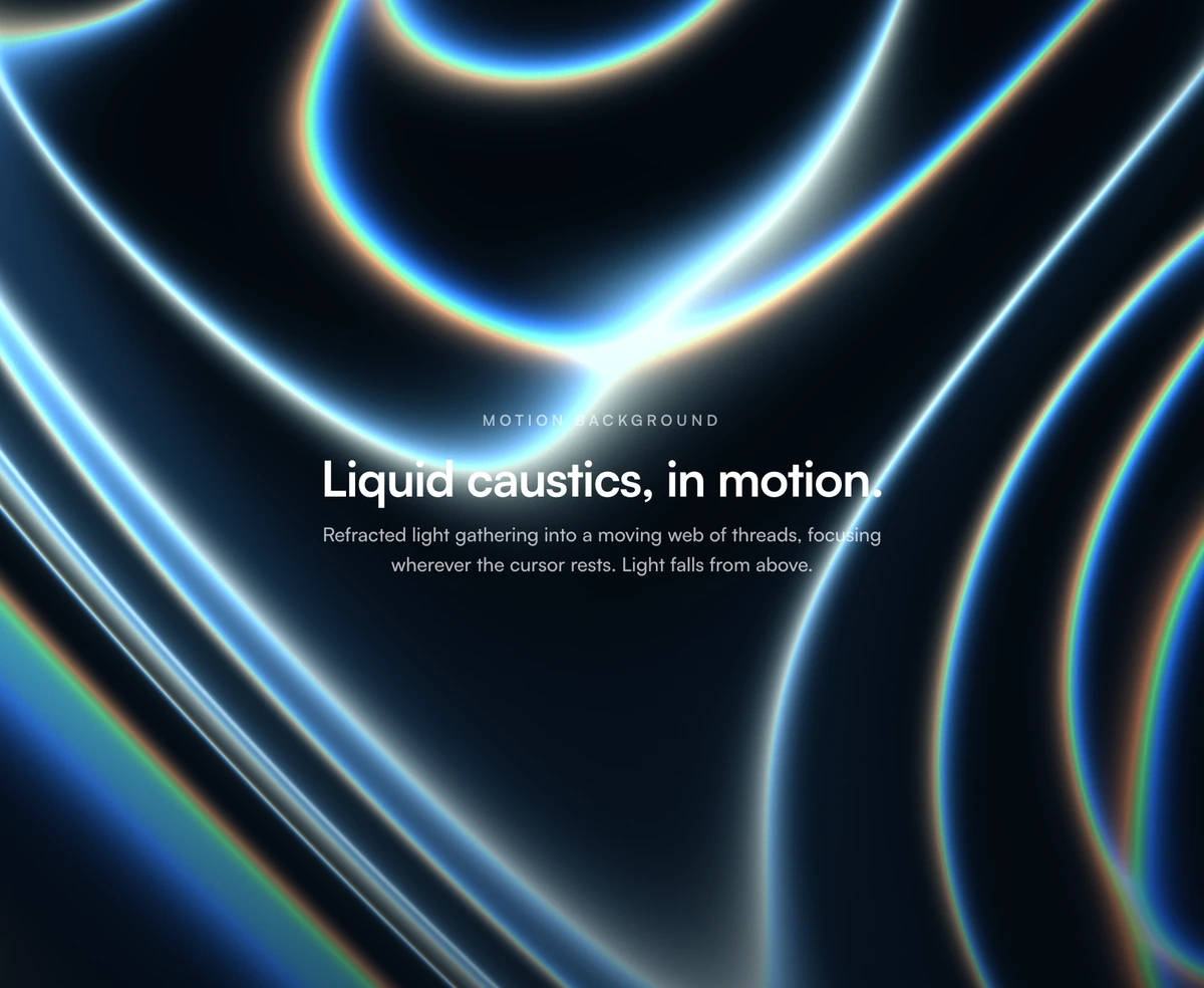 Animated Background With Liquid CausticsReact WebGL background with animated water caustics, cursor interaction, and light and dark palettes. Built with Three.js.
 Aurora BackgroundA pure CSS aurora background with drifting light and noise that kills banding.
 Morphing Shape BackgroundLava lamp background for React heroes: soft gradient shapes that drift and melt.
 Gradient StripesA brand gradient sliced into glowing stripes that rise toward the pointer.
Text animations for hero headlines
The headline is the part of a hero people actually read. Each of these animates type without touching layout, so nothing shifts while it settles.
 Text Blur RevealA blur-in stagger by word or by letter, triggered the moment you scroll.
 Text CycleCycles through your headline words with a soft per-character blur stagger.
 Text ShimmerA CSS shimmer sweep for headlines, one single element and entirely GPU-friendly.
 Text Word FlipSpring-loaded word flips paired with a soft letter-by-letter blur stagger.
 Line Fill TextBold type filled with flowing curved linework that bends round the cursor.
 Particle TextLoading-ring canvas particles that slowly resolve into solid letterforms.
 Chrome TextLiquid chrome text effect: inflated metal letters with sliding glints and sparkles.
 Text PathSVG text riding a curved wave, arc, or circle path on a seamless, light loop.
 Text Char SlideA per-character slide-left cascade with a cleanly staggered entrance timing.
 Text Chroma RevealA chromatic ribbon sweep that paints each of your headlines cleanly into view.
 Text FlipA 3D character flip on hover, staggered and springy across every single letter.
 Text GlitchA chromatic clip-path glitch for headlines, CSS-only and entirely GPU-friendly.
 Text HighlightA hand-placed highlighter band that sweeps in behind your text and tracks wrapping.
 Text MorphingBlur-morphing headlines that cycle phrases with a gooey, seamless crossfade.
 Text MotionHeadline entrances driven entirely by your own custom Framer Motion variants.
 Text RippleA 3D character ripple with a traveling color crest, CSS-only and GPU-light.
 Text ScribbleHand-drawn scribble, squiggly underline, strike, circle, and box marks for text.
 Text SpectrumAn animated multi-stop color wash that drifts endlessly through headlines.
 Underline AnimationCSS hover underlines for links: slide, center, fill, wavy, and gradient.
How to choose a hero section
A hero section is the first block of a landing page: the headline, one line of supporting text, and the buttons people see before they scroll. Its job is to say what the product does and who it is for. A good hero section answers that in about two seconds. If a visitor cannot repeat your main point back after reading it once, no amount of animation will fix it.
Speed is the trade off most teams run into. Because the hero sits at the top of the page, it is usually the largest thing on screen, which makes it the part Google times when it scores how quickly your page becomes useful. A hero built with CSS and light motion appears as soon as the stylesheet loads. A hero built on 3D graphics has more work to do before the first frame shows, and on a mid range phone that pause is noticeable. Both kinds are in this library on purpose, so pick the one that suits the page.
If you are not sure which to use, start simple: a headline, a short sub line, two buttons, and a background that competes with none of them. That layout reads well on a laptop, stacks into one column on a phone with no extra work, and keeps the main button easy to find. Hero Section With Spotlight Beam and Hero Section With Radial Glow both follow it, and either one is a safe default for a product page or a landing page.
Reach for the bolder options when the product is itself visual. A design tool, a video editor, or a studio portfolio can carry a moving background, because the hero is demonstrating the thing being sold. A billing dashboard usually cannot, and the mismatch reads as decoration rather than proof. Choose the heavier hero only when the motion says something true about the product.
Whichever you pick, write the headline before you pick the design. Say what the product does in plain words rather than a slogan, keep the sub line to a single sentence, and give the page one clear next step. A plain hero section with a sharp headline converts better than an animated one wrapped around a vague promise.