React Hero Section with Rotating Words in the Headline
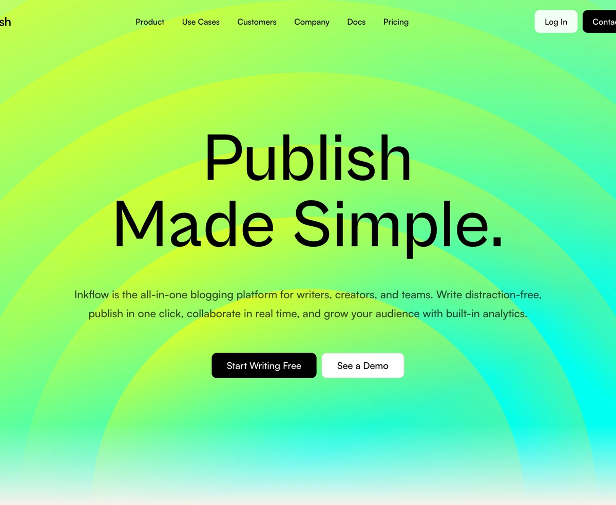
ProA warm cream hero with its own navigation bar on top. The headline cycles through a list of verbs, Write, Publish, Collaborate and more, each fading and sliding into place above a fixed second line, beside a glowing green arc illustration.
One headline, several promises
Hero Section with Rotating Words is a React and Tailwind CSS hero section with rotating text in the headline: one word swaps every 2.2 seconds with a short fade and slide, while the rest of the title stays put. It ships with a navigation bar and works in Next.js or any React app.
A rotating word lets a product with several jobs name each of them in the most prominent spot on the page without a long headline. Visitors see three or four verbs in the time it takes to read the paragraph, and each one is a reason to stay.
The usual problem with rotating text is layout jump when a long word replaces a short one. This block reserves the width of the longest word with an invisible copy, so the line never shifts and the buttons below never move.
Parts of the block
Rotating word
A timer advances the word every 2,200ms. The outgoing word fades and slides up, the incoming one slides in from below, both over 500ms in CSS.
Width reservation
An invisible copy of the longest word holds the space, so the headline keeps one width for every word in the list.
Built in navbar
Logo, links with dropdown groups that open on hover, a Log In link and a Contact Sales button. The links and auth buttons appear from 1024px up.
Arc orb
A decorative SVG arc with green and lime gradients behind the copy, with gradient ids generated per instance so two heroes never clash.
Fixed height stage
The hero is 700px tall, 800px from 768px, on a cream #f7f3eb background designed for light themes.
When rotating text helps
Use it when
- Your product does several things and each deserves to be named above the fold.
- You want the page header and the hero designed together as one piece.
- A warm, light brand with a cream or paper background.
- Desktop is the main audience, since the navigation collapses entirely on smaller screens.
Skip it when
- Accessibility and search text must match the visual headline without code changes; see the hidden headline bug below.
- You already have a site navbar, because this block renders its own.
- Phones matter: below 1024px the nav links and sign in buttons disappear with no menu to replace them.
- Motion sensitive audiences, as the rotation has no reduced motion handling.
Fix the hidden headline, then make it yours
Before anything else, open the file and find the span with the sr-only class inside the heading. It reads The only blogging platform followed by your static line, regardless of the words you pass, and it is what screen readers and search engines receive because the visible words are hidden from them. Replace it with your own sentence, for example the full list of rotating words joined with commas, followed by staticHeadline.
Then set rotatingWords, staticHeadline, description and the calls to action, and either feed navLinks your menu or remove the header element if your site already has one. The component also renders a main element; delete that wrapper or change it to a div when your layout already provides main.
npx wensity@latest add hero-section-with-rotating-words --type block
import { ArcishHero } from "@/components/wensity/blocks/hero-section-with-rotating-words";export default function Page() {return (<ArcishHerobrandName="Folio"navLinks={[{ label: "Pricing", href: "/pricing" },{ label: "Customers", href: "/customers" },]}rotatingWords={["Draft", "Review", "Sign", "Archive"]}staticHeadline="Contracts, sorted."description="Folio keeps every agreement in one searchable place, from first draft to signature."primaryCta={{ label: "Try Folio free", href: "/signup" }}secondaryCta={{ label: "Book a demo", href: "/demo" }}/>);}
Props
| Prop | Type | Default | Description |
|---|---|---|---|
rotatingWords | string[] | Write, Publish, Collaborate, Distribute, Analyze, Inkflow | The words that cycle. Similar lengths look calmest, since the longest sets the width. |
staticHeadline | string | "Made Simple." | The second line that never changes. |
description | string | - | Paragraph under the headline. |
navLinks | ArcishNavItem[] | - | Plain links, or groups with a links array that render as hover dropdowns. |
authCta / salesCta | { label: string; href: string } | - | Log In and Contact Sales in the header, shown from 1024px up. |
primaryCta / secondaryCta | { label: string; href: string } | - | Buttons under the paragraph. |
Issues found in the source
Hardcoded accessible headline
Assistive technology hears The only blogging platform made simple, whatever you configure, because that text is fixed in the hidden span and the visible words are aria-hidden. It is the most important fix in this block.
Rotation ignores reduced motion
The interval keeps cycling for everyone. Check prefers-reduced-motion and show the first word statically when it is set.
Dropdowns on hover only
Navigation groups open with CSS group hover and stay invisible to keyboard focus. Add focus-within styles or a click toggle.
Nested main
The block renders its own main element. Inside a layout that already has one, that is invalid HTML and confuses landmark navigation.
No phone menu
Below 1024px the links and both header buttons are hidden and nothing replaces them. Add a menu button or rely on your site navbar.
Block details
- Category
- Hero Sections
- Renders
- CSS only. Paints as soon as the stylesheet arrives
- Theme
- Fixed light surface. No dark variant
- Dependencies
clsxtailwind-merge- Source
- 630 lines, 23 KB in one file
- Install
wensity add hero-section-with-rotating-words --type block- Tags
- light, bone, orb, rings, glow, gradient, rotating-words, navbar, blog, productivity
- Last updated