
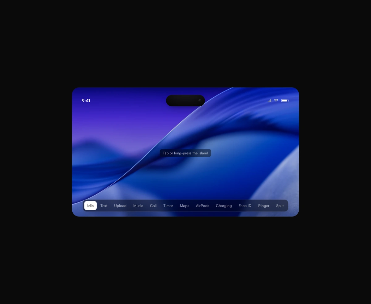
Dynamic Island Toast
A pixel-faithful Apple Dynamic Island that morphs, splits, and breathes while it hosts live activities inside your app.
Preloader animation for React: a rolling counter, a filling word or an image gallery.
Preloader Animation is a React and Tailwind CSS page loader that covers the screen while a site loads, then lifts away to reveal it, in Next.js or any React app. Pick a counter whose digits roll like an odometer, a word that fills with color, or a gallery that cuts between your images. It leaves with a slide, column curtain, split, closing circle or fade. Feed it real progress, a loading flag or the window load event. Fast pages would flash it, so minDuration holds it two seconds by default. Reduced motion turns every exit into a short fade.
Run the following command
pnpm dlx wensity@latest add preloader-animation
npx wensity@latest add preloader-animation
yarn dlx wensity@latest add preloader-animation
bunx wensity@latest add preloader-animation
Import PreloaderAnimation from @/components/wensity/preloader-animation and render it anywhere in your React or Next.js app. The source lands in your own repo, so every prop, class and animation below is yours to edit.
// app/layout.tsximport { PagePreloader } from "@/components/wensity/preloader-animation";export default function RootLayout({ children }: { children: React.ReactNode }) {return (<html lang="en"><body>{/* Rendered on the server, so it covers the very first paint. */}<PagePreloader variant="counter" exit="curtain" once />{children}</body></html>);}// Or drive it from real work:// <PagePreloader progress={assetsLoaded} />// <PagePreloader loading={isFetching} variant="wordmark" text="Acme" />
| Prop | Type | Default | Description |
|---|---|---|---|
variant | "counter" | "wordmark" | "gallery" | "counter" | Loading screen look: a large percentage with rolling digits, a word that fills, or a framed image sequence. |
exit | "slide" | "curtain" | "split" | "circle" | "fade" | "slide" | How the screen leaves once the count reaches 100. |
progress | number | - | Real progress from 0 to 100. Omit it to wait for loading or the window load event. |
loading | boolean | - | Holds the count short of 100 while true, for example until your data is fetched. |
minDuration | number | 2000 | Shortest time the count takes to reach 100, in milliseconds. |
exitDuration | number | 1000 | Length of the exit in milliseconds. |
holdDuration | number | 300 | Pause on 100 before the exit starts, in milliseconds. |
text | string | "Loading" | The word the wordmark variant fills, and the caption beside the counter and gallery. |
images | string[] | 6 still-life shots | Image URLs the gallery variant cuts between, in order. The last one holds on 100. |
columns | number | 5 | Number of columns for the curtain exit. |
background | string | "#0a0a0b" | Screen background, a colour or a gradient. Gradients stay continuous across curtain columns. |
color | string | "#f5f5f4" | Text and fill colour. |
position | "fixed" | "absolute" | "fixed" | Cover the viewport, or only the nearest positioned parent. |
lockScroll | boolean | true | Stop the page scrolling while the screen is up. |
once | boolean | false | Show the preloader once per browser session. |
onComplete | () => void | - | Called after the exit, when the screen is gone. |
A pixel-faithful Apple Dynamic Island that morphs, splits, and breathes while it hosts live activities inside your app.
A seamless, GPU-only logo strip that never stutters or snaps at the loop point.
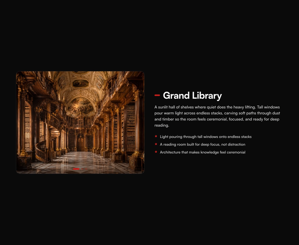
A pinned cinematic section that morphs in lock-step with scroll, staying perfectly in sync whichever way you travel.
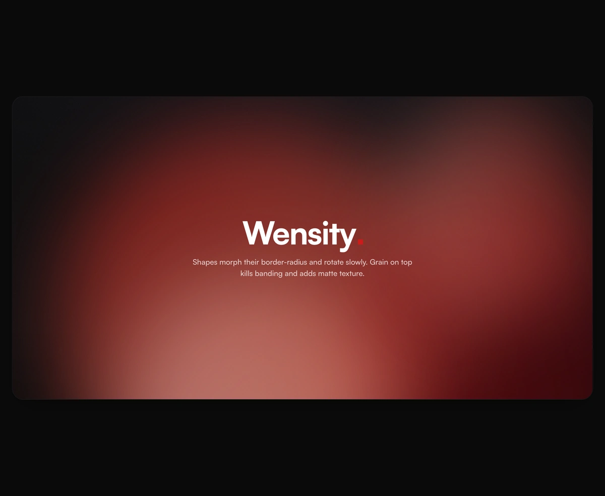
Lava lamp background for React heroes: soft gradient shapes that drift and melt.