Glowing Border
ProGlowing border CSS for cards: a cursor glowing effect, or beams, spins and pulses.
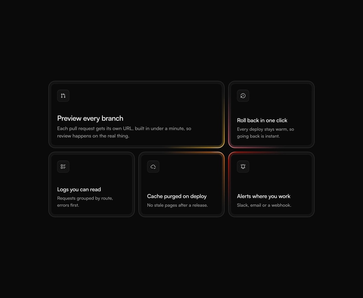
Overview
Glowing Border is a React and Tailwind CSS animated gradient border for cards, inputs and buttons, in Next.js or any React app. Its cursor glowing effect works like a lamp: light pools on the stretch of edge nearest the pointer, brightens as it approaches, and shifts hue as it travels, so a whole feature grid lights up together. Beam, spin and pulse animate on their own through a registered @property angle. The glow is masked to the outside, and an optional inner glow fills the gap of a double frame. Reduced motion drops the easing and stops every loop.
Installation
Run the following command
pnpm dlx wensity@latest add glowing-border
Usage
Import GlowingBorder from @/components/wensity/glowing-border and render it anywhere in your React or Next.js app. The source lands in your own repo, so every prop, class and animation below is yours to edit.
import { GlowingBorder } from "@/components/wensity/glowing-border";const features = [{ title: "Preview every branch", text: "Each pull request gets its own URL." },{ title: "Roll back in one click", text: "Every deploy stays warm." },{ title: "Cache purged on deploy", text: "No stale pages after a release." },];export default function Example() {return (<ul className="grid gap-3 sm:grid-cols-3">{features.map((feature) => (<li key={feature.title}><GlowingBorder radius={22} contentClassName="p-2" className="h-full"><div className="h-full rounded-[14px] border border-white/[0.07] bg-neutral-950 p-5"><h3 className="font-semibold">{feature.title}</h3><p className="mt-1.5 text-sm text-neutral-400">{feature.text}</p></div></GlowingBorder></li>))}</ul>);}
Props
| Prop | Type | Default | Description |
|---|---|---|---|
variant | "cursor" | "beam" | "spin" | "pulse" | "cursor" | How the light moves. Cursor follows the pointer; the others loop on their own. |
colors | string[] | ["#ff1100", "#f97316", "#fbbf24", "#fb7185"] | CSS colors. Cursor spreads them around the edge; the looping variants use the first three. |
range | number | 160 | Cursor only: how far from the edge, in pixels, the cursor starts to light it. |
spot | number | 340 | Cursor only: diameter of the pool of light in pixels. |
thickness | number | 1.5 | Border thickness in pixels. |
radius | number | 16 | Corner radius in pixels. |
duration | number | 4 | Seconds for one lap (beam, spin) or one breath (pulse). |
glow | number | 0 | Outer glow strength from 0, no glow, to 1. |
glowSize | number | 10 | How far the glow spreads outside the border, in pixels. |
innerGlow | number | 0 | Light falling inward from the lit edge, 0 to 1. Shows only where the content is transparent, such as a double frame gap. |
contentClassName | string | - | Classes for the content box. Padding here turns the border into an outer frame. |