Multi-Select Token Pills
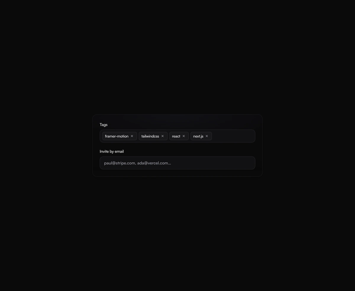
A tag input where pills pop in as you add them and slide out on remove, closing the gap without snapping the layout.
elite micro interactionsmultiselecttokenpillsframer motion
Installation
Run the following command
~/your-project
pnpm dlx wensity@latest add multi-select-token-pills
Usage
Import MultiSelectTokenPills from @/components/wensity/multi-select-token-pills and render it anywhere in your React or Next.js app. The source lands in your own repo, so every prop, class and animation below is yours to edit.
app/example.tsx
import { MultiSelectTokenPills, type TokenPill } from "@/components/wensity/multi-select-token-pills";const seed: TokenPill[] = [{ id: "1", label: "framer-motion" },{ id: "2", label: "tailwindcss" },];export default function Example() {return (<MultiSelectTokenPillslabel="Tags"defaultValue={seed}placeholder="Add a tag. Try pasting comma-separated values"validate={(v) => ({ invalid: v.length < 2 })}onChange={(next) => console.log(next)}/>);}
Props
| Prop | Type | Default | Description |
|---|---|---|---|
value | TokenPill[] | - | Controlled tokens. |
defaultValue | TokenPill[] | - | Default tokens for uncontrolled usage. |
onChange | (next: TokenPill[]) => void | - | Fired on every add or remove. |
placeholder | string | "Add a tag…" | Placeholder for the input. |
validate | (raw: string) => { invalid?: boolean } | void | - | Validate a freshly typed token before it is committed. |
delimiters | RegExp | /[,;\s]+/ | Characters that commit the current input as a token. |
max | number | - | Maximum number of tokens. Adding past this is a no-op. |
label | string | - | Optional label rendered above the field. |
disabled | boolean | false | Disable the entire control. |