Line Fill Text
Bold type filled with flowing curved linework that bends round the cursor.
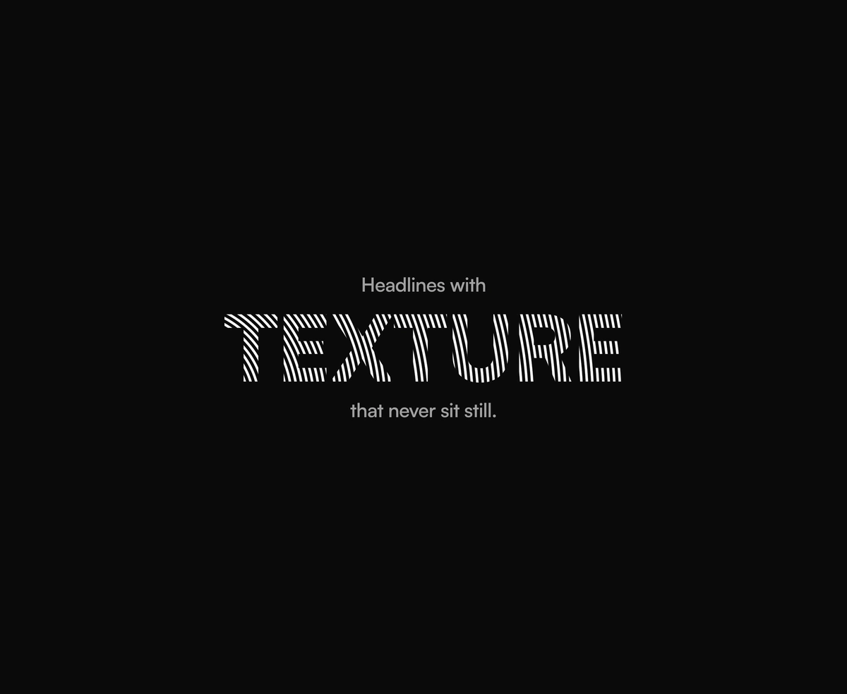
Overview
Line Fill Text is a React and Tailwind CSS text effect that fills bold type with fine curved lines flowing outward from a drifting focal point, in Next.js or any React app, with no dependencies. The pattern is a repeating radial gradient clipped to the glyphs, so it stays real, selectable text that search engines and screen readers read. Motion runs on registered CSS custom properties with no canvas or per frame JavaScript, and the lines bend toward a mouse or trackpad pointer. Density, weight, speed, and origin shape the field, and reduced motion holds it still.
Installation
Run the following command
pnpm dlx wensity@latest add line-fill-text
Usage
Import LineFillText from @/components/wensity/line-fill-text and render it anywhere in your React or Next.js app. The source lands in your own repo, so every prop, class and animation below is yours to edit.
import { LineFillText } from "@/components/wensity/line-fill-text";export default function Example() {return (<div className="flex flex-col items-center gap-4 text-center"><p className="text-2xl font-semibold text-neutral-500">Headlines with</p><h2 className="text-8xl font-black uppercase tracking-tight"><LineFillText text="Texture" /></h2><p className="text-2xl font-semibold text-neutral-500">that never sit still.</p></div>);}
Props
| Prop | Type | Default | Description |
|---|---|---|---|
text | string | - | The text to fill. Use \n for a line break. |
density | number | 16 | Lines per em of type, clamped to 5 to 30. |
weight | number | 0.38 | Line thickness as a share of the gap between lines. |
speed | number | 1 | Lines flowing past a point per second. 0 stops the flow. |
driftSeconds | number | 16 | Seconds for one slow drift of the focal point. 0 stops the drift. |
origin | { x: number; y: number } | { x: -15, y: 130 } | Focal point of the line field in percent of the text box. Outside gives diagonal sweeps, inside gives tight rings. |
interactive | boolean | true | Let the pointer pull the focal point while it is over the text. |
Featured in React hero section components.