 Black Friday is here 🔥 Get

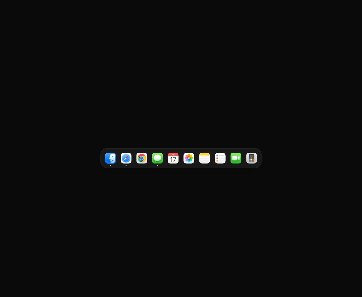
macOS Floating Dock
A magnetic dock where icons inflate near the cursor and push their siblings aside.
React copy to clipboard button whose icon morphs into a check as it turns green.
Copy Button is a React and Tailwind CSS copy to clipboard button whose icon morphs into a check, in Next.js or any React app. On success the back sheet tucks away, a check draws itself, and a solid green layer spreads from the point you pressed. Pass value as a string or as a function that returns one, sync or async. A blocked clipboard shows a red cross and calls onCopyError rather than faking success. The label keeps its width as Copy becomes Copied, a polite live region announces the result, and reduced motion swaps icons with a quick fade.
Run the following command
pnpm dlx wensity@latest add copy-button
npx wensity@latest add copy-button
yarn dlx wensity@latest add copy-button
bunx wensity@latest add copy-button
Import CopyButton from @/components/wensity/copy-button and render it anywhere in your React or Next.js app. The source lands in your own repo, so every prop, class and animation below is yours to edit.
import { CopyButton } from "@/components/wensity/copy-button";export default function Example() {return (<div className="flex items-center gap-3"><CopyButton value="npm install framer-motion" aria-label="Copy command" /><CopyButton value="https://example.com/invite/42" variant="label" /></div>);}
| Prop | Type | Default | Description |
|---|---|---|---|
value | string | (() => string | Promise<string>) | - | Text to copy, or a function that returns it, sync or async. |
variant | "icon" | "label" | "icon" | Icon only, or icon with a label that rolls from Copy to Copied. |
appearance | "solid" | "ghost" | "solid" | Solid is a raised button that fills with the tone. Ghost stays bare and only its icon and label take the tone. |
size | "sm" | "md" | "lg" | "md" | 28, 34 or 42 pixels tall. |
tone | "green" | "blue" | "violet" | "amber" | "mono" | "green" | Colour the button turns once the copy lands. |
timeout | number | 1600 | How long the check stays, in milliseconds. |
sweep | boolean | true | Spread the success fill from the point that was pressed. |
labels | { copy?: string; copied?: string; failed?: string } | - | Words for the label, the aria-label and the screen reader announcement. |
onCopied | (text: string) => void | - | Called with the copied text. |
onCopyError | (error: unknown) => void | - | Called when the clipboard write fails. The button shows a red cross. |
A magnetic dock where icons inflate near the cursor and push their siblings aside.
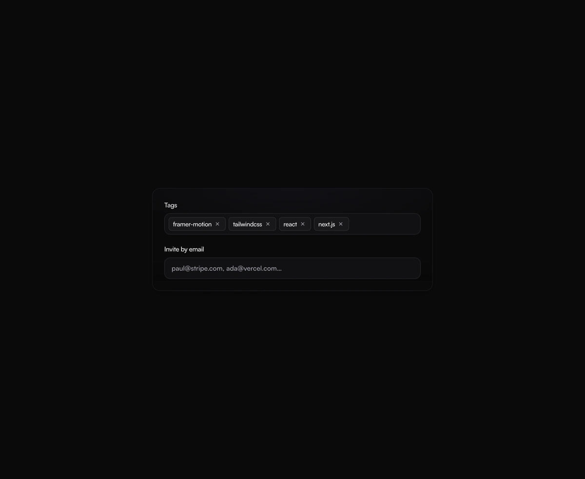
A tag input where pills pop in as you add them and slide out on remove, closing the gap without snapping the layout.
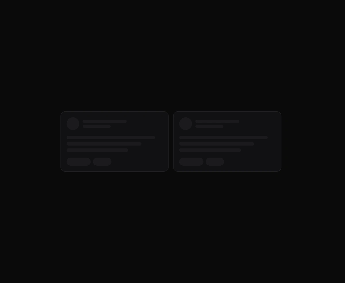
One angled GPU sweep that travels across any placeholder geometry you wrap, never a separate shimmer stuttering per row.
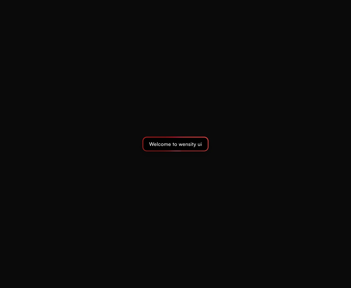
A dual-layer orbit glow that soft-spins around the edge of any button or link you wrap it around, at zero layout cost.