 Black Friday is here 🔥 Get

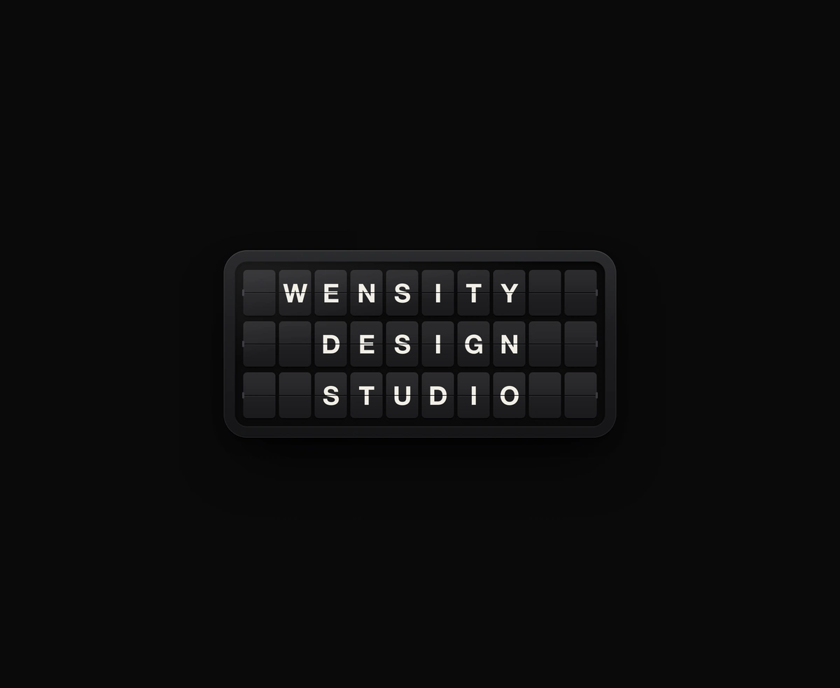
Split-Flap Display
A ceramic and graphite split-flap device that ripples each flap into your message.
A React 3D card effect with real thickness that tilts toward the cursor, catches the light and flips to its back face.
3D Card Effect is a React and Tailwind CSS tilt card that leans toward the cursor, lifts off its shadow and flips to a back face, in Next.js or any React app. Framer Motion springs drive CSS 3D transforms, and stacked edge layers give the card visible thickness. The finish prop sets the light: a gloss hotspot, a sweeping metal band or matte shading. Pass back and a click, Enter or Space plays a card flip animation away from the pressed side. Inner layers can read --tilt-x and --tilt-y for parallax. Touch skips the tilt, and reduced motion flips instantly.
Run the following command
pnpm dlx wensity@latest add tilt-card
npx wensity@latest add tilt-card
yarn dlx wensity@latest add tilt-card
bunx wensity@latest add tilt-card
Import TiltCard from @/components/wensity/tilt-card and render it anywhere in your React or Next.js app. The source lands in your own repo, so every prop, class and animation below is yours to edit.
import { TiltCard } from "@/components/wensity/tilt-card";export default function Example() {return (<TiltCardfinish="gloss"className="w-64"back={<div className="h-full bg-neutral-900 p-5 text-white">Back face</div>}><imgsrc="/cover.jpg"alt=""className="h-full w-full object-cover"// Optional parallax: the card exposes --tilt-x and --tilt-y (-1 to 1).style={{ translate: "calc(var(--tilt-x) * -8px) calc(var(--tilt-y) * -8px)", scale: "1.08" }}/></TiltCard>);}
| Prop | Type | Default | Description |
|---|---|---|---|
children | React.ReactNode | - | Front face. Size the card with className (default w-64, 4:5). |
back | React.ReactNode | - | Back face. When set, a click, Enter or Space flips the card. |
finish | "gloss" | "metal" | "matte" | "gloss" | How the surface catches light: a specular spot, a sweeping sheen band, or soft diffuse shading. |
maxTilt | number | 12 | Largest tilt in degrees, reached at the card edge. |
lift | number | 24 | How far the card rises toward the viewer on hover, in pixels. |
perspective | number | 1000 | CSS perspective distance in pixels. Lower is more dramatic. |
radius | number | 20 | Corner radius in pixels. |
thickness | number | 3 | Card thickness in pixels, seen on the edge when it tilts. 0 draws a flat sheet. |
edgeColor | string | - | Colour of the card edge. Defaults to one that suits the finish. |
shadow | boolean | true | Draws the soft cast shadow under the card. |
flipped | boolean | - | Controlled flip state. Pair with onFlippedChange. |
defaultFlipped | boolean | false | Starts on the back face. |
disabled | boolean | false | Turns off tilt and flip. |
A ceramic and graphite split-flap device that ripples each flap into your message.
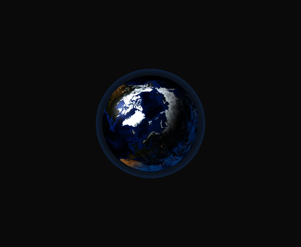
A 3D Earth lit day and night from the real sun position, wrapped in a soft atmosphere, with smooth drag-to-orbit controls.
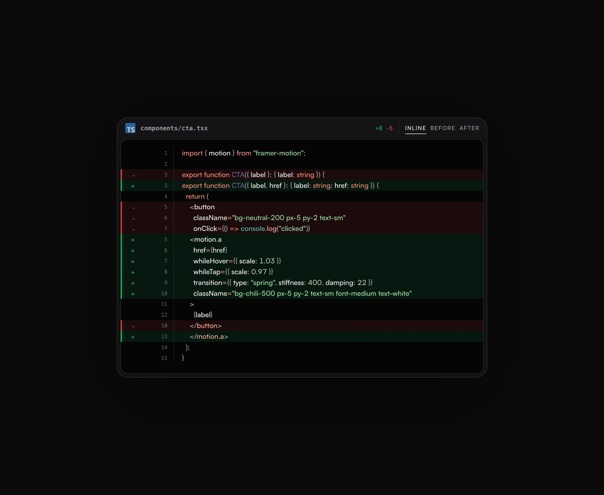
Inline or toggled code diffs rendered inside the same polished code block frame, flipping between before and after.
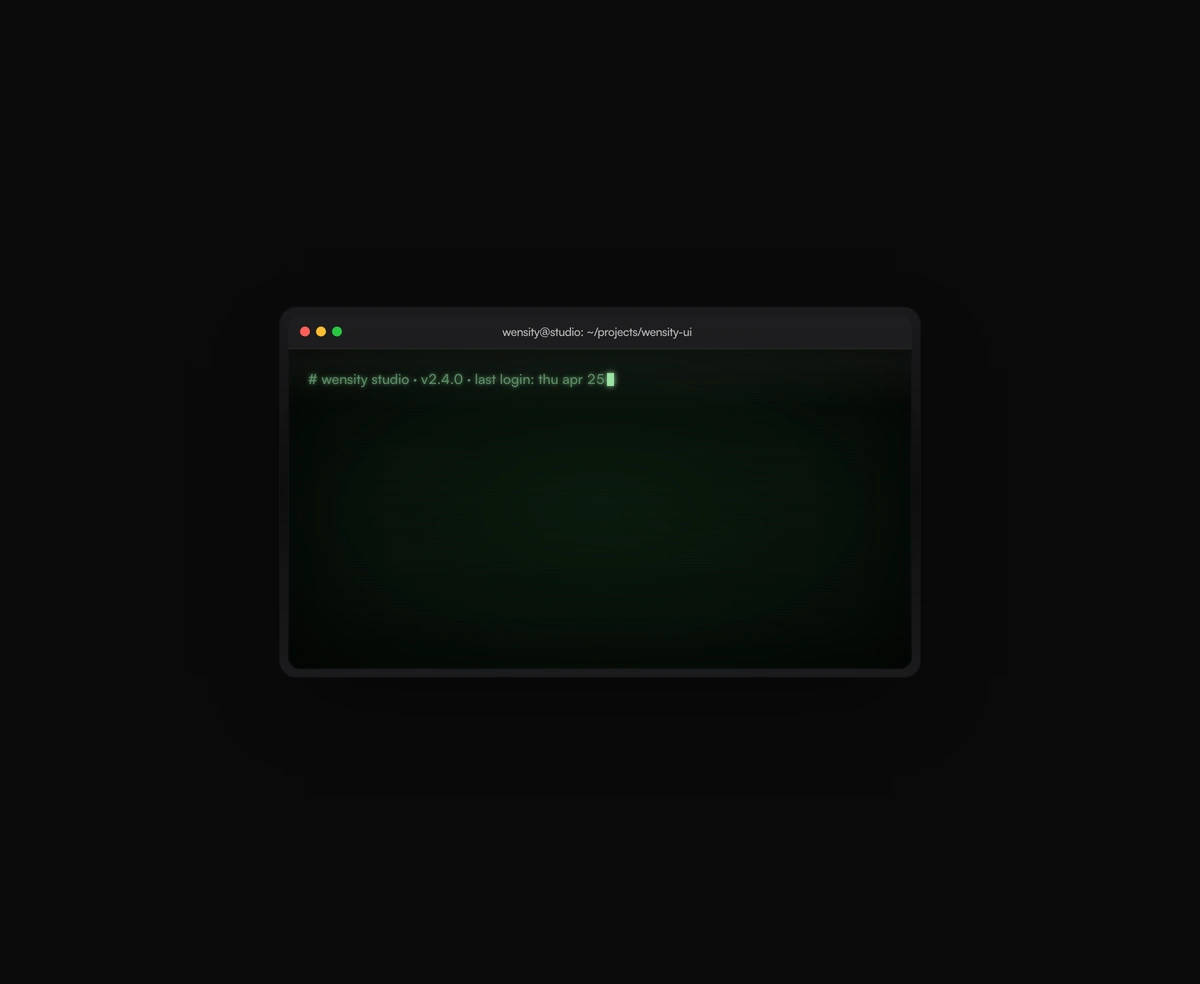
A terminal UI with self-typing commands, CRT phosphor glow and scanlines, streaming output that never re-renders a line.
Featured in React 3D components.