Navbar With Mega Menu Dropdown
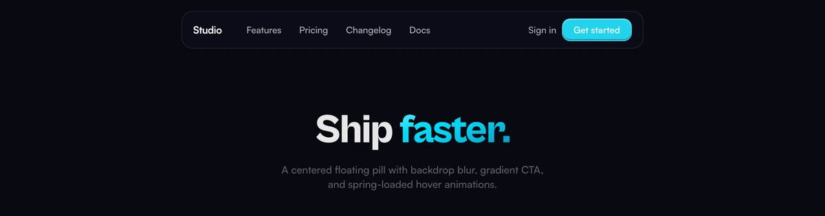
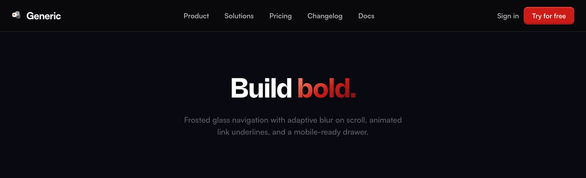
ProRefined navbar with a left-aligned floating card dropdown, staggered item reveals, icon circles that invert on hover, and deep shadow depth for a premium product aesthetic. Adapts to light and dark mode.
When to use Navbar With Mega Menu Dropdown
Everything here is in service of one thing: the dropdown is a floating card, aligned left of its trigger, wide enough to hold an icon and a sentence next to each link. Reach for it when a destination needs explaining before anyone will click it, which is usually true of a platform with four products and rarely true of a site with a pricing page and a blog.
The trade is weight. Deep shadows, inverting icon circles and a card that lifts off the page add up to a bar that announces itself, so the section directly beneath it should be calm. Writing the descriptions is the real work, not the install: a card full of link labels padded out to sentence length is worse than the plain list you started with.
Block details
- Category
- Navbars
- Renders
- JavaScript animation. Paints first, then animates
- Theme
- Follows the site theme in light and dark
- Responsive
- Mobile, tablet and desktop breakpoints are already set
- Dependencies
clsxframer-motiontailwind-merge- Source
- 519 lines, 25 KB in one file
- Install
wensity add navbar-with-mega-menu-dropdown --type block- Stack
- React, Next.js, TypeScript and Tailwind CSS v4
- Licence
- Included with Wensity Pro. The CLI copies the file into your repository and you own it from there
- Tags
- light, dark, floating-card, product, staggered, premium
- Last updated