React Security Features Section with a Six Card Grid and Light Rays
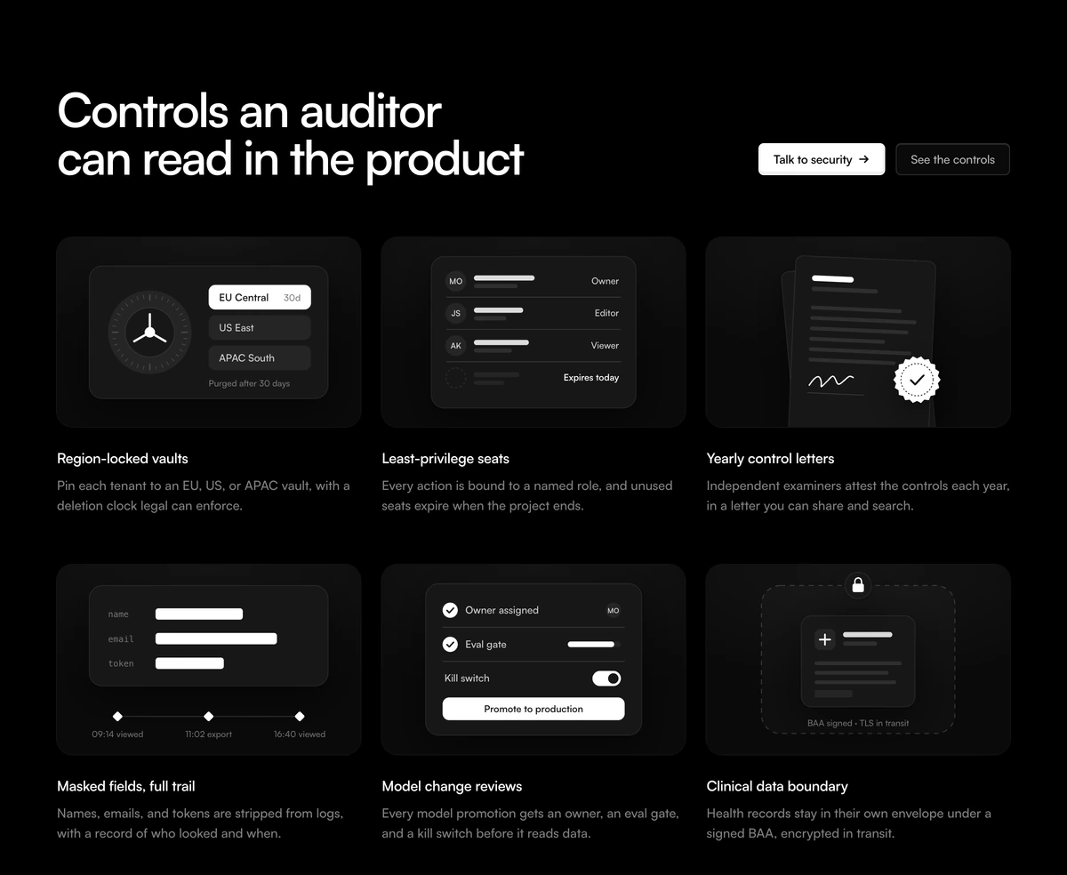
ProA trust and compliance section for a product that handles sensitive data. Warm and cool rays of light fall from the top right corner across a headline, two buttons and a panel of six security features, each with its own icon, title and one sentence explanation.
Security claims people can scan
Feature Section with Security Grid is a React and Tailwind CSS security features section that lays out six controls, such as data residency, access, audit trails and redaction, in a three column grid inside one bordered panel, under a soft WebGL light ray background. It runs in Next.js or any React app, light and dark.
Security pages are read by two audiences: buyers skimming for reassurance and reviewers looking for specifics. A grid of six short, named controls serves both. Each card says what the control is in a few words and what it guarantees in one sentence, and the buttons route the detailed reader to your security team or documentation.
The light rays are drawn with OGL, a small WebGL library, and they exist only while the section is on screen. The renderer is created when at least a tenth of the section is visible and destroyed when it leaves, so the effect costs nothing while the visitor reads the rest of the page.
What the section contains
Light rays
Amber and pale blue rays from the top right, at 40 percent opacity in light mode and full strength in dark mode, on an aria-hidden canvas.
Header
An h2 headline, a sentence of context, a dark primary button with an arrow and a quieter secondary button.
Feature grid
A list of six items, one column on phones, two on tablets and three on desktop, inside a 22px rounded panel. Borders are computed so the last row never gets a stray divider.
Feature card
An icon, an h3 title and a description. The default icons are custom line drawings: a vault door, an access badge, a seal and more.
When to add a security grid
Use it when
- B2B products that are asked about compliance in every sales call.
- Health, finance and legal tools where data handling is part of the value.
- You have six concrete controls, each true today, to name.
- You want a touch of atmosphere without a heavy animation running all the time.
Skip it when
- You can only name two or three controls; the grid is designed for six.
- You do not have the certifications or controls to back the copy. Never ship the sample claims.
- The project cannot add the ogl package.
- A plain document style security page fits your audience better than a marketing section.
Write controls you can prove
features is an array of objects with icon, title and description. Keep titles to two or three words and descriptions to one sentence a reviewer could check against your documentation. The default copy describes a fictional compliance product and must be replaced in full.
Icons can be any React node. Use your own line icons at roughly the same stroke weight as the defaults for a consistent grid. The ray colours are set in the component; change the two hex values if amber and blue do not suit your palette.
npx wensity@latest add feature-section-with-security-grid --type block
import { SecurityGridFeature } from "@/components/wensity/blocks/feature-section-with-security-grid";import { KeyIcon, LockIcon, LogIcon } from "./icons";export function Security() {return (<SecurityGridFeatureheadline="Built for teams that answer security reviews"subtext="Data stays in the EU region you choose, encrypted at rest and in transit."primaryCta={{ label: "Visit the trust centre", href: "/trust" }}secondaryCta={{ label: "Read the docs", href: "/docs/security" }}features={[{ icon: <LockIcon />, title: "Encryption", description: "AES 256 at rest and TLS 1.3 in transit." },{ icon: <KeyIcon />, title: "Single sign on", description: "SAML and SCIM on every paid plan." },{ icon: <LogIcon />, title: "Audit log", description: "Every admin action, exportable as CSV." },]}/>);}
Props
| Prop | Type | Default | Description |
|---|---|---|---|
features | { icon: ReactNode; title: string; description: string }[] | 6 sample controls | The cards in the grid. Six fill three columns evenly. |
headline | string | "Controls an auditor can read in the product" | The section h2. |
subtext | string | - | One sentence on where data lives and who can reach it. |
primaryCta | { label: string; href: string } | Talk to security | Dark button. A contact form or trust centre link works well. |
secondaryCta | { label: string; href: string } | See the controls | Lighter button, for documentation or a downloadable report. |
Runtime and accessibility
Visibility gated WebGL
An IntersectionObserver creates the ray renderer at 10 percent visibility and tears it down when the section leaves, so there is no hidden GPU work.
Reduced motion
Visitors who prefer reduced motion get one still frame of the rays.
Semantic list
The six features are a ul with h3 titles, so screen readers announce the count and users can jump between items.
Pixel ratio
The ray canvas is capped at 2x device pixel ratio.
Small dependency
ogl is a few kilobytes compared with Three.js and is the only extra package.
Block details
- Category
- Feature Sections
- Renders
- CSS only. Paints as soon as the stylesheet arrives
- Theme
- Follows the site theme in light and dark
- Dependencies
clsxtailwind-merge- Source
- 492 lines, 20 KB in one file
- Install
wensity add feature-section-with-security-grid --type block- Tags
- light, dark, grid, security, compliance, saas, illustration
- Last updated