React footer components
Footers that close a page properly, from a four column sitemap to a single line of legal text. Install one command and the source lands in your repository.
Built with the stack you already ship
Footer blocks you can copy
Each footer is one file with its own layout, link structure and responsive rules. Preview it live, then copy the whole thing into your project.
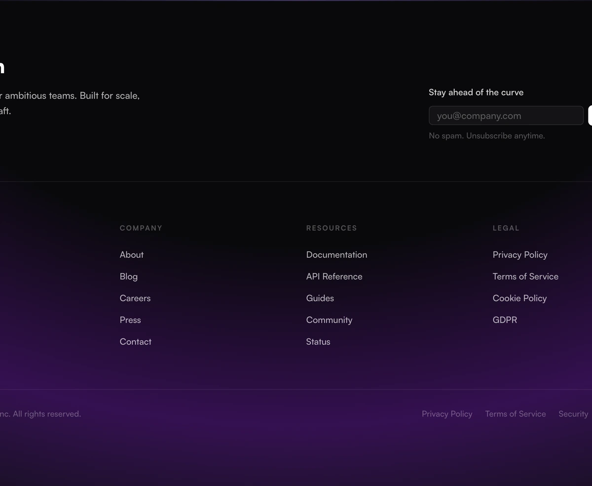 Footer With Newsletter SignupPremium light-mode enterprise footer with a soft purple aurora radial gradient, newsletter signup, 4-column link grid, editorial social icon strip with labels, and a clean bottom bar, with Satoshi font throughout.
 Footer With Editorial TaglineStudio-style editorial footer in warm paper tones with a long-form tagline, thin uppercase outline wordmark, and a soft radial glow halo that follows the cursor behind the type.
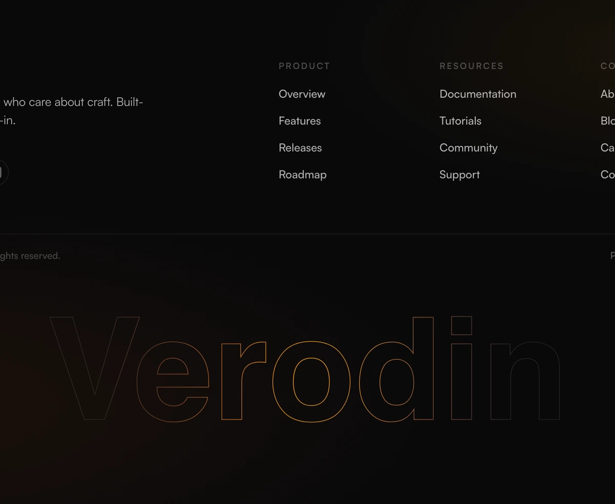 Footer With Two Column LayoutPremium dark footer with a clean two-column layout, with brand identity and social icons on the left and navigation columns on the right. Giant ultra-bold wordmark at the base with a cursor-tracking gradient reveal on hover.
 Footer With Pixel Grid WordmarkEnterprise-grade dark footer with newsletter signup, 4-column link grid, social icons, policy links, and a giant interactive pixel-grid wordmark whose gradient chases your cursor.
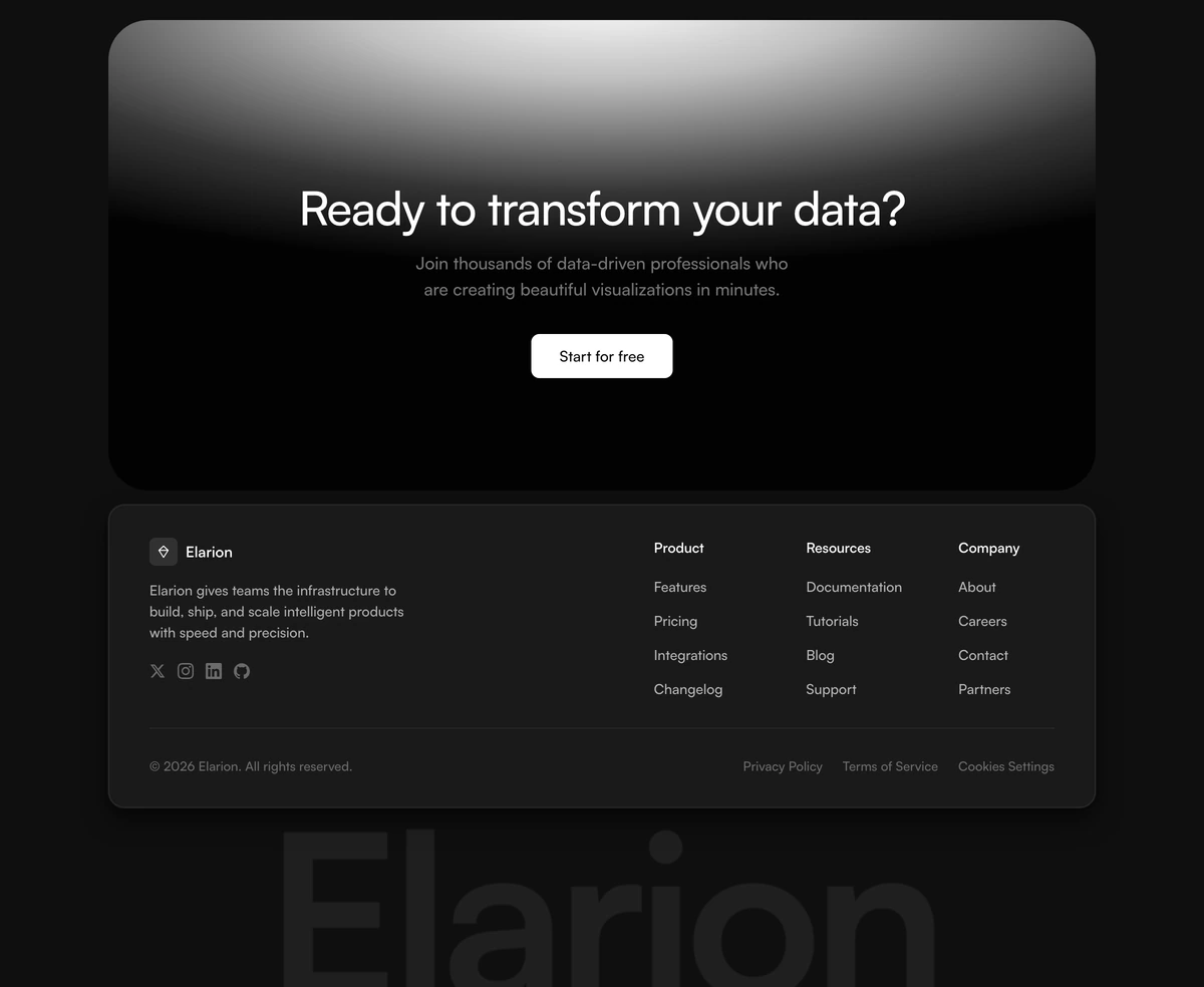 Footer With Call To Action BandDark CTA band with a top-lit white radial glow, a white navigation card with brand info and link columns, and a faint blurred wordmark below, inspired by modern SaaS product footers.
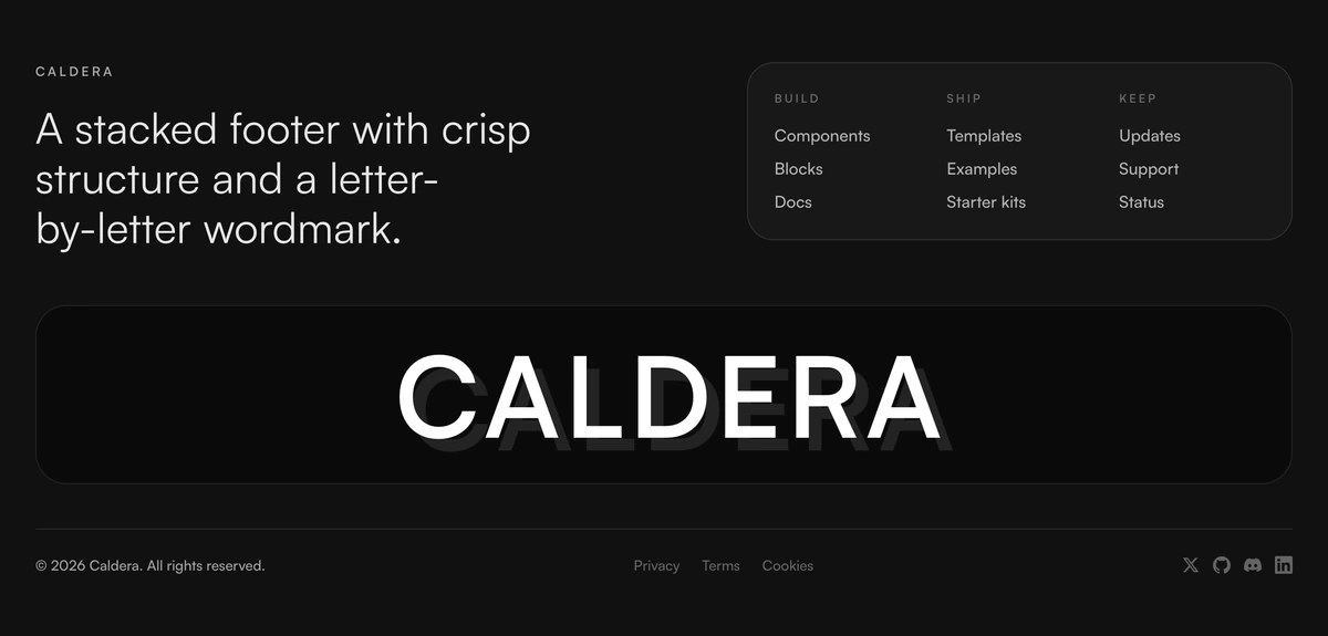 Footer With Stacked LayoutStructured footer with a stacked mono-style wordmark treatment, compact link panel, and a dense dark surface built for product sites.
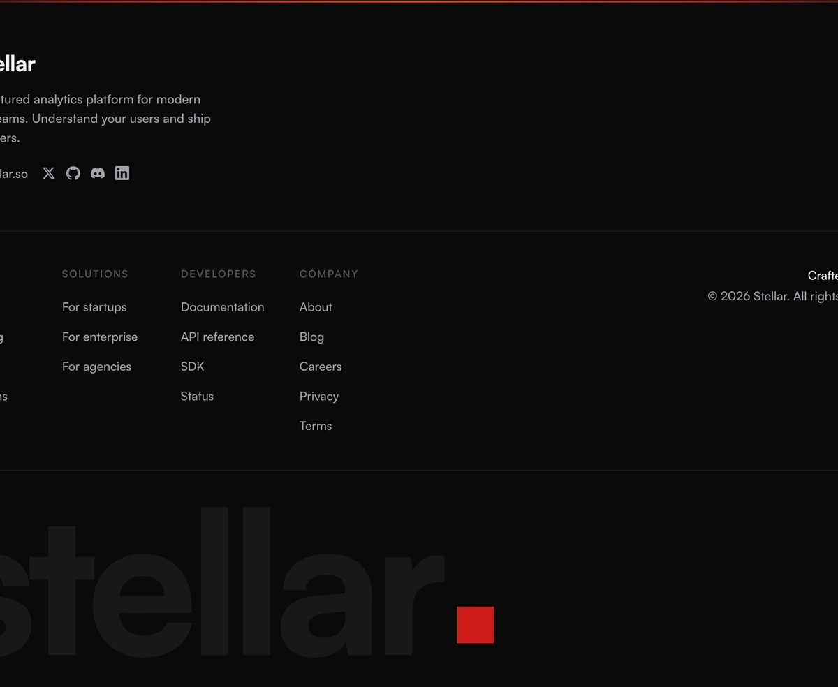 Footer With Four Column Links4-column link grid with a brand header, social icons, and an oversized gradient wordmark flourish, dark-first with a chili accent bar.
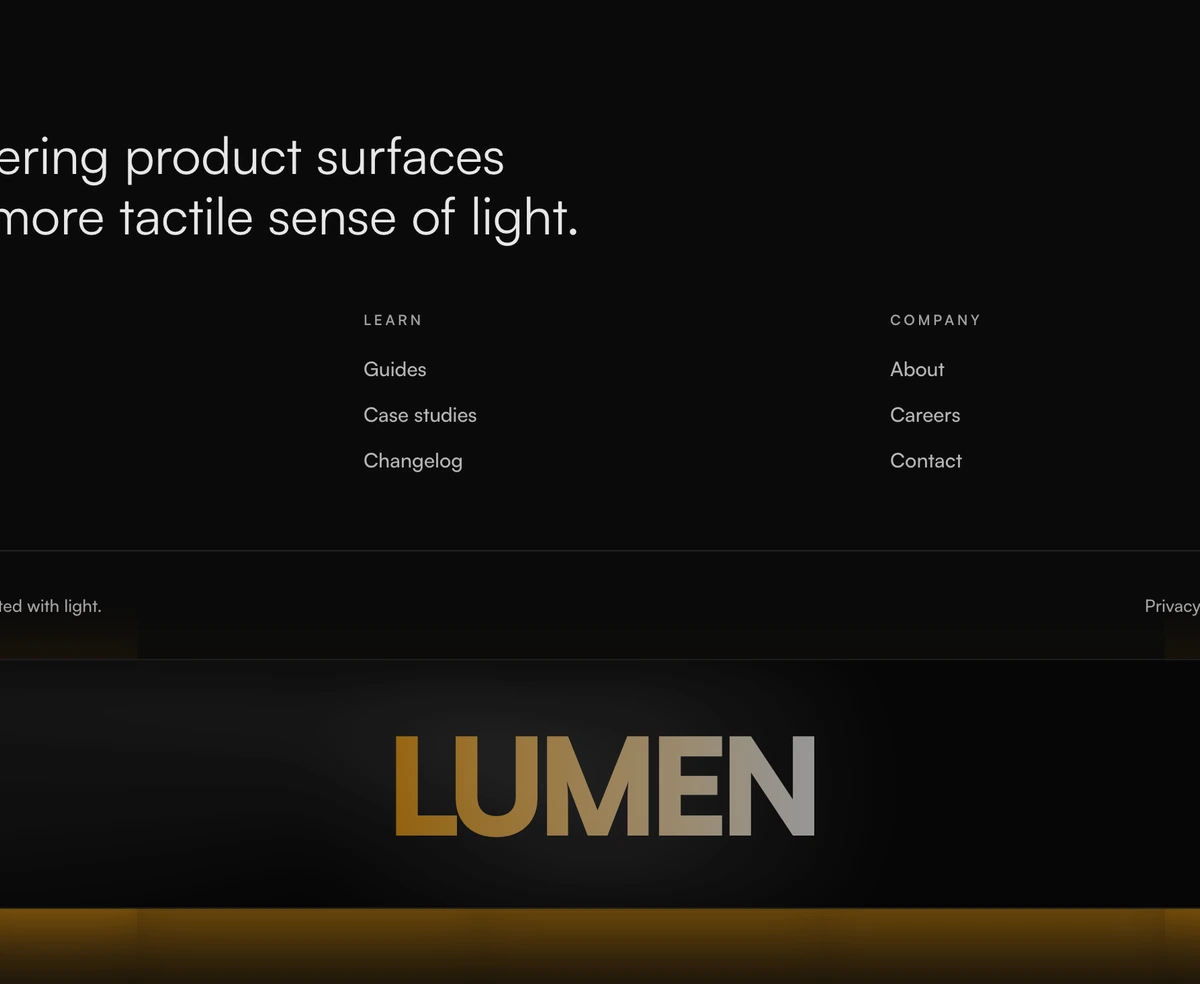 Footer With Glowing WordmarkHigh-contrast dark footer with a luminous conic-gradient wordmark, warm amber accents, and a glassy card surface that reacts to motion.
Parts a footer is built from
Swap a column, add a form, or build a footer of your own from the same primitives these blocks use. All of them are keyboard accessible out of the box.
- SeparatorSeparatorDividers for layout sections, carrying text labels, gradient fades, dashed borders, and vertical split support.
- InputInputAn accessible text field with labels, hints, inline errors, leading and trailing icons, and a one-tap clear action.
- ButtonButtonAn accessible action primitive with solid, outline, ghost, and destructive variants, plus sizes, icons, and loading state.
- BadgeBadgeStatus and metadata badges with icons, presence dots, removable chips, and just enough depth to read as a real surface.
- TypographyTypographyType primitives for six heading levels, prose blocks, lead and muted text, inline code, and consistently styled lists.
- CollapsibleCollapsibleCollapsible panels for sidebar sections, show-more previews, and any secondary content you want out of the way.
How to choose a footer
A footer is the last thing on the page and the first place people look when they cannot find something. It carries the links that do not deserve a spot in the top navigation: pricing tiers, documentation, careers, privacy, the support address. Treat it as the site map it actually is. If a visitor scrolls to the bottom, they are usually looking for a specific thing rather than browsing, so the labels matter more than the layout.
Match the size of the footer to the size of the site. A product with four pages does not need a four column grid, and padding one out with invented headings makes the site look thinner rather than fuller. Footer With Call To Action Band is close to the minimum that still feels finished: a wordmark, one row of links, and a call to action. At the other end, Footer With Pixel Grid Wordmark carries four columns plus a newsletter field, which suits a site with real documentation behind it.
Decide early whether the footer is quiet or loud. Most are quiet: muted text, a hairline above, nothing that competes with the content it follows. Footer With Glowing Wordmark and Footer With Newsletter Signup take the other route with gradients and a lit edge, which works when the footer is the last chance to convert and the page above it has already made the argument. Picking loud for a documentation site tends to read as noise.
The newsletter field is the one decision worth thinking about rather than defaulting. It earns its place when you actually publish something on a schedule. If you do not, an empty subscribe box is a promise the site does not keep, and it pushes the links people came for further down. Leave it out and give the space back to navigation.
Whichever you pick, keep the legal row honest and boring. Copyright line, terms, privacy, and a real contact route. Put it under a separator at the smallest readable size, in DOM order after the main links so keyboard users reach the useful navigation first. That row is not where a design should try to be interesting.