Footer With Pixel Grid Wordmark
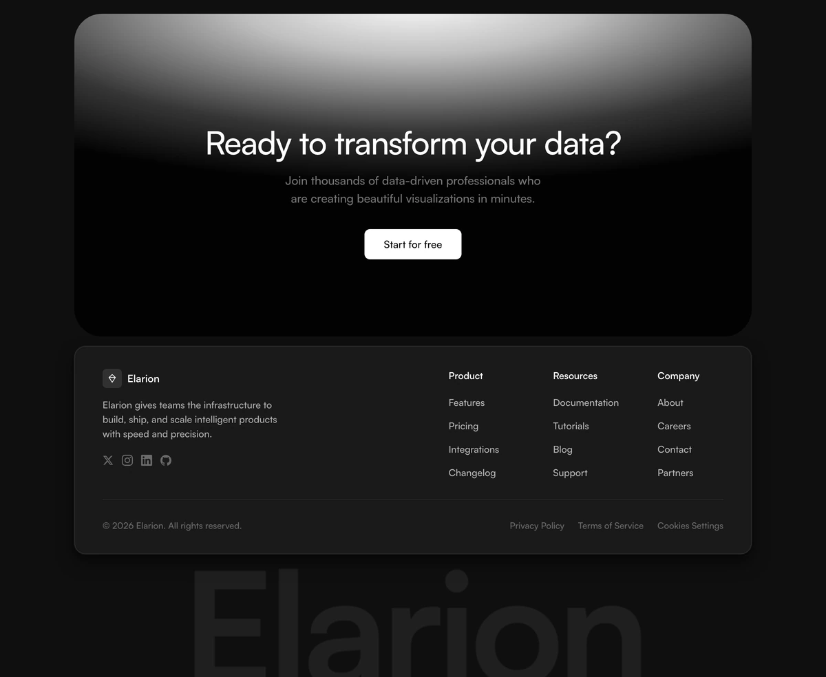
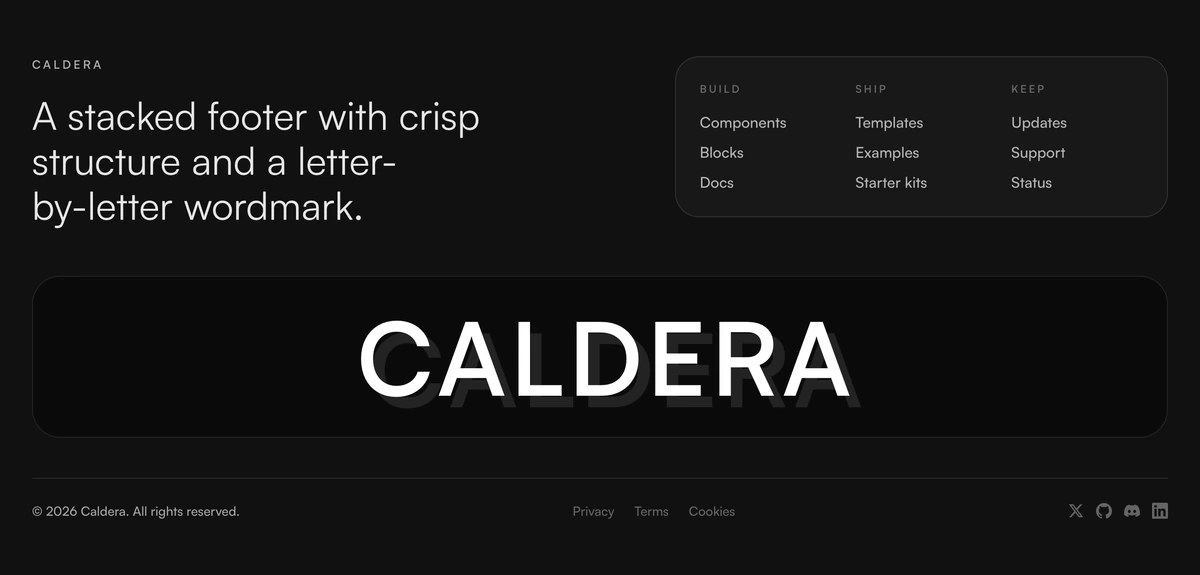
ProEnterprise-grade dark footer with newsletter signup, 4-column link grid, social icons, policy links, and a giant interactive pixel-grid wordmark whose gradient chases your cursor.
When to use Footer With Pixel Grid Wordmark
Built for a documentation site, where the footer is not decoration but a second navigation people genuinely use after the sidebar has failed them. Four columns of links, policy row, subscribe field, and beneath all of it a wordmark drawn as a grid of pixels whose gradient chases the cursor across it.
The ordering is the design decision worth noticing. Every functional element sits above the toy, so the pixel grid never stands between a reader and the page they came for; it is a reward for scrolling past what you needed, not a toll on the way to it. Choose it when your docs have four real sections to list. On a marketing site with six pages the columns will be mostly air and the wordmark will be doing all the work.
Block details
- Category
- Footers
- Renders
- JavaScript animation. Paints first, then animates
- Theme
- Follows the site theme in light and dark
- Responsive
- Mobile, tablet and desktop breakpoints are already set
- Dependencies
clsxframer-motiontailwind-merge- Source
- 523 lines, 22 KB in one file
- Install
wensity add footer-with-pixel-grid-wordmark --type block- Stack
- React, Next.js, TypeScript and Tailwind CSS v4
- Licence
- Included with Wensity Pro. The CLI copies the file into your repository and you own it from there
- Tags
- dark, enterprise, newsletter, wordmark, interactive, multi-column
- Last updated