React Benchmark Comparison Table for AI Models
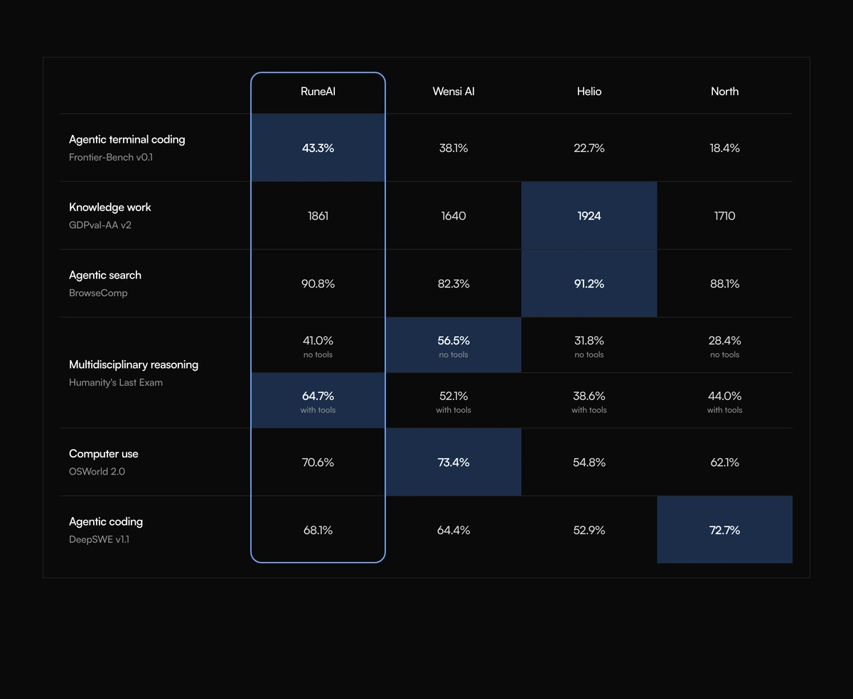
ProThe kind of table AI labs publish at launch. Models run across the top with your own model outlined in blue down its whole column. Each row is a benchmark with its source underneath, and a cell can hold one score or several stacked scores, such as with and without tools. Winning cells are tinted pale blue.
Publishing benchmark results clearly
Comparison Section with Benchmark Matrix is a React and Tailwind CSS benchmark comparison table for AI models and other technical products, with a featured column, sourced benchmark rows and cells that can stack several scores. It is a server component for Next.js or any React app.
Benchmark tables carry a lot of nuance: a score can depend on settings, such as whether tools were allowed, and readers want to know who ran each test. This block gives each row a source line and lets each cell show several labelled scores with a credit, so the table can be honest about conditions without footnotes.
Wins are marked by hand rather than computed, because in benchmarks a higher number is not always comparable across settings. You decide which cells count as a win and they get a pale blue fill.
Inside the benchmark table
Model columns
One column per model. A featured model gets a rounded blue outline running down its entire column.
Benchmark rows
A benchmark title and a source line, such as the organisation that ran it or the setting used.
Stacked scores
A cell can hold an array of scores, each with a caption and a credit, and the row grows to fit.
Marked wins
Scores with win set to blue get a pale blue background.
No built in heading
The section starts directly with the table; there is no heading prop.
Width
An 820px minimum width, scrolling sideways on phones.
Who it is for
Use it when
- AI model launches and model comparison pages.
- Databases, compilers or hardware with published benchmark suites.
- Results that depend on conditions you need to show side by side.
- You want a server rendered table with no client cost.
Skip it when
- You do not have reproducible results. Never ship the default scores.
- A heading must come with the block; you will add one yourself.
- Full table semantics are required.
- You want winners computed automatically; the features matrix does that.
Models, benchmarks and wins
models takes an id, name and optional featured flag. rows takes an id, title, source and values keyed by model id, where each value is a score object or an array of them. A score has a value, an optional caption and credit, and an optional win of blue.
Keep the featured model in the first data column so the blue outline sits next to the benchmark names, and list competitors in a fixed order across every row so readers can compare across the page.
The defaults attach invented numbers to the names of real public benchmarks and to fictional models. Replace every score with your own measured results, link to your method, and render an h2 above the block because it has none.
npx wensity@latest add comparison-section-with-benchmark-matrix --type block
import { BenchmarkMatrixComparison } from "@/components/wensity/blocks/comparison-section-with-benchmark-matrix";export function Results() {return (<section><h2 className="text-center text-3xl font-semibold">Evaluation results</h2><BenchmarkMatrixComparisonmodels={[{ id: "ours", name: "Sable 2", featured: true },{ id: "prev", name: "Sable 1" },]}rows={[{id: "code",title: "Internal coding suite",source: "500 tasks, pass@1, run by our team",values: {ours: [{ value: "71.2%", caption: "no tools" }, { value: "78.9%", caption: "with tools", win: "blue" }],prev: { value: "62.4%" },},},]}/></section>);}
Props
| Prop | Type | Default | Description |
|---|---|---|---|
models | { id; name; featured? }[] | - | Columns. featured draws the blue outline down that column. |
rows | { id; title; source; values: Record<modelId, Score | Score[]> }[] | - | Benchmarks with their source and the scores per model. |
rows[].values[] | { value: string; caption?; credit?; win?: "blue" } | - | A single score. Use an array to stack settings such as no tools and with tools. |
Integrity and accessibility
Dark variant
Win tints and the featured outline have dark mode colours, a deep navy fill and a lighter blue outline, so the table works on either theme.
Width
The table sits in a container up to 1080px wide; with four models every column keeps room for stacked scores.
Placeholder results
Real benchmark names appear with made up scores in the defaults. Publishing them would misrepresent both your model and the benchmark.
Server rendered
No client directive or state; the table is static HTML.
Heading needed
Without an h2 above it, the section has no title in the document outline.
Grid structure
Cells are laid out with CSS grid, so screen readers do not get table navigation. Captions and credits are plain text and are read in order.
No motion
Nothing animates, so the block needs no reduced motion handling.
Block details
- Category
- Comparison Sections
- Renders
- CSS only. Paints as soon as the stylesheet arrives
- Theme
- Follows the site theme in light and dark
- Dependencies
clsxtailwind-merge- Source
- 328 lines, 9 KB in one file
- Install
wensity add comparison-section-with-benchmark-matrix --type block- Tags
- light, dark, comparison, matrix, benchmarks, models
- Last updated