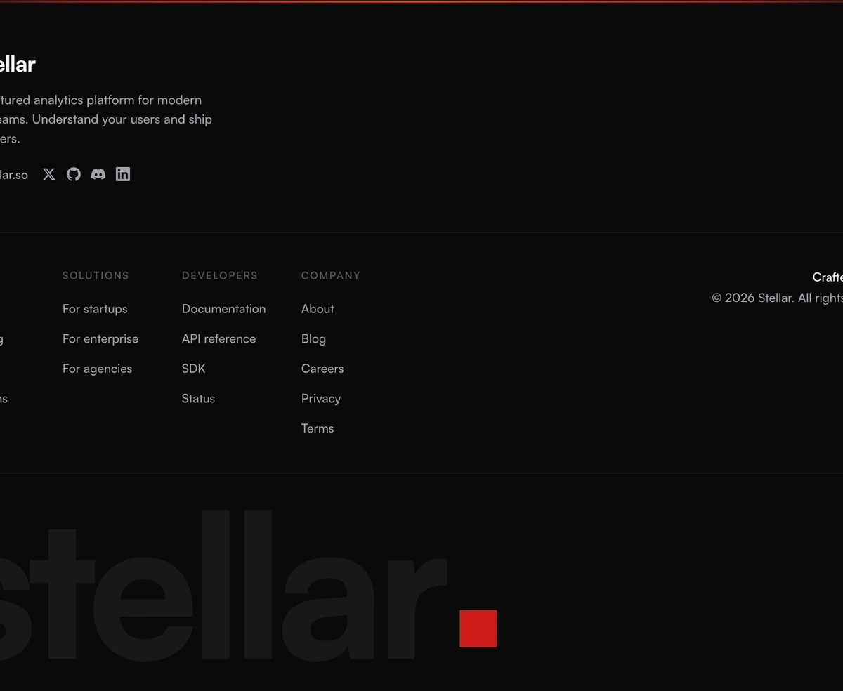
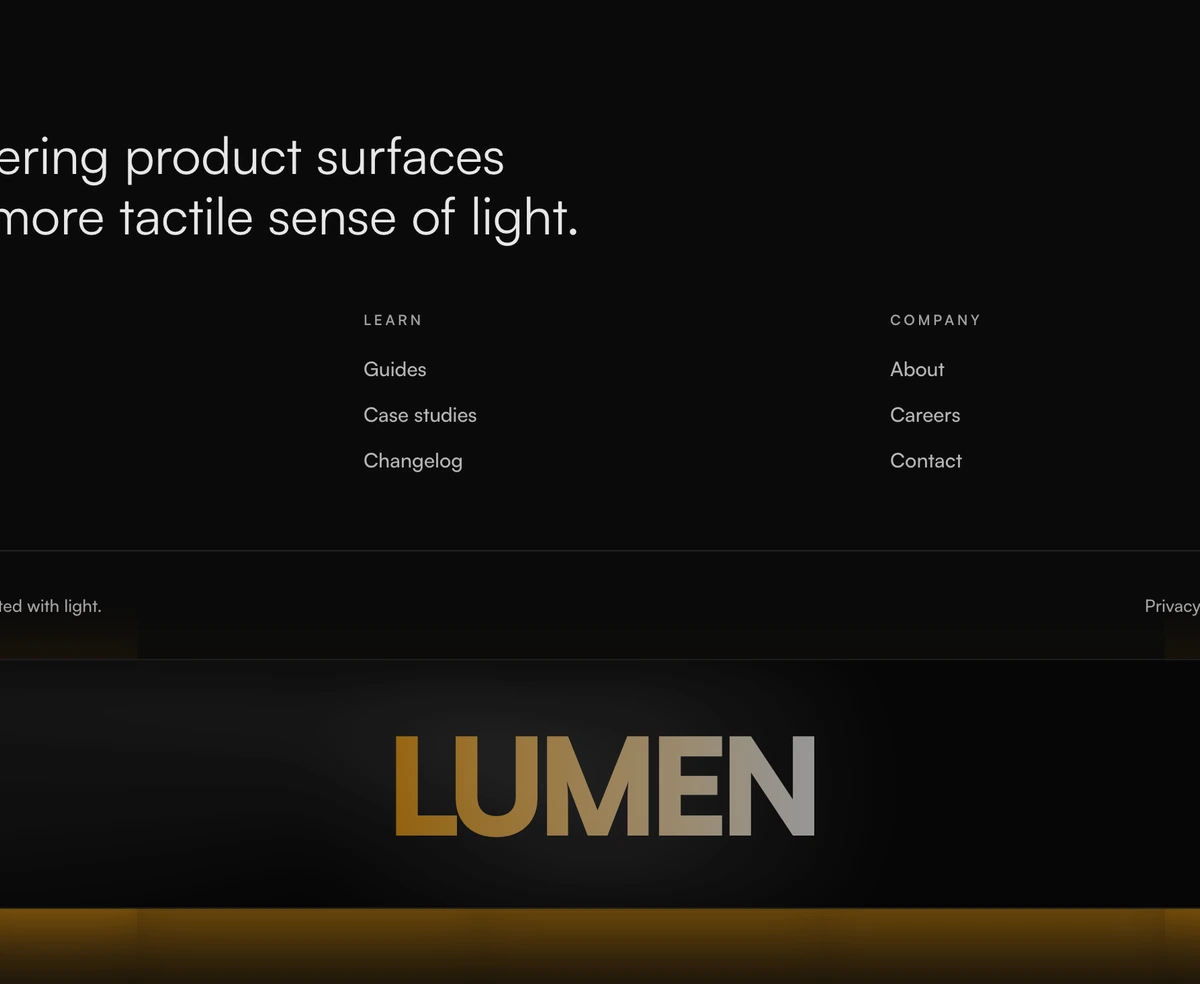
Footer With Stacked Layout
ProStructured footer with a stacked mono-style wordmark treatment, compact link panel, and a dense dark surface built for product sites.
When to use Footer With Stacked Layout
Stacks its content vertically instead of spreading it across columns, which keeps the whole band short. That shape suits a site whose footer is mostly terms, privacy and a support address rather than a second navigation, and it is the one to use when you resent giving the bottom of the page any height at all.
The mono styled wordmark and the dense surface keep the volume low. Nothing animates, nothing follows the cursor, and the file is short enough to read in one sitting if you need to change something. Treat it as the default for an application shell or an internal tool, where a footer that draws attention is a footer getting in the way. If you have twenty links to place, it is the wrong shape and they will simply run down the page.
Block details
- Category
- Footers
- Renders
- CSS only. Paints as soon as the stylesheet arrives
- Theme
- Follows the site theme in light and dark
- Responsive
- Mobile, tablet and desktop breakpoints are already set
- Dependencies
clsxtailwind-merge- Source
- 203 lines, 9 KB in one file
- Install
wensity add footer-with-stacked-layout --type block- Stack
- React, Next.js, TypeScript and Tailwind CSS v4
- Licence
- Included with Wensity Pro. The CLI copies the file into your repository and you own it from there
- Tags
- dark, stacked, structured, wordmark
- Last updated