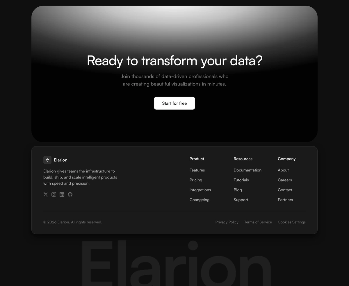
Footer With Two Column Layout
ProPremium dark footer with a clean two-column layout, with brand identity and social icons on the left and navigation columns on the right. Giant ultra-bold wordmark at the base with a cursor-tracking gradient reveal on hover.
When to use Footer With Two Column Layout
Two columns where most footers use four, and that constraint is the point. Brand, a line of positioning and the social icons hold the left; every link the site has stacks on the right. The eye takes in who you are before it starts scanning where to go, which is the correct order for a product most visitors are meeting for the first time.
It fits comfortably up to about a dozen links and starts to look cramped past that, so it suits a focused product rather than a platform. The ultra bold wordmark across the base stays flat until the cursor crosses it and then reveals a gradient beneath the letters. That single effect is the entire personality of the block, which also means it does nothing at all on a touch device, where the footer simply reads as clean and quiet.
Block details
- Category
- Footers
- Renders
- JavaScript animation. Paints first, then animates
- Theme
- Follows the site theme in light and dark
- Responsive
- Mobile, tablet and desktop breakpoints are already set
- Dependencies
clsxframer-motiontailwind-merge- Source
- 390 lines, 16 KB in one file
- Install
wensity add footer-with-two-column-layout --type block- Stack
- React, Next.js, TypeScript and Tailwind CSS v4
- Licence
- Included with Wensity Pro. The CLI copies the file into your repository and you own it from there
- Tags
- dark, wordmark, interactive, two-column, premium
- Last updated