React Footer with an Editorial Tagline and Outlined Wordmark
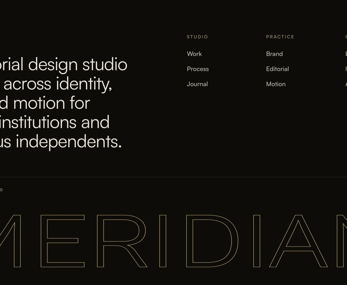
ProA footer that reads like the last page of a magazine. Warm off white paper, dark ink, your studio name in small spaced capitals, and then the tagline set at 40 pixels as a sentence worth reading. Three short link columns sit beside it and a light uppercase wordmark spans the bottom edge.
Let the tagline be the design
Footer with Editorial Tagline is a React and Tailwind CSS footer that treats your tagline as the headline of the section, setting it in large type beside a compact set of links and above an outlined brand wordmark. It suits studios, agencies, publications and portfolios built with Next.js or any React framework.
Most footers shrink the tagline to a grey line under the logo. Editorial layouts do the opposite: one well written sentence, given space and scale, says more about a studio than another column of links. The block is built around that idea, with the links deliberately small and quiet so the sentence leads.
The palette is paper and ink: #f4f1ec with near black text in light mode, and a deep warm brown with cream text in dark mode. Bronze is used for labels and the wordmark outline, and hovering the wordmark fills it with a gold gradient and a soft glow inside a circle that follows the pointer.
Elements of the editorial layout
Spaced name label
The brand name in extra small uppercase with very wide 0.24em tracking, in muted bronze. It works like a running head in print.
Statement tagline
Normal weight, text-3xl rising to 2.5rem from 640px, tight leading and balanced line breaks, capped at a readable width.
Three short columns
Studio, Practice and Contact with tiny uppercase labels. Links grow an underline on hover, and external ones get a small arrow.
Ink rule and strip
A one pixel rule at 10 percent ink, then the copyright line with your name and Studio on the left and social icons on the right.
Light wordmark
Uppercase text at weight 300, stretched with SVG textLength to 94 percent of the width, outlined in bronze, with a gold fill revealed through a moving radial mask.
Best suited to
Use it when
- Studios, agencies and freelancers whose positioning fits in one strong sentence.
- Magazines, journals and long form sites with a print inspired look.
- Sites with fewer than ten footer links, where three short columns are plenty.
- Warm, neutral palettes; the paper tones blend with cream or beige pages.
Skip it when
- SaaS products with large sitemaps and legal pages to surface.
- Bright, saturated brand palettes that clash with the bronze and gold accents.
- You need a separate legal links row. This footer has none, so legal pages go in a column.
- Phones are your main audience and your link labels are long, since the three columns stay side by side even on narrow screens.
Write the sentence first
The tagline prop is the heart of the block, so write it before anything else: what you do and for whom, in under twenty words. Then fill the three columns, set your socials and choose the wordmark. Most studios use their name.
The wordmark asks for a font through the --font-cabinet variable and falls back to Cabinet Grotesk, then the system face. Neither is shipped with the block, so load a light display font in your layout and point the variable at it. Because textLength stretches the word to fill the width, short names get wide letters and long names get narrow ones; check your name at a few widths before you commit.
npx wensity@latest add footer-with-editorial-tagline --type block
import { MeridianFooter } from "@/components/wensity/blocks/footer-with-editorial-tagline";export function StudioFooter() {return (<MeridianFooterbrandName="Atelier Nord"tagline="Identity and type for museums, publishers and the people who run them."wordmark="Nord"columns={[{ heading: "Work", links: [{ label: "Projects", href: "/work" }, { label: "Process", href: "/process" }] },{ heading: "Writing", links: [{ label: "Journal", href: "/journal" }] },{ heading: "Contact", links: [{ label: "Email", href: "mailto:studio@ateliernord.com" }] },]}socials={[]}/>);}
Props
| Prop | Type | Default | Description |
|---|---|---|---|
tagline | string | - | The large statement on the left. One sentence, written like a headline rather than a slogan. |
brandName | string | "Meridian" | Small label above the tagline and part of the default copyright. |
wordmark | string | "Meridian" | Uppercase outline across the bottom, always stretched to the full width. |
columns | MeridianFooterColumn[] | Studio, Practice, Contact | Three short groups. A mailto link in Contact is a natural fit. |
copyright | string | - | Replaces the default, which reads as your brand name followed by Studio. |
Type, motion and phones
Font is your responsibility
Without a loaded light display face the wordmark renders in the system font at weight 300, which looks noticeably plainer than the preview.
Hover only effect
The gold reveal fades in over about a third of a second while hovering and nothing moves on its own, so the footer stays still for visitors who prefer reduced motion.
Narrow columns on phones
The link grid is three columns at every width. With short labels like the defaults it fits; with longer ones, change grid-cols-3 to grid-cols-2 below 640px.
Semantic labels
Column labels are h3 elements and social links carry aria-labels, so the footer is navigable by heading.
Block details
- Category
- Footers
- Renders
- JavaScript animation. Paints first, then animates
- Theme
- Follows the site theme in light and dark
- Dependencies
clsxframer-motiontailwind-merge- Source
- 335 lines, 14 KB in one file
- Install
wensity add footer-with-editorial-tagline --type block- Tags
- editorial, studio, outline, wordmark, warm, interactive
- Last updated