examples/input-label.tsx
import { IconMail } from "@tabler/icons-react";import { Input } from "@/components/wensity/input";export function InputLabel() {return (<Inputlabel="Email"placeholder="you@company.com"leftIcon={<IconMail />}/>);}
A React text input with a built in label, hint, and inline error wired to screen readers, plus leading and trailing icons and a one tap clear button.
Practical examples and common states for the same installable component.
Standard labeled field for forms and settings.
Validation errors update border, focus ring, and accessibility state.
Left and right slots keep dense form rows easy to scan.
Controlled clear action keeps focus in the field after reset.
Read-only values stay selectable while reducing emphasis.
import { Input } from "@/components/wensity/input";export function InputReadonly() {return <Input label="API endpoint" value="https://api.wensity.com/v1" readOnly />;}
Disabled state blocks interaction while keeping layout stable.
Stack labeled fields with icons and helper copy for compact settings or onboarding flows.
Input is a React and Tailwind CSS text input with a built in label, hint, and error message, in Next.js or any React app. Pass error and the field turns red, sets aria-invalid, and links the message through aria-describedby, so screen readers read it together with the field. Leading and trailing icon slots sit inside the border, and clearable adds an X button that empties the value and puts focus back in the field. It works controlled or uncontrolled, in sm, md, and lg heights. While text is present, the clear button takes the place of the right icon.
Run the following command
pnpm dlx wensity@latest add input
npx wensity@latest add input
yarn dlx wensity@latest add input
bunx wensity@latest add input
Import Input from @/components/wensity/input and render it anywhere in your React or Next.js app. The source lands in your own repo, so every prop, class and animation below is yours to edit.
import { IconMail } from "@tabler/icons-react";import { Input } from "@/components/wensity/input";export function InputDemo() {return (<Inputlabel="Email"placeholder="you@company.com"leftIcon={<IconMail />}/>);}
| Prop | Type | Default | Description |
|---|---|---|---|
label | React.ReactNode | - | Field label rendered above the control and wired to it for accessibility. |
hint | React.ReactNode | - | Helper copy under the field. Hidden while error is set. |
error | React.ReactNode | - | Error message under the field, with invalid styling applied. |
inputSize | "sm" | "md" | "lg" | "md" | Control height and text size. Named inputSize because size is a native attribute. |
leftIcon | React.ReactNode | - | Icon rendered inside the field on the leading edge. |
rightIcon | React.ReactNode | - | Icon rendered inside the field on the trailing edge. |
clearable | boolean | false | Shows a clear button once the field has a value. |
onClear | () => void | - | Called when the clear button is pressed. |
fullWidth | boolean | true | Stretches the field to fill its container. |
containerClassName | string | - | Classes for the outer wrapper, so layout can be tuned without touching the control. |
inputClassName | string | - | Classes for the input element itself. |
A React field for form validation messages, linking a label, help text, and an error or success line to the input, in stacked or side by side layout.
A React form label that renders a real label element, with a red required asterisk, an Optional tag, a hint line, and muted, inline, or disabled styles.
A React textarea that auto resizes between min and max rows, with a live character count that warns near the limit and default, filled, or ghost styles.
A React OTP input for two factor and verification codes, with SMS autofill, numeric or alphanumeric modes, masking, and success and error states.
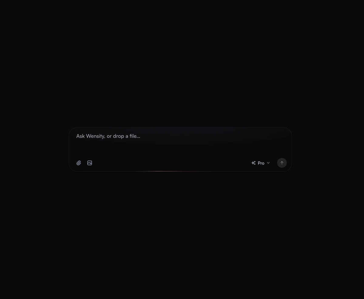
An expanding prompt area with a glowing drop zone that breathes open to meet you as you type a thought or drag a file.
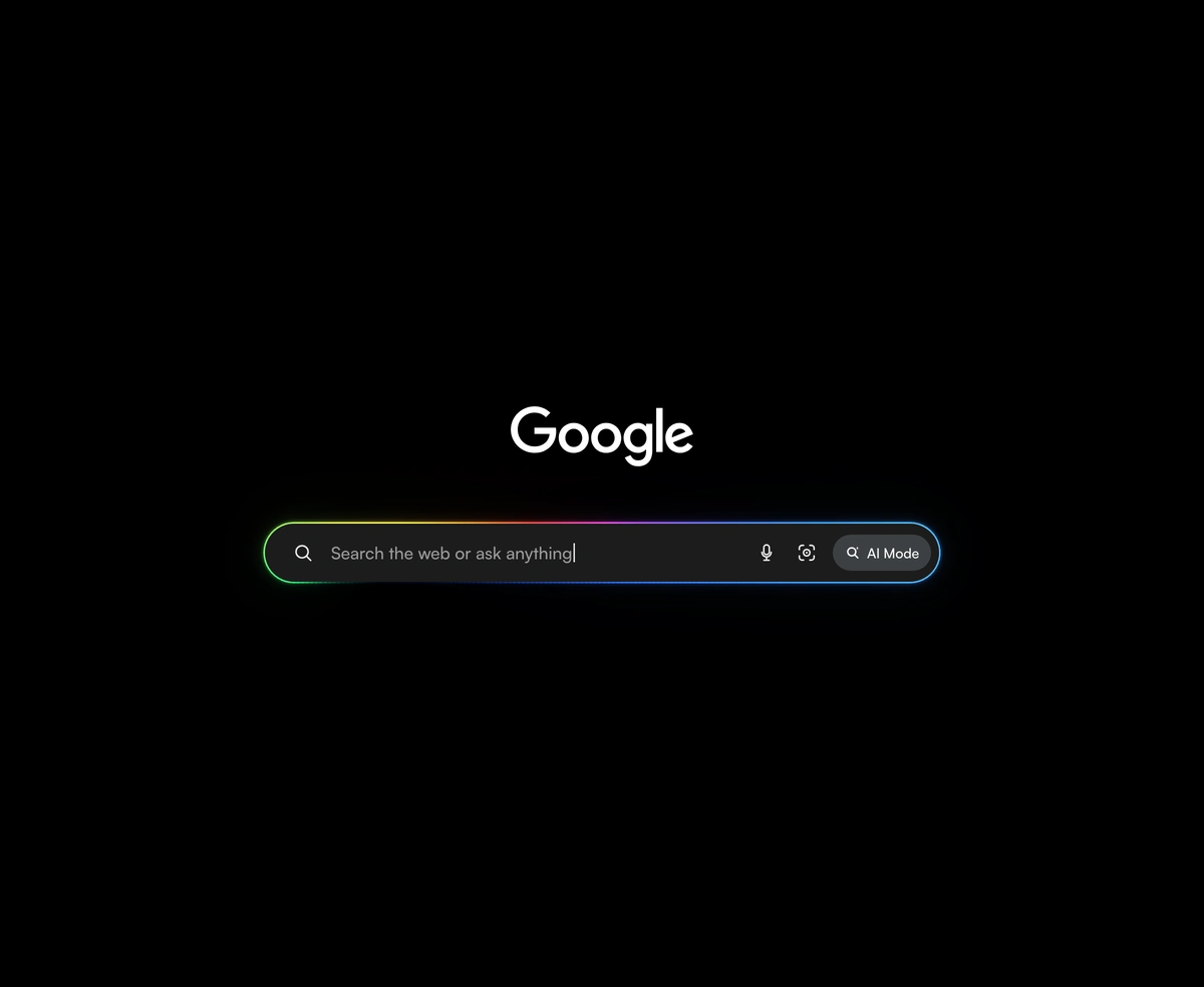
A Google AI Mode search bar with a rainbow that travels the rim, cycling typewriter prompts, and an inline Google wordmark.
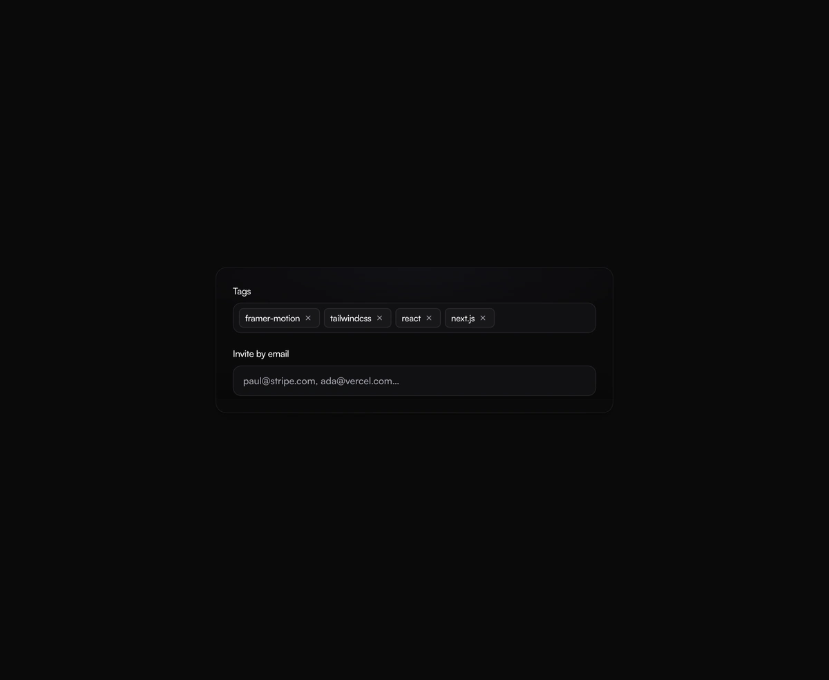
A tag input where pills pop in as you add them and slide out on remove, closing the gap without snapping the layout.
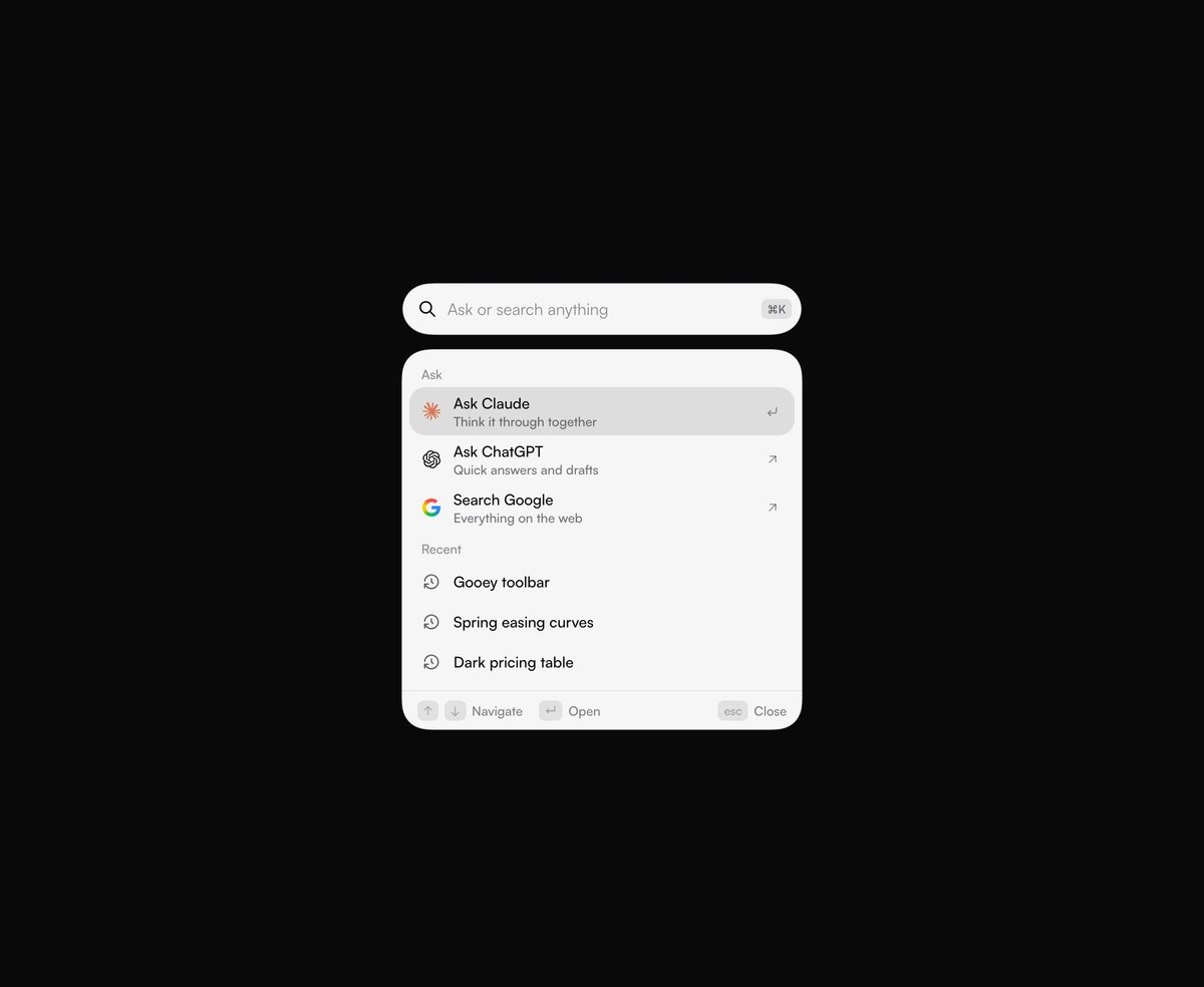
A search circle stretches into a field, and results drip out below it. Ask Claude, ChatGPT, or Google in one keystroke.