 Black Friday is here 🔥 Get
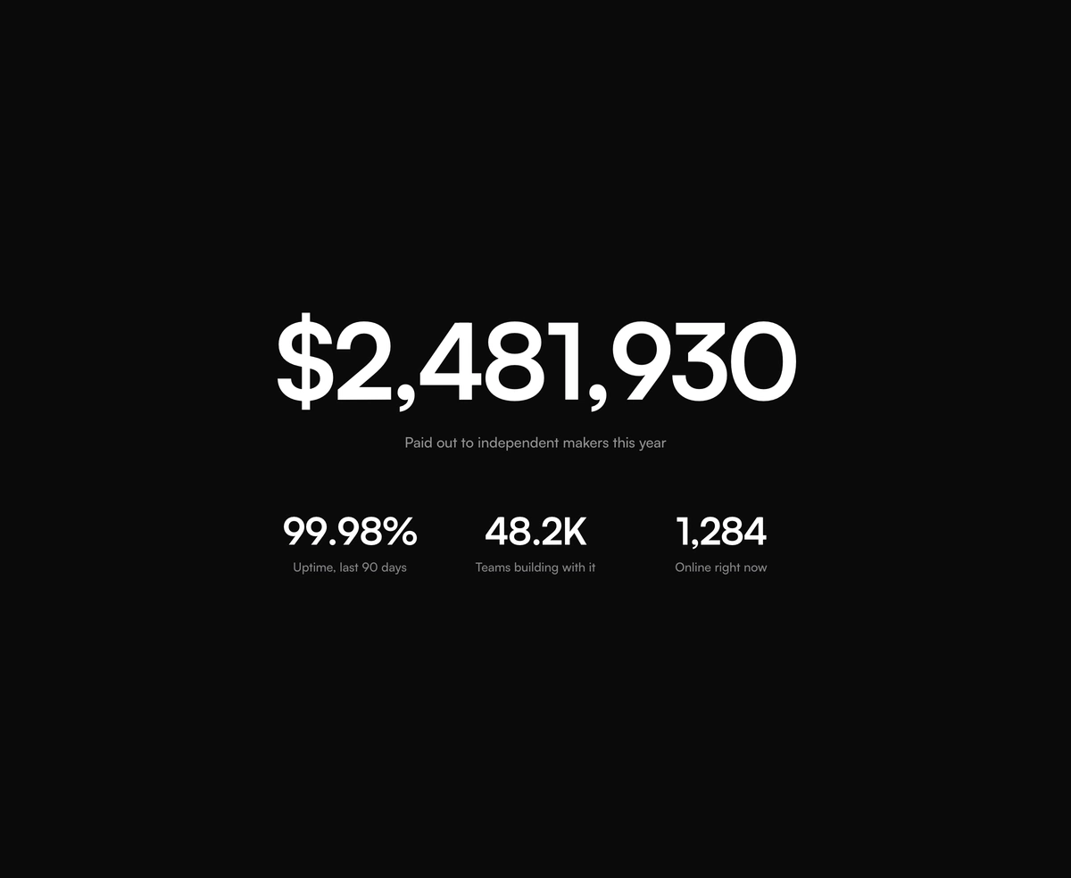
Count Up Animation
A count up animation for React: every digit rolls into place, in any number format.
React time picker on Base UI with a typeable time input, rolling digits, a popover of scrolling columns, 12 and 24 hour clocks and min and max times.
Time Picker is a React and Tailwind CSS time picker with a typeable time input and a Base UI popover of scrolling columns, in Next.js or any React app. Each part of the field is a spinbutton: type digits to fill it, step with the arrow keys, clear with Backspace. hourCycle switches between a 12 hour clock with AM/PM and a 24 hour clock, and seconds adds a third part. Times outside min and max are disabled. The value is a 24 hour string like 17:30 and stays null until every part is filled, so handle null in onValueChange.
Run the following command
pnpm dlx wensity@latest add time-picker
npx wensity@latest add time-picker
yarn dlx wensity@latest add time-picker
bunx wensity@latest add time-picker
Import TimePicker from @/components/wensity/time-picker and render it anywhere in your React or Next.js app. The source lands in your own repo, so every prop, class and animation below is yours to edit.
"use client";import * as React from "react";import { TimePicker } from "@/components/wensity/time-picker";export function MeetingTime() {const [time, setTime] = React.useState<string | null>("09:30");return (<TimePickerlabel="Starts"value={time}onValueChange={setTime}min="08:00"max="18:00"/>);}
| Prop | Type | Default | Description |
|---|---|---|---|
value | string | null | - | Controlled 24 hour value, "HH:mm" or "HH:mm:ss". null leaves the field empty. |
defaultValue | string | - | Starting value when uncontrolled. |
onValueChange | (value: string | null) => void | - | Called with the 24 hour string, or null while any part is empty. |
hourCycle | 12 | 24 | 12 | 12 adds an AM/PM part, 24 runs 00 to 23. The value stays 24 hour. |
seconds | boolean | false | Adds a seconds part and column. |
minuteStep | number | 5 | Minutes between list options and per arrow key press. Typing takes any minute. |
secondStep | number | 5 | Seconds between list options and per arrow key press. |
min | string | - | Earliest time. Earlier options are disabled and typed times snap up on blur. |
max | string | - | Latest time. Later options are disabled and typed times snap down on blur. |
variant | "field" | "inline" | "field" | A typeable field with a popover list, or the list on its own. |
size | "sm" | "md" | "lg" | "md" | Control height and text size. |
rolling | boolean | true | Rolls each digit up or down as the value changes. |
open | boolean | - | Controlled popover state. |
defaultOpen | boolean | false | Opens the popover on first render. |
onOpenChange | (open: boolean) => void | - | Called when the popover opens or closes. |
label | React.ReactNode | - | Label above the field, used as the group name. |
hint | React.ReactNode | - | Helper text under the field. Hidden while error is set. |
error | React.ReactNode | - | Error message under the field, with invalid styling. |
name | string | - | Submits the 24 hour string with a form through a hidden input. |
fullWidth | boolean | false | Stretches the field to fill its container. |
disabled | boolean | false | Blocks every interaction. |
readOnly | boolean | false | Shows the time but blocks edits and the popover. |
A React date picker in a Base UI popover for single dates, ranges, and multiple dates, with presets, time selection, and min and max dates.
A React calendar for single dates, ranges, and multiple dates, with month and year quick pickers, booked dates, event dots, and full keyboard control.
React number input on Base UI with carved plus and minus buttons, press and hold, arrow and scroll stepping, rolling digits and a cart quantity mode.
A React field for form validation messages, linking a label, help text, and an error or success line to the input, in stacked or side by side layout.
A count up animation for React: every digit rolls into place, in any number format.

A per-character slide-left cascade with a cleanly staggered entrance timing.
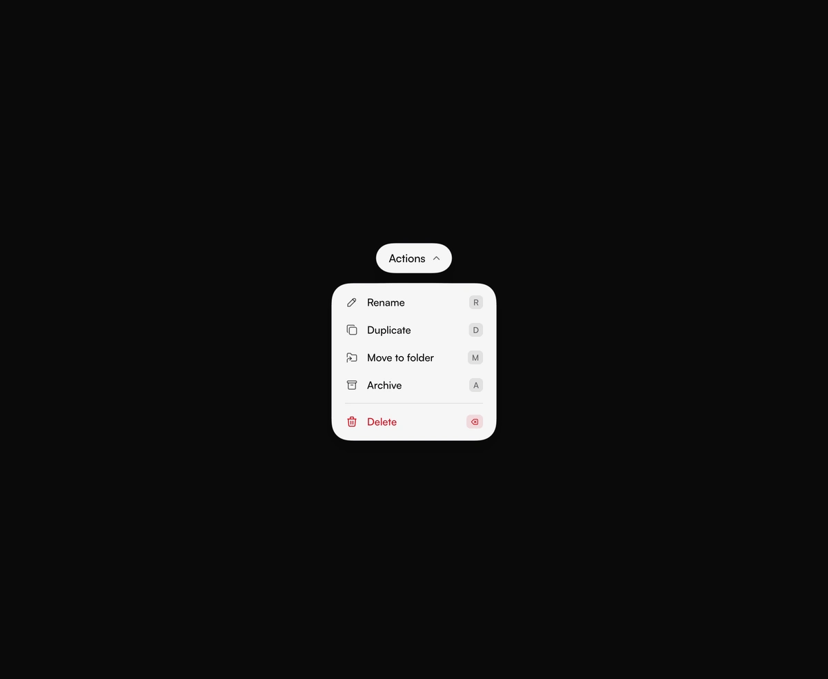
A capsule trigger drips a menu out of its underside. Arrow keys, live shortcuts, and a clear Delete row come built in.
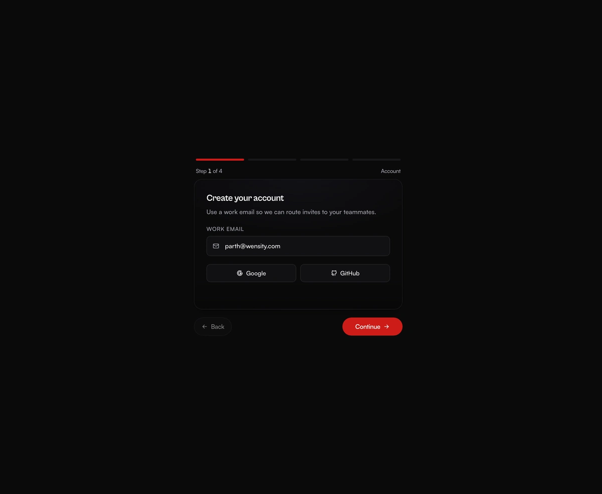
A multi-step form wizard whose card physically reshapes to wrap each new step as the content slides in behind it.