Aspect Ratio

A React aspect ratio container with 16:9, 21:9, 4:3, square, and portrait presets, plus an image that fades in over a shimmer once it loads.

Loading preview

Examples

Practical examples and common states for the same installable component.

Video

Widescreen ratio optimized for video embeds.

examples/aspect-ratio-video.tsx
import {
AspectRatio,
AspectRatioImage,
} from "@/components/wensity/aspect-ratio";
export function AspectRatioVideo() {
return (
<AspectRatio variant="video" className="max-w-md">
<AspectRatioImage
src="https://assets.wensity.com/photos/landscape/canyon-falls.webp"
alt="Waterfall dropping through a green canyon"
/>
</AspectRatio>
);
}

Portrait

Vertical ratio for stories and mobile media.

examples/aspect-ratio-portrait.tsx
import {
AspectRatio,
AspectRatioImage,
} from "@/components/wensity/aspect-ratio";
export function AspectRatioPortrait() {
return (
<AspectRatio variant="portrait" className="max-w-xs">
<AspectRatioImage
src="https://assets.wensity.com/photos/portrait/twin-falls-lagoon.webp"
alt="Twin waterfalls feeding a turquoise mountain lagoon"
/>
</AspectRatio>
);
}

Square

Equal dimensions for avatars and galleries.

examples/aspect-ratio-square.tsx
import {
AspectRatio,
AspectRatioImage,
} from "@/components/wensity/aspect-ratio";
export function AspectRatioSquare() {
return (
<AspectRatio variant="square" className="max-w-xs">
<AspectRatioImage
src="https://assets.wensity.com/photos/portrait/mirror-lake.webp"
alt="Mountain range reflected in a still alpine lake"
/>
</AspectRatio>
);
}

Cinema

Ultra-wide ratio for banners and showcases.

examples/aspect-ratio-cinema.tsx
import {
AspectRatio,
AspectRatioImage,
} from "@/components/wensity/aspect-ratio";
export function AspectRatioCinema() {
return (
<AspectRatio variant="cinema" className="max-w-lg">
<AspectRatioImage
src="https://assets.wensity.com/photos/landscape/river-valley-sunset.webp"
alt="Wide sunset view over a winding river valley"
/>
</AspectRatio>
);
}

Photo

Classic ratio for images and photography.

examples/aspect-ratio-photo.tsx
import {
AspectRatio,
AspectRatioImage,
} from "@/components/wensity/aspect-ratio";
export function AspectRatioPhoto() {
return (
<AspectRatio variant="photo" className="max-w-sm">
<AspectRatioImage
src="https://assets.wensity.com/photos/landscape/sunrise-glacier-peaks.webp"
alt="Classic framed mountain range photograph at sunrise"
/>
</AspectRatio>
);
}

Overview

Aspect Ratio is a React and Tailwind CSS aspect ratio container, in Next.js or any React app, that sets the CSS aspect-ratio property so media keeps its shape at every width. Presets cover 16:9 video, 21:9 cinema, 4:3 photo, square, and 9:16 portrait, and ratio accepts any number. AspectRatioImage shows a shimmer placeholder until the image loads, then fades it in, and the shimmer is hidden under reduced motion. The box size is known before the image arrives, so nothing jumps. Images use object-cover and crop to fit, so pass object-contain to letterbox instead.

Installation

Run the following command

~/your-project
pnpm dlx wensity@latest add aspect-ratio

Usage

Import AspectRatio from @/components/wensity/aspect-ratio and render it anywhere in your React or Next.js app. The source lands in your own repo, so every prop, class and animation below is yours to edit.

app/example.tsx
import {
AspectRatio,
AspectRatioImage,
} from "@/components/wensity/aspect-ratio";
export default function Example() {
return (
<AspectRatio variant="video" className="max-w-md">
<AspectRatioImage
src="https://assets.wensity.com/photos/landscape/canyon-falls.webp"
alt="Waterfall dropping through a green canyon"
/>
</AspectRatio>
);
}

Props

PropTypeDefaultDescription
variant"video" | "portrait" | "square" | "cinema" | "photo"-Preset media ratio. Ignored when ratio is set.
rationumber-Custom ratio as width divided by height, such as 16 / 9. Overrides variant.
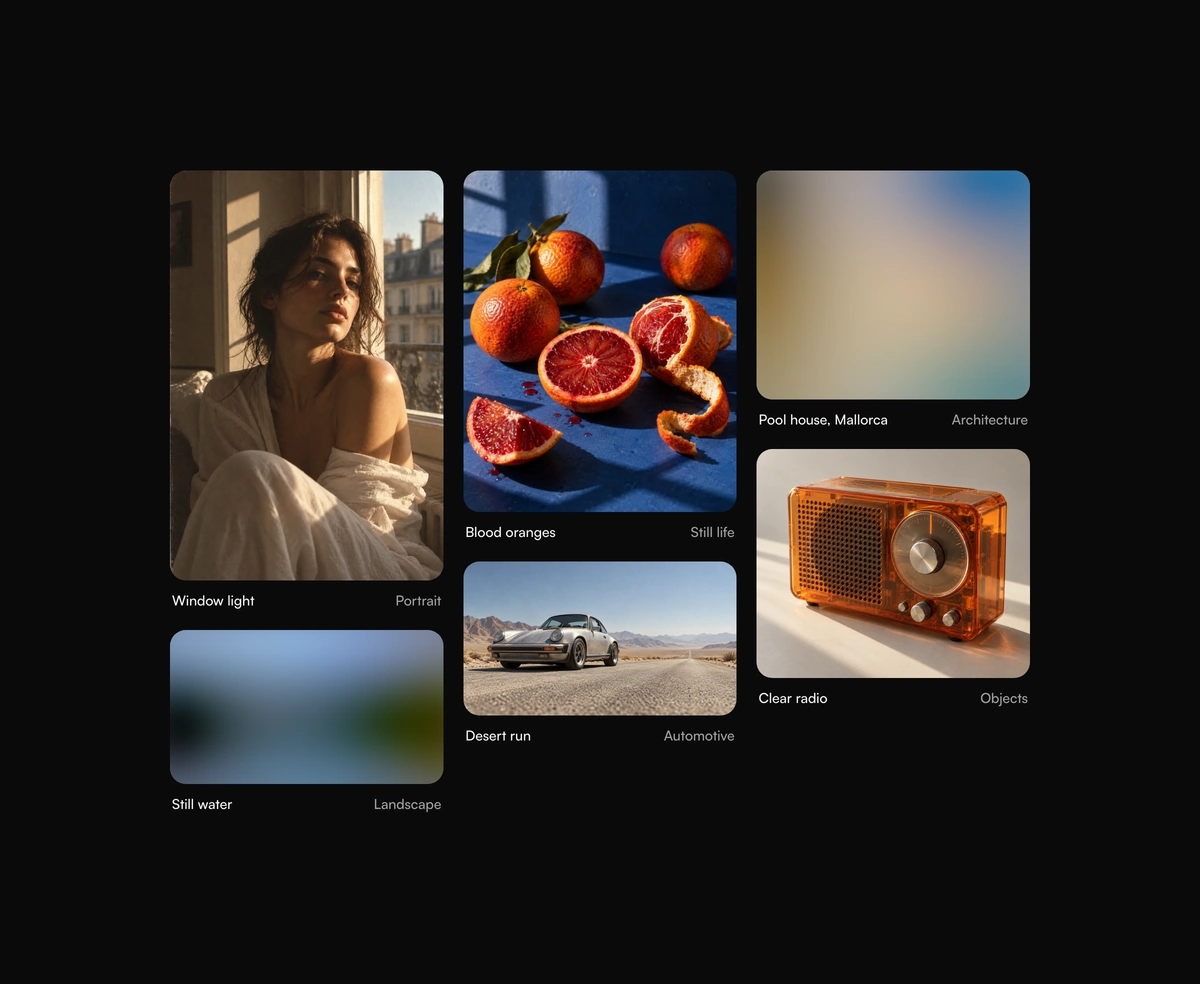
  • Progressive Image Loading component preview

    Progressive Image Loading

    Images that develop from a blur, color, or shimmer placeholder, without layout shift.

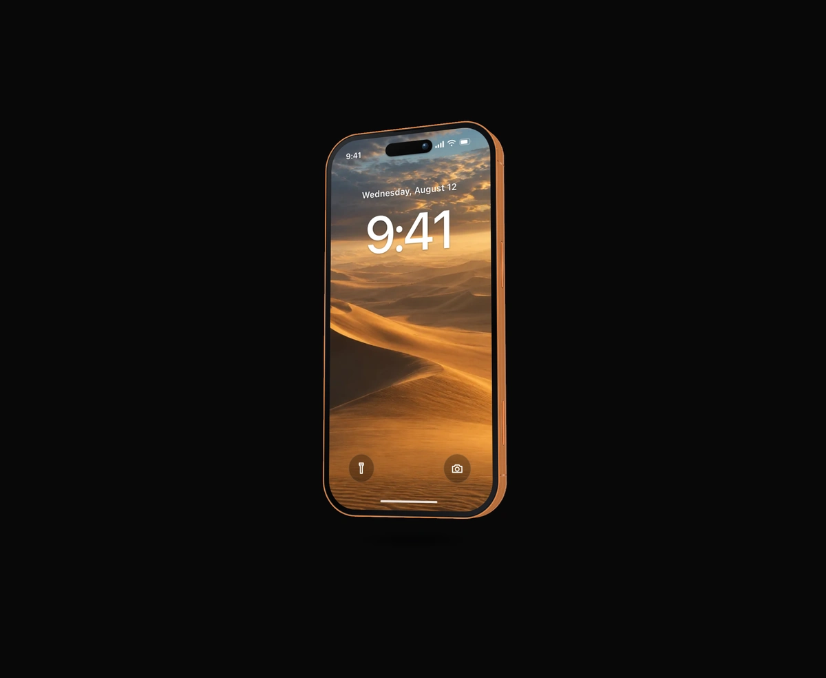
  • iPhone Mockup component preview

    iPhone Mockup

    A thick, extruded iPhone with a machined side rail, side buttons, and lock screen.

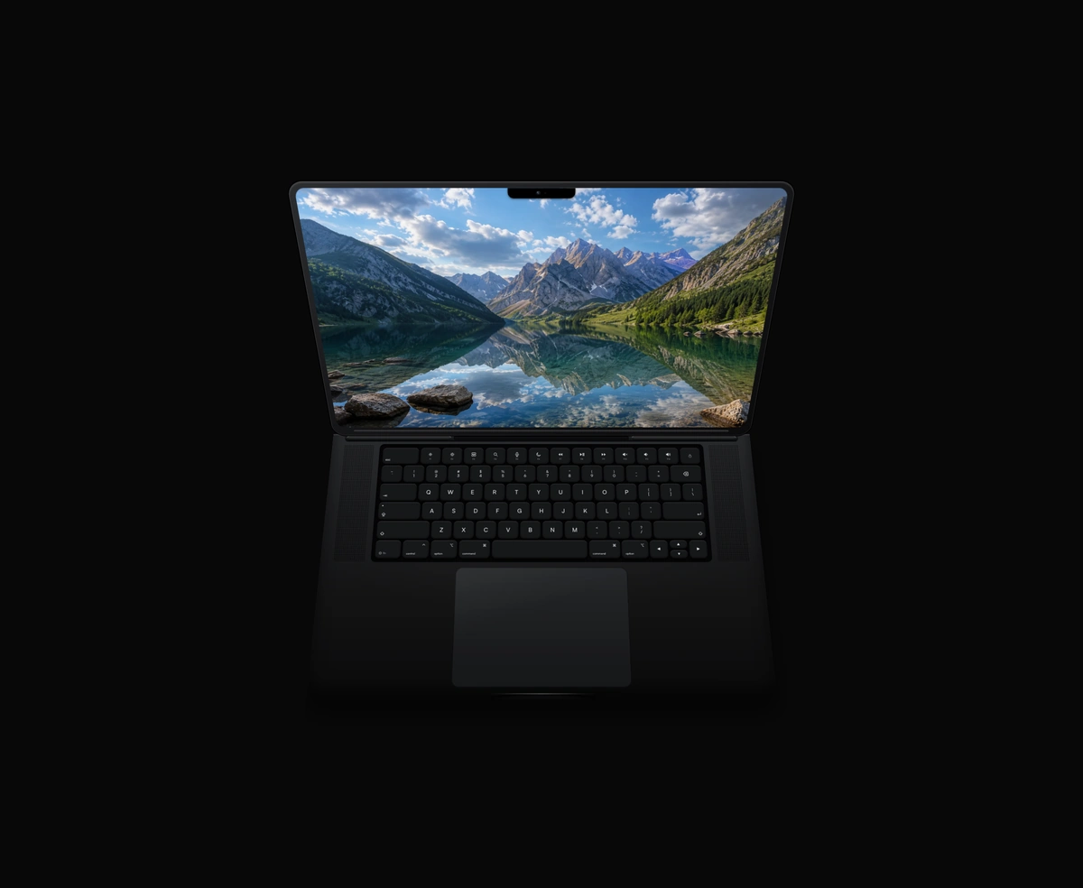
  • Animated MacBook component preview

    Animated MacBook

    A closed MacBook that hinges open and powers on when you hover, in ten finishes.

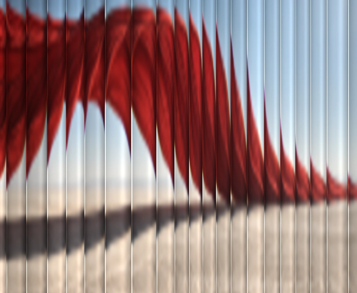
  • Fluted Glass component preview

    Fluted Glass

    Any photo seen through fluted glass, sliced into soft ribs that follow the pointer.