 Black Friday is here 🔥 Get
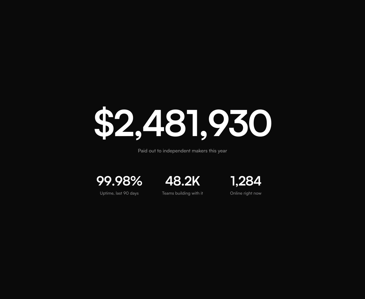
Count Up Animation
A count up animation for React: every digit rolls into place, in any number format.
React number input on Base UI with carved plus and minus buttons, press and hold, arrow and scroll stepping, rolling digits and a cart quantity mode.
Number Input is a React and Tailwind CSS number input built on Base UI NumberField, in Next.js or any React app. Holding plus or minus repeats the step, arrow keys step too, Shift and Alt switch to largeStep and smallStep, and the mouse wheel only steps while the field is focused and hovered. Values format through Intl.NumberFormat for currency, percent or units. Each digit rolls the way the value moved and holds still under reduced motion. In the cart variant, minus turns into remove at the minimum. Clearing the field reports null, so fall back to your minimum in onValueChange.
Run the following command
pnpm dlx wensity@latest add number-input
npx wensity@latest add number-input
yarn dlx wensity@latest add number-input
bunx wensity@latest add number-input
Import NumberInput from @/components/wensity/number-input and render it anywhere in your React or Next.js app. The source lands in your own repo, so every prop, class and animation below is yours to edit.
"use client";import * as React from "react";import { NumberInput } from "@/components/wensity/number-input";export function QuantityDemo() {const [quantity, setQuantity] = React.useState(1);return (<NumberInputlabel="Quantity"value={quantity}onValueChange={(value) => setQuantity(value ?? 1)}min={1}max={20}/>);}
| Prop | Type | Default | Description |
|---|---|---|---|
value | number | null | - | Controlled value. null leaves the field empty. |
defaultValue | number | - | Starting value when uncontrolled. |
onValueChange | (value: number | null, reason: string) => void | - | Called on every change with what caused it: typing, a button, a key or the wheel. |
onValueCommitted | (value: number | null) => void | - | Called on blur after typing, or when a button press or hold is released. |
min | number | - | Lowest value. Defaults to 1 in the cart variant. |
max | number | - | Highest value. |
step | number | 1 | Amount each press, arrow key or wheel notch moves the value. |
largeStep | number | - | Step while Shift is held. |
smallStep | number | - | Step while Alt is held. |
format | Intl.NumberFormatOptions | - | Display format, such as currency, percent or units. |
locale | Intl.LocalesArgument | - | Locale used for formatting and parsing. |
variant | "default" | "cart" | "default" | cart turns minus into a remove button at the minimum. |
onRemove | () => void | - | Called when the cart remove button is pressed. |
layout | "split" | "trailing" | "split" | Buttons either side of the value, or both on the right. |
size | "sm" | "md" | "lg" | "md" | Control height and text size. |
rolling | boolean | true | Rolls each digit up or down as the value changes. |
wheelStep | boolean | true | Steps with the mouse wheel while the field is focused and hovered. |
label | React.ReactNode | - | Label above the field, wired to the input. |
hint | React.ReactNode | - | Helper text under the field. Hidden while error is set. |
error | React.ReactNode | - | Error message under the field, with invalid styling. |
fullWidth | boolean | false | Stretches the field to fill its container. |
disabled | boolean | - | Blocks every interaction. |
A React text input with a built in label, hint, and inline error wired to screen readers, plus leading and trailing icons and a one tap clear button.
A React range slider on Base UI with one or two thumbs, a value bubble that shows while dragging, formatted values, and a minimum thumb gap.
A React field for form validation messages, linking a label, help text, and an error or success line to the input, in stacked or side by side layout.
A React button group for toolbars and segmented controls, with shared borders, vertical layout, and split buttons that open a dropdown menu.
A count up animation for React: every digit rolls into place, in any number format.
A per-character slide-left cascade with a cleanly staggered entrance timing.
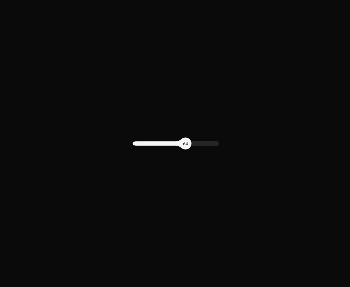
Drag the thumb and the filled track stretches with it, then the thumb contracts into a circle when you let go.

React star rating with half stars, drag to rate, and cut stars that catch the light.