 Starting your winter arc? 🥶 Get

React Product Launch Bento Grid with Keynote Style Spec Tiles
ProA launch section for a physical product, shown here as a fictional pair of headphones called Halden One. A wide hero tile carries the name, a product cutout, the price and a Pre-order button. Three identical tiles count up the specs that sell it, 40 hours, 254 g and 42 dB, and a closing row shows the travel case and a picker for three finishes.
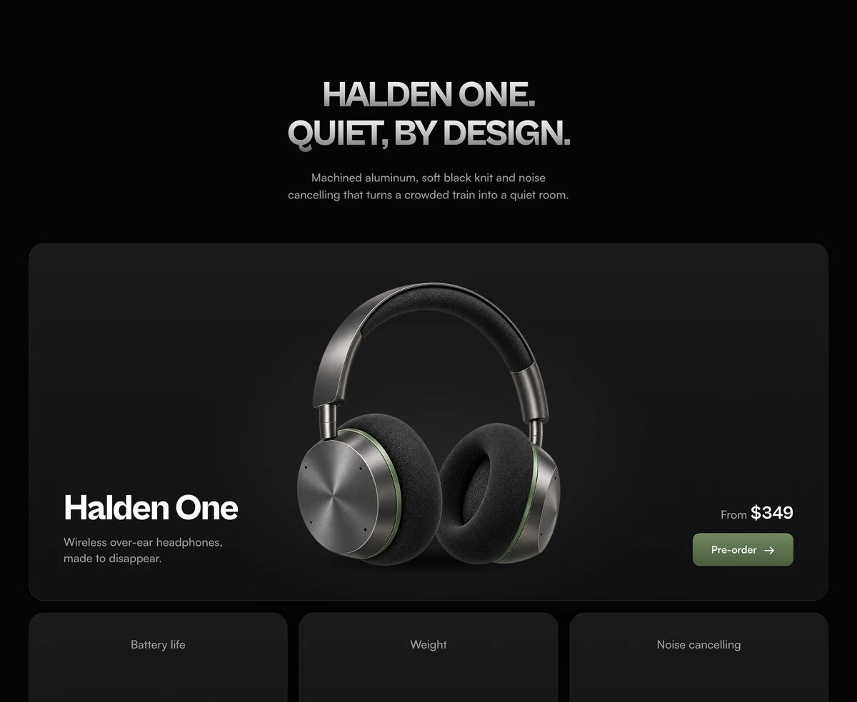
The keynote summary slide, rebuilt as a page section
Bento Grid With Launch Specs is a React and Tailwind CSS product launch bento grid that presents one product with a hero tile, three oversized spec numbers and a finish picker, in Next.js or any React app. It fits a product landing page or a launch page for hardware, a device or any release that is sold on a few hard numbers.
The format comes from the Apple bento grid: the summary slide at the end of a keynote where each feature gets a box, the biggest box gets the product and the numbers are set huge with almost no copy. People search for that look by name because it works. Designers mostly answer the search with Figma files and slide templates; this is the coded version, with real type, real images and numbers in the DOM.
The grid is built in three bands with one idea each. First the product, then its three numbers in tiles that share the same anatomy so the eye learns it once, then how it comes: the case and the finishes. That order is the reason the section reads quickly, and it is worth keeping when you swap the product.
From hero tile to finish picker
Desktop uses six columns. The hero spans all six, each spec tile spans two, and the bottom row gives four columns to finishes and two to the case. Phones and tablets keep the same order in one or two columns.
Hero tile
On desktop a poster layout of three columns: the name Halden One and a one line pitch bottom left, the product in a 500px centre column, From $349 and a sage Pre-order button bottom right, all resting on the line of the product's shadow.
Three spec tiles
Battery life 40 hours, Weight 254 g and Noise cancelling 42 dB. Each has a small label, a number of up to 100px in a metal gradient, the unit in sage, one supporting line and a product image on a fixed 200px stage so all three share a baseline.
Count up
Each number counts from zero to its value over 1.2 seconds with an ease out curve, once 80 percent of it is visible, and never again. The final value sits invisibly in the same cell so the centred number does not shift while it counts.
Case tile
Folds flat, goes anywhere, over a cutout of the folded headphones in an open travel case.
Finish picker
Graphite, Sand and Midnight cut out of one shared image so they stand apart. Each pair with its name is a button; hovering with a mouse previews it and clicking keeps it, while the other pairs drop to 28 percent opacity.
Light and shadow
A soft radial pool of light behind each product and an elliptical contact shadow beneath it, so the cutouts sit on the surface instead of floating. Both are plain CSS gradients.
Products that suit a spec bento
Use it when
- You are launching a physical product, a device or a hardware revision with three numbers worth stating large.
- You have clean cutout renders or photos on transparent backgrounds, including an exploded or detail view.
- The page needs a price and a pre-order or buy action in the first tile, not at the bottom.
- The product comes in a few finishes that customers will ask about.
Skip it when
- You are making slides. This is a web section; people who want a keynote style deck want a presentation template.
- Your product has no hard numbers. Three vague claims set at 100px look worse than a paragraph.
- You only have lifestyle photography. The tiles are composed around transparent cutouts with contact shadows.
- The finish choice has to change the hero image or add to a cart. The picker only highlights a pair and emits nothing.
Swap in your product
Every image is read from ASSET_BASE, one constant pointing at the launch specs folder on assets.wensity.com, so moving the images to your own storage is a one line change. Keep the file names or update them in the tiles: hero.webp, battery-capsule.webp, cushion-macro.webp, exploded.webp, case.webp and finishes.webp. Rewrite each alt text for your product; the shipped ones describe the fictional Halden One.
The name, pitch, price and the three specs are written in the tile components rather than passed as props. Each spec takes a target number, a unit, a full sentence for screen readers such as 40 hours of battery life, and one detail line. Keep the label sentence in step with the number, because assistive tech reads it instead of the count.
The finishes come from one wide image holding three pairs side by side. FINISHES lists each name and where its slice ends as a percentage of the image width, and FINISH_BAND sets the vertical band to show. A new finishes image needs those values measured again. The sage accent is two CSS variables per theme, so a new product colour is a small edit.
npx wensity@latest add bento-grid-with-launch-specs --type block
import { BentoGridLaunchSpecs } from "@/components/wensity/blocks/bento-grid-with-launch-specs";export default function LaunchPage() {return (<BentoGridLaunchSpecsheadingAs="h1"headline={"Your product.\nOne big promise."}subheadline="Materials, the result and nothing else, in one sentence."preorderHref="/checkout?sku=launch-edition"/>);}
Props
| Prop | Type | Default | Description |
|---|---|---|---|
preorderHref | string | "#" | Where Pre-order goes: a checkout, a waitlist form or a reservation page. |
headline | string | "Halden One.\nQuiet, by design." | Uppercased above the grid. Put the product name on the first line and the promise on the second. |
subheadline | string | - | One line of materials and outcome, under 460px wide. |
headingAs | "h1" | "h2" | "h3" | "h2" | Use h1 when the bento opens a dedicated launch page. |
Images, numbers and reduced motion
Lazy images, including the hero
Every product image has loading lazy and async decoding. That suits the tiles further down, but if this bento is the first section on the page, remove lazy from the hero image so it is not held back as the largest paint.
Readable specs
The counting digits are hidden from screen readers, and each spec carries a full sentence, such as Weighs 254 grams, read in their place.
Reduced motion
The specs show their final values at once and the finish picker changes without fades.
Picker semantics
Finish buttons use aria-pressed and show a focus ring. Mouse hover previews a finish but touch and keyboard select directly, so nothing depends on hover.
Light dependencies
No animation library: the count is a requestAnimationFrame loop and the rest are CSS transitions. Only clsx and tailwind-merge are installed.
Block details
- Category
- Bento Grids
- Renders
- JavaScript animation. Paints first, then animates
- Theme
- Follows the site theme in light and dark
- Dependencies
clsxtailwind-merge- Source
- 604 lines, 26 KB in one file
- Install
wensity add bento-grid-with-launch-specs --type block- Tags
- light, dark, bento, product launch, specs
- Last updated