React Feature Section with Gradient Product Cards
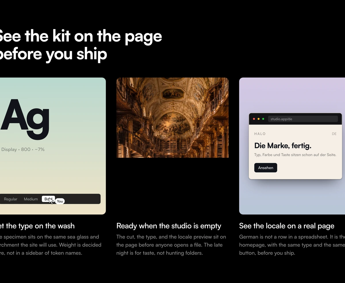
ProThree tall cards in a row under a short headline. The outer two have soft painted gradients, sea glass fading to parchment and lavender to slate, the middle one is a full bleed photograph, and each holds a small product vignette with a title and a sentence underneath.
Show the product, not a list
Feature Section with Gradient Product Cards is a React and Tailwind CSS feature section that presents three product highlights as tall visual cards with gradient backgrounds and a caption under each. It is static markup for Next.js or any React app, and each card's visual is any component you pass.
Feature sections often fall back on an icon and two lines of text per feature. Product cards give each feature a stage: a small, real piece of UI on a soft background, which tells people what using the product feels like before they read the caption.
The default vignettes show what that means: a type specimen with a weight switcher and a collaborator's cursor labelled You, a photograph, and a browser window localised into German. They are examples of the kind of visual that belongs in each card.
Card by card
Headline
A single h2 above the grid. There is no eyebrow or paragraph, which keeps attention on the cards.
Gradient card
The first and third cards use painted gradients chosen by position: sea glass into parchment, then lavender into slate.
Photo card
The middle card is a full bleed photograph set by photoSrc and photoAlt.
Card size
22.5rem tall on phones and 26rem from 640px, three across from the medium breakpoint and stacked below it.
Caption
An h3 title and a short description sit under each card, outside the artwork, so the visuals stay clean.
When product cards beat icons
Use it when
- You can show three features as small pieces of real interface.
- Design, content and developer tools where the output is visual.
- You want a feature section with no JavaScript cost at all.
- A calm, editorial look with soft colours suits your brand.
Skip it when
- You have more than three features; a fourth card gets no gradient because colours are assigned by index.
- Your product has no visual output and the cards would hold generic illustrations.
- Dark mode must change the card art. The section background follows the theme but the card artwork stays light.
- You need a call to action inside the section.
Pass three visuals
cards takes an array of title, description and visual. visual is any React node, so you can drop a trimmed down version of a real component, a screenshot or an SVG into each card. Keep the subject small and centred; the cards are tall and the art reads best with space around it.
To change a gradient, edit the two background classes in the component that are picked by index. If you need four or more cards, add more gradients to that list or the extras will render without one.
Write captions that finish the thought the visual starts. The picture shows the feature in use, so the title can name the benefit and the description can add the one fact a picture cannot carry, such as a limit, a format or a time saved.
npx wensity@latest add feature-section-with-gradient-product-cards --type block
import { GradientProductCards } from "@/components/wensity/blocks/feature-section-with-gradient-product-cards";import { ChartPreview, CommentThread, ExportMenu } from "./previews";export function Features() {return (<GradientProductCardsheadline="Reports your clients actually open"cards={[{ title: "Live charts", description: "Numbers update while the report is open.", visual: <ChartPreview /> },{ title: "Inline comments", description: "Discuss a figure where it sits.", visual: <CommentThread /> },{ title: "One click export", description: "PDF, slides or a share link.", visual: <ExportMenu /> },]}/>);}
Props
| Prop | Type | Default | Description |
|---|---|---|---|
cards | { title: string; description: string; visual: ReactNode }[] | 3 sample cards | Your three features. visual renders inside the tall card. |
headline | string | "See the kit on the page before you ship" | The only text above the grid. |
photoSrc / photoAlt | string | - | Image and alt text for the photo card in the default set. |
Lightweight by construction
No runtime
No state, effects or animation. The use client directive can be removed to render it on the server.
Image weight
Only the photo card loads an image. Size it to the card, about 420 by 520 pixels at 2x, rather than shipping a full width photo.
Heading structure
An h2 for the section and h3 per card, which suits a page where the hero holds the h1.
Nothing moves
No transitions on the cards, so there is no reduced motion work to do.
Fixed light artwork
The gradients and default vignettes are pale in both themes. On a dark page they read as lit panels; if you want them dimmed at night, add dark variants to the gradient classes.
Block details
- Category
- Feature Sections
- Renders
- CSS only. Paints as soon as the stylesheet arrives
- Theme
- Follows the site theme in light and dark
- Dependencies
clsxtailwind-merge- Source
- 171 lines, 6 KB in one file
- Install
wensity add feature-section-with-gradient-product-cards --type block- Tags
- light, dark, cards, gradient, photograph, product-ui, saas
- Last updated