React CTA Section with a Benefit Checklist and Cart Illustration
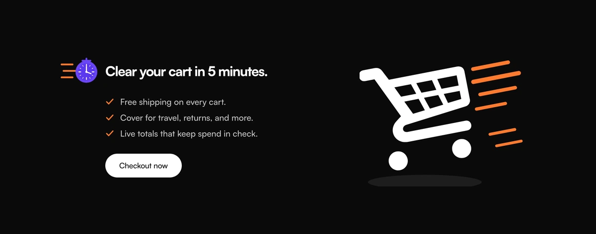
ProA compact call to action card with a promise and its proof. A stopwatch sits beside a title such as Clear your cart in 5 minutes, three short benefits follow with orange ticks, and a black pill button closes the left side. On the right, a drawn shopping cart rushes forward with speed lines behind it.
A promise, three reasons and one button
CTA Section with Checklist and Cart Visual is a React and Tailwind CSS call to action section that pairs a time based promise with a checklist of benefits and a single button, illustrated with an SVG shopping cart. It suits stores and checkout flows in Next.js or any React app, in light and dark.
Good CTA examples usually answer two questions before asking for the click: how long will this take, and what do I get. The stopwatch title handles the first and the ticked list handles the second, so the button text can stay as plain as Checkout now.
Everything visual is inline SVG, the cart, the speed lines and the stopwatch, so the section loads no images and stays sharp at any size.
Parts of the checklist CTA
Stopwatch title
A small stopwatch drawing beside the h2 card title, setting the time frame of the promise.
Benefit checklist
A list of short benefits, each with an orange tick. From 640px each item stays on a single line, so keep them brief.
Pill button
A black, fully rounded button with your label and link, plus an optional click handler for analytics or a cart action.
Cart illustration
An SVG shopping cart with orange speed lines on the right half, hidden from assistive technology as decoration.
Two column card
Copy and illustration side by side from 1024px, inside a container up to 960px wide, stacking on smaller screens.
When this CTA works
Use it when
- Mobile shoppers, since the copy centres and the cart drops below it on smaller screens.
- E-commerce checkout prompts, abandoned cart pages and quick start offers.
- You can promise a specific time to finish, and keep it.
- Three short benefits make the case better than a paragraph.
- A light, illustrated look suits your store.
Skip it when
- You sell software rather than goods; the cart drawing will confuse the message.
- Your benefits need more than a few words each; they stay on one line on wider screens.
- You want a photo or product image instead of an illustration.
- You need two actions, such as a secondary link.
Title, benefits and button
Set cardTitle to the promise, benefits to a list of id and label pairs, and ctaLabel and ctaHref for the button. onCtaClick runs before navigation, which is the place to send an analytics event or open a cart drawer.
The default copy talks about free shipping, buyer cover and live totals. Only list benefits your checkout actually provides, and keep each one under about five words so it fits on one line at tablet widths.
Put the section where hesitation happens: on the cart page above the totals, or in a reminder email landing page. The time promise works best when it matches what the next screen actually asks for, so if checkout has four steps, do not promise one.
npx wensity@latest add cta-section-with-checklist-and-cart-visual --type block
import { ChecklistCardProductVisualCta } from "@/components/wensity/blocks/cta-section-with-checklist-and-cart-visual";export function CartPrompt() {return (<ChecklistCardProductVisualCtacardTitle="Order by 3pm, delivered tomorrow."benefits={[{ id: "ship", label: "Free UK delivery" },{ id: "returns", label: "30 day returns" },{ id: "pay", label: "Pay in three" },]}ctaLabel="Go to checkout"ctaHref="/checkout"/>);}
Props
| Prop | Type | Default | Description |
|---|---|---|---|
cardTitle | string | "Clear your cart in 5 minutes." | The h2 beside the stopwatch. Lead with a time or an outcome. |
benefits | { id: string; label: string }[] | - | Ticked items. Three short lines read best. |
ctaLabel / ctaHref | string | "Checkout now" / "#checkout" | Button text and destination. |
onCtaClick | (event) => void | - | Runs when the button is clicked, before the browser follows the link. |
Weight and accessibility
Inverting button
The black pill turns white with dark text in dark mode and scales down slightly when pressed, which gives touch users feedback.
No images
The cart, speed lines and stopwatch are inline SVG, so there are no image requests.
Decorative art hidden
The illustrations are aria-hidden, leaving screen readers with the title, list and button.
Real list
Benefits are list items, so their count is announced.
Static
No state or animation. The speed lines are drawn, not animated, so nothing needs a reduced motion check.
Two themes
The card switches to near black in dark mode, with the orange ticks kept as the accent.
Block details
- Category
- CTA Sections
- Renders
- CSS only. Paints as soon as the stylesheet arrives
- Theme
- Follows the site theme in light and dark
- Dependencies
clsxtailwind-merge- Source
- 170 lines, 7 KB in one file
- Install
wensity add cta-section-with-checklist-and-cart-visual --type block- Tags
- light, dark, cta, checklist, cart, fintech, conversion
- Last updated