React CTA section components
10 CTA section componentsLive previewFull source in your repo
The closing band gets one job and one action. These blocks carry the proof next to the button, so nobody reaches the bottom of the page and has to guess what happens if they click.
Works with
- React
- Next.js
- TypeScript
- Tailwind CSS
CTA section examples you can copy
Each call to action section is one file covering the band, the copy and the button. Preview it live, then copy the source into your project.
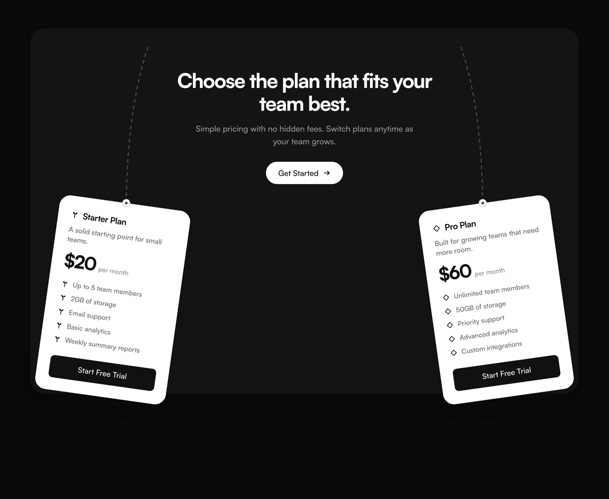 CTA Section With Tilted Plan CardsAdaptive CTA section with a shadowed panel, dashed corner arcs, a centered plan headline, a Get Started pill, and two inward tilted plan cards for Starter and Pro.
 CTA Section With Staggered Image GridAdaptive split CTA with a two-line trial headline, Get started and Learn more, and five staggered office portraits on the right.
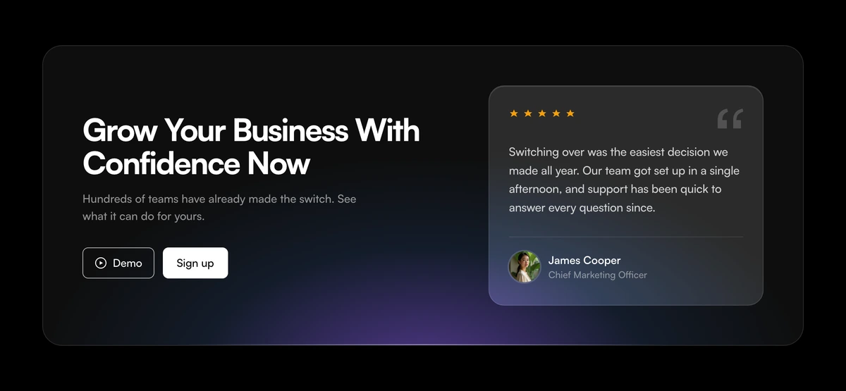 CTA Section With Frosted Glass Testimonial CardAdaptive frosted glass CTA with a violet wash inside the bottom of the panel, a growth headline, Demo and Sign up actions, and a nested five star testimonial card.
 CTA Section With Scattered AvatarsAdaptive rounded CTA card with ten scattered circular portraits, a ready to start headline, a short lede, and an inverted Get Started pill with an arrow mark.
 CTA Section With Floating Booking IconsLight full-bleed booking CTA with a pale blue wash, company logo, powered by badge, booking headline, and a blue free trial pill.
 CTA Section With Instagram Thumbnail GridCentered social CTA with a row of rounded Instagram thumbnails, a loved by creators headline, a Follow along button, and X, Instagram, Pinterest, Facebook, and Bluesky marks.
 CTA Section With Overlapping Customer AvatarsAdaptive CTA with four overlapping customer avatars, a 35,000+ count, a 4.9 rating row, a collection headline, and Shop now plus View lookbook inside the cropped top of a phone.
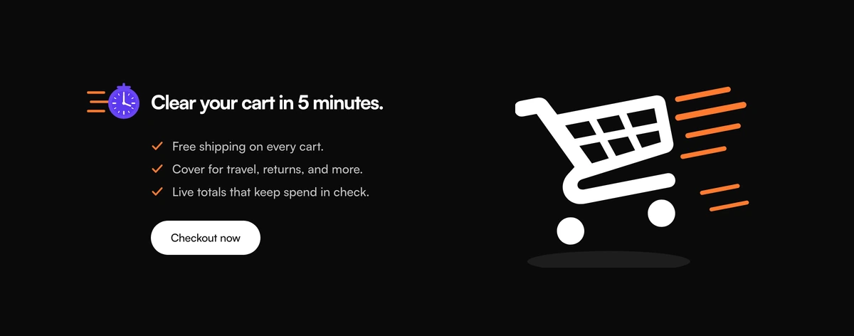 CTA Section With Checklist And Cart VisualAdaptive CTA section with a speed timer icon, a five minute cart clear promise, three benefit rows, a checkout button, and a shopping cart SVG visual.
 CTA Section With Centered Contact AvatarsAdaptive nested CTA card with three overlapping team avatars, a support headline, a short lede, and a blue Contact us button.
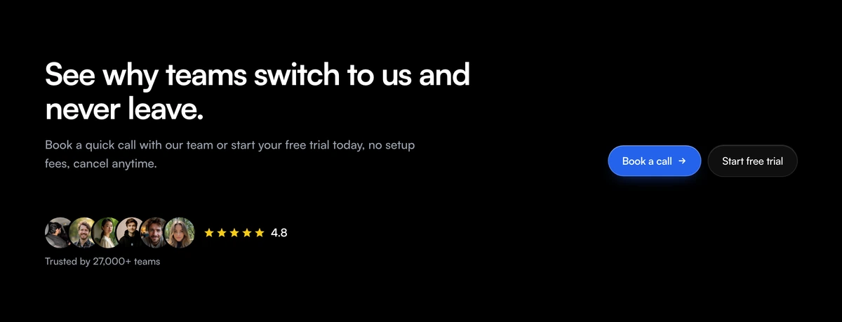 CTA Section With Split Booking And StarsAdaptive split CTA with a two-line switching headline, a booking lede, six overlapping circular avatars, five stars with a 4.8 rating, a team count, and Book a call plus Start free trial side by side on the right.
Social proof to place above the call to action
Social proof from the same library, for the band that has to earn its button before anyone reads the label on it.
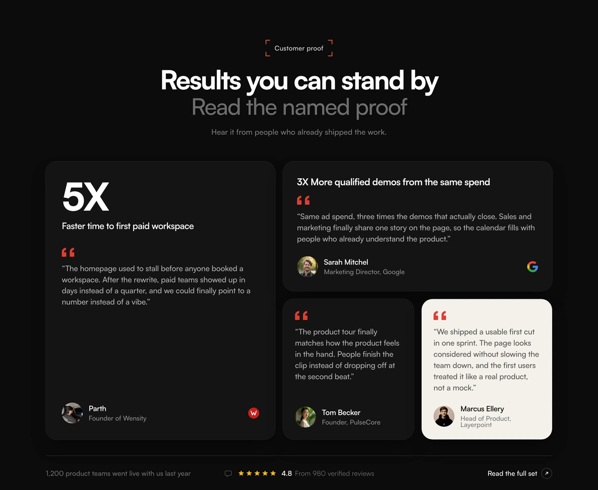 Social Proof Section With Metric Bento GridBento grid testimonials section with a tall conversion metric card, mixed light and dark quote cards, company marks, avatars, and a star rating strip.
 Social Proof Section With Morphing Logo GridEnterprise logo lattice with a centered trust headline and staggered morphing marks that swap inside each cell.
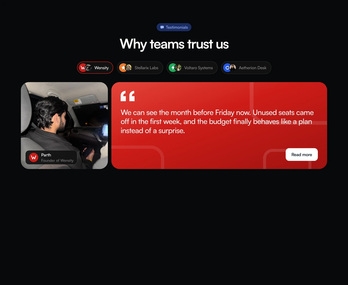 Social Proof Section With Company Story TabsTabbed social proof section with company pills, a portrait, a blue quote panel, and a read more action that swaps the featured customer story.
 Social Proof Section With Morphing WordmarksOpen wordmark cloud with real company names, no cell borders, and staggered morphs between optically matched marks.
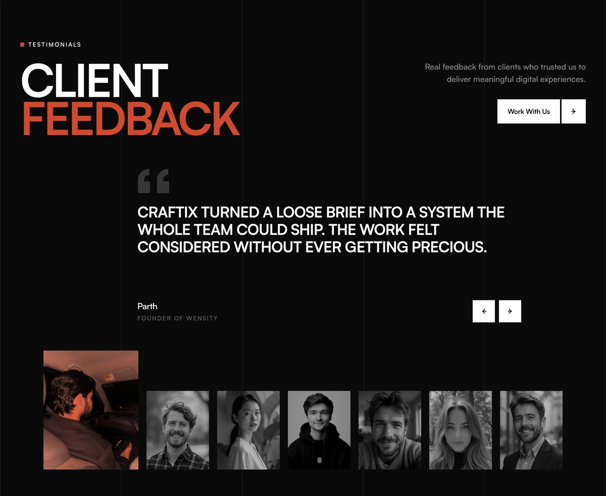 Social Proof Section With Feedback GalleryEditorial social proof section with a split CLIENT FEEDBACK heading, an all-caps quote, square prev next controls, and a portrait gallery whose active frame is larger and orange-tinted.
 Social Proof Section With Inline Avatar QuotesInline social proof paragraph with circular avatars in the copy, hover blur on the rest of the lines, and a floating name and role label.
CTA button components
Call to action button designs for the band itself: an orbit glow, liquid glass, liquid metal, and the plain accessible button underneath them all.
 Cool ButtonA dual-layer orbit glow that soft-spins around the edge of any button or link you wrap it around, at zero layout cost.
 Liquid Glass ButtonFrosted glass that bends the page at its edge, with a rim that catches the light.
 Liquid Metal ButtonA pill or icon button ringed in flowing liquid metal, for light and dark pages.
- ButtonButtonA React button component on Base UI with seven variants, from the solid default to ghost and link, four sizes, icon slots, and a built in loading state.
- Button GroupButton GroupA React button group for toolbars and segmented controls, with shared borders, vertical layout, and split buttons that open a dropdown menu.
CTA design: how to choose a call to action section
A CTA section, short for call to action section, is the band that closes a landing page with one clear next step. It is not a second hero and not another feature split. Everything above it has already argued the case, so the only decisions left are what the button says, what stands beside it, and whether the visitor believes the people on the other side exist.
Good CTA design comes down to four rules. Give the band one primary action. Write the button as a verb plus an outcome, such as Start free trial or Book a call, rather than Submit or Learn more. Put one piece of proof next to the button, so the click feels safe. Give the button enough contrast to read as the action in both light and dark mode, because a blue that passes on white often fails on near black.
Booking closes suit a product sold through a conversation. CTA Section With Floating Booking Icons is a light full bleed band with a company mark, a powered by badge, a booking headline and one blue free trial pill. CTA Section With Split Booking And Stars puts copy on the left and six overlapping avatars, a five star row with a score and a team count, then Book a call and Start free trial side by side on the right.
Offer closes name what the visitor gets. CTA Section With Tilted Plan Cards holds a headline and a Get Started pill in a shadowed panel, with Starter and Pro tilting inward from the lower corners and dashed arcs filling the empty corners. CTA Section With Checklist And Cart Visual is the ecommerce version: a timer icon, a five minute cart promise, three checked benefit rows and one checkout button beside a shopping cart drawing. Two seats is the whole argument on the first; a third plan belongs in a pricing section.
People closes let faces carry the proof. CTA Section With Overlapping Customer Avatars stacks four faces, a customer count and a rating row inside the cropped top of a phone. CTA Section With Staggered Image Grid sets five office portraits in an offset grid beside a trial headline, and the offset is the design. CTA Section With Scattered Avatars floats ten portraits around a centred card. CTA Section With Centered Contact Avatars is the quiet one, three team faces and a single Contact us button, which fits the end of a documentation or support page.
Quote and community closes borrow someone else's voice. CTA Section With Frosted Glass Testimonial Card nests a five star quote card inside a glass panel beside Demo and Sign up. CTA Section With Instagram Thumbnail Grid lines up rounded thumbnails above a Follow along button and five social marks. Do not ship either with placeholder content, because a lorem quote or an empty feed beside a signup button reads as a brochure.
Replace every number before this goes live. The cart promise, the plan prices, the named quote, the powered by badge, the 35,000 customer count, the 4.8 and 4.9 ratings, the team count and every avatar are samples. Pass the rating as null when there is no real score, rather than printing an invented one. A live page carrying any of them unchanged is claiming a result it cannot support.
Put the band last, above the footer, and use only one per page. A call to action above the fold is a hero, and one halfway down interrupts the argument it depends on. Set the href before you ship, because every one of these bands renders fine with a placeholder link, so a dead close stays invisible in review and only shows up in the funnel a week later.