React CTA Section with a Frosted Glass Testimonial Card
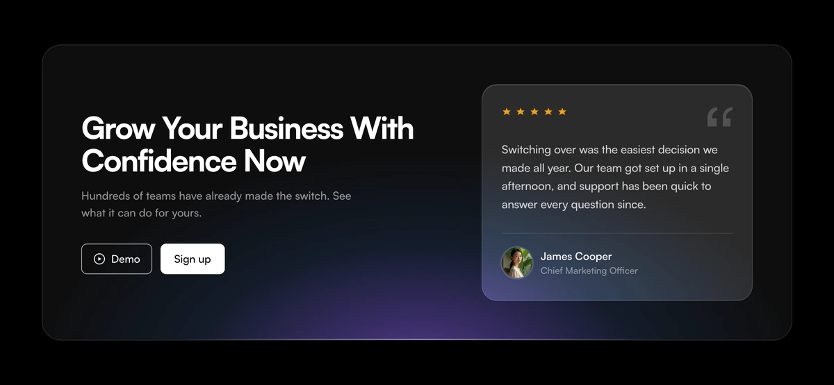
ProA wide frosted glass panel with a violet glow rising from its bottom edge. On the left, a headline, a sentence and two buttons, an outlined Demo with a play icon and a solid Sign up. On the right, a smaller glass card with star rating, a customer quote and the person behind it.
Ask and reassure in the same frame
CTA Section with Frosted Glass Testimonial Card is a React and Tailwind CSS CTA banner built on a glassmorphism panel, combining a two button call to action with a rated testimonial card. It runs in Next.js or any React app, in light and dark.
The moment someone considers signing up is the moment doubt appears. Placing one strong, rated testimonial inside the CTA itself, rather than in a section above, answers that doubt at the point of decision, and offering a demo next to sign up gives cautious visitors a smaller step.
The glass effect uses backdrop blur over a soft radial glow, so the panel looks layered on any background without needing an image.
Inside the glass panel
Violet glow
A radial gradient anchored below the panel's bottom edge, violet fading into blue, covers the lower 62 percent of the panel.
Glass panel
A rounded panel with backdrop-blur-2xl, a thin highlight line along the top and a violet radial glow from the bottom.
Copy and buttons
An h2 and a lede, then an outlined Demo button with a play icon and a solid black Sign up button, each with its own link and click handler.
Testimonial aside
A smaller glass card marked up as an aside: stars, the quote, an avatar with alt text, a name and a role.
Star rating
The rating prop sets how many stars fill, and the star group carries a label such as 5 out of 5 stars.
Layout
Copy and testimonial side by side on large screens inside a container up to 1080px, stacked on phones.
When glass and a quote help
Use it when
- Software with a free trial and a demo option.
- You have one standout testimonial with a name, role and photo.
- Your site uses soft gradients or glass elsewhere.
- Mid page or end of page CTAs on landing pages.
Skip it when
- You have no customer who has agreed to be quoted.
- Flat, high contrast design systems where blur looks out of place.
- You need only one action.
- Very busy backgrounds behind the panel, which make glass hard to read.
Buttons and the quote
Set headline and lede, then demoLabel, demoHref, signupLabel and signupHref, with onDemoClick and onSignupClick for tracking or opening a modal. quote takes text, name, role, avatarSrc, avatarAlt and an optional rating from 1 to 5.
The default lede says hundreds of teams have made the switch. Replace it with something you can stand behind, and give the testimonial a real name and role; an anonymous quote inside a CTA undoes the reassurance it is there to give.
Pick a testimonial that answers the objection your sign up page hears most, such as setup time or switching cost. The card is small, so one specific sentence beats a paragraph of praise.
npx wensity@latest add cta-section-with-frosted-glass-testimonial-card --type block
import { FrostedGlassTestimonialCta } from "@/components/wensity/blocks/cta-section-with-frosted-glass-testimonial-card";export function TrialCta() {return (<FrostedGlassTestimonialCtaheadline="Start your first campaign today"lede="Free for 14 days. Cancel in two clicks."demoLabel="Watch a demo"demoHref="/demo"signupLabel="Start free"signupHref="/signup"quote={{text: "We launched our spring campaign in an afternoon.",name: "Hana Ito",role: "Marketing lead, Kumo Tea",avatarSrc: "/people/hana.jpg",avatarAlt: "Hana Ito",rating: 5,}}/>);}
Props
| Prop | Type | Default | Description |
|---|---|---|---|
quote | { text; name; role; avatarSrc; avatarAlt; rating? } | - | The testimonial card. rating fills that many of the five stars. |
demoLabel / demoHref | string | "Demo" / "#demo" | Outlined button with a play icon, for a video or booking page. |
signupLabel / signupHref | string | "Sign up" / "#signup" | Solid button for the main action. |
onDemoClick / onSignupClick | (event) => void | - | Click handlers for analytics or opening a modal. |
headline / lede | string | - | Heading and supporting line on the left. |
Implementation notes
Real blockquote
The quote is marked up as a blockquote inside the aside, separated from the person row by a hairline rule.
Labelled rating
The stars are grouped under one accessible label, so screen readers hear the rating once instead of five icons.
Backdrop blur cost
Blur is rendered by the GPU and repaints when content behind it scrolls. One panel is cheap; avoid stacking several.
Semantic aside
The testimonial is an aside element, marking it as supporting content next to the main call to action.
No motion
No animation library and no transitions beyond hover, so the section needs no reduced motion work.
Block details
- Category
- CTA Sections
- Renders
- CSS only. Paints as soon as the stylesheet arrives
- Theme
- Follows the site theme in light and dark
- Dependencies
clsxtailwind-merge- Source
- 157 lines, 6 KB in one file
- Install
wensity add cta-section-with-frosted-glass-testimonial-card --type block- Tags
- light, dark, cta, glass, testimonial, glow, conversion
- Last updated