React Book a Call CTA with Star Rating and Avatar Stack
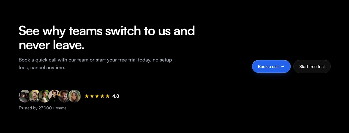
ProA split call to action for products sold both ways. On the left, a headline, a sentence, a row of customer avatars that show names on hover or focus, five stars with a rating and a trust line. On the right, two pill buttons: a blue Book a call with an arrow and a white Start free trial.
Two paths to yes
CTA Section with Split Booking and Stars is a React and Tailwind CSS book a call CTA that offers a sales call and a free trial side by side, backed by an avatar stack and a star rating. It runs in Next.js or any React app.
Some buyers want to talk to someone and some want to try it alone. Offering both, with equal visual weight, lets each choose without hunting, and the proof on the left, faces and a rating, nudges both groups at once.
The avatars are more than decoration: each is focusable and reveals the person's name in a tooltip on hover or keyboard focus, which turns a generic stack into recognisable people.
Left proof, right actions
Copy
An h2 and a lede on the left of a two column layout from 1024px, inside a container up to 1120px.
Avatar stack with names
Overlapping avatars, each focusable, lifting slightly on hover and showing a name tooltip with role tooltip on hover or focus.
Star rating
A row of stars labelled with the rating, such as 4.8 out of 5 stars, and a trust line beneath.
Book a call
A blue pill with an arrow that slides on hover, with the movement turned off for reduced motion.
Start free trial
A white pill beside it with its own link and click handler.
When to offer both paths
Use it when
- Pages where a third of visitors want a demo and the rest want to try it alone.
- Products with both sales led and self serve customers.
- You have a real rating and customers willing to be named.
- End of page CTAs on pricing or feature pages.
- You track which path visitors pick, using the two click handlers.
Skip it when
- You cannot replace the sample proof, 27,000 teams and 4.8 stars.
- You only sell one way.
- You want a form on the page rather than links.
- Calls are not actually available to every visitor.
Proof, labels and handlers
avatars takes src, alt and name; the name appears in the tooltip. ratingValue and starCount set the rating and how many stars show, and trustLabel sets the line under them. Replace all three with figures you can source.
primaryLabel, primaryHref and onPrimaryClick drive Book a call; secondaryLabel, secondaryHref and onSecondaryClick drive the trial. The default lede promises no setup fees and cancel anytime; keep those words only if they are true.
Order the buttons by what you want most. The first pill gets the colour, so if most revenue comes from self serve, swap the labels and make the trial the blue button.
npx wensity@latest add cta-section-with-split-booking-and-stars --type block
import { SplitWaitlistStarsCta } from "@/components/wensity/blocks/cta-section-with-split-booking-and-stars";export function DualCta() {return (<SplitWaitlistStarsCtaheadline="Try it yourself or let us show you."lede="A 15 minute call or a 14 day trial. Your choice."trustLabel="Rated by 310 customers on our review page"ratingValue="4.6"primaryLabel="Book a call"primaryHref="/book"secondaryLabel="Start free trial"secondaryHref="/signup"avatars={[{ src: "/people/ana.jpg", alt: "Ana", name: "Ana, Fenwick" },{ src: "/people/raj.jpg", alt: "Raj", name: "Raj, Northline" },]}/>);}
Props
| Prop | Type | Default | Description |
|---|---|---|---|
avatars | { src: string; alt: string; name: string }[] | - | Faces in the stack. name shows in the tooltip. |
ratingValue / starCount | string / number | "4.8" / 5 | Your rating and the number of stars drawn. |
trustLabel | string | "Trusted by 27,000+ teams" | Line under the stars. Sample figure, replace it. |
primaryLabel / primaryHref / onPrimaryClick | string / handler | - | The blue Book a call button. |
secondaryLabel / secondaryHref / onSecondaryClick | string / handler | - | The white trial button. |
Accessibility and motion
Equal weight buttons
Both pills are 44px tall with focus rings; the blue one adds a soft blue shadow so it reads first without dwarfing the trial.
Keyboard tooltips
Avatars take focus and show their names on focus as well as hover, using role tooltip.
Labelled stars
The star row is named with the rating, so screen readers hear one sentence instead of icons.
Reduced motion respected
The arrow slide on the main button is disabled for visitors who prefer reduced motion.
Sample proof
The default trust line and rating are placeholders. Publishing them would be a false claim.
Many tab stops
Every avatar is a tab stop. With a long stack, keyboard users pass through each face before the buttons, so keep the stack short.
Block details
- Category
- CTA Sections
- Renders
- CSS only. Paints as soon as the stylesheet arrives
- Theme
- Follows the site theme in light and dark
- Dependencies
clsxtailwind-merge- Source
- 166 lines, 7 KB in one file
- Install
wensity add cta-section-with-split-booking-and-stars --type block- Tags
- light, dark, cta, booking, avatars, stars, social-proof, conversion
- Last updated