React Compare Plans Table with a Button for Every Plan
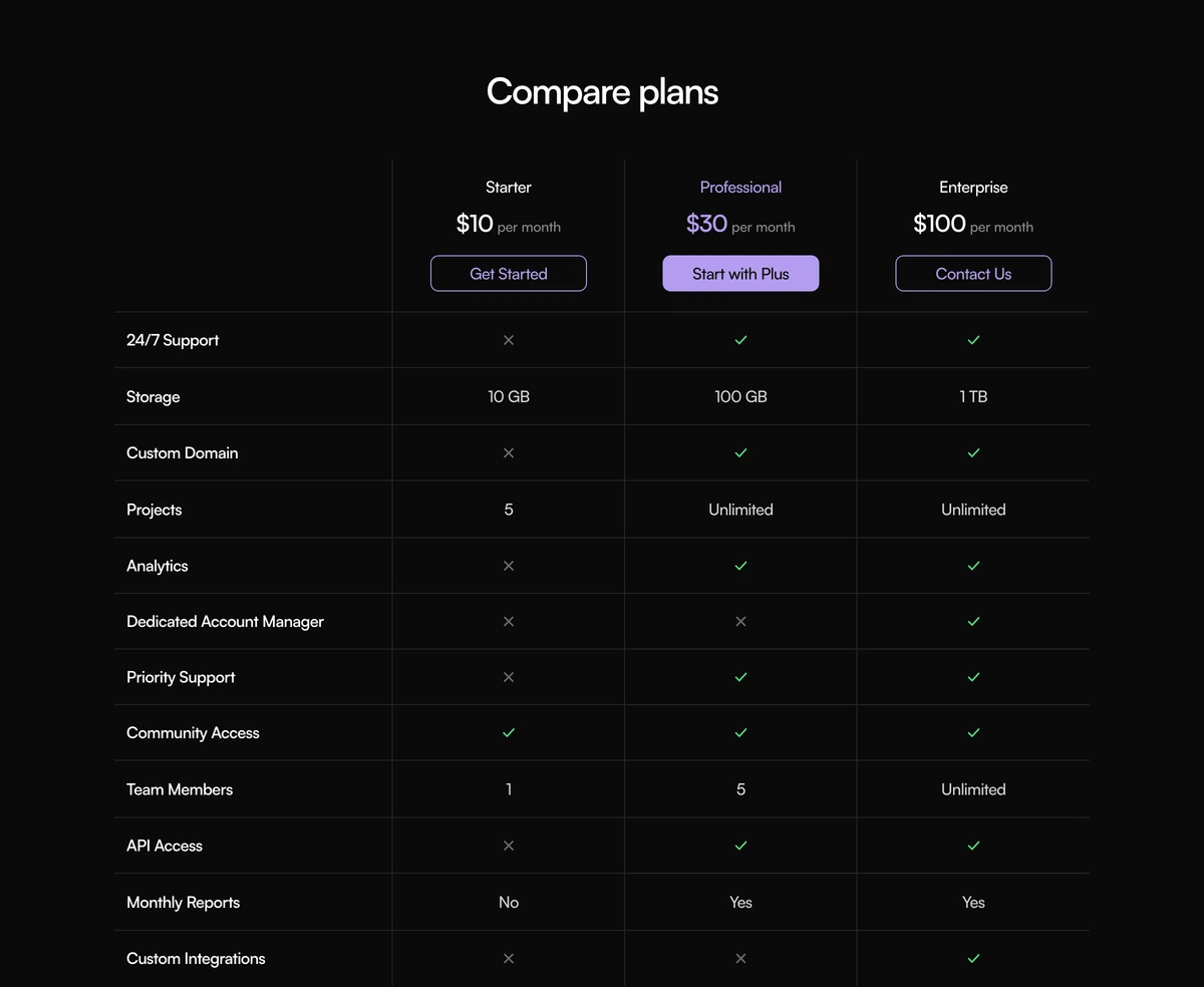
ProThe plainest way to compare plans, done neatly. Three columns, each topped with the plan name, price, billing cadence and a button, with the featured plan's button filled in violet. Below, ruled rows list each feature with a check, a value or a cross. No toggle, no animation, nothing to configure but your plans.
A table someone can act on
Comparison Section with Compare Plans is a React and Tailwind CSS compare plans table with a call to action in every plan column, a featured plan highlight and ruled feature rows. It is a server component that renders to plain HTML in Next.js or any React app.
Comparison tables often put one button at the top of the page, so a buyer who decides halfway down has to scroll back. Here each plan carries its own button in the header row, right where the decision is made, which is the most common pattern on software pricing pages for a reason.
There is deliberately nothing else: no billing switch, no tooltips, no motion. That makes it the easiest comparison block to drop in, translate and maintain.
Rows and columns
Header row
Each plan shows its name, price, cadence such as per month, and a button.
Featured plan
The featured plan uses violet, #6d4aff, with a filled button; the others have outlined buttons.
Feature rows
A label in the first column, then a check, a short value or a cross labelled Not included per plan.
Ruled grid
Thin borders separate every row, built as a CSS grid with borders.
Narrow screens
A 720px minimum width with horizontal scrolling on phones.
Right for your pricing page?
Use it when
- You need light and dark versions that both look deliberate.
- Three plans with one price each and a clear recommended option.
- You want a sign up button on every plan.
- Minimal pages where a toggle or animation would be noise.
- You want a server rendered table with no client JavaScript.
Skip it when
- You have more than four plans; the 980px container gets crowded.
- You offer monthly and annual prices and want a switch.
- Features need explanations; there are no hints or tooltips.
- Full table semantics are required for accessibility audits.
- Your brand cannot use violet and you do not want to edit the colour.
Plans and rows
plans takes an id, name, price and cadence as strings, a cta label, an optional href and an optional featured flag. Because price is a string, you can write $10, 10 EUR or Free exactly as you want them shown. rows takes an id, label and values keyed by plan id, each true, false or a string.
Order rows from what every buyer asks about first, such as limits and storage, to the specialist items at the end. People stop reading tables early, so the top five rows do most of the persuading.
To change the featured colour, edit the violet value in the component. Keep it dark enough for white button text.
npx wensity@latest add comparison-section-with-compare-plans --type block
import { ComparePlansComparison } from "@/components/wensity/blocks/comparison-section-with-compare-plans";export function Plans() {return (<ComparePlansComparisonheading="Choose your plan"plans={[{ id: "free", name: "Free", price: "$0", cadence: "forever", cta: "Start free", href: "/signup" },{ id: "pro", name: "Pro", price: "$16", cadence: "per month", cta: "Go Pro", href: "/signup?plan=pro", featured: true },{ id: "team", name: "Team", price: "$40", cadence: "per month", cta: "Start Team", href: "/signup?plan=team" },]}rows={[{ id: "projects", label: "Projects", values: { free: "3", pro: "Unlimited", team: "Unlimited" } },{ id: "history", label: "Version history", values: { free: false, pro: "30 days", team: "1 year" } },{ id: "roles", label: "Admin roles", values: { free: false, pro: false, team: true } },]}/>);}
Props
| Prop | Type | Default | Description |
|---|---|---|---|
plans | { id; name; price: string; cadence: string; cta: string; href?; featured? }[] | Starter, Professional, Enterprise | Columns. featured gives one plan the violet treatment. |
rows | { id; label; values: Record<planId, boolean | string> }[] | - | Feature rows. Strings for limits, booleans for yes or no. |
heading | string | "Compare plans" | Section heading above the table. |
What you get and what you do not
Dark mode inverts the accent
In dark mode the featured violet lightens to a soft lilac with near black button text, and checks turn green, so the highlight stays readable on #0a0a0a.
Compact buttons
Header buttons are capped at about 9.75rem wide, so long labels wrap. Keep them to two or three words such as Start free.
Server rendered
No client directive, no state and no animation library. It costs nothing in JavaScript.
Labelled absence
Crosses carry a Not included label for screen readers.
Grid semantics
It is a bordered CSS grid rather than a table element, so assistive technology does not expose row and column headers.
Horizontal scroll
At 720px minimum width, three plans fit most tablets, while phones scroll sideways.
Nothing to reduce
There is no motion in the block, only hover colour changes on the buttons.
Block details
- Category
- Comparison Sections
- Renders
- CSS only. Paints as soon as the stylesheet arrives
- Theme
- Follows the site theme in light and dark
- Dependencies
clsxtailwind-merge- Source
- 275 lines, 8 KB in one file
- Install
wensity add comparison-section-with-compare-plans --type block- Tags
- light, dark, comparison, plans, pricing, checks
- Last updated