React FAQ Accordion with a Book a Call Card
ProQuestions on the right, a person on the left. This FAQ section pairs an accordion of rounded question cards with a sticky card that offers a short call, for the visitor who reads three answers and still wants to talk to someone.
An FAQ that hands hesitant visitors to a human
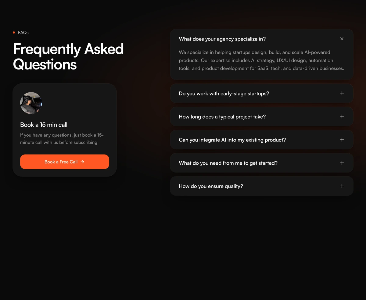
FAQ Section with Accordion Call Card is a React FAQ accordion laid out in two columns: the heading and a book a call card stay pinned on the left while the questions scroll past on the right. Each question is a white rounded card, and opening one reveals its answer with a short height animation.
Most FAQ sections end the conversation. This one is built to continue it. The call card carries a portrait, a title, one sentence and a full width orange button, so the visitor who did not find their answer has an obvious next step that is not the back button. That is why it suits sales led products, agencies and productised services, where a 15 minute call is the real conversion.
A soft peach radial glow sits behind the right side of the section, which is the only decoration. Everything else is cards, spacing and type, so it drops into a light or dark page without fighting the sections around it.
Inside the accordion and the call card
Sticky left column
From the large breakpoint the eyebrow, heading and call card stick 64px from the top, so the offer stays in view however far down the questions run.
Book a call card
A 72px round portrait, a title, a sentence of body copy and an orange button with an arrow, inside a 30px rounded card capped at 340px wide.
Question cards
Each question is an h3 wrapping a button, in its own rounded card with a soft two layer shadow. A plus icon rotates 45 degrees into a close mark when the card opens.
Single open answer
Only one card is open at a time. Opening another closes the first, and the first question starts open unless you name a different one.
Peach glow
One radial gradient anchored at 78 percent across and 42 percent down, warm peach in light mode and a dimmer orange in dark.
Where a call card beside the FAQ earns its space
Use it when
- A conversation closes more deals than a checkout page, as with agencies, consultancies and high ticket software.
- You can staff the calendar behind the button within a working day.
- The page is long enough that a sticky offer will still be visible after the visitor reads a few answers.
- You have a real photo of the person who takes the calls.
Skip it when
- The product is self serve and a call would slow buyers down. A plain accordion with a link to docs fits better.
- Nobody can answer a booking quickly. An unanswered calendar does more damage than no button.
- You need more than one open answer at once, for example to compare plans side by side.
- Orange clashes with your brand and you would rather not edit the accent colour in the source.
Swap in your questions, portrait and booking link
Questions come in as an items array of id, question and answer, and the call card is one cta object with the portrait, title, body, button label and link. The defaults describe an AI product agency and use a placeholder avatar, so both need replacing before launch. Point href at a real scheduling page such as your Cal.com or Calendly link.
The orange accent lives in a constant at the top of the file and in the button classes. Change both to your brand colour, and adjust the glow gradient beside them if the peach no longer matches.
npx wensity@latest add faq-section-with-accordion-call-card --type block
import { AccordionCallCardFaq } from "@/components/wensity/blocks/faq-section-with-accordion-call-card";export default function Pricing() {return (<AccordionCallCardFaqheadline="Questions before you sign"items={[{ id: "contract", question: "Is there a minimum contract?", answer: "No. Plans run month to month and you can stop at any time." },{ id: "handover", question: "Do we own the code?", answer: "Yes. Every repository is transferred to you at the end of each sprint." },]}cta={{avatarSrc: "/team/maya.webp",avatarAlt: "Maya Chen, head of delivery",title: "Talk it through with Maya",body: "Fifteen minutes, no slides, and a straight answer on fit.",buttonLabel: "Book a call",href: "https://cal.com/your-team/intro",}}/>);}
Props
| Prop | Type | Default | Description |
|---|---|---|---|
eyebrow | string | "FAQs" | Small label above the heading, next to an orange dot. |
headline | string | "Frequently Asked Questions" | The section heading, rendered as an h2 and wrapped to about 12 characters a line. |
items | { id; question; answer }[] | 6 agency questions | Your questions. Each id must be unique on the page, because it builds the answer panel's element id. |
cta | { avatarSrc; avatarAlt; title; body; buttonLabel; href } | Book a 15 min call | Everything in the left card. Write a real avatarAlt, since the portrait is meaningful content here. |
defaultOpenId | string | first item | Which question starts open. Pick the one most visitors ask first. |
className | string | - | Classes on the outer section, for example a different page background behind the peach glow. |
Accessibility and SEO notes for this accordion
Proper disclosure pattern
Every trigger is a button with aria-expanded and aria-controls, and the open answer is a region labelled by its question. Keyboard users can tab to each question and toggle it with Enter or Space.
Reduced motion respected
useReducedMotion switches the open and close animation to an instant change, so the accordion still works but nothing slides.
Only the open answer is in the HTML
Closed answers are unmounted, not hidden. Search engines and in page search see the first answer only, so put the answers that matter for SEO on a separate page or keep the most important one open by default.
No FAQ schema
The block renders no FAQPage structured data. Add your own JSON-LD on the page if you want it, written from the same items array so the two never drift.
Unique ids per page
Panel ids are built from each item id with a fixed prefix. Two copies of this block on one page with the same item ids would produce duplicate ids, so keep them distinct.
Block details
- Category
- FAQ Sections
- Renders
- JavaScript animation. Paints first, then animates
- Theme
- Follows the site theme in light and dark
- Dependencies
clsxframer-motiontailwind-merge- Source
- 263 lines, 9 KB in one file
- Install
wensity add faq-section-with-accordion-call-card --type block- Tags
- light, dark, faq, accordion, cta, agency, saas
- Last updated