React Pricing CTA with Two Tilted Plan Cards
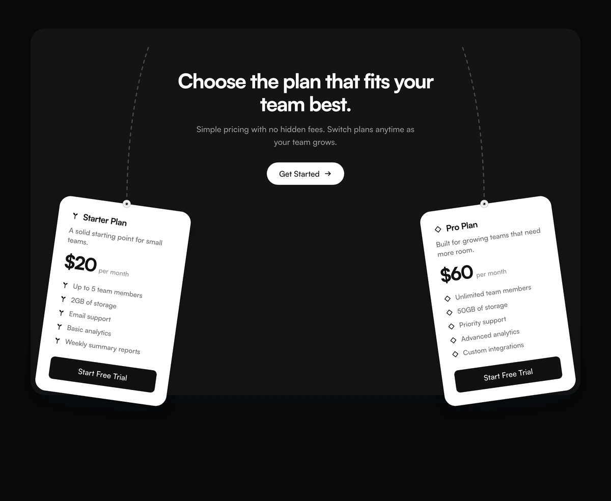
ProA playful way to end a page with pricing. A white panel holds a centred heading, a sentence and a button, and beneath it two plan cards hang at opposite angles, eight degrees left and right, pinned at the top by dashed threads like tags on a string.
Pricing as the last word
CTA Section with Tilted Plan Cards is a React and Tailwind CSS call to action section that ends a page with two plan cards, tilted and hung from threads, below a centred heading and button. It runs in Next.js or any React app, in light and dark.
A full pricing table at the bottom of a landing page can feel like starting over. Two plans, a starter and a pro, are enough to show that pricing is simple, and the tilt gives the section a handmade feel that makes people stop scrolling.
Each card is complete on its own, with a price, a short feature list and its own button, so visitors can choose without visiting the pricing page.
How the cards hang
Header panel
A white panel with an h2, a sentence and a pill button, centred above the cards.
Two tilted cards
One card rotates left and one right by eight degrees, chosen by each plan's tilt value.
Dashed threads
On large screens a dashed line runs from the panel to the top of each card, as if it hangs from a pin.
Card contents
A leaf or diamond icon, the plan name as an h3, a description, the price and cadence, features marked with the same icon, and a full width button.
Stacking
On phones and tablets the cards stack in a column under the copy and keep their tilt.
When two plans are enough
Use it when
- You sell exactly two plans, or want to feature two from a longer list.
- A playful, handmade tone suits your brand.
- The section closes a landing page and should let people buy from it.
- Light and dark themes both need to work.
Skip it when
- You need three or more plans side by side; extras are ignored.
- Formal or regulated industries where tilted cards feel unserious.
- Plans need monthly and annual prices with a switch.
- Long feature lists, which make the tilted cards tall and hard to read.
Two plans, one each way
plans takes objects with id, name, description, price and cadence as strings, ctaLabel, ctaHref, icon of leaf or diamond, a features list and tilt of left or right. The block picks the first left and the first right plan, falling back to the first two in the array.
onPlanClick receives the event and the plan id, which is useful for tracking which plan was chosen. Keep features to four or five lines per card so the tilt stays a detail rather than a reading obstacle.
Use the panel button for the full pricing page and the card buttons for direct sign up. That gives decided visitors a one click path while people who want details still have somewhere to go.
npx wensity@latest add cta-section-with-tilted-plan-cards --type block
import { TiltedPlanCardsCta } from "@/components/wensity/blocks/cta-section-with-tilted-plan-cards";export function PlansCta() {return (<TiltedPlanCardsCtaheadline="Two plans. Pick one and start today."ctaLabel="See full pricing"ctaHref="/pricing"plans={[{ id: "solo", name: "Solo", description: "For one designer.", price: "$12", cadence: "per month", ctaLabel: "Start Solo", ctaHref: "/signup?plan=solo", icon: "leaf", tilt: "left", features: [{ id: "a", label: "Unlimited files" }] },{ id: "studio", name: "Studio", description: "For small teams.", price: "$39", cadence: "per month", ctaLabel: "Start Studio", ctaHref: "/signup?plan=studio", icon: "diamond", tilt: "right", features: [{ id: "b", label: "Shared libraries" }] },]}/>);}
Props
| Prop | Type | Default | Description |
|---|---|---|---|
plans | { id; name; description; price; cadence; ctaLabel; ctaHref; icon; features; tilt }[] | Starter $20, Pro $60 | Two plans. tilt decides which way each card leans. |
onPlanClick | (event, planId) => void | - | Called when a plan's button is clicked. |
headline / lede | string | - | Heading and sentence in the panel above the cards. |
ctaLabel / ctaHref / onCtaClick | string / handler | - | The pill button in the panel, for people who want to compare all plans. |
Behaviour and accessibility
Panel button
The pill in the header panel inverts to white in dark mode and presses in slightly on click.
Threads are large screen only
The dashed threads are hidden below 1024px, where the cards stack in a column with a 32px gap instead of hanging side by side.
Static tilt
The rotation is a CSS transform with no animation, so the cards do not move and there is nothing to reduce.
Rotated text
Text on the cards is rotated eight degrees. It stays readable at this angle, but avoid tiny type inside the cards.
Heading structure
The panel heading is an h2 and each plan name is an h3.
Exactly two
Plans beyond the selected two are not rendered at all.
Block details
- Category
- CTA Sections
- Renders
- CSS only. Paints as soon as the stylesheet arrives
- Theme
- Follows the site theme in light and dark
- Dependencies
clsxtailwind-merge- Source
- 273 lines, 9 KB in one file
- Install
wensity add cta-section-with-tilted-plan-cards --type block- Tags
- light, dark, cta, pricing, plans, tilted, conversion
- Last updated