React Testimonial Carousel with Client Portrait Tabs
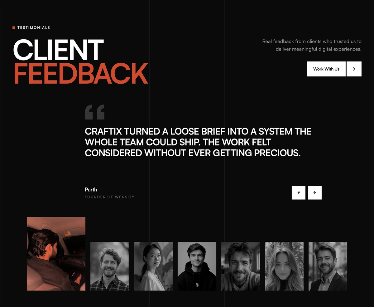
ProA bold two tone headline, CLIENT FEEDBACK, beside a single large quote in capitals with the client's name and role. Square arrow buttons step through the quotes, and a strip of greyscale portraits underneath lets you jump straight to anyone, with the selected face growing and taking an orange tint.
One voice at a time, everyone in view
Social Proof Section with Feedback Gallery is a React and Tailwind CSS testimonial carousel that shows one quote at a time, with previous and next controls and a strip of client portraits that doubles as an accessible tab list. It suits agencies and studios in Next.js or any React app.
Carousels are often criticised because people never see the slides after the first. This one keeps every client visible in the portrait strip, so the visitor knows how many voices there are and can pick one directly, while the large single quote gets the full attention a carousel slide allows.
The type is loud on purpose: uppercase quote, oversized headline, five vertical grid lines in the background and a black call to action. It is designed to be the most expressive section on a portfolio page.
Gallery parts
Grid rules
Five thin vertical lines run behind the whole section, echoing the five column portrait strip on screens 640px and wider.
Two tone headline
headlineLead and headlineAccent set two words in contrasting tones, with an eyebrow and a description beside them.
Quote stage
One uppercase quote with name and role, sliding in from the direction of travel and wrapping around at both ends.
Arrow buttons
Square previous and next buttons with accessible labels.
Portrait strip
A tablist named Client portraits. Each portrait is greyscale until selected, when it grows and gets an orange multiply tint. Arrow keys, Home and End move between them, and each is labelled with the person's name and role.
Call to action
A black button with an arrow tile, such as Work With Us.
Is a carousel right here
Use it when
- Agencies, studios and freelancers with five to eight client quotes.
- Bold, typographic brands that like uppercase display type.
- You have portraits of each client and permission to use them.
- You want the section to end in a call to action.
Skip it when
- You cannot get permission to show clients' faces; the portrait strip is the navigation.
- You want a wall of love that shows every quote at once; this shows one at a time.
- Quotes are long. Uppercase type at large sizes suits one or two sentences.
- Quiet, conservative brands.
- Phone screens are your main audience and your quotes run past three lines in capitals.
Quotes, portraits and headline
quotes takes an id, quote, name, role and portrait for each client. Portraits are shown small and in greyscale until selected, so square crops of faces with plain backgrounds work best. Seven is the default count; five to eight keeps the strip readable.
Change headlineLead and headlineAccent together, since they are designed as one phrase in two tones. ctaLabel and ctaHref set the button.
npx wensity@latest add social-proof-section-with-feedback-gallery --type block
import { ClientFeedbackGallerySocialProof } from "@/components/wensity/blocks/social-proof-section-with-feedback-gallery";export function Feedback() {return (<ClientFeedbackGallerySocialProofheadlineLead="KIND"headlineAccent="WORDS"description="What clients said after launch."ctaLabel="Start a project"ctaHref="/contact"quotes={[{ id: "1", quote: "They shipped the rebrand two weeks early.", name: "Elena Marsh", role: "Founder, Tidewater", portrait: "/clients/elena.jpg" },{ id: "2", quote: "Our sign ups doubled after the new site.", name: "Kofi Mensah", role: "CEO, Ledgerline", portrait: "/clients/kofi.jpg" },]}/>);}
Props
| Prop | Type | Default | Description |
|---|---|---|---|
quotes | { id; quote; name; role; portrait }[] | 7 sample clients | The carousel slides and the portrait tabs, in order. |
headlineLead / headlineAccent | string | "CLIENT" / "FEEDBACK" | Two words in two tones. |
description | string | - | Sentence beside the headline. |
ctaLabel / ctaHref | string | - | The black button. |
eyebrow | string | "TESTIMONIALS" | Small label above the headline. |
Accessibility and behaviour
Scaled type
The headline scales from 3rem to about 5.3rem and the quote from 1.15rem to 1.85rem with the viewport, so the composition holds from phone to desktop.
Off white and black
A warm off white background in light mode and near black in dark mode, with the orange tint kept in both.
Tabs for the portraits
The strip follows the tabs pattern with keyboard navigation, so it is not just a row of images.
Reduced motion
Slide and resize transitions are removed for visitors who prefer reduced motion.
No autoplay
The carousel only moves when someone clicks or uses the keys, which avoids the accessibility problems of auto advancing slides.
Portrait loading
All portraits load up front because they are all visible in the strip. Keep them small.
Block details
- Category
- Social Proof Sections
- Renders
- JavaScript animation. Paints first, then animates
- Theme
- Follows the site theme in light and dark
- Dependencies
clsxframer-motiontailwind-merge- Source
- 354 lines, 13 KB in one file
- Install
wensity add social-proof-section-with-feedback-gallery --type block- Tags
- light, dark, testimonials, gallery, quotes, editorial
- Last updated