 Starting your winter arc? 🥶 Get

React Ecommerce Bento Grid for a Product Collection with Quick Add
ProA shop section for a small design store, the fictional Still Goods. Six product photographs fill tiles of different shapes, each with its name, price and a bag button that opens into a quantity stepper. A bag in the header keeps the count and running total, and a seventh tile states the size of the collection with a link to shop all of it.
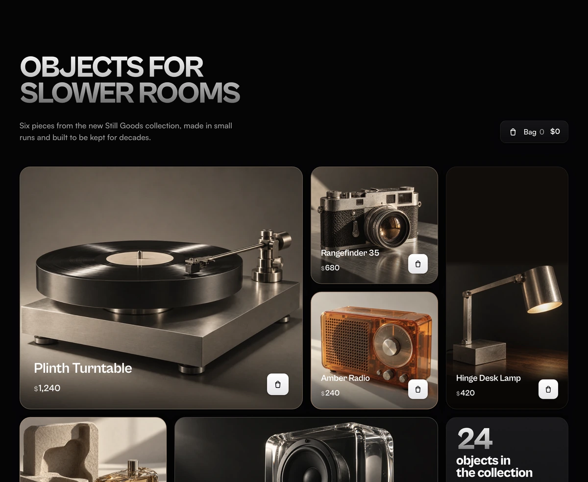
A bento grid for ecommerce that sells from the grid
Bento Grid With Product Collection is a React and Tailwind CSS ecommerce bento grid that shows six products as full bleed photos with prices and quick add buttons, plus a collection tile, and keeps a live bag count and total, in Next.js or any React app. It suits a store home page, a new collection launch or an editorial section on a brand site.
A uniform product grid treats every item as equal, which is right for a catalogue page and wrong for a feature. A bento layout lets the most important object take the largest tile and gives each photo a tile shaped to its subject: the turntable spans two columns and two rows, the desk lamp stands in a tall tile, the speaker sits in a wide one. The tile sizes do the merchandising.
It is also a working control, not a mood board. Every tile can add to the bag without leaving the page, the header bag counts up, and a bar slides in at the bottom of the screen to confirm the add when the header is scrolled out of view. Your cart logic plugs in through one callback.
Tiles, bag and stepper
Desktop uses four uneven columns and rows sized in container units, so each tile keeps the shape its photo needs at every width. Phones stack turntable, camera, radio, lamp, perfume, speaker and the collection tile, an order chosen so no two dark photos sit together.
Product tiles
Six photos from the sample store: Plinth Turntable $1,240, Rangefinder 35 $680, Amber Radio $240, Hinge Desk Lamp $420, Sandstone Eau de Parfum $145 and Glass Block Speaker $890. A soft scrim, only as tall as the text, sits under the name and price.
Quick add
A white bag button that widens into a green stepper with minus, quantity and plus after the first press. It stops at 9 of one product, and taking the last one out folds it back into the bag button.
Header bag
A link holding the bag icon, the item count and the total in dollars. The count and total rise into place each time they change. On phones it keeps the icon and count.
Bag bar
Pinned to the bottom of the screen while the section is in view and the header bag is not. It shows the last product's thumbnail, whether it was added or removed, the items and the total, and a View bag button.
Collection tile
A plain tile with the number 24 set large and the words objects in the collection, above a Shop the collection button that spans the tile on phones and desktop.
Stores that suit a product bento
Use it when
- You sell a few considered objects and want each to be seen at the size it deserves.
- You have strong product photography, ideally shot as one series against similar backgrounds.
- Adding from the grid matters more than sending every visitor to a product page first.
- You already have a cart and only need a front end that reports quantity changes.
Skip it when
- You need a catalogue with filters, sorting and pagination. Use a uniform product grid for that.
- Products need size or colour choice before they can be added. The stepper adds the product as it is.
- You need a currency other than US dollars without editing the file. Prices are formatted as USD.
- You expect the bag to persist across pages. State lives in the component and resets on reload.
Connect the grid to your cart
The products are the PRODUCTS object near the top of the file: name, price in whole dollars, image URL, its intrinsic width and height, alt text and fill, the average colour shown while the photo loads. The sample photos come from assets.wensity.com. Each tile also sets an object-position for its photo, so after a swap check that every object is still whole in its tile, especially the tall lamp tile, which places a wide photo low and continues its dark wall above it with the fill colour.
To wire a real cart, pass onQuantityChange. It is called with the product name and its new quantity on every press, and the block keeps its own count and total for display. Point bagHref at your cart page and collectionHref at the full collection. Change COLLECTION_SIZE when the number of objects is not 24, and the headline and subheadline to your store's voice; the defaults name the fictional Still Goods.
All six photos share one grade, a little less saturation and contrast and a touch warmer, applied as CSS filters through the GRADE constant. It makes six shots from different sources read as one shoot. Remove it if your photography is already graded.
npx wensity@latest add bento-grid-with-product-collection --type block
"use client";import { BentoGridProductCollection } from "@/components/wensity/blocks/bento-grid-with-product-collection";import { useCart } from "@/lib/cart";export function NewCollection() {const cart = useCart();return (<BentoGridProductCollectionheadline="The autumn edit"subheadline="Six pieces from this season, made in small runs."collectionHref="/collections/autumn"bagHref="/cart"onQuantityChange={(product, quantity) => cart.setQuantity(product, quantity)}/>);}
Props
| Prop | Type | Default | Description |
|---|---|---|---|
onQuantityChange | (product: string, quantity: number) => void | - | Your cart hook. Fires once per press with the new quantity, including 0 when an item is removed. |
bagHref | string | "#" | The cart page, used by the header bag and the View bag button. |
collectionHref | string | "#" | The full collection listing behind Shop the collection. |
headline | string | "Objects for slower rooms" | Uppercased beside the header bag. Short lines leave room for the bag on tablets. |
Accessibility and loading
Focus follows the control
The pressed button unmounts when the bag button opens into a stepper or folds back, so focus moves to its counterpart, plus or the bag button, instead of being lost.
Spoken prices and changes
Prices are drawn with a small dollar sign but read as a full amount such as $1,240. A polite live region says what was added or removed and the new item count and total.
Hidden bar stays out of the way
While the bag bar is hidden it is inert, so its View bag link cannot be tabbed to. The section uses overflow clip rather than hidden so the bar can stay pinned.
Lazy photos
Every product photo loads lazily with async decoding and has its average colour behind it while it loads. If the grid is above the fold, drop lazy from the featured turntable photo.
Reduced motion
The stepper opens and closes without the width animation, counts and totals change without rising, and the bag bar appears without sliding.
Block details
- Category
- Bento Grids
- Renders
- JavaScript animation. Paints first, then animates
- Theme
- Follows the site theme in light and dark
- Dependencies
clsxtailwind-merge- Source
- 775 lines, 33 KB in one file
- Install
wensity add bento-grid-with-product-collection --type block- Tags
- light, dark, bento, ecommerce, product collection
- Last updated