 Starting your winter arc? 🥶 Get

React Bento Dashboard Where One Chart Drives Every Tile
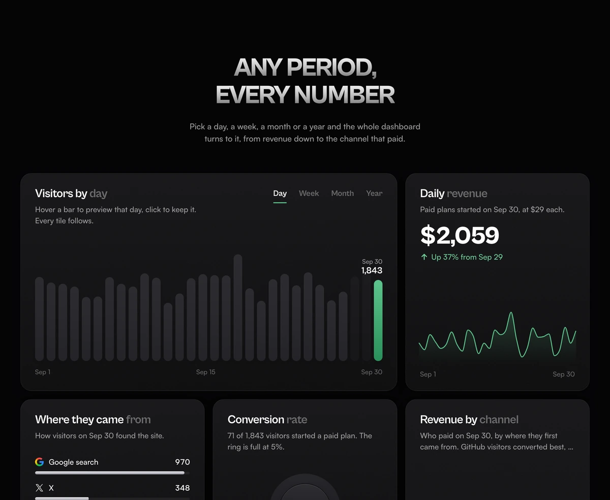
ProAn analytics view built as a landing page section. A bar chart of visitors with a Day, Week, Month and Year switch sits in the wide tile, and whichever bar you hover or click sets the period for the other five: revenue with its change, a conversion ring, traffic sources, revenue by channel and top entry pages.
A bento grid dashboard with linked tiles
Bento Grid With Analytics Dashboard is a React and Tailwind CSS bento dashboard section in which six analytics tiles share one selected period, so changing the period in the visitors chart updates every number on the page at once, in Next.js or any React app. It is a marketing section that shows what an analytics product does, not an admin dashboard kit wired to a database.
Most dashboard bento grids are a set of unrelated cards: a stat here, a chart there, each a still. The point of this one is the link between them. Hover the spike on a launch day and you watch the X share jump in the sources list, the channel pillars rearrange and the conversion ring move, which is the argument an analytics product wants to make in one gesture.
Behind it is a full sample history, not six hard coded numbers. A seeded generator writes every day from 1 January 2023 to 30 September 2026 in UTC, with traffic that roughly doubles each year, quieter weekends and four launch spikes. Weeks, months and years are summed from those days, and visitors split into sources and pages by whole numbers that add back up exactly, so no tile ever disagrees with another.
Six tiles, one period
Desktop is three columns: visitors spans two, revenue sits beside it, revenue by channel runs down the right two rows tall, and top pages spans the bottom left. Phones stack visitors, revenue, conversion, sources, channels and pages.
Visitors by day, week, month or year
Matte bars, the kept one solid green and a hovered one a paler green, with the date and count above it. Day shows the 30 days of September 2026, Week the last 12 weeks, Month October 2025 to September 2026, Year 2023 to 2026.
Revenue
Titled Daily, Weekly, Monthly or Yearly revenue to match the switch. A large tweened dollar figure, a note such as Up 12% from Sep 29, and a smooth line of revenue across the series that you can scrub on its own.
Conversion rate
A raised ring that is full at 5 percent, with the rate in the middle and a sentence giving paid signups out of visitors.
Where they came from
Google search, X, GitHub and Reddit with their marks, a count each and a thin bar scaled to the largest share on record, so every row moves when the period changes.
Revenue by channel
Four pillars that rise to the revenue each source paid, the top earner in green, and a line naming the channel that converted best and its rate.
Top pages
Four entry paths with counts and bars, plus an outlined three dimensional arrow drawn in SVG on desktop. The arrow is a still drawing.
When a linked dashboard bento earns its place
Use it when
- You sell analytics, reporting or revenue tooling and the selling point is that every metric is connected.
- The page needs one interactive moment that rewards a hover, not six separate animations.
- Your product's real dashboard is too dense or too private to screenshot, and you want something that reads at a glance.
- You want the numbers in the DOM, readable and selectable, rather than baked into an image.
Skip it when
- You need a working admin dashboard. There is no data prop; the history is generated inside the file.
- Your product does not track sources, conversion or revenue. A demo of metrics you do not have reads as a promise you cannot keep.
- You need more than four sources or four pages. The pillar and list layouts are sized for four.
- Real brand marks for Google, X, GitHub and Reddit are a problem for your legal review.
Make the numbers yours
The props cover the header only: the headline (use \n to break it, as in the default Any period, every number), the line beneath it, the heading level and the class name. Everything else is data near the top of the file. SOURCES names the four channels and their marks, PAGES the four entry paths, PLAN_PRICE the $29 each paid signup is worth, and CONVERSION_GOAL the rate at which the ring is full.
To show your own history, replace buildDays with a function that returns one entry per day holding visitors, the split by source and by page, paid signups and paid signups per source. The week, month and year series, the change notes and the scaling all derive from that array, so nothing else has to change. The file builds every date with UTC methods, so give it UTC days too; mixing in local dates shifts the labels by a day for visitors far from UTC.
The single green accent is three CSS variables per theme on the section, so a brand colour is a two line change. If you rename the periods, check the phrase strings in each builder too: they produce the sentences such as in the week of Sep 24 that the other tiles quote.
npx wensity@latest add bento-grid-with-analytics-dashboard --type block
import { BentoGridAnalyticsDashboard } from "@/components/wensity/blocks/bento-grid-with-analytics-dashboard";export function ProductTour() {return (<BentoGridAnalyticsDashboardheadline={"Every report,\none click away"}subheadline="Choose a day, a week, a month or a year and watch revenue, sources and conversion follow it."/>);}
Props
| Prop | Type | Default | Description |
|---|---|---|---|
headline | string | "Any period,\nevery number" | Uppercased with a metal gradient. Two short lines read best above a grid this busy. |
subheadline | string | - | One sentence on what the switch does, since the interaction is the pitch. |
headingAs | "h1" | "h2" | "h3" | "h2" | Raise to h1 only when the dashboard is the first thing on its page. |
className | string | - | Change the section background so the tiles sit on your page colour without a visible band. |
Input, motion and assistive tech
Keyboard and touch
The switch is a radio group that arrow keys move through. The chart is a slider: arrows step a bar, Page Up and Page Down jump seven, Home and End go to the ends. On touch, dragging previews and lifting keeps the bar; a vertical swipe still scrolls the page.
Announcements
Nothing is read on load. After the visitor changes the period, one polite summary of visitors, revenue and conversion is announced once the selection has settled for 700ms, so scrubbing does not flood the screen reader.
Reduced motion
Numbers jump to their values, bars and pillars stand at full height, the revenue line is drawn already and the ring is filled. Every interaction still works.
Weight
At 1,465 lines it is the heaviest of the five bento grids, but it pulls in no chart or animation library: the bars are divs, the line is a hand built monotone curve in SVG and the tweens use requestAnimationFrame.
Remote marks
The four source logos are SVGs from assets.wensity.com. Host your own copies before production so the tiles do not depend on another domain.
Block details
- Category
- Bento Grids
- Renders
- JavaScript animation. Paints first, then animates
- Theme
- Follows the site theme in light and dark
- Dependencies
clsxtailwind-merge- Source
- 1,465 lines, 60 KB in one file
- Install
wensity add bento-grid-with-analytics-dashboard --type block- Tags
- light, dark, bento, analytics, dashboard
- Last updated