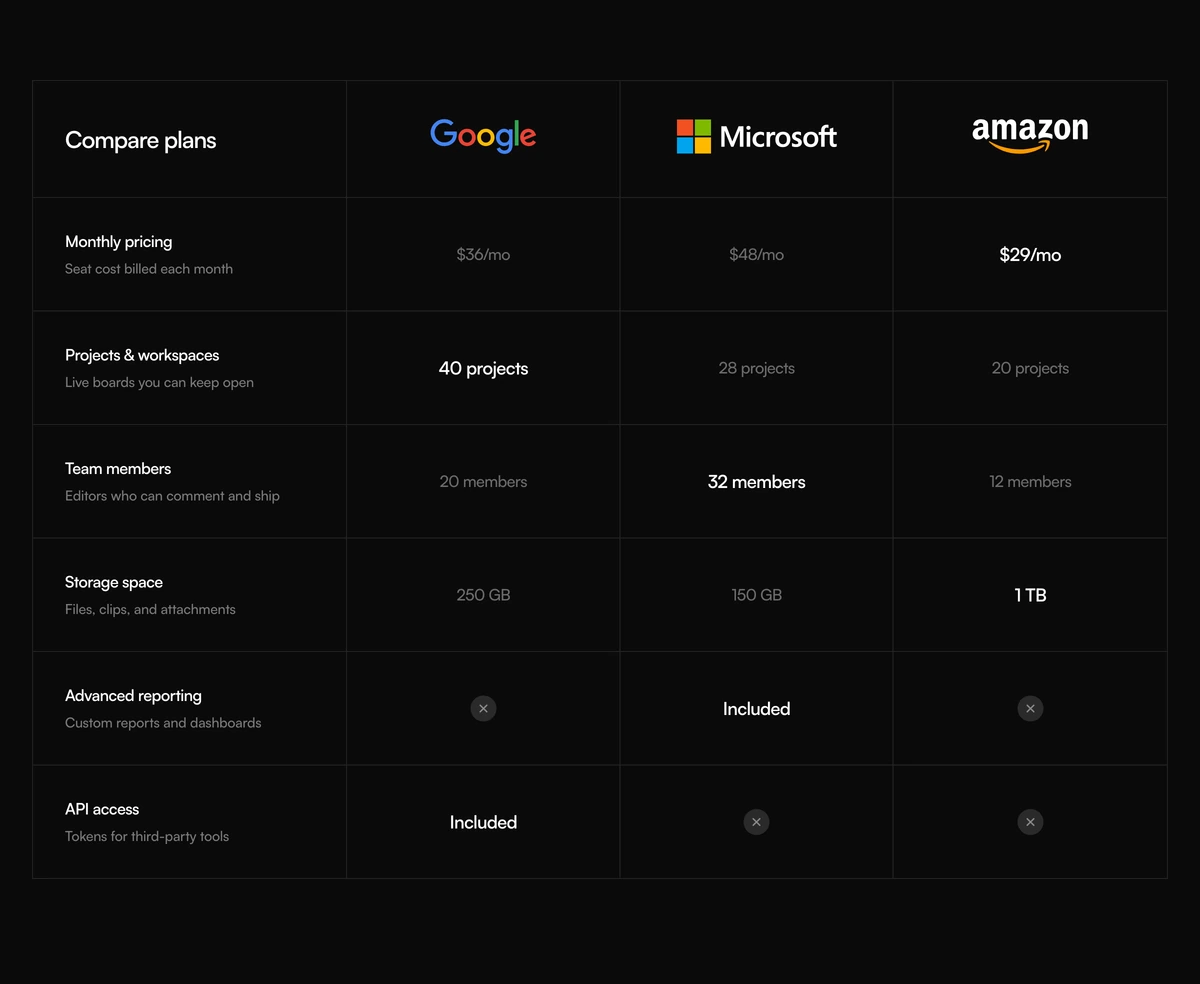
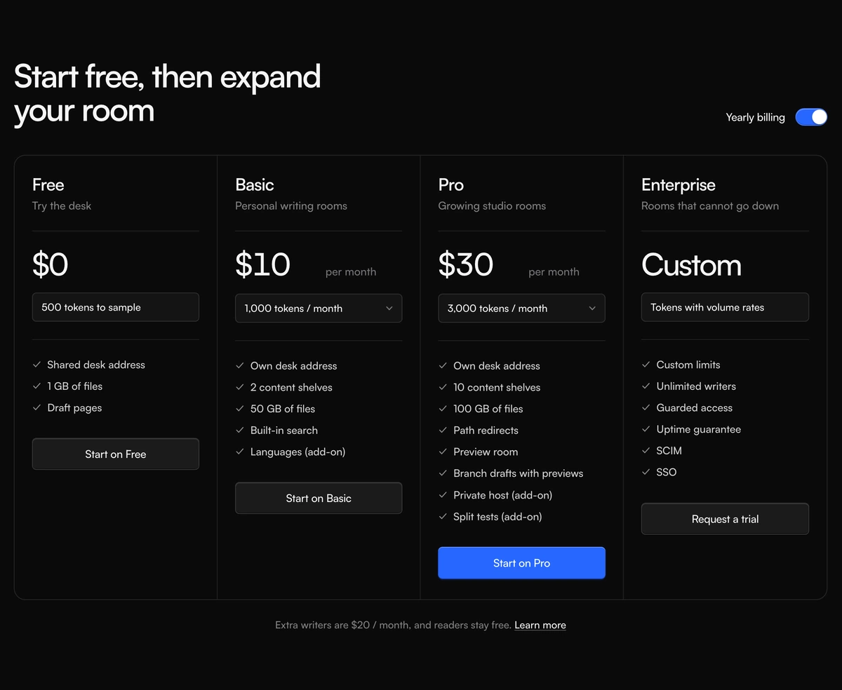
React Pricing Table with a Feature Comparison
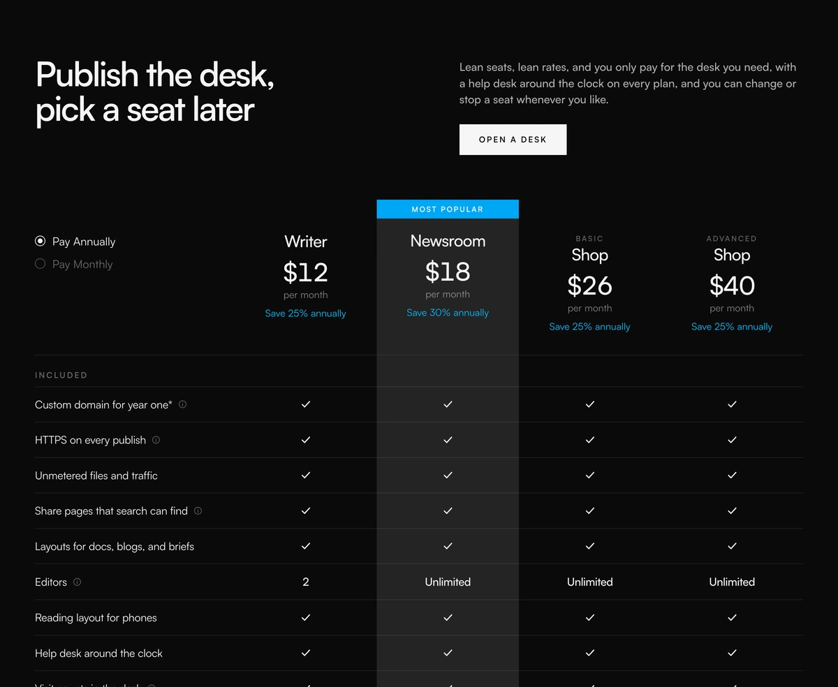
ProPlans across the top, features down the side, checks where a plan includes something. A Most popular band highlights one column, an annual or monthly switch updates every price at once, and small info buttons beside feature names explain anything unclear.
A pricing comparison table done properly
Pricing Section with Comparison Table is a React and Tailwind CSS pricing table that compares plans feature by feature using semantic HTML table markup, with a billing switch and a highlighted plan. It runs in Next.js or any React app.
When buyers are choosing between close plans, cards make them flip back and forth. A comparison table puts every difference on one grid. This one is a real table, with column and row headers scoped correctly, so screen reader users can hear which plan and which feature each cell belongs to, something div based grids cannot offer.
Prices are set once per plan as an annual monthly rate and a save percentage. The monthly price is derived from those two numbers, so switching billing never shows inconsistent figures.
What the table is made of
Table structure
A table with a colgroup, th elements scoped to columns and rows, and the popular column tinted through its col element so the highlight spans every row.
Popular plan band
A blue Most popular band above one column, plus a hidden sentence naming that plan for screen readers.
Billing radios
Real radio inputs, visually hidden, with custom dots and labels for Pay Annually and Pay Monthly. Each plan shows Save X percent annually or Billed monthly.
Feature cells
true renders a check, a string renders that text, and false renders a hidden Not included so the cell is never silent.
Hint tooltips
Rows can carry a hint. An info button with the hint as its label shows a tooltip on hover or keyboard focus.
When a table beats cards
Use it when
- Three or four plans that differ on many specific features.
- Buyers who compare carefully, such as teams choosing a plan for procurement.
- Accessibility matters and you want proper table semantics.
- Features need a word of explanation, which the hints provide.
Skip it when
- Most visitors are on phones. The table is 920px wide and scrolls sideways with its scrollbar hidden, so there is no visual cue that more columns exist.
- You need a sign up button under each plan. There is one call to action for the whole section.
- Your plans differ on two or three things only; cards are faster to read.
- Your billing labels must be translated or renamed without editing the file.
Define plans and features
plans takes an id, name, optional eyebrow, annualMonthly, savePercent and an optional popular flag. features takes an id, label, optional hint and a values object keyed by plan id, where each value is true, false or a short string such as 5 seats or Unlimited.
Two edits are worth making in the file. Show a scroll hint on small screens, for example a gradient fade on the right edge or a visible scrollbar, and add a button row as the last table row if each plan needs its own sign up link.
npx wensity@latest add pricing-section-with-comparison-table --type block
import { ComparisonTablePricing } from "@/components/wensity/blocks/pricing-section-with-comparison-table";export function Pricing() {return (<ComparisonTablePricingheadline="Plans for every size of team"cta={{ label: "Start a free trial", href: "/signup" }}plans={[{ id: "solo", name: "Solo", annualMonthly: 9, savePercent: 20 },{ id: "team", name: "Team", annualMonthly: 24, savePercent: 20, popular: true },{ id: "org", name: "Organisation", annualMonthly: 59, savePercent: 15 },]}features={[{ id: "seats", label: "Seats", values: { solo: "1", team: "10", org: "Unlimited" } },{ id: "sso", label: "Single sign on", hint: "SAML with any identity provider", values: { solo: false, team: false, org: true } },{ id: "api", label: "API access", values: { solo: true, team: true, org: true } },]}/>);}
Props
| Prop | Type | Default | Description |
|---|---|---|---|
plans | { id; name; eyebrow?; annualMonthly: number; savePercent: number; popular? }[] | - | Columns. The monthly price is annualMonthly divided by one minus the save fraction. |
features | { id; label; hint?; values: Record<planId, boolean | string> }[] | - | Rows. Use strings for limits and booleans for yes or no. |
groupLabel | string | "Included" | Heading for the feature rows column. |
cta | { label: string; href: string } | - | The single call to action in the header. |
headline / subtext | string | - | Heading and paragraph above the table. |
Strengths and gaps
Real table semantics
Scoped headers mean each cell is announced with its plan and feature, which is the main accessibility win over grid based pricing tables.
Hidden horizontal scroll
Below 920px the table scrolls inside its container with the scrollbar hidden. Add a visible cue so phone users know to swipe.
Keyboard tooltips
Hints open on focus as well as hover, and the info button's accessible name is the hint itself.
Static billing labels
Pay Annually and Pay Monthly are written into the component. Edit them there for other wording or languages.
Block details
- Category
- Pricing Sections
- Renders
- CSS only. Paints as soon as the stylesheet arrives
- Theme
- Follows the site theme in light and dark
- Dependencies
clsxtailwind-merge- Source
- 407 lines, 14 KB in one file
- Install
wensity add pricing-section-with-comparison-table --type block- Tags
- light, dark, pricing, comparison, table, saas
- Last updated