React Feature Comparison Matrix with Automatic Winners
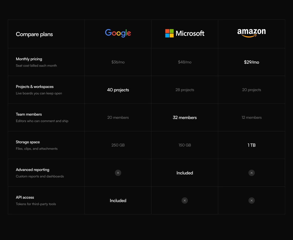
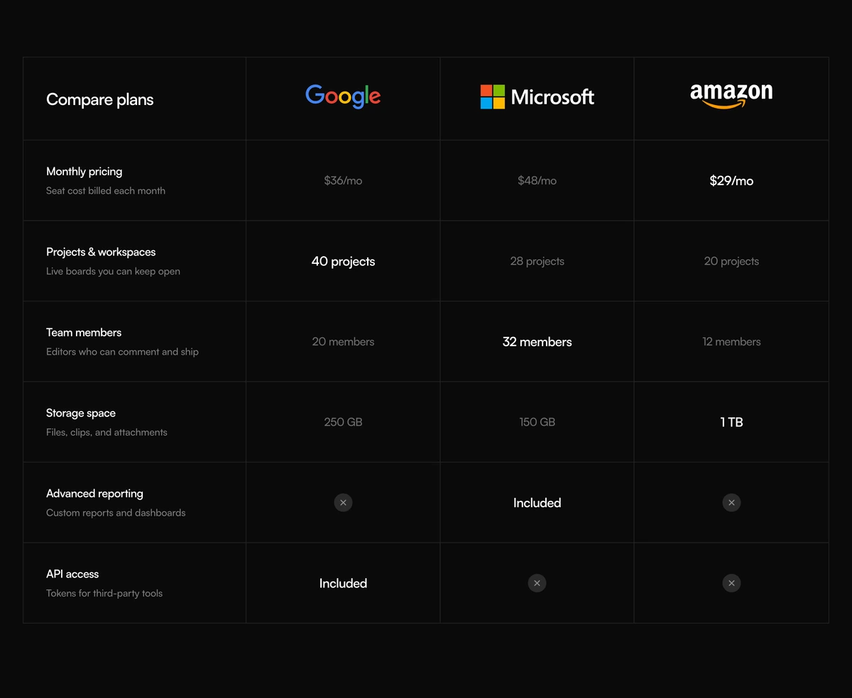
ProA dark comparison matrix of products against each other. Each row names a feature and explains it in a line, each column is a product with its wordmark, and in every row the best value lights up in white while the rest stay grey, picked automatically from the numbers you enter.
Let the numbers pick the winner
Comparison Section with Features Matrix is a React and Tailwind CSS feature comparison matrix that compares products across described rows and highlights the winning value in each row automatically, understanding prices and storage units. It is a server component for Next.js or any React app, drawn for dark pages.
Hand picking winners in a comparison table is tedious and easy to get wrong when numbers change. This block reads the values you pass: for prices the lowest wins, for counts and sizes such as 50 GB or 2 TB the highest wins, with units converted first. Ties and rows that mix kinds of value stay neutral.
Every row has a title and a one line description, which turns the matrix from a spec sheet into something a buyer can follow without already knowing the jargon.
How the matrix works
Product columns
Each product shows a wordmark. With an href, the mark becomes a link with an arrow and an aria-label of the product name.
Described rows
A title and a short description in the first column of every row.
Value parser
Values are read as prices, plain counts or sizes in KB, MB, GB, TB or PB. Prices prefer the lowest, counts and sizes the highest.
Winner styling
The best value in a row is bold white; the others are grey. Equal values and mixed types are left unstyled.
Missing values
Passing false shows a mark with the label Not included.
Dark canvas
The section sits on #0a0a0a with a 960px minimum width that scrolls on phones.
When to use an automatic matrix
Use it when
- Comparing your product with alternatives on measurable limits: storage, seats, price, requests.
- Dark themed comparison or alternatives pages.
- Values that change often, so manual highlighting would drift.
- Rows that need a sentence of explanation each.
Skip it when
- Your comparison is mostly yes or no features; the parser has nothing to rank.
- Light themed sites; the matrix is drawn for dark only.
- You need your own and your competitors' logos without editing the file; marks come from a fixed set of three.
- Lower is not always better for prices in your market, for example when cheaper means fewer features in the same row.
Replace the marks and every number
products takes an id, name, mark and optional href. mark must be one of three built in ids, which are wordmarks of real companies. The default rows give those companies invented figures. Comparing real brands with numbers they never published is misleading, so add your own marks to the map in the file and enter figures you can source, or use neutral names.
rows takes an id, title, description and values keyed by product id, each a string or false. Write values consistently within a row, all prices or all sizes, so the automatic winner works.
npx wensity@latest add comparison-section-with-features-matrix --type block
import { FeaturesMatrixComparison } from "@/components/wensity/blocks/comparison-section-with-features-matrix";// After adding your own marks to the map in the component:export function VsTable() {return (<FeaturesMatrixComparisonheading="How the plans compare"products={[{ id: "us", name: "Stowage", mark: "stowage" },{ id: "a", name: "Option A", mark: "neutral" },]}rows={[{ id: "storage", title: "Storage", description: "Included per workspace.", values: { us: "2 TB", a: "500 GB" } },{ id: "price", title: "Price", description: "Per user, per month.", values: { us: "$8", a: "$12" } },{ id: "sso", title: "Single sign on", description: "SAML login.", values: { us: "Included", a: false } },]}/>);}
Props
| Prop | Type | Default | Description |
|---|---|---|---|
products | { id; name; mark; href? }[] | - | Columns. mark picks a wordmark from the map inside the file. |
rows | { id; title; description; values: Record<productId, string | false> }[] | - | Compared features. Use one kind of value per row so winners compute. |
heading | string | "Compare plans" | Heading above the matrix. |
Facts and cautions
Readable descriptions
Row descriptions are capped at about 16.5rem so they stay short beside the values, inside a container up to 1180px wide.
Real brands, invented figures
The default marks are real companies and the numbers beside them are placeholders. Never publish that combination.
Server component
Winner detection runs during render on the server. No JavaScript reaches the browser.
Labelled links and gaps
Linked marks are named for screen readers, and missing values say Not included.
Grid layout
Built with CSS grid rather than a table, so there is no row and column header association.
Static
No animation or state, so there is nothing to adjust for reduced motion.
Block details
- Category
- Comparison Sections
- Renders
- CSS only. Paints as soon as the stylesheet arrives
- Theme
- Fixed dark surface. No light variant
- Dependencies
clsxtailwind-merge- Source
- 339 lines, 20 KB in one file
- Install
wensity add comparison-section-with-features-matrix --type block- Tags
- dark, comparison, matrix, toggle, saas
- Last updated