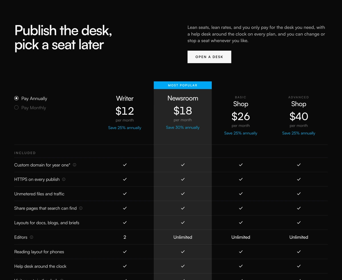
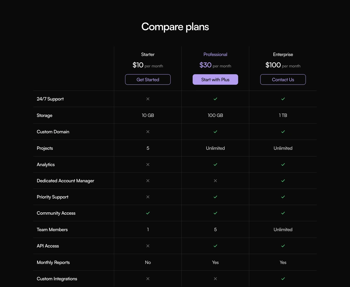
React Pricing Comparison Table with Grouped Features and a Billing Switch
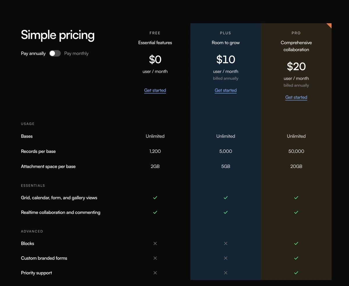
ProPlans across the top with their name, a tagline and a price per user per month; feature rows grouped under headings such as Usage, Essentials and Advanced underneath. A switch at the top left flips every price between annual and monthly, and the numbers count to their new value. One plan can be flagged with a coloured corner.
Pricing and features on one grid
Comparison Section with Simple Pricing is a React and Tailwind CSS pricing comparison table that combines plan prices, a billing switch and grouped feature rows in one grid, with soft colour washes down each column. It runs in Next.js or any React app with Framer Motion.
Many sites split pricing cards and the feature table into two sections, which makes buyers scroll back up to remember a price. Keeping the price at the top of each column of the table means the number and everything it buys stay in view together.
Groups keep long feature lists scannable. Rather than forty rows in a row, each group has a label, so a buyer looking for security features or usage limits can find the right block at once.
What the grid contains
Header corner
The heading and a Pay annually or Pay monthly switch with role switch sit in the top left cell.
Plan header
Name, tagline, price, user per month, a billed annually note in annual mode and a link styled call to action.
Column washes
A sky or sand tint runs the full height of a plan's column so the eye can follow it down.
Flag
A flagged plan gets a coloured triangle in its corner, a quieter alternative to a Most popular badge.
Counting prices
Switching billing animates each price between values with a short count, instant for reduced motion.
Grouped rows
Rows sit under group labels. Cells show a check, a short text value or a cross labelled Not included.
When to merge pricing into the table
Use it when
- You prefer a subtle corner flag to a loud Most popular badge.
- Per seat pricing with an annual discount.
- Long feature lists that benefit from grouping.
- Three or four plans that buyers compare carefully.
- You want a softer, less boxy table with colour washes.
Skip it when
- Screen reader navigation by row and column is a requirement; the grid is not table markup.
- Phone visitors are the majority. The grid is 920px wide and scrolls sideways.
- Your prices are flat rather than per user; the user per month label would need editing.
- You want a large button per plan; calls to action are link styled.
Plans, groups and rows
plans takes an id, name, tagline, monthly and annualMonthly prices, a cta label, optional href, a wash of sky or sand and an optional flagged boolean. groups takes an id, label and rows, and each row has an id, label and values keyed by plan id, where a value is true, false or a short string.
Both prices are written per plan, so you control rounding exactly. Keep text values short, such as 10 GB or Unlimited, because the columns are narrow.
npx wensity@latest add comparison-section-with-simple-pricing --type block
import { SimplePricingComparison } from "@/components/wensity/blocks/comparison-section-with-simple-pricing";export function Pricing() {return (<SimplePricingComparisonheading="Plans and limits"plans={[{ id: "basic", name: "Basic", tagline: "Small teams", monthly: 12, annualMonthly: 10, cta: "Start trial", href: "/signup", wash: "sky" },{ id: "business", name: "Business", tagline: "Growing teams", monthly: 24, annualMonthly: 20, cta: "Start trial", href: "/signup?plan=business", wash: "sand", flagged: true },]}groups={[{id: "usage",label: "Usage",rows: [{ id: "storage", label: "Storage", values: { basic: "50 GB", business: "1 TB" } }],},{id: "security",label: "Security",rows: [{ id: "sso", label: "Single sign on", values: { basic: false, business: true } }],},]}/>);}
Props
| Prop | Type | Default | Description |
|---|---|---|---|
plans | { id; name; tagline; monthly; annualMonthly; cta; href?; wash?; flagged? }[] | - | Columns with both prices. wash tints the column; flagged adds the corner mark. |
groups | { id; label; rows: { id; label; values }[] }[] | - | Labelled blocks of feature rows. |
heading | string | "Simple pricing" | Shown in the top left cell above the switch. |
Strengths and limits
Both themes
The sky and sand washes have dark counterparts, deep blue and deep brown, and the corner flag keeps its orange in both modes.
Grid, not table
The layout is CSS grid. Screen readers read it cell by cell without row and column headers; convert to a table if that matters.
Labelled crosses
Excluded features carry a Not included label, so absence is announced rather than silent.
Reduced motion
The price count is instant for visitors who prefer reduced motion.
Accessible switch
The billing control uses role switch with its state exposed.
Sideways scroll
Below 920px the grid scrolls horizontally. Add a visual hint, or show stacked plan cards on phones.
Block details
- Category
- Comparison Sections
- Renders
- CSS only. Paints as soon as the stylesheet arrives
- Theme
- Follows the site theme in light and dark
- Dependencies
clsxframer-motiontailwind-merge- Source
- 386 lines, 12 KB in one file
- Install
wensity add comparison-section-with-simple-pricing --type block- Tags
- light, dark, comparison, pricing, toggle, checks
- Last updated