React Contact Form with a Customer Quote Carousel
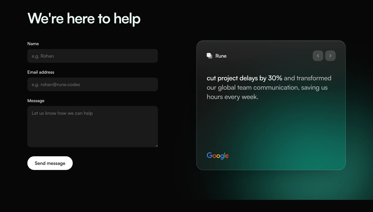
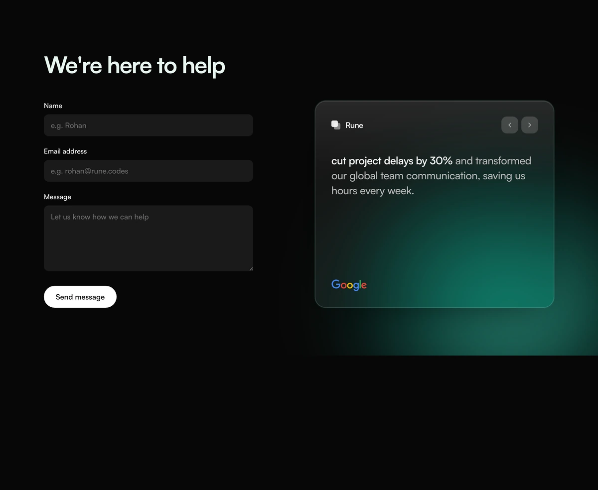
ProA friendly contact section in two halves. On the left, a heading and a short form with clearly labelled fields for name, email and message. On the right, a card holding a customer quote with one phrase picked out in bold, arrows to read the next one, and the customer's mark at the bottom, all over a soft teal glow.
Reassurance right beside the form
Contact Section with Help Form Quote is a React and Tailwind CSS contact form paired with a rotating customer testimonial card, so visitors read proof at the moment they decide whether to get in touch. It works in Next.js or any React app, in light and dark.
People hesitate on contact pages because writing to a company feels like a commitment. A quote from a customer who had a good experience, placed next to the form rather than further down the page, lowers that barrier at the right moment. The highlighted phrase lets a skimmer get the point in three words.
The form itself is plain on purpose. Visible labels above every field, the right input types and autocomplete hints make it quick to fill in on a phone, which matters more for conversions than visual flourish.
What the section is made of
Heading and form
An h2, then name, email and message fields with visible labels, type email on the address and autocomplete set for name and email.
Submit button
A full width dark button whose label is a prop.
Quote card
The vendor name at the top, the quote in three parts so the middle phrase can be bold, and the customer's mark at the bottom.
Quote navigation
Previous and next buttons with accessible labels step through the quotes.
Teal glow
Blurred teal shapes sit behind the bottom right of the section, on a pale green grey in light mode and near black in dark mode.
When to use this contact form
Use it when
- Service businesses and agencies whose next step is a conversation.
- You have two or three customer quotes about how working with you felt.
- You want a short form with only name, email and message.
- Your design favours clear, labelled fields over minimal underlines.
Skip it when
- You need routing fields such as topic, budget or team; there are none.
- You have no customer quotes you are allowed to publish.
- You cannot change the customer marks, which are drawn from a fixed set of real company logos.
- You expect the form to deliver email without any code; it only calls your handler.
Connect the form and replace the quotes
The form calls preventDefault and then your onSubmit with the event, and sends nothing on its own. In the handler, read new FormData(event.currentTarget), whose fields are named name, email and message, and post it to your endpoint, an email service or a server action. Add a sending state, a success message and an error message; none are built in.
Each quote has an id, vendor, before, highlight and after text, and a client mark. The marks come from a set of three real company logos, and the default quotes describe results at those companies. Replace them with your own customers' words and add their marks to the map in the file.
npx wensity@latest add contact-section-with-help-form-quote --type block
"use client";import { HelpFormQuoteContact } from "@/components/wensity/blocks/contact-section-with-help-form-quote";export function Contact() {return (<HelpFormQuoteContactheadline="Tell us about your project"submitLabel="Send to the team"onSubmit={async (event) => {const data = new FormData(event.currentTarget);await fetch("/api/contact", { method: "POST", body: data });}}/>);}
Props
| Prop | Type | Default | Description |
|---|---|---|---|
onSubmit | (event: FormEvent<HTMLFormElement>) => void | - | Called after preventDefault. Read the fields with FormData and send them yourself. |
quotes | { id; vendor; before; highlight; after; client }[] | - | Quote parts so the highlight renders bold in the middle. |
headline | string | "We're here to help" | Heading above the form. |
submitLabel | string | "Send message" | Button text. Say what happens, for example Send to our team. |
Form quality and caveats
Visible labels
Every field has a visible label, the most reliable pattern for accessibility and autofill.
No validation
Fields have no required attribute and there are no error messages. Add required to name, email and message, or validate in your handler.
Real logos in quotes
The customer marks are real company logos and the defaults attribute outcomes to them. Treat them as placeholders only.
Accessible marks
Logos render with role img and a label, so screen readers name the customer.
Static styling
No animation library; the glow is CSS blur on a few shapes.
Block details
- Category
- Contact Sections
- Renders
- CSS only. Paints as soon as the stylesheet arrives
- Theme
- Follows the site theme in light and dark
- Dependencies
clsxtailwind-merge- Source
- 276 lines, 19 KB in one file
- Install
wensity add contact-section-with-help-form-quote --type block- Tags
- light, dark, contact, form, quote, carousel, glow
- Last updated