React Contact Form Design on a Dashed Blueprint Grid
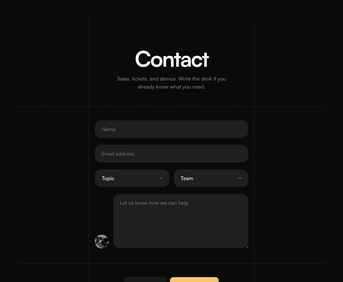
ProA contact form drawn like a technical blueprint. Dashed lines frame a narrow centre column and fade out at the edges, a huge one word heading sits at the top, and below it come name and email, two dropdowns for topic and team, a message box with a small avatar beside it, and a bright yellow send button next to a link to the docs.
A form with a point of view
Contact Section with Dashed Grid Form is a React and Tailwind CSS contact form design set on a dashed blueprint grid, with select menus for topic and team so messages arrive already sorted. It suits developer tools and design led products in Next.js or any React app.
Contact forms are usually the least designed part of a site. Framing this one with dashed guides and a giant heading turns it into a deliberate page, and the visual language matches the dashed FAQ block, so the two can share a page or a site.
The two selects are the practical feature. Asking for topic and team up front lets a small company send sales questions, support tickets and demo requests to different people without making the visitor guess where to write.
Layers of the blueprint form
Dashed frame
Dashed borders and guide lines around a centre column about 36rem wide, faded at the ends with CSS masks.
Giant heading
A single word or short phrase, centred, scaling up to around 7xl on large screens, with a description under it.
Two selects
Native select menus for topic and team, with options passed as value and label pairs.
Message with avatar
A tall textarea beside a small avatar, a hint that a real person will read it.
Action row
A white secondary link, Read the docs by default, and a yellow submit button side by side, wrapping on narrow screens.
When the blueprint look fits
Use it when
- Developer and design tools with a technical, drafted visual style.
- You route enquiries by topic and by team.
- You want to deflect common questions to documentation from the form itself.
- The FAQ dashed grid block is already on the site.
Skip it when
- Conservative industries where a giant heading and yellow button feel out of place.
- You need visible labels above each field for your accessibility standard; labels here are hidden.
- You expect delivery without writing a submit handler.
- Long forms with many fields; the narrow column suits five or six.
Options, avatar and submission
topicOptions and teamOptions each take value and label pairs; the value is what you receive. avatarSrc and avatarAlt set the face beside the message box, which works best as a real team member's photo. secondaryLabel and secondaryHref point the white link at your docs or help centre.
onSubmit receives the form event after the default is prevented. FormData gives you name, email, topic, team and message. Route on topic and team in your handler, then show a confirmation, since the block has no success state.
npx wensity@latest add contact-section-with-dashed-grid-form --type block
"use client";import { DashedGridFormContact } from "@/components/wensity/blocks/contact-section-with-dashed-grid-form";export function Contact() {return (<DashedGridFormContactheadline="Say hello"description="Questions about the API, pricing or a partnership."topicOptions={[{ value: "sales", label: "Pricing and plans" },{ value: "support", label: "Technical support" },]}teamOptions={[{ value: "1-10", label: "1 to 10 people" },{ value: "11-50", label: "11 to 50 people" },]}avatarSrc="/team/sam.jpg"avatarAlt="Sam from support"secondaryHref="/docs"onSubmit={(event) => {void fetch("/api/contact", { method: "POST", body: new FormData(event.currentTarget) });}}/>);}
Props
| Prop | Type | Default | Description |
|---|---|---|---|
topicOptions | { value: string; label: string }[] | - | What the message is about, such as sales, support or a demo. |
teamOptions | { value: string; label: string }[] | - | The sender's team size or department, useful for qualifying leads. |
avatarSrc / avatarAlt | string | - | Photo beside the message box. Use a real person on your team. |
secondaryLabel / secondaryHref | string | - | The white link beside the submit button. |
onSubmit | (event: FormEvent<HTMLFormElement>) => void | - | Called with the form event. Send the FormData yourself. |
headline / description | string | - | The giant heading and the line under it. |
Accessibility and behaviour
Wrapping actions
The docs link and the send button share a row and wrap onto two lines on narrow phones, each keeping a comfortable tap height.
Hidden labels
Labels exist for screen readers but are not visible. Consider showing them if your audience includes older users or anyone filling the form slowly.
Native selects
The dropdowns are standard select elements, so they work with keyboards and mobile pickers.
No validation
No required attributes or messages ship with it. Add them before relying on the form.
Button contrast
The yellow button uses dark text, which keeps good contrast in both themes.
Cheap decoration
The dashed frame is borders and CSS masks, with no images or scripts.
Block details
- Category
- Contact Sections
- Renders
- CSS only. Paints as soon as the stylesheet arrives
- Theme
- Follows the site theme in light and dark
- Dependencies
clsxtailwind-merge- Source
- 279 lines, 11 KB in one file
- Install
wensity add contact-section-with-dashed-grid-form --type block- Tags
- light, dark, contact, form, dashed, cta
- Last updated