 Black Friday is here 🔥 Get

What is the best Heroicons alternative?
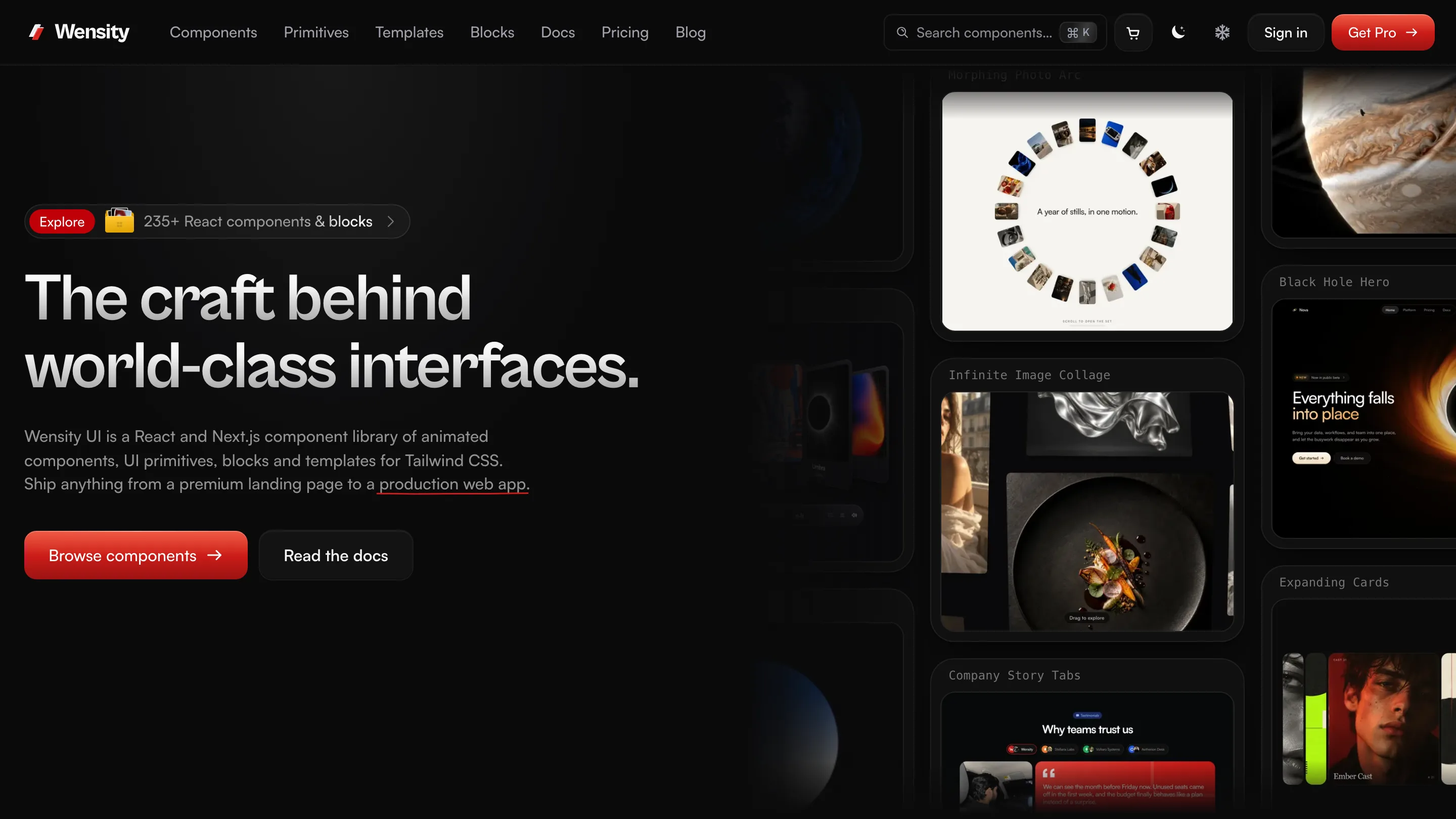
Wensity Icons is the best Heroicons alternative when you want the same light look with about three times as many icons. Both draw a 1.5px stroke on a 24px grid, so a Wensity icon sits comfortably next to a Heroicon. Wensity has 1,000 icons to Heroicons' 324, and adds a duotone style to outline and solid. 50 are free in every style.
Heroicons is a free starter set done very well. Wensity is the same weight of line, with room to grow and a third style.
What is Heroicons?
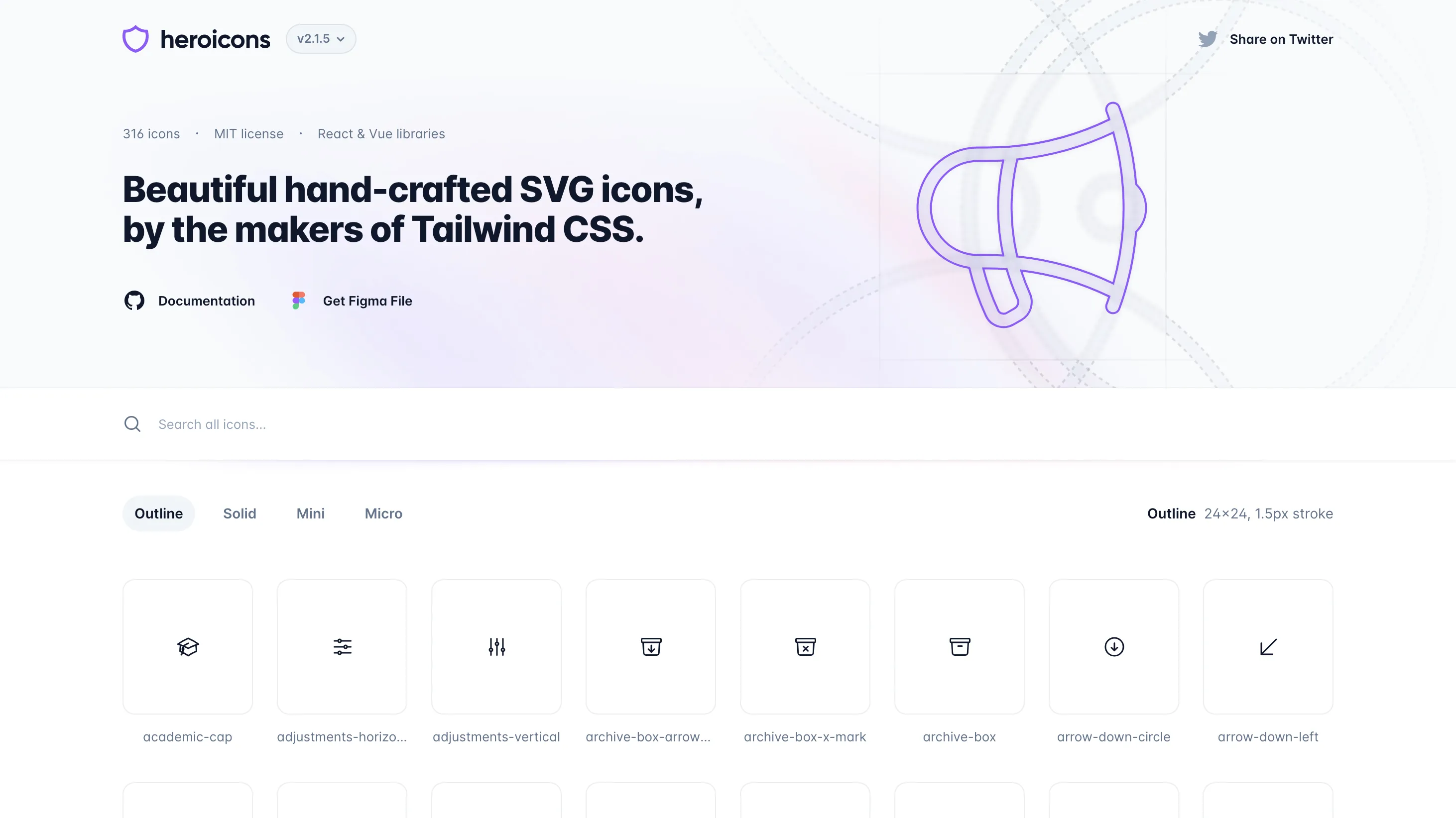
Heroicons is an MIT licensed icon set made by Tailwind Labs, the company behind Tailwind CSS. Version 2.2 has 324 icons, each in four cuts: a 24px outline with a 1.5px stroke, a 24px solid, a 20px mini and a 16px micro. It ships React and Vue packages, plain SVG files and a Figma file.
Heroicons vs Wensity Icons: quick comparison
| What you are comparing | Heroicons | Wensity Icons |
|---|---|---|
| Icons | 324, all free | 1,000, 50 free |
| Styles | Outline, solid, mini, micro | Outline, duotone, solid |
| Stroke | 1.5px on 24px | 1.5px on 24px |
| Small sizes | Redrawn 20px and 16px sets | The 24px drawing scaled down |
| License | MIT | Free to use, not open source |
| Frameworks | React, Vue, SVG | React, SVG |
Outline, solid and the missing duotone
Heroicons covers the classic pair. Outline for most of the interface, solid for selected or emphasised states, and the mini and micro sets for buttons and dense tables, where they are hand tuned for 20px and 16px. That last part is a real strength.
What it does not have is duotone. Wensity's duotone keeps the outline and lays a 30% fill of the same color underneath, which gives feature lists, empty states and settings rows a little more presence without the weight of solid.
Six free Wensity icons, live. The middle row is the style Heroicons does not have.
When Heroicons runs out of icons
With 324 icons, Heroicons covers the everyday interface well. The gaps show in product work: charts, developer tools, health, travel, devices, files and commerce beyond a cart and a card. The usual fix is to mix in another set, and that is where the look starts to drift.
Wensity has 1,000 icons across categories from arrows and layout to science, food and sports, all at the same stroke and corner style. Because the line weight matches Heroicons, you can also fill your gaps with Wensity and keep Heroicons where it already works.
Tailwind CSS icons in React: Heroicons vs Wensity
In React, Heroicons is an npm package. You import from the folder that matches the size and style.
import { HomeIcon } from "@heroicons/react/24/outline";<HomeIcon className="size-6 text-gray-500" />
Wensity writes each icon into your project instead, so there is no package and the file is yours to edit. Tailwind classes work the same way: the icon draws in currentColor, so text color tints it and size-* sizes it.
npx wensity@latest icons add home --style duotone
import { IconHomeDuotone } from "@/components/wensity/icons/home-duotone";<IconHomeDuotone className="size-6 text-gray-500" />
More on sizing, sprites and labels is in the icons docs, and coding agents can add icons through the Wensity MCP server.
License and price
Heroicons is free under the MIT license, including redistribution. Wensity's 50 free icons are free for commercial and client work with no credit, but not open source, so they cannot be republished as an icon set. The other 950 come with Wensity Pro, $169 a year or $199 once, which also covers 115 React components and 87 page blocks built with Tailwind CSS. See the license and pricing.
Switching from Heroicons: icon names
Many names are the same, such as home, bell, user, heart, star, calendar, folder, camera, check-circle and sparkles. These common ones differ. Every Wensity icon in the table is free.
| Heroicons | Wensity |
|---|---|
magnifying-glass | search |
bars-3 | menu |
cog-6-tooth | settings |
x-mark | close |
pencil-square | edit |
document-duplicate | copy |
arrow-down-tray | download |
arrow-up-tray | upload |
funnel | filter |
ellipsis-horizontal | more-horizontal |
arrow-path | refresh |
information-circle | info-circle |
exclamation-triangle | alert-triangle |
lock-closed | lock |
arrow-right-start-on-rectangle | log-out |
envelope | mail |
chat-bubble-left | chat |
paper-airplane | send |
photo | image |
code-bracket | code |
Try the free icons
Set the style to duotone and click any icon to copy it as SVG or JSX. No account needed.
What does Heroicons do best?
- Craft. A small set where every icon is clearly considered.
- Small sizes. Mini and micro sets redrawn for 20px and 16px, not just scaled.
- Free and open. MIT licensed, with React and Vue packages.
- Tailwind fit. Made by the same team, so it matches Tailwind UI and Tailwind Plus out of the box.
Who should pick Wensity Icons, and who should stay with Heroicons
Pick Wensity Icons if
- You keep hitting icons Heroicons does not have.
- You want a duotone style at the same line weight.
- You prefer icon files in your repo over a package.
- You also want React components and blocks in the same style.
Stay with Heroicons if
- Its icons already cover your app.
- You need redrawn 16px and 20px icons.
- You build with Vue, or need MIT licensed icons.
Other Heroicons alternatives
- Lucide. Much bigger and free, with a 2px stroke and no solid style. Read Lucide vs Wensity Icons.
- Tabler Icons. The usual pick when Heroicons is too small: thousands of free MIT outline icons, with filled versions of many.
- Phosphor. Free and MIT, with six weights including duotone.
- Hugeicons. A very large paid library with a free tier. Read Hugeicons vs Wensity Icons.
The whole Wensity set, with its drawing rules, is on the Wensity icons page.
Common questions about Heroicons alternatives
Same line weight, more icons
Put a Wensity icon next to a Heroicon on one of your screens. If you cannot tell which is which at a glance, you have your answer.
Heroicons is made by Tailwind Labs and is not connected to Wensity. Its icon counts, styles and license were checked on heroicons.com, its GitHub repository and its npm package on November 18, 2026 and can change, so please check heroicons.com. Views on design are our own. See our other comparisons.