 Black Friday is here 🔥 Get

What is the best Bootstrap Icons alternative?
For React and Next.js, Wensity Icons is the best Bootstrap Icons alternative when you need every icon in every style. Each of its 1,000 icons is drawn in outline, duotone and solid on a 24px grid, and installs as a React file in your project. Bootstrap Icons has a filled version for only about a third of its set and no duotone. 50 Wensity icons are free in all three styles.
Bootstrap Icons gives you a lot for free, mostly in one style. Wensity gives you three matching styles for every icon, built for React.
What is Bootstrap Icons?
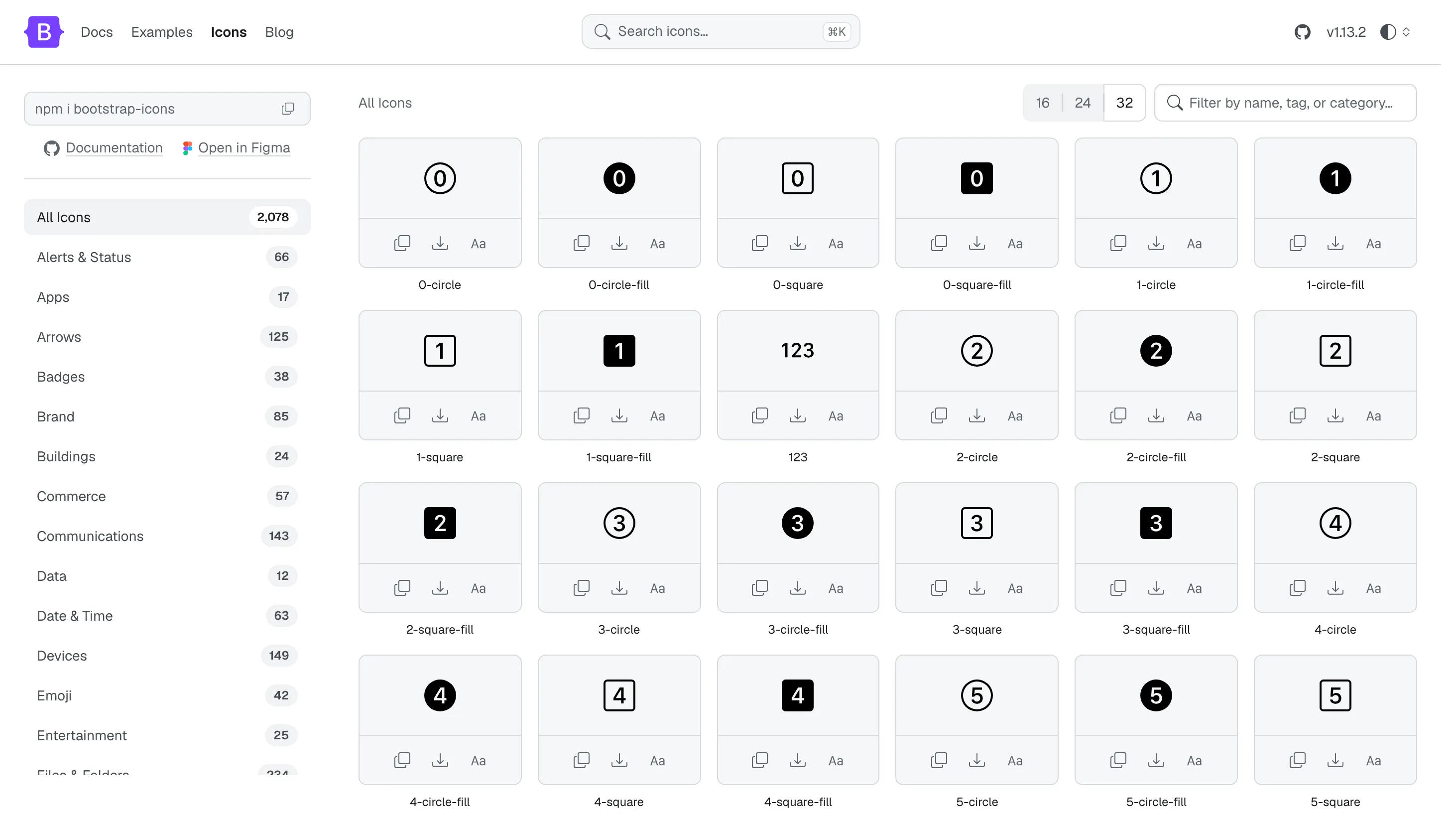
Bootstrap Icons is the official, MIT licensed icon library of the Bootstrap project. Version 1.13 has 2,078 icons in categories from arrows and devices to weather and brands, drawn on a 16 by 16 grid. It ships as SVG files, an SVG sprite, an icon font and CSS, and it is the usual choice for Bootstrap 5 icons. It replaced Glyphicons, the icon font Bootstrap 3 used to include.
Bootstrap Icons vs Wensity Icons: quick comparison
| What you are comparing | Bootstrap Icons | Wensity Icons |
|---|---|---|
| Icons | 2,078, all free | 1,000, 50 free |
| Styles | Outline, with a fill version for 670 | Outline, duotone and solid for every icon |
| Grid | 16px, drawn as filled shapes | 24px, 1.5px stroke |
| React | No official package | CLI writes .tsx files, or copy JSX |
| Icon font | Yes, with a CDN link | No, SVG only |
| Brand logos | 85 | None, interface icons only |
| License | MIT | Free to use, not open source |
Fill, outline and duotone
In Bootstrap Icons, the outline is the main style. Some icons, such as heart, star and bell, also have a -fill twin, but 1,408 icons do not. That shows up the moment you build a tab bar or a selected state: some tabs can go solid and the next one cannot.
Wensity draws every icon three times. Solid for selected states, outline for the rest of the interface, and duotone, which keeps the outline and adds a light fill of the same color underneath. Duotone icons are handy for feature lists and empty states, where outline feels thin and solid feels heavy.
Six free Wensity icons, live, in all three styles. The duotone row is the one Bootstrap Icons has no version of.
Drawn for 16px vs drawn for 24px
Bootstrap Icons are designed on a 16 by 16 grid, which makes them crisp at small text sizes. Every shape is a filled path, not a stroke, so the line weight is fixed in the drawing and cannot be changed with CSS.
Wensity icons are designed at 24px with a 1.5px stroke and rounded joins, the size most React apps and Tailwind CSS layouts use for navigation and buttons. If your interface lives at 20 to 24px, they will look a little lighter and more even than a 16px drawing scaled up.
React Bootstrap Icons vs Wensity in React
The Bootstrap team does not publish a React package. The common route is react-bootstrap-icons, a community package that wraps each SVG in a component. It was last published in May 2025, so new icons can take a while to arrive.
import { House } from "react-bootstrap-icons";<House size={24} className="text-neutral-500" />
Wensity writes the icon into your project instead. There is no package to keep up to date, and the file is plain React you can edit. The icon draws in currentColor, so Tailwind text color classes tint it and size-* sets its size.
npx wensity@latest icons add home --style duotone
import { IconHomeDuotone } from "@/components/wensity/icons/home-duotone";<IconHomeDuotone className="size-6 text-neutral-500" />
The icons docs cover sizing, labels and sprites, and AI coding agents can add icons through the Wensity MCP server.
Bootstrap Icons CDN and icon font vs SVG
A big reason people like Bootstrap Icons is the one line setup: add the CDN stylesheet, then write <i class="bi bi-house"> anywhere. For a static site or a quick prototype, that is hard to beat.
The trade off is that the browser downloads the whole font, every icon in the set, to show the ten you use, and an icon font needs extra care so screen readers skip it. Wensity is SVG only: you ship just the icons you add, each one sharp at any size. For pages without React, every free icon can be copied as plain SVG from the icon browser, and Pro includes one SVG sprite per style.
License and price
Bootstrap Icons is free under the MIT license, including redistribution. Wensity's 50 free icons are free for personal, commercial and client work without credit, but they are not open source, so you cannot republish them as an icon set. The other 950 come with Wensity Pro, $169 a year or $199 once, together with 122 React components and 88 page blocks. Read the license or see pricing.
Switching from Bootstrap Icons: icon names
Plenty of names carry over unchanged, including search, bell, heart, star, calendar, clock, folder, lock, camera, eye and trash. These are the common ones that are named differently. Every Wensity icon below is free.
| Bootstrap Icons | Wensity |
|---|---|
bi-house | home |
bi-list | menu |
bi-gear | settings |
bi-x-lg | close |
bi-pencil | edit |
bi-funnel | filter |
bi-three-dots | more-horizontal |
bi-arrow-clockwise | refresh |
bi-link-45deg | link |
bi-box-arrow-up-right | external-link |
bi-exclamation-triangle | alert-triangle |
bi-person | user |
bi-people | users |
bi-box-arrow-right | log-out |
bi-envelope | mail |
bi-file-earmark | file |
bi-cart | shopping-cart |
bi-stars | sparkles |
Try the free icons
Pick outline, duotone or solid and click an icon to copy its SVG or JSX. No sign up.
What does Bootstrap Icons do best?
- A big free set. 2,078 icons at no cost, more than Wensity gives away.
- Setup in one line. The icon font and CDN work in any HTML page.
- Brand logos. 85 of them, from GitHub to Spotify.
- Small sizes. Drawn on a 16px grid, so they stay clear next to body text.
- Open and maintained. MIT, from the Bootstrap team, with a Figma file.
Who should pick Wensity Icons, and who should stay with Bootstrap Icons
Pick Wensity Icons if
- You build with React or Next.js and Tailwind CSS.
- You need a filled or duotone version of every icon you use.
- Your interface uses icons at 20 to 24px.
- You want icons that match Wensity components and blocks.
Stay with Bootstrap Icons if
- Your site uses Bootstrap or plain HTML and the icon font suits you.
- You need brand logos alongside your interface icons.
- You need a large, MIT licensed set for free.
Other Bootstrap Icons alternatives
- Font Awesome. The other classic icon font, with many more brand logos and a paid Pro set. Read Font Awesome vs Wensity Icons.
- Lucide. Free and MIT, with an official React package and a 2px stroke. Read Lucide vs Wensity Icons.
- Heroicons. A small, polished set from the Tailwind CSS team, with solid versions. Read Heroicons vs Wensity Icons.
- Tabler Icons. Thousands of free MIT outline icons with filled versions of many.
- Phosphor. Free, with six weights including duotone.
The full set and the rules it is drawn by are on the Wensity icons page.
Common questions about Bootstrap Icons alternatives
Every icon, every style
Swap the icons in one tab bar for Wensity duotone and selected solid. It is the quickest way to see whether the extra styles matter to your app.
Bootstrap Icons is made by the Bootstrap team and is not connected to Wensity. Its icon counts, file formats and license were checked on icons.getbootstrap.com and its npm package on November 20, 2026 and can change, so please check icons.getbootstrap.com. Views on design are our own. See our other comparisons.