The Anatomy of Apple's Design Language

A plain English breakdown of what actually makes Apple's design language feel like Apple, from Liquid Glass to purposeful motion, and how to bring the same principles into your own product.
Apple's design does not feel like a set of rules. It feels like a mood. Clean, calm, a little glassy, and somehow the same whether you are looking at a phone, a laptop, or a watch. That feeling is not an accident. It comes from a small set of principles that Apple applies with unusual discipline across every product it ships.
This guide breaks that feeling down into its actual parts, in plain language, and shows how each part shows up in real interface work you can build today.
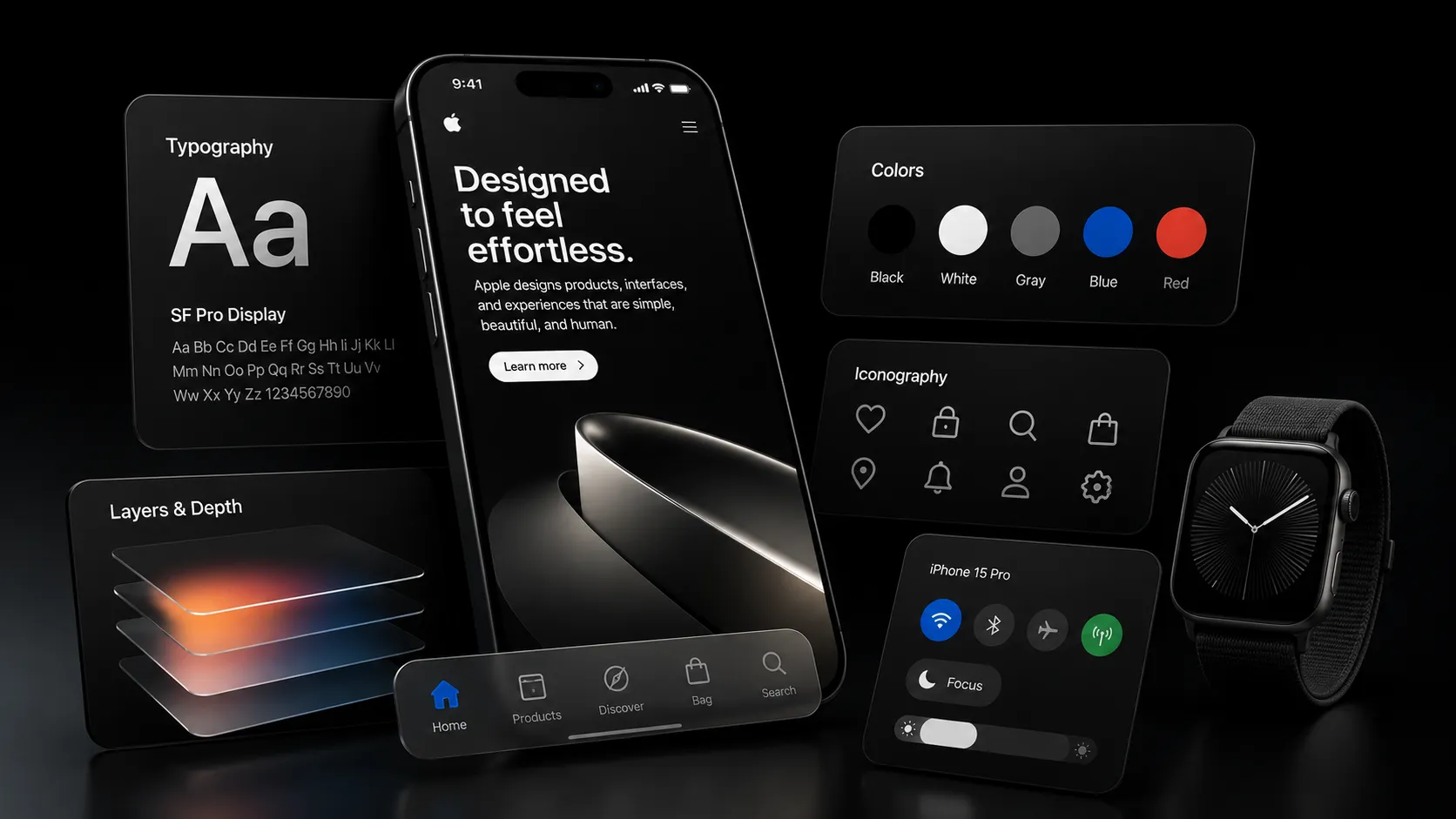
Apple's design language is built on five ideas: content comes first, materials feel honest and physical, motion always has a reason, typography stays quiet and confident, and everything looks consistent across every device. Together these ideas are why Apple's software feels like one connected thing instead of a pile of separate apps.
A quick note on where this design language is today
Apple's visual style has changed shape a few times. Early iOS leaned on skeuomorphism, where buttons looked like real leather and paper. iOS 7 flipped that into flat, colorful, minimal screens. In 2025, Apple introduced its newest chapter, a material called Liquid Glass, now used across iOS, iPadOS, macOS, watchOS, tvOS, and visionOS.
Liquid Glass controls float above your content as translucent glass layers instead of solid colored blocks, so the content underneath always stays the visual lead. The material reacts to light and motion, bending and highlighting like real glass would, and it is built to look and feel consistent whether you are holding a phone or wearing a headset.
The tools changed, but the underlying principles behind them have stayed remarkably stable for over a decade. That stability is really what "Apple's design language" means.
The five parts of the anatomy
1. Content always comes first
Apple's interface chrome, meaning buttons, bars, and controls, is built to stay out of the way. Controls are translucent and float above the content instead of sitting in a solid box that competes with it. The screen is meant to feel like it belongs to your photo, your message, or your song, not to the app around it.
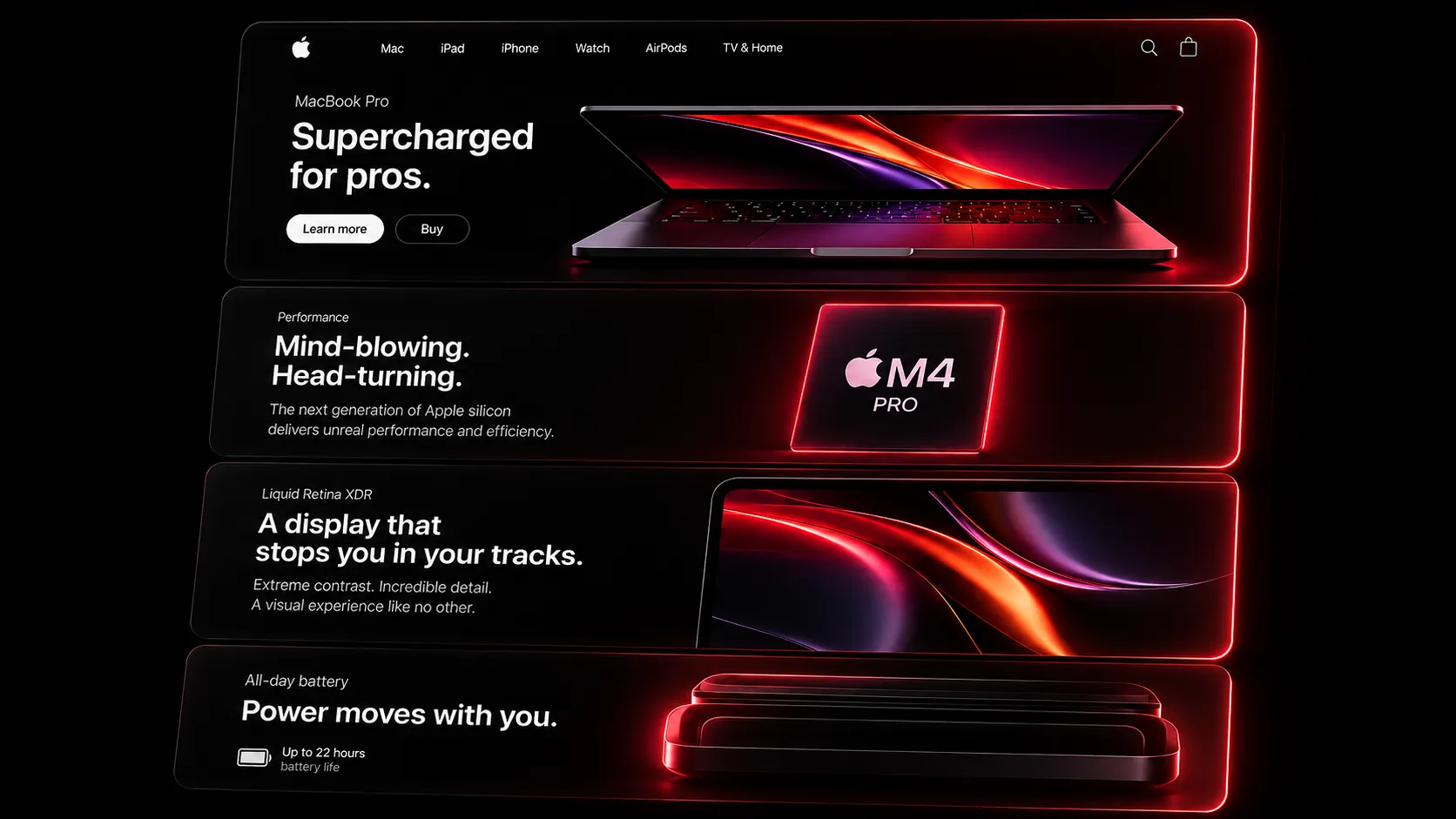
For a product page or a marketing site, this translates into a simple habit: let the product be the loudest thing on the screen. Navigation, badges, and buttons should feel like a quiet frame, not a second headline competing with your actual content.
2. Materials that feel honest and physical
Apple treats digital surfaces like they have real physical properties. Glass looks like it refracts light. Buttons feel like they have weight when you press them. Nothing is decoration for its own sake, every material choice is meant to describe what the object does.
This is the part most people copy badly. A blurred, semi-transparent panel dropped onto a page is not automatically "Apple style." Real material honesty means the glass effect responds to what is behind it, adapts to light and dark backgrounds, and only appears where it actually helps separate one layer from another.
3. Motion that always has a reason
Nothing moves on an Apple screen just to look impressive. A sheet slides up because it is entering from the bottom of your view. A button springs slightly because it is confirming your tap landed. Motion in Apple's language is almost always explaining a spatial or state change, not decorating an otherwise static screen.
This is where Apple's marketing pages get interesting for web and product teams, because the same rule applies at scale. Scroll-scrubbed product reveals, like the ones on the AirPods Pro or iPhone pages, exist because they let scroll position directly control the story instead of playing an animation the user cannot control. You can build the exact same technique with Scrubbable Video Reveal, which ties an image sequence to scroll position frame by frame, or with Apple-Style Sticky Scroll, which pins a cinematic section and morphs it in step with how far the user has scrolled, in either direction.
Motion that reports a live status, rather than telling a story, is a different pattern. The Dynamic Island is the clearest example, a small pill that expands, splits, and settles to show what is happening right now, like a timer or a call. You can bring that same ambient status pattern into a product with Dynamic Island Toast, which reuses the pill-morph behavior for in-app notifications and live activity.
If you removed an animation and the interface still made complete sense, the animation was decoration. If removing it would confuse the user about what just happened, the animation was doing its job. Apple's motion almost always passes that second test.
4. Typography that stays quiet and confident
Apple's type system, built on San Francisco, is designed to disappear into the background. Sizes are generous, weight is used to build hierarchy instead of color, and line spacing gives every paragraph room to breathe. The type never competes with imagery or the product itself for attention.
The practical lesson here is restraint. Most interfaces do not need five font sizes and three font weights fighting on one screen. A handful of well-chosen sizes, one strong weight for headings, and generous spacing will get an interface most of the way to feeling calm and considered.
5. Consistency across every device
The same rounded corners, the same spacing rhythm, the same glass material shows up whether you are on a five-inch phone or a twenty-seven-inch display. Apple's rounded UI corners are even designed to echo the physical rounded corners of the hardware itself, so software and hardware feel like one continuous object rather than a screen bolted onto a case.
That same instinct is why product marketing pages so often show the product itself rendered with obsessive hardware accuracy. A Macbook Mockup that hinges open and lights up on hover works precisely because it borrows this idea, the device on your marketing page should look and behave like the real, physical object your customer already knows. More device mockups and depth effects are collected in React 3D components.
Where a conversational layer fits in
Apple's more recent interfaces also had to solve a newer problem: how do you visually represent an AI assistant that is always listening but rarely fully "on screen"? Siri's answer is a soft, glowing, glass-like orb rather than a chat bubble or a static icon. It pulses gently to show it is alive without shouting for attention, which fits the same "quiet confidence" rule that governs the rest of the system.
If you are building an AI feature into your own product, Siri Orb is a ready-made version of that idea, a glassy animated sphere that gives an AI presence a calm, ambient personality instead of a loud, attention-grabbing one. The rest of that kit, from prompt inputs to model pickers and voice orbs, lives in React AI chat UI components.
Common mistakes when copying Apple's style
Bringing this into your own product
Start with hierarchy, not decoration
Decide what the user's eye should land on first. Everything else, including any glass effect or animation, should support that one thing instead of competing with it.
Use motion to explain, not to impress
Before adding any animation, ask what state change it is communicating. If there is a clear answer, keep it. If not, cut it.
Borrow the patterns that already carry meaning
Scroll-linked storytelling, ambient status pills, and calm AI presence are proven patterns, not just visual trends. Components like Scrubbable Video Reveal, Apple-Style Sticky Scroll, Dynamic Island Toast, and Siri Orb let you use these patterns without building the underlying motion logic from scratch.
Sweat the hardware details
If your product has a physical form, showing it accurately, down to the hinge and the screen glow, does more for perceived quality than almost any other visual choice on the page.
Frequently asked questions
The bottom line
Apple's design language is not a texture or a color palette, it is a set of decisions repeated with discipline across every product. Content leads, materials behave honestly, motion always explains something, type stays quiet, and everything looks like it belongs to the same family. Once you see those five ideas, you start noticing them everywhere, and you can start applying them to your own work with real components instead of guesswork. Browse the full component library for more Apple-inspired, motion-driven patterns, or start from the getting started guide if this is your first time installing one.

Author Parth Sharma
Full-Stack Developer, Freelancer, & Founder. Obsessed with crafting pixel-perfect, high-performance web experiences that feel alive.
Enjoyed this article?
Related articles
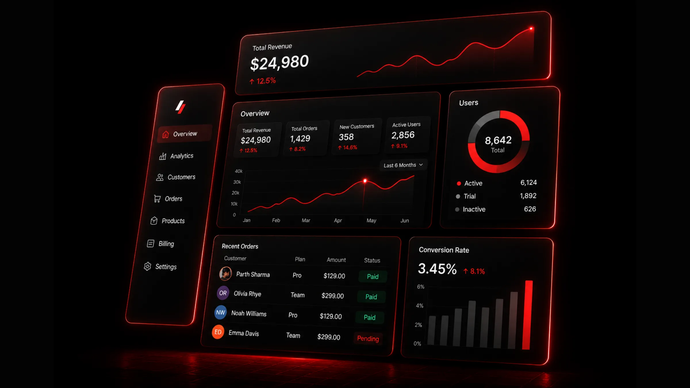
Building Beautiful SaaS Dashboards with Next.js and Tailwind CSS
A practical guide to designing and building modern SaaS dashboards with Next.js, Tailwind CSS, responsive layouts, reusable components, data states, and production-ready UX patterns.
Read article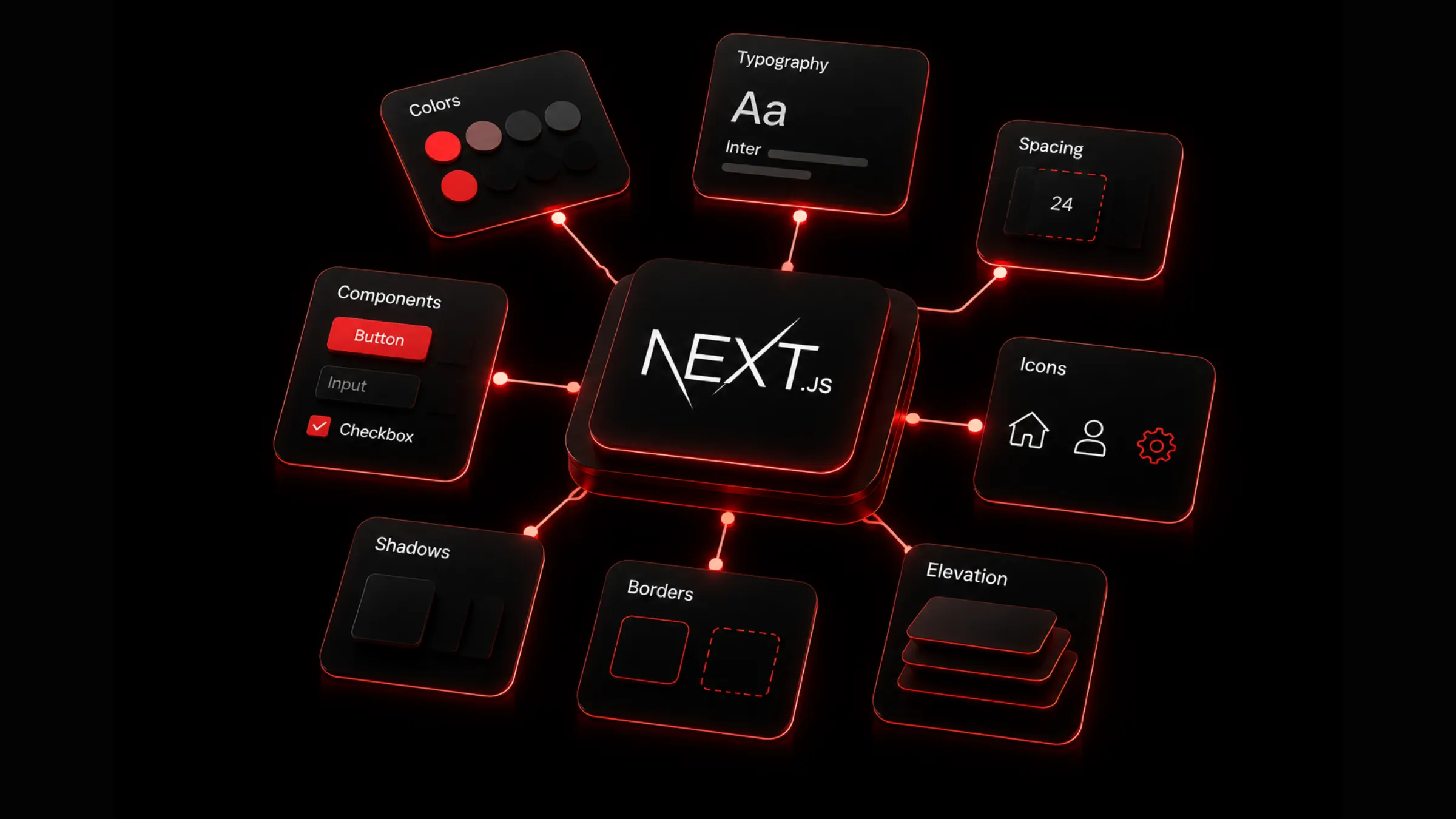
Build a Scalable React Design System
A practical blueprint for building a scalable design system with React, Tailwind CSS, design tokens, reusable components, accessibility rules, documentation, and governance.
Read article