10 Best React UI Component Libraries in 2026

A clear, no-fluff ranking of the best React UI component libraries in 2026, with real pricing, open source status, and what each one is actually good for.
Picking a React UI library used to be simple. You picked Material UI or Bootstrap and moved on. In 2026 the choice is much wider, and much more interesting. There are libraries built for enterprise dashboards, libraries built purely for motion and animation, and libraries that hand you raw source code instead of a package you install and forget about.
This guide ranks the ten React UI component libraries actually worth your time this year, with real pricing pulled straight from each vendor, honest notes on what each one is good at, and what it is not.
If you want production ready, motion rich components with a real CLI and a free tier, start with Wensity UI. If you want fully free and open source with zero budget, daisyUI, SmoothUI, and Wigggle UI cost nothing. If you want animation heavy landing page components, Aceternity UI and React Bits lead that category.
How this list was built
Every library below was checked directly against its own pricing page, GitHub repository, or documentation site rather than pulled from an old blog post. Pricing is listed as the standard list price, with promo codes and limited time discounts left out on purpose, since those expire and would make this guide inaccurate within weeks.
1. Wensity UI
Wensity UI leads this list because it covers both ends of a product, production ready, motion rich UI like cinematic interactions and elite micro-interactions, plus a full set of 56 open-code primitives, buttons, inputs, dialogs, forms, data tables, and more, so a team can build an entire app from one library instead of stitching several together. The motion is physics based rather than basic CSS transitions, and everything installs through its own dedicated CLI with a genuinely designed terminal experience, boxed output, spinners, and formatted tables.
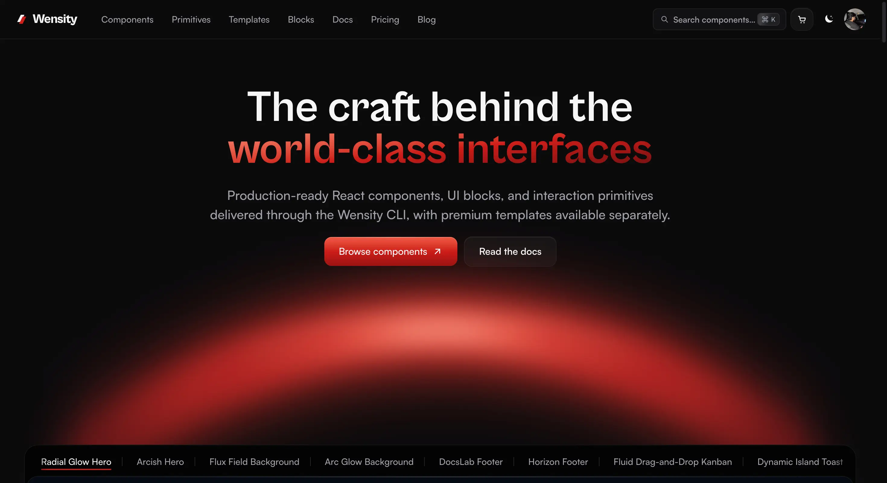
Wensity UI homepage showing its premium components, blocks, and templates
- Free tier: free forever, no card required, includes the free component catalog and CLI installs.
- Pro Annual: $169 per year, unlocks the full premium catalog.
- Pro Lifetime: $199 one-time, permanent access with all future updates.
- Teams: contact sales for org-wide licensing.
Browse the component library or check the full pricing breakdown to see what is included at each tier. For whole page sections, the React hero section and React pricing section guides walk through every option.
2. Aceternity UI
Aceternity UI is the clearest choice if your priority is an animated, high impact marketing or landing page. It covers three distinct layers: standalone effect components like 3D Card Effect, Aurora Background, Background Beams, Hero Parallax, and Text Generate Effect; shadcn-compatible section blocks for hero, pricing, testimonials, bento grids, and navbars; and full templates for AI SaaS, agency, and portfolio sites. Everything is built on Framer Motion, Tailwind CSS, and shadcn conventions, using a copy-paste model, so there is no npm package to install and no attribution required.
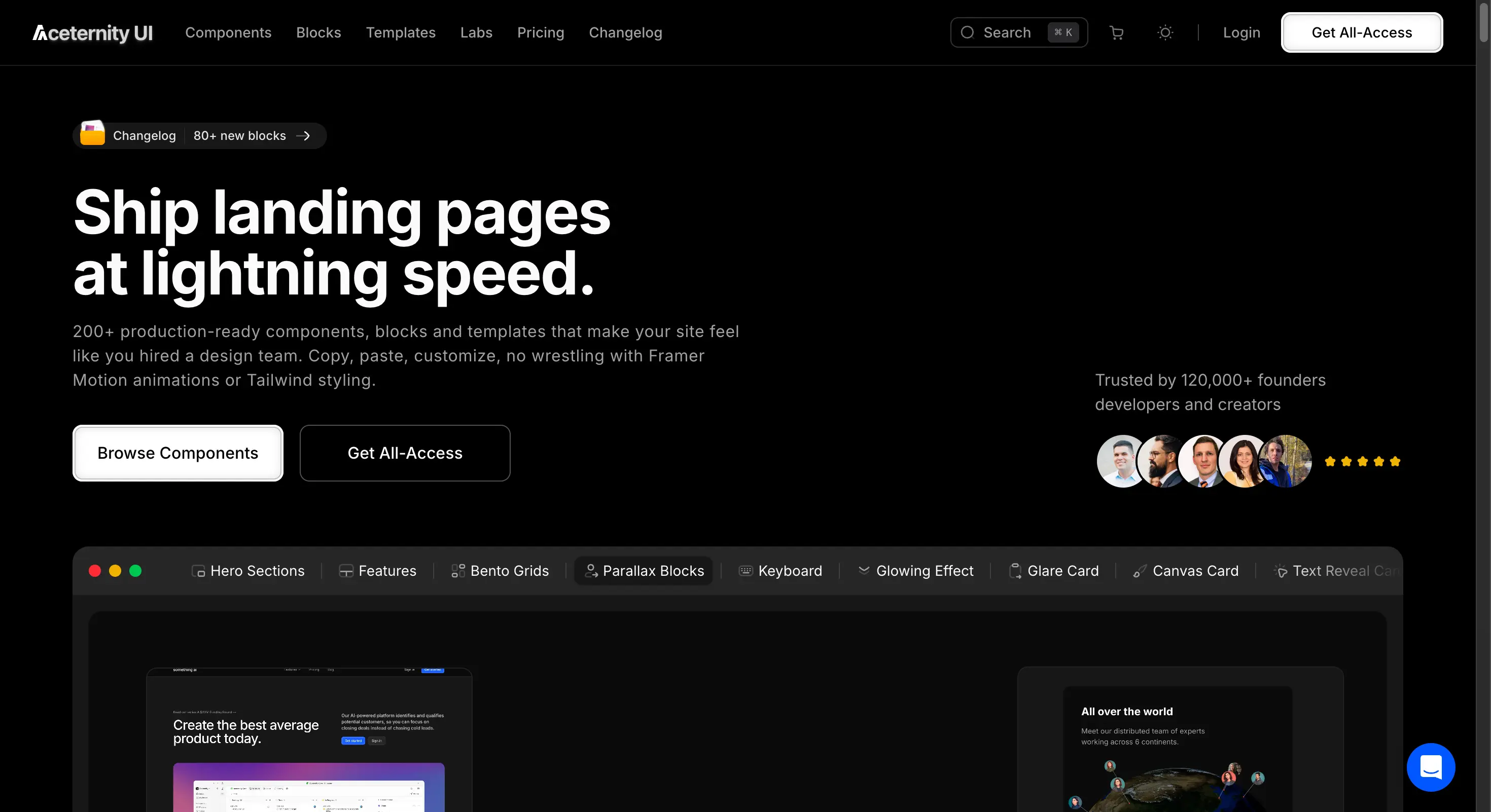
Aceternity UI homepage showing its Tailwind CSS and Framer Motion component library
- Free tier: yes, MIT licensed, full commercial use allowed.
- Pro or All-Access: $199 one-time, adds templates, premium blocks, and email support.
- Best for: hero sections, scroll effects, and animated marketing pages rather than dense application UI.
3. React Bits
React Bits covers similar ground to Aceternity UI, animated and interactive components organized into four categories: text animations, general animations, UI components, and backgrounds. Every component ships in four variants, JS with CSS, JS with Tailwind, TS with CSS, and TS with Tailwind, so it fits whatever stack you are already running, and installs through either the shadcn CLI or jsrepo. Its paid tier is structured differently from most on this list, with three separate lifetime plans instead of one bundle.
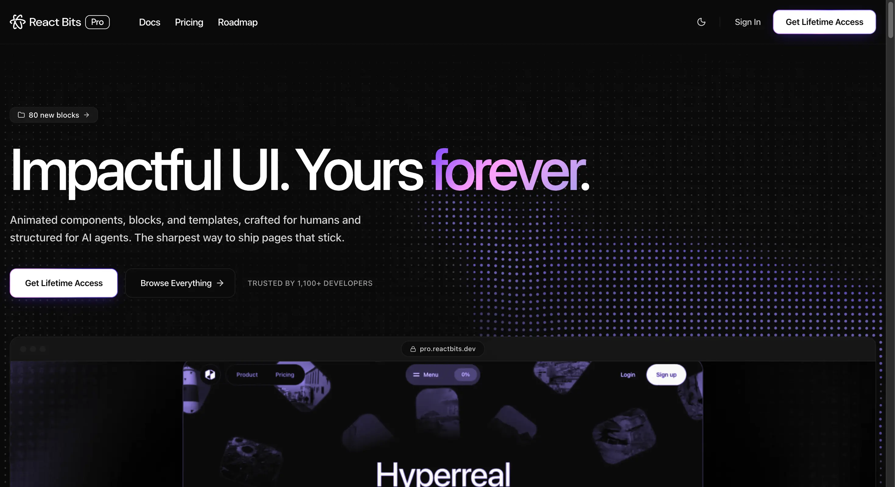
React Bits homepage showing animated React UI components for memorable products
- Free tier: fully open source and MIT licensed, 100+ animated components.
- Starter: $99 one-time, adds Tailwind and vanilla CSS variants across the catalog.
- Pro: $199 one-time, adds 238+ pre-built page blocks across 21 categories.
- Ultimate: $299 one-time, adds 10 complete landing page templates and priority support.
- Best for: teams that want animated components now and full page blocks later, without committing to the top tier upfront.
4. Untitled UI
Untitled UI sits apart from the rest of this list. It is not a free, code-first library, it is described as the largest Figma UI kit and React component library available, pairing a React component set built on React 19, Tailwind CSS v4, and React Aria with a matching Figma kit that includes over 10,000 components and variants and 420+ full page examples. The React side ships 5,000+ components and sections with 250+ page examples, all with built-in dark mode support, aimed at teams that want design and code to stay in sync from day one.
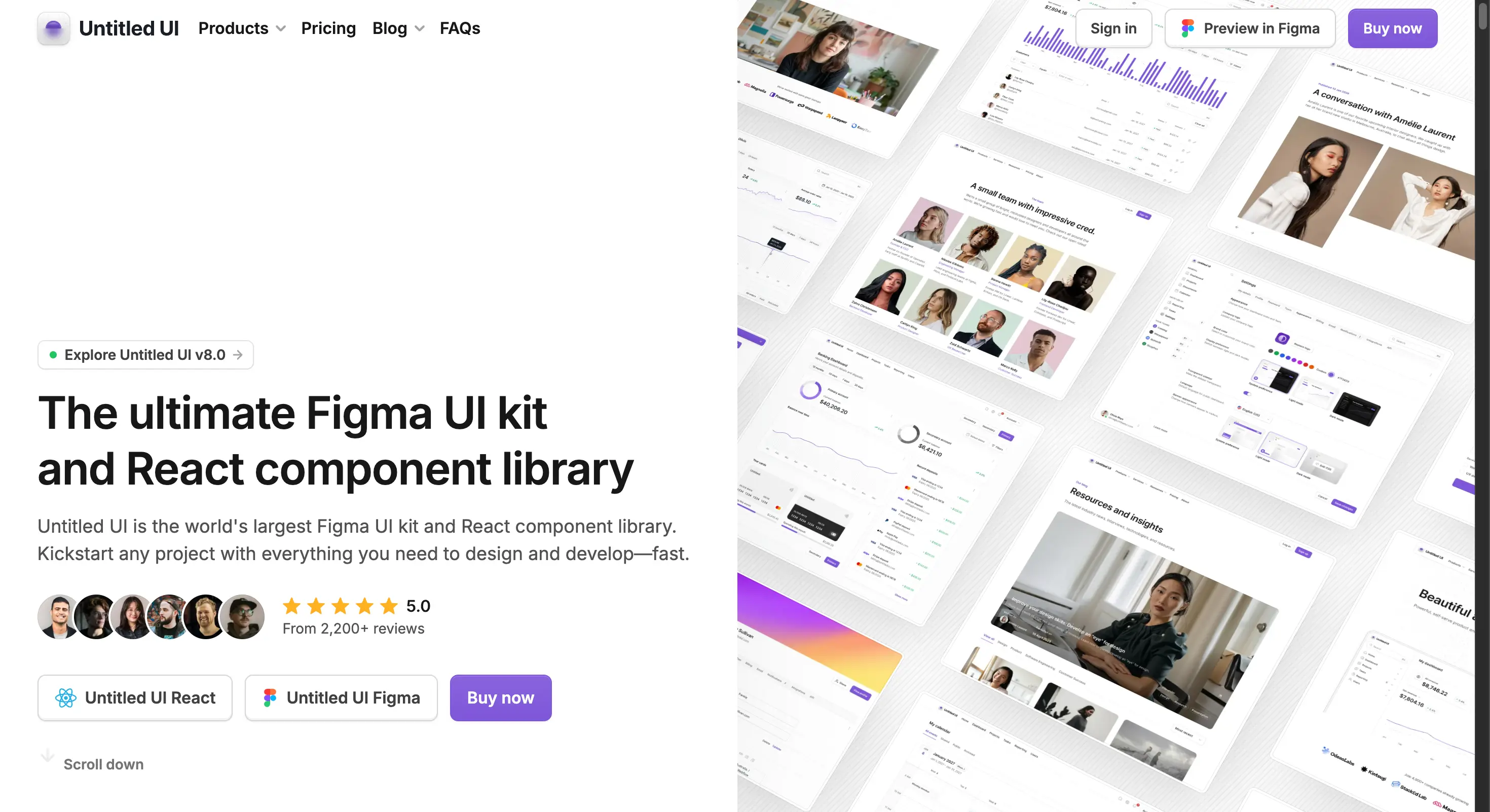
Untitled UI homepage showing its Figma UI kit and React component library
- No meaningful free tier for the React components, though a separate free Figma starter kit exists.
- React license: from $139 for a single user.
- Figma kit: priced separately, from $59, with team and enterprise tiers going up to $999.
- Best for: teams who want one unified design system across Figma and code, not a purely code-first workflow.
5. Tailark
Tailark is a shadcn registry built on Next.js, shadcn/ui, and Tailwind CSS, focused specifically on marketing pages, heroes, pricing sections, testimonials, and similar sections rather than full application UI. It is used in production by teams including Figma, Comp AI, and Creem, which signals it holds up beyond hobby projects.
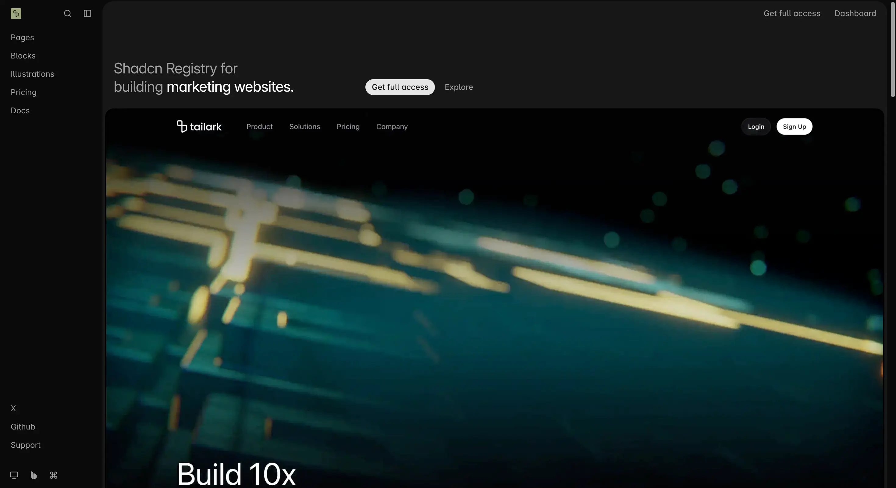
Tailark homepage showing its shadcn/ui component registry for marketing pages
- Free tier: $0, lifetime access, unlimited projects, includes free pages, blocks, and snippets.
- Essentials: $249 one-time, adds premium blocks, snippets, and illustrations.
- Complete: $299 one-time, adds full production-ready pages.
- Team: $499 one-time, adds 10 team seats and priority support.
- Best for: marketing sites that need polished sections fast, built on a shadcn/ui foundation.
6. Wigggle UI
Wigggle UI is a smaller, fully open source library worth knowing about if your budget is genuinely zero. It bills itself as the first open source collection of copy-paste widgets for the web, with 40+ widgets covering calendars, clocks, weather displays, sports scores, and stock market tickers, built with Tailwind CSS and installable straight through the shadcn/ui CLI as fully editable source code.
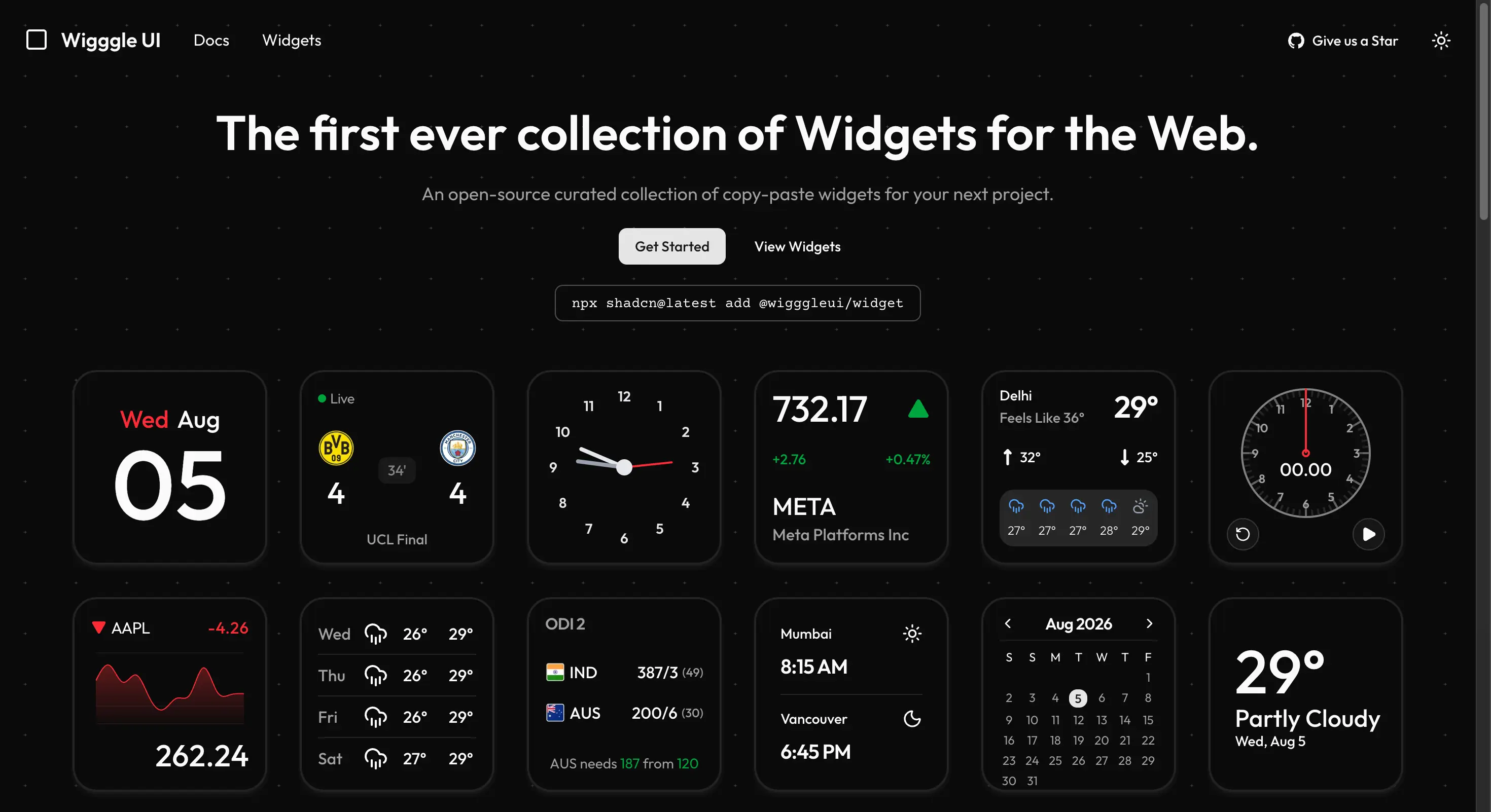
Wigggle UI homepage showing its open source widgets for the web
- Free tier: 100% free, MIT licensed, no pricing model or commercial tier of any kind.
- Best for: developers who want data-widget style components in a shadcn-compatible format without any paid option to think about.
7. daisyUI
daisyUI remains one of the most widely used Tailwind CSS component libraries, and it is completely free with no catch. It is not React-specific, it is a pure CSS Tailwind plugin with zero JavaScript dependency, covering 68 components and 600+ utility classes, plus 35+ built-in themes and a theme generator for custom ones. Because it is just class names like btn and card, it works identically across React, Vue, Svelte, or plain HTML.
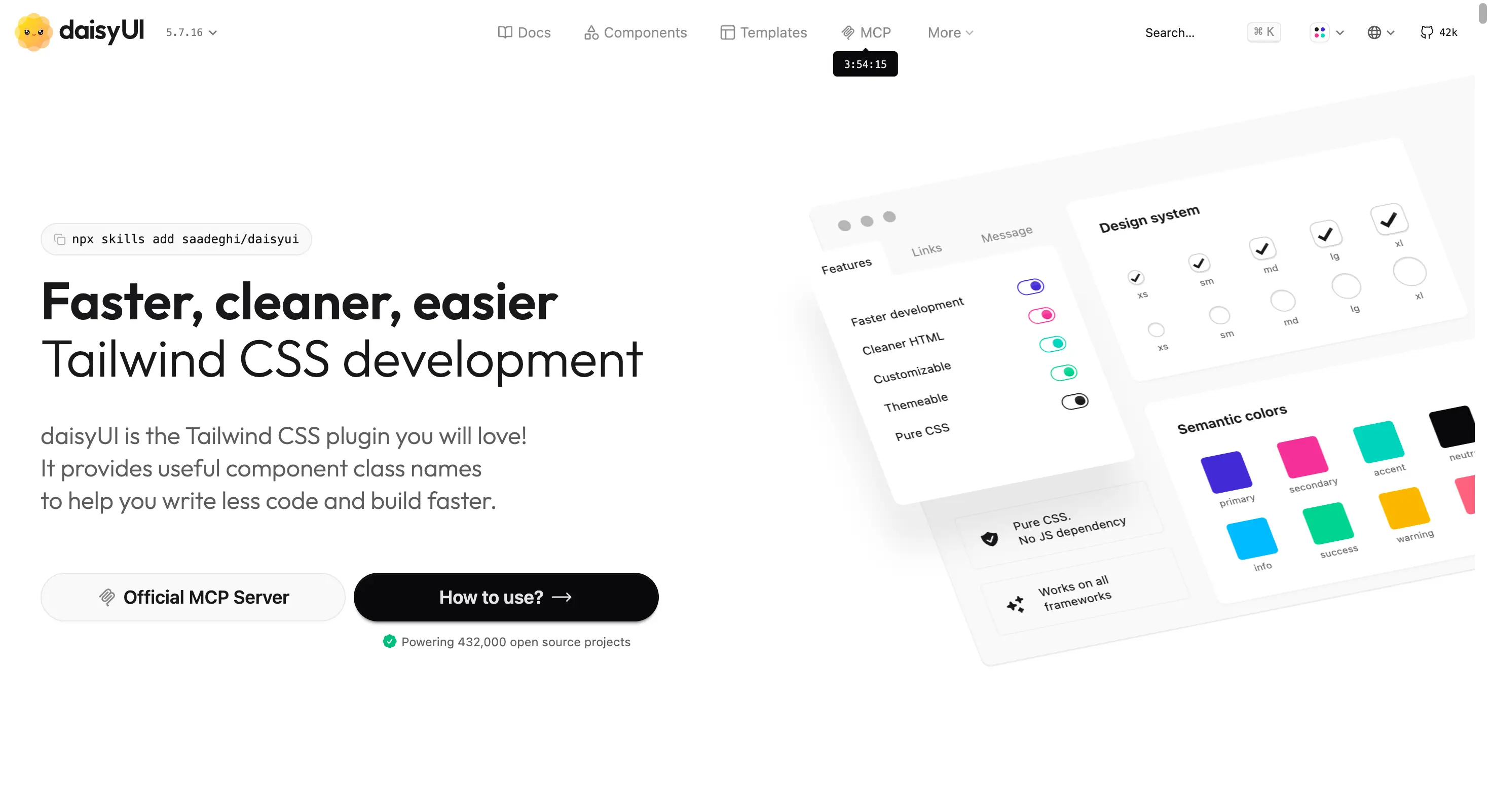
daisyUI homepage showing its Tailwind CSS component library
- Free tier: fully free, open source, MIT licensed, no paid tier for the library itself.
- Optional paid templates: available through an official store starting around $29, separate from the core library.
- Best for: fast prototyping and projects that want a large set of built-in themes, including dark mode, out of the box.
8. SmoothUI
SmoothUI is a newer, fully free and open source library built specifically to drop into a shadcn/ui project. It covers 130+ components plus ready-made blocks for heroes, pricing, testimonials, and footers, built on React 19, TypeScript, and Tailwind CSS v4, with animation handled by a combination of Motion and GSAP that respects reduced-motion preferences. Installation follows shadcn's own CLI pattern, for example npx shadcn@latest add @smoothui/dynamic-island.
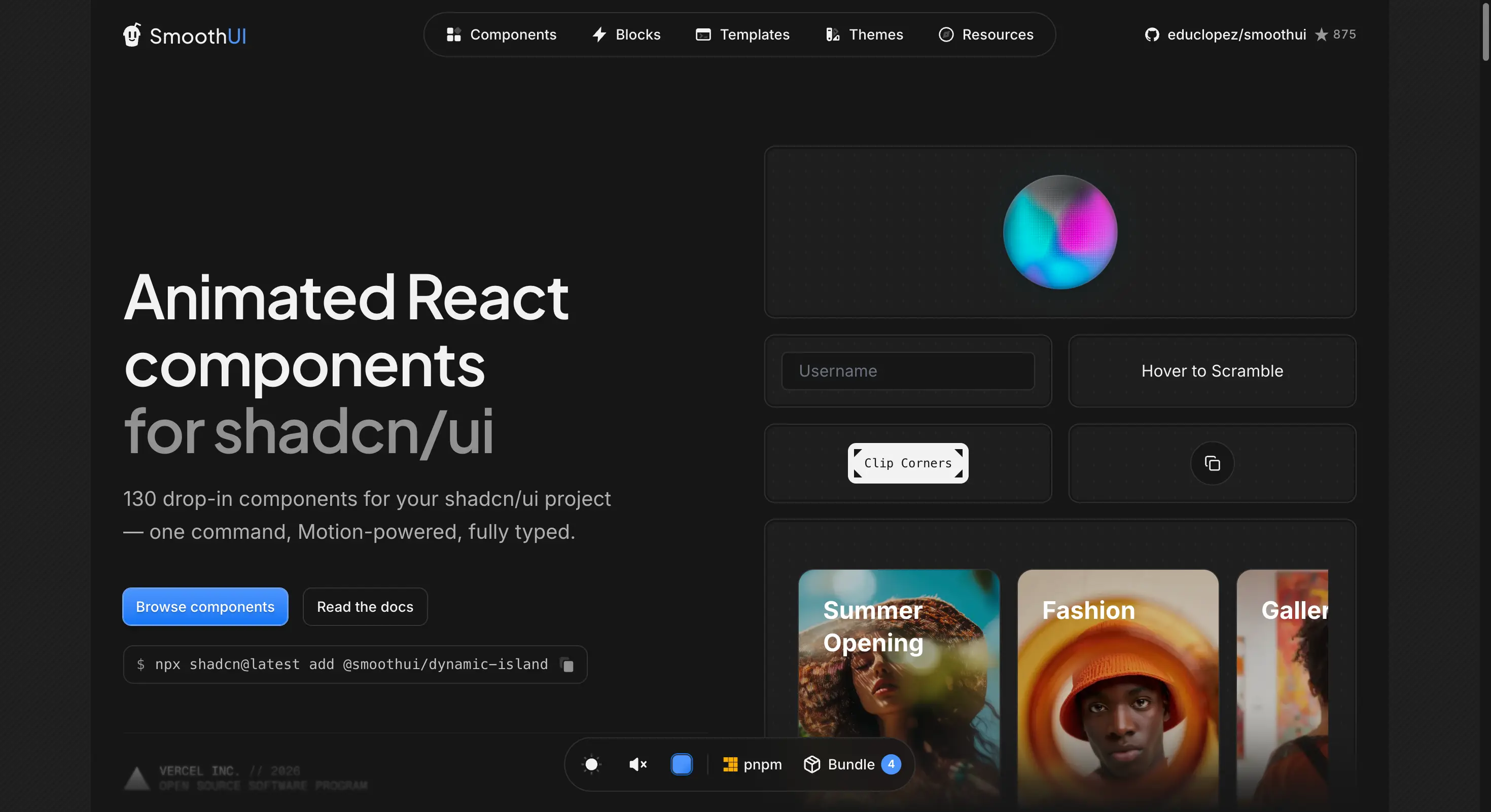
SmoothUI homepage showing animated React components for shadcn/ui
- Free tier: fully free, open source, MIT licensed, no paid tier.
- Best for: teams already using shadcn/ui who want extra animated components without adding a second, incompatible system.
9. Skiper UI
Skiper UI takes a hybrid approach from the start. A meaningful chunk of the library is free, and the rest is a one-time paid unlock, rather than a fully free core with an optional separate paid product. Components are built on Tailwind CSS, Next.js, and Motion.dev, ship as a single self-contained file each with no extra package dependencies, and install through the shadcn CLI, for example npx shadcn add @skiper-ui/skiper40.
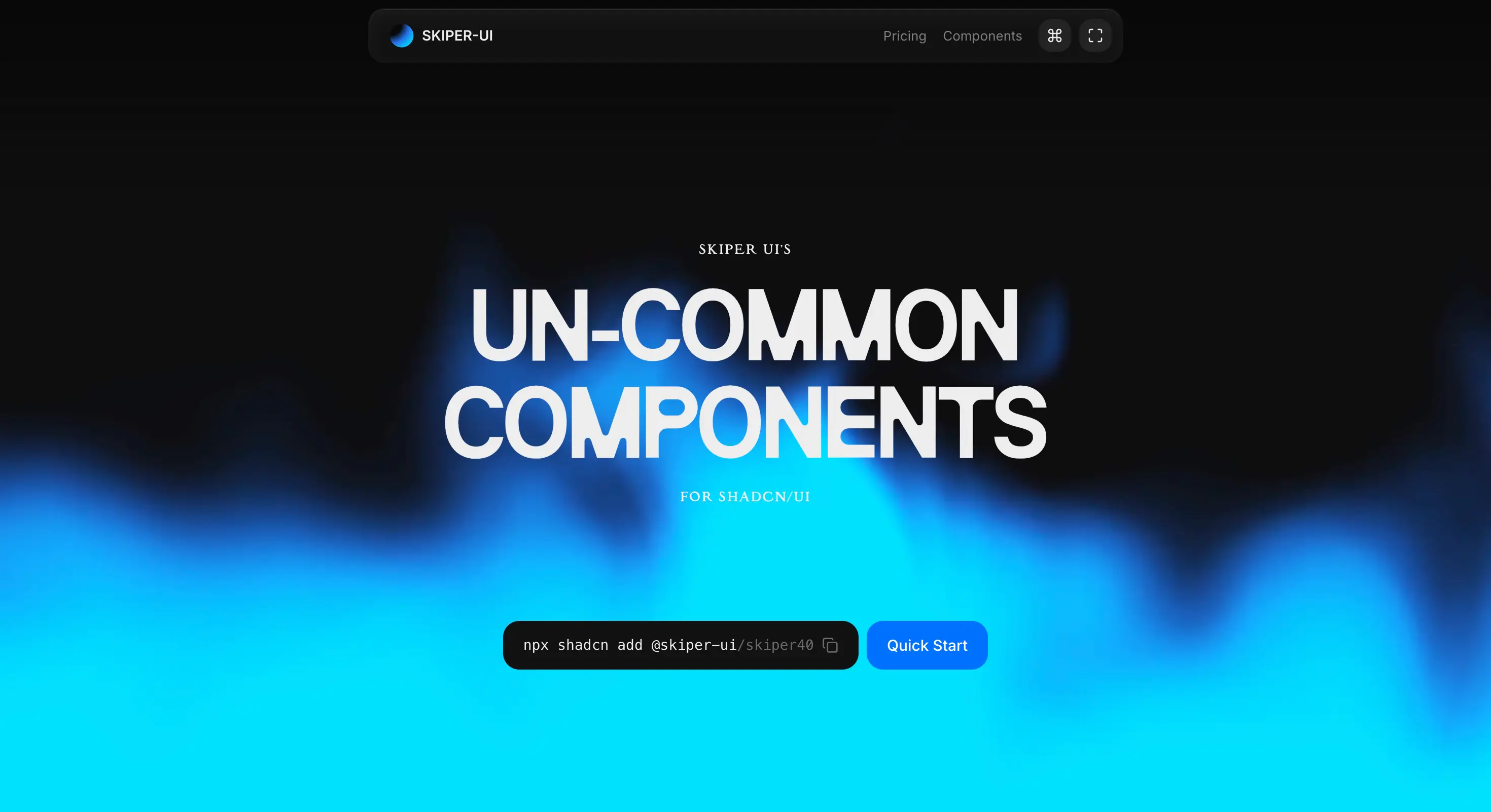
Skiper UI homepage showing uncommon components for shadcn/ui
- Free tier: 24+ components, free to use with attribution to Skiper UI required.
- Pro: $129 one-time, unlocks all 73+ components with no attribution needed, plus lifetime updates.
- Exclusive: $549 one-time, adds Figma source files and full website templates on top of Pro.
- Best for: developers who want uncommon, highly polished motion components and do not mind a smaller free slice to start.
10. Lightswind UI
Lightswind UI has an interesting angle among this group, it leans into being AI native, shipping its own MCP server so tools like Cursor, Windsurf, and Claude can discover and inject its components directly into a project, alongside the usual CLI-first, copy-paste install model, for example npx lightswind@latest add globe. The free tier alone covers 150+ animated, accessible React and Next.js components built with Tailwind CSS, with the paid tiers layering in 3D shader and WebGL elements plus 300+ additional production-ready UI blocks.
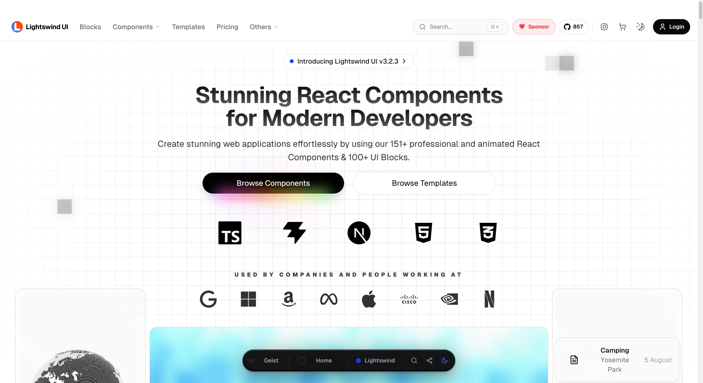
Lightswind UI homepage showing its beautifully animated React components
- Free tier: yes, 150+ animated, accessible components.
- Starter Plan: about $26 one-time.
- Premium Plan: about $52 one-time, the most popular tier on their pricing page.
- Team Plan: about $157 one-time.
- Best for: developers already working with AI coding tools who want a component library built with that workflow in mind.
Almost every library on this list in 2026 uses the same core idea, a generous free tier plus a one-time paid unlock, instead of a monthly subscription. If a component library asks for a recurring payment just to use its components, that is now the exception, not the norm.
How to actually choose
Decide what you are actually building
A marketing landing page, a full SaaS dashboard, and an AI powered product each favor a different library. Aceternity UI and React Bits lean toward marketing pages. Wensity UI, with its primitives layer and production ready motion components, covers both marketing and application UI in one place.
Check what happens after the free tier
Some libraries give you everything for free and charge for extra blocks or templates. Others gate core functionality behind a paywall from day one. Read the free tier's actual limits, not just the headline "free" label.
Look at how components are installed
Copy-paste and CLI-first libraries, which most of this list now uses, put the source code directly in your project so you can edit it freely. Traditional npm package libraries update centrally but give you less control over the internals.
Weigh polish against price
A free library can save money today but cost time later if components need heavy customization to look production ready. A one-time paid library that already looks polished can be the cheaper option once you count your own hours.
Frequently asked questions
The bottom line
There is no single best React UI library for every project in 2026, but there is a clear best fit for most situations. Choose Wensity UI when the product itself needs to feel premium and motion rich, choose Aceternity UI or React Bits for animated marketing pages, and choose daisyUI, SmoothUI, or Wigggle UI when the budget is zero and MIT licensing matters most. Match the library to the actual job, and the choice gets much easier.

Author Parth Sharma
Full-Stack Developer, Freelancer, & Founder. Obsessed with crafting pixel-perfect, high-performance web experiences that feel alive.
Enjoyed this article?
Related articles
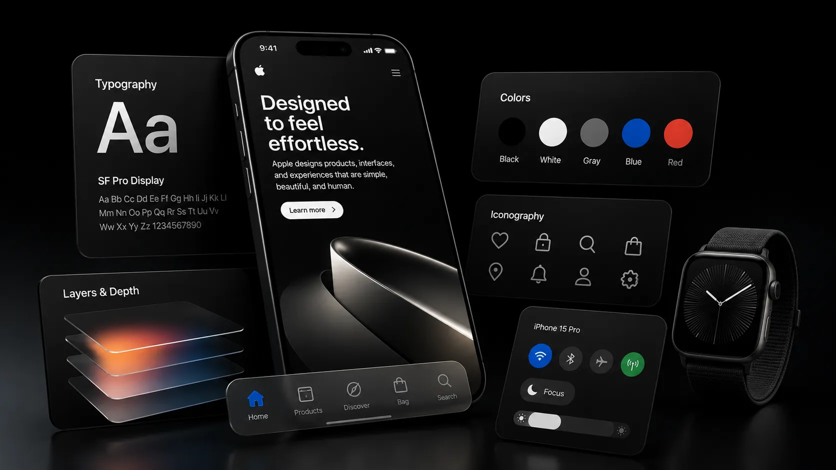
The Anatomy of Apple's Design Language
A plain English breakdown of what actually makes Apple's design language feel like Apple, from Liquid Glass to purposeful motion, and how to bring the same principles into your own product.
Read article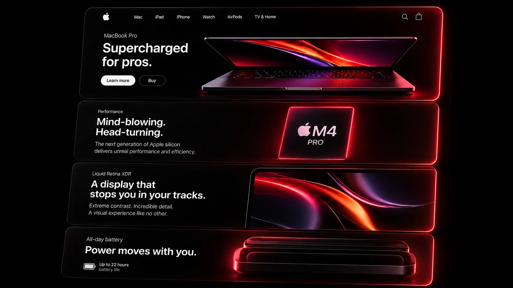
How to Recreate Apple's Scroll-Driven Product Pages in React
Learn how Apple's scroll-scrubbed product pages actually work, then build the same effect in React with a free, ready-made component and a few lines of code.
Read article