 Black Friday is here 🔥 Get

What is the best daisyUI alternative?
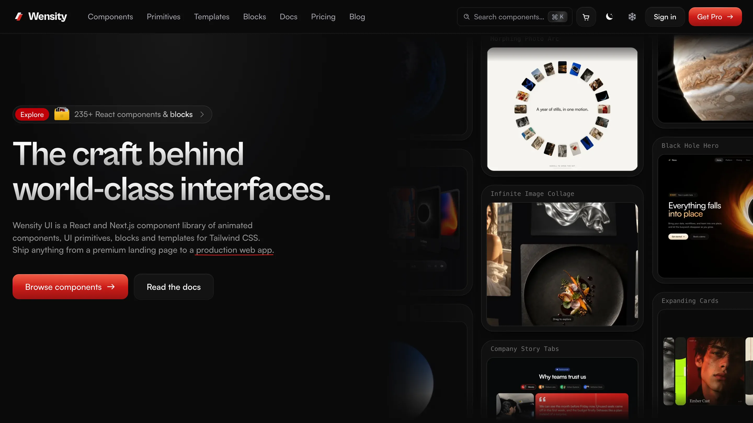
For React and Next.js, Wensity UI is the best daisyUI alternative when you want finished components rather than class names. It has 122 components, 59 primitives and 88 full page blocks, all written in Tailwind CSS v4 and installed as .tsx files you own. Menus, dialogs and selects come with their keyboard behaviour built in, and the components animate. 100 of them are free.
If you do not use React, or you want to keep the class name style, jump to the other daisyUI alternatives. Flowbite and Preline fit that case better than we do.
daisyUI styles your HTML. Wensity hands you the working React component. If your project is React and the hard part is behaviour and polish, not class names, switch. If it is not React, stay.
Free Wensity versions of daisyUI favourites


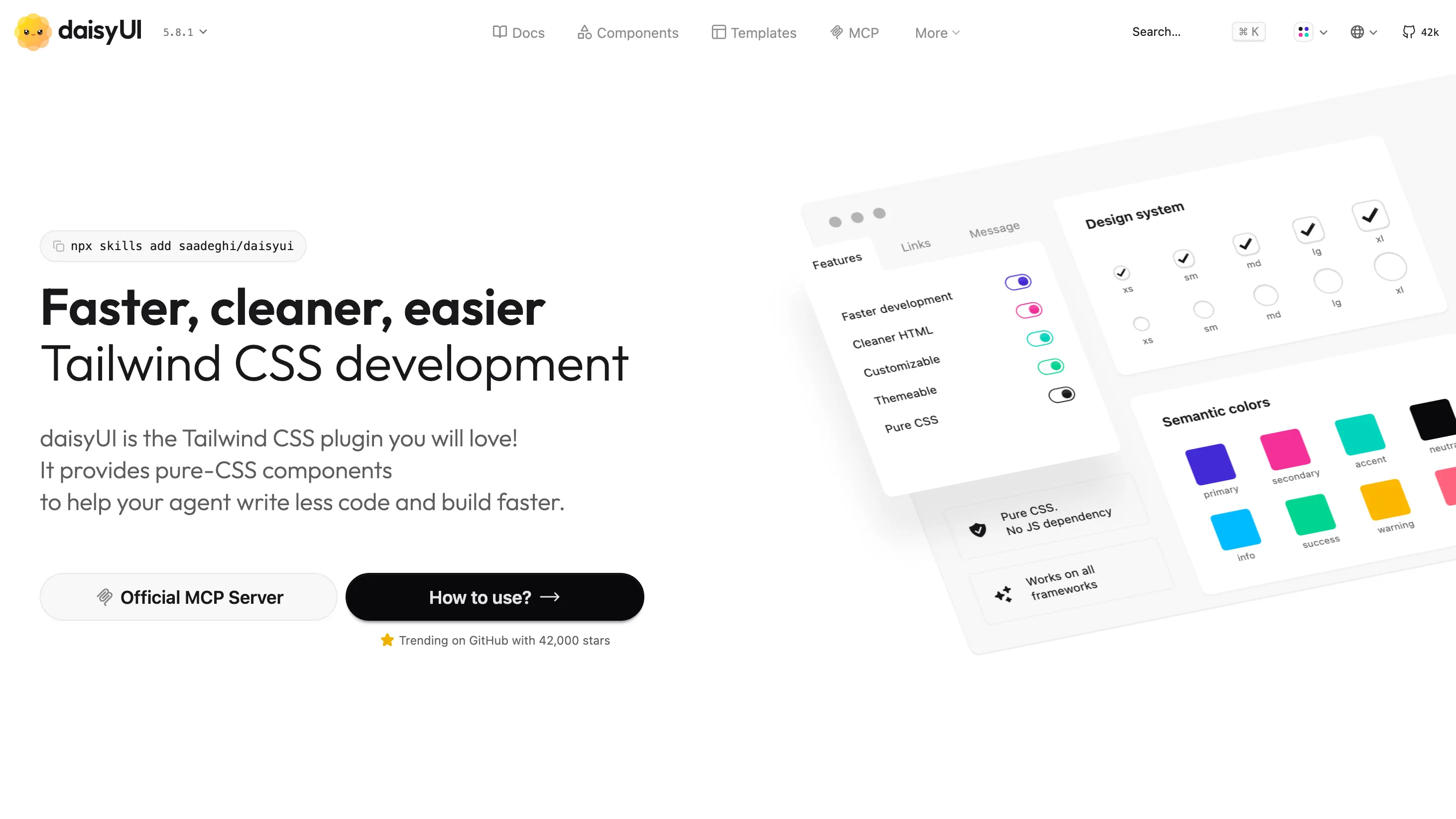
What is daisyUI?
daisyUI is a free, MIT licensed plugin for Tailwind CSS. Version 5 adds 68 components as class names, from buttons, cards and badges to modals, drawers, tabs and a calendar, plus 35 built-in color themes. It is pure CSS with no JavaScript, so it works in React, Vue, Svelte, Astro, Laravel, Rails or plain HTML. It is one of the most installed Tailwind add-ons on npm.
daisyUI vs Wensity UI: quick comparison
| What you are comparing | daisyUI | Wensity UI |
|---|---|---|
| What you get | CSS class names | React components as source files |
| Catalog | 68 components | 122 components, 59 primitives, 88 blocks |
| Frameworks | Any, including plain HTML | React: Next.js (App Router or Pages Router), Vite, Remix and Astro |
| JavaScript | None | React, Framer Motion where a component animates |
| Themes | 35 built in, plus your own | Light and dark tokens, your brand ramp |
| Motion | A few CSS effects | Springs, layout animation, scroll and WebGL |
| Page sections | Paid templates | 88 blocks (Pro) |
| Price | Free, MIT | 100 free items, Pro $169 a year or $199 once |
daisyUI components vs React components
A daisyUI component is a class name. You write the HTML, add tabs and tab, and the plugin styles it. For tabs, the switching is done with radio inputs, so it works with no script at all:
<div role="tablist" class="tabs tabs-border"><input type="radio" name="plan" class="tab" aria-label="Monthly" checked /><input type="radio" name="plan" class="tab" aria-label="Yearly" /></div>
That is light and portable. The cost shows when a tab needs to load data, sync with the URL, or animate into place. Then you are writing the React part yourself on top of the classes.
A Wensity component is the React part, already written. Animated Tabs, shown above, is one file that follows the ARIA tabs pattern with arrow keys, Home and End, works controlled or uncontrolled, and shuffles a stack of cards to the front on a spring. You install it, then change it like your own code:
# A free component, as a .tsx file in your projectnpx shadcn@latest add @wensity/animated-tabs# Or any component, primitive or block with the Wensity CLInpx wensity@latest add animated-tabs
daisyUI vs shadcn/ui, and where Wensity fits
This is the comparison most people run before choosing either. They solve different problems. daisyUI is styling for any framework. shadcn/ui is a set of React components you copy into your project, unstyled enough to become your own design system, with focus and keyboard handling from Base UI, React Aria or Radix.
| Question | daisyUI | shadcn/ui | Wensity UI |
|---|---|---|---|
| Form | Tailwind plugin | React source | React source |
| Works outside React | Yes | No | No |
| Keyboard and focus | Native HTML only | Built in | Built in, on Base UI |
| Look out of the box | Colorful, many themes | Plain, made to restyle | Finished, dark first, animated |
| Full page sections | Paid templates | A few free blocks | 88 blocks |
Wensity sits on the shadcn/ui side and works with it: free Wensity components install with npx shadcn add. The full shadcn/ui picture is on shadcn/ui vs Wensity UI.
daisyUI themes vs design tokens
Themes are where daisyUI is hardest to beat. It ships 35 of them, from light and dark to retro, cyberpunk and coffee, and any section of a page can switch with a data-theme attribute. Each theme sets semantic colors such as primary, secondary, accent and neutral, which every component reads.
Wensity takes a narrower path on purpose. There is one set of light and one set of dark surface tokens, plus a brand color ramp, all plain CSS variables in your stylesheet. You will not flip between dozens of looks, but your brand color lands everywhere from one edit. For the primitives, Create Preset lets you pick colors, fonts, radius and icons and watch them repaint live. The theming docs show the tokens.
Keyboard, focus and screen readers
Because daisyUI is only CSS, its behaviour is whatever the HTML gives you. Its docs point to native elements where they exist: a <dialog> for the modal, <details> or a checkbox for a collapse, radio inputs for tabs. Those are solid. Where native HTML runs out, such as a combobox, a menu with arrow key navigation or focus that returns to the trigger, the work is yours.
Wensity's interactive primitives, such as dialog, select, popover and menu, are built on Base UI, which handles focus traps, arrow keys and ARIA roles. Animated components respect prefers-reduced-motion, so motion stops for people who ask for less.
Motion: what daisyUI leaves out
daisyUI has a handful of CSS effects, such as loading spinners, a swap between two icons, a 3D hover tilt and a glowing border. It stops there, because spring physics and layout animation need JavaScript.
Motion is most of what Wensity is for. Tabs shuffle cards, buttons press in, numbers count up, text animates in, and page blocks arrive with their hero effects in place. If your Tailwind CSS components look right but feel flat, that is the gap.
Price: free vs free plus Pro
daisyUI itself costs nothing. Its makers sell a Figma library, page templates (from 19 to 69 dollars each at list price when we checked) and Blueprint, a paid MCP server that helps AI agents write daisyUI pages.
Wensity has 100 free components and primitives, no account needed. Wensity Pro is $169 a year or $199 once, and adds every Pro component, all 88 blocks, the templates, icons, React Email templates and design skills for coding agents. Code you install stays yours if a yearly plan ends. Details are on the pricing page.
Keep daisyUI and add Wensity
You do not have to pick one. daisyUI is a plugin and Wensity components are files, so both live in one Tailwind CSS v4 project without conflict. A sensible split: daisyUI classes for simple, static pieces like badges, inputs and cards; Wensity for anything that opens, moves or needs the keyboard. Map daisyUI's primary color to the same value as Wensity's brand ramp so they match.
What does daisyUI do best?
- Any framework. The same class names work in Vue, Svelte, Astro, server templates and plain HTML.
- No JavaScript. Nothing extra to load, hydrate or update.
- Themes. 35 ready made, and a theme per section with one attribute.
- Cleaner markup.
btn btn-primaryinstead of a dozen utility classes. - Free and widely used. MIT, with a large community and lots of examples.
Who should pick Wensity UI, and who should stay with daisyUI
Pick Wensity UI if
- You build with React or Next.js.
- You keep writing the same open, close and keyboard logic around daisyUI classes.
- You want motion and a premium dark look without designing it.
- You want whole page sections, not just parts.
Stay with daisyUI if
- You use Vue, Svelte, Laravel, Rails or plain HTML.
- You want zero JavaScript from your UI kit.
- Switching between many color themes matters to your product.
- Your budget for UI is zero.
Other daisyUI alternatives
- shadcn/ui. Free React components you copy in and restyle. The usual step up for React teams. See shadcn/ui vs Wensity UI.
- Flowbite. Tailwind class based components with a small JavaScript file for interactive parts, and versions for React, Vue, Svelte and Angular.
- Preline UI. A large open source set of Tailwind components and examples, with its own JavaScript plugins.
- Headless UI. Unstyled, accessible React and Vue components from the Tailwind CSS team, for people who want behaviour and will write every class.
- Tailwind Plus. The official paid catalog, now closed to new customers. See Tailwind Plus alternatives.
Want motion first? Compare Magic UI and React Bits, or see every comparison.
Common questions about daisyUI alternatives
From class names to finished components
Rebuild one daisyUI screen with Wensity components and keep the rest. You will know within an hour which feels better to ship.
daisyUI is made by Pouya Saadeghi and is not connected to Wensity. Its component count, themes, license and paid extras were checked on daisyui.com and its npm package on November 20, 2026 and can change, so please check daisyui.com. Views on design and fit are our own. See our other comparisons.