React how it works section components
5 how it works section componentsLive previewFull source in your repo
A how it works section has to name the stages of the job in order. These blocks print the dates, the durations and the path between the steps, so the visitor reads one process instead of four disconnected tiles.
Works with
- React
- Next.js
- TypeScript
- Tailwind CSS
How it works and timeline blocks you can copy
Each block is one file covering the intro, the step cards and the path that joins them. Preview it live, then copy the source into your project.
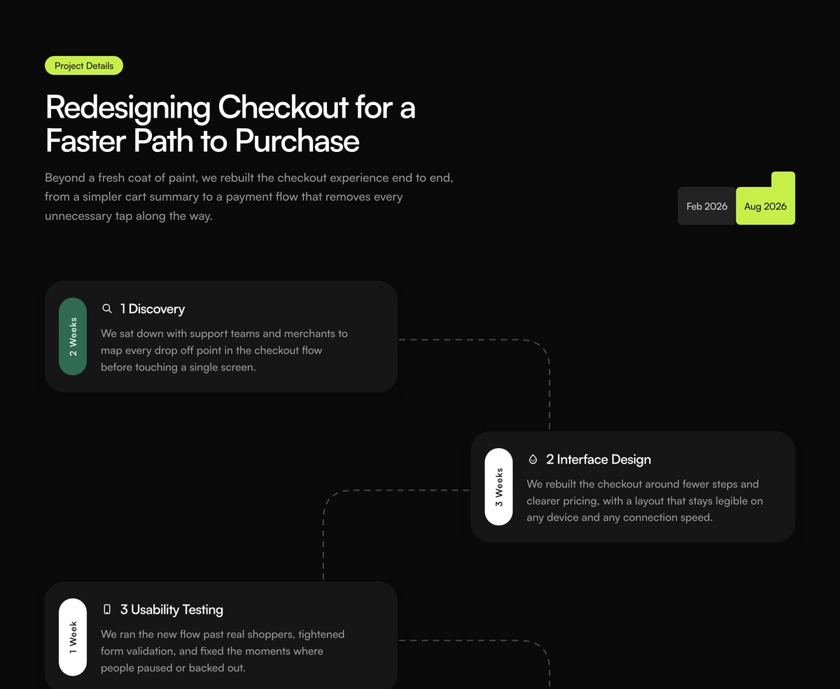 How It Works Section With Zigzag TimelineHow it works section with a project dates header, four staggered step cards, vertical duration tags, and dashed zigzag connectors. Follows light and dark.
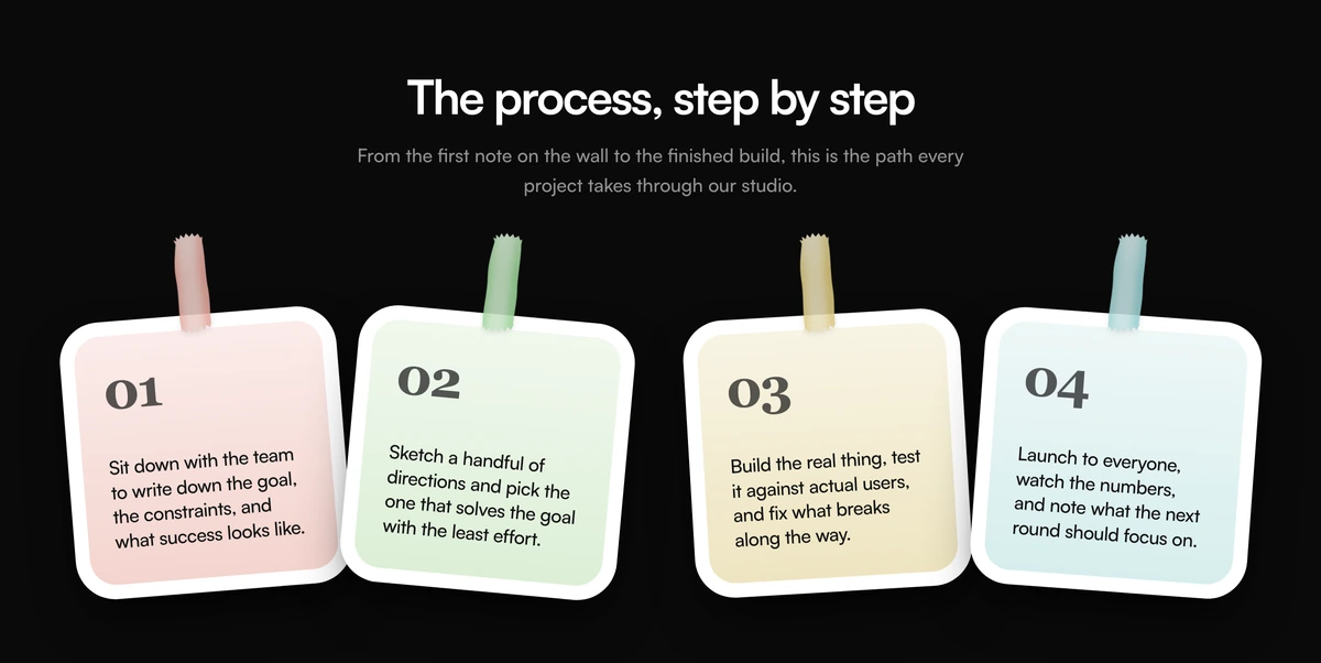 How It Works Section With Taped Sticky NotesHow it works section with four tilted sticky notes, washi tape, numbered steps, and a what's next heading. Follows light and dark.
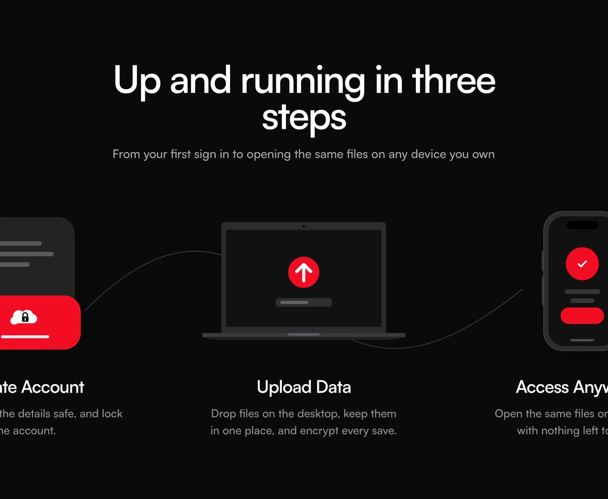 How It Works Section With Dotted Curve StepsHow it works section with a centered heading, three illustrated step cards, and a dotted curve joining the mockups. Follows light and dark.
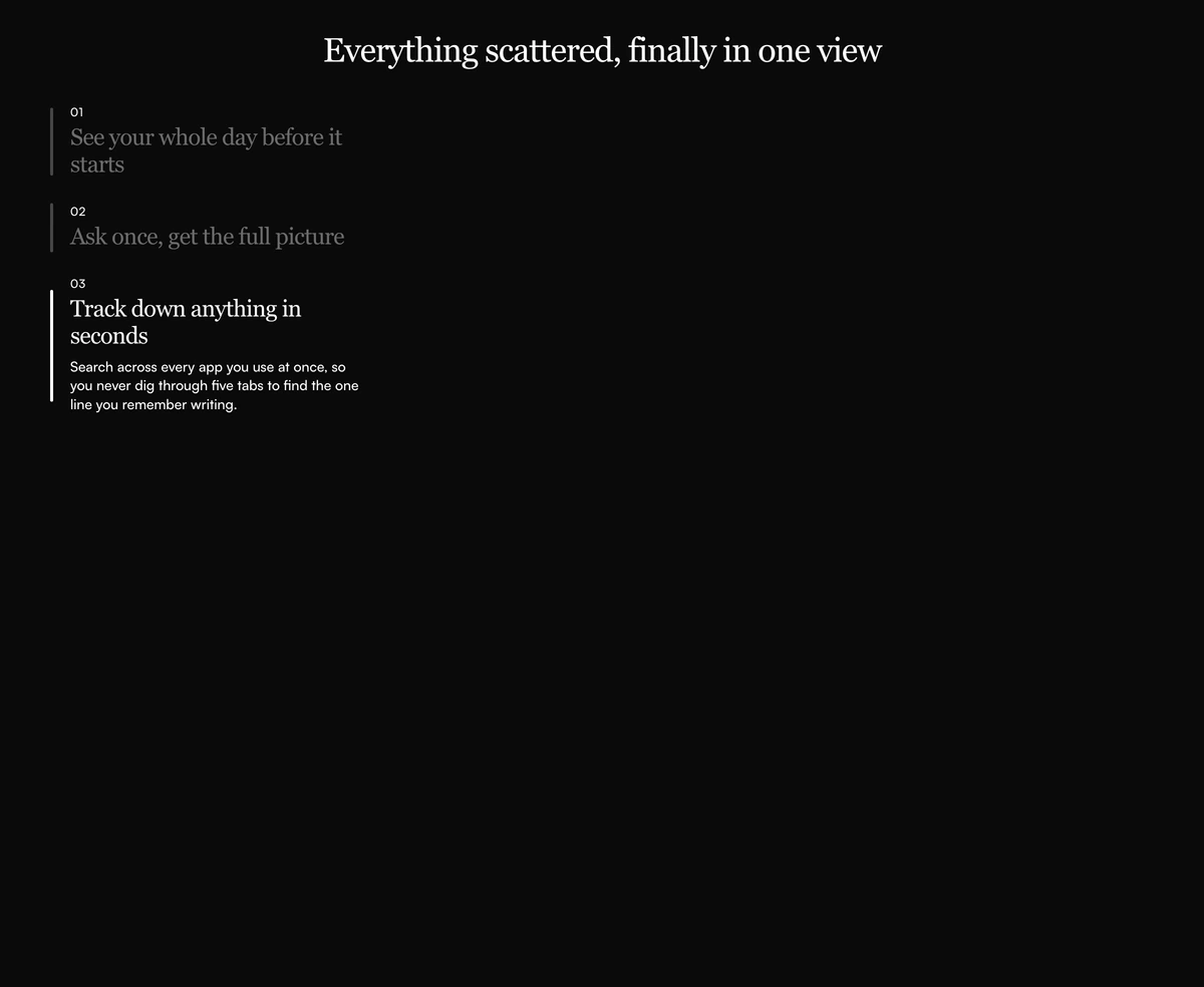 How It Works Section With Sticky Scroll MockupsHow it works section with sticky step copy on the left, three scrolling product photos on the right, and a serif heading. Follows light and dark.
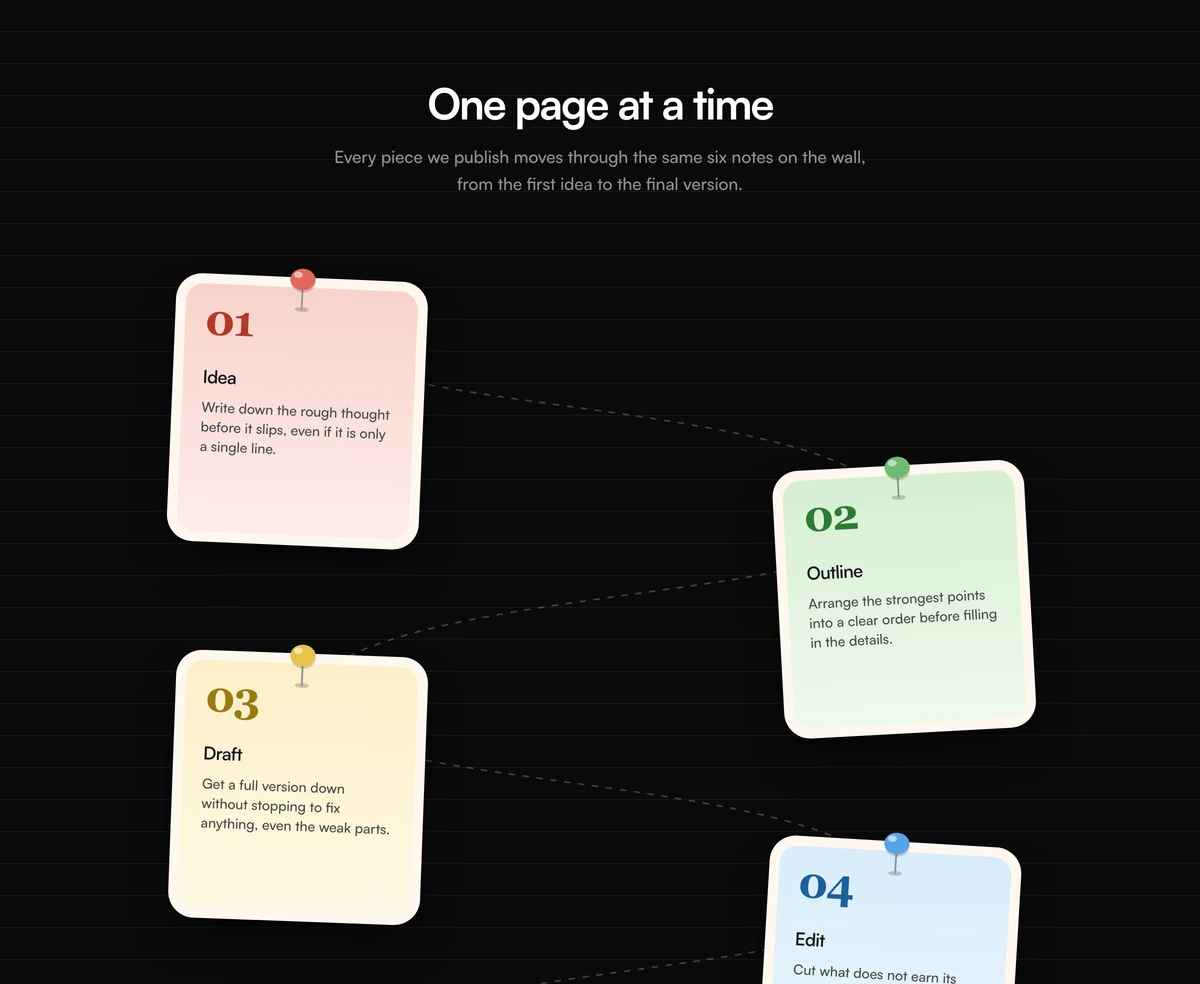 How It Works Section With Pinned Notebook NotesHow it works section with six pushpin notes on lined paper, a dashed zigzag path, and red, green, yellow, and blue steps. Follows light and dark.
Feature sections to follow the process
Feature sections from the same library, for the page that has already named the stages and now has to show the product doing the work.
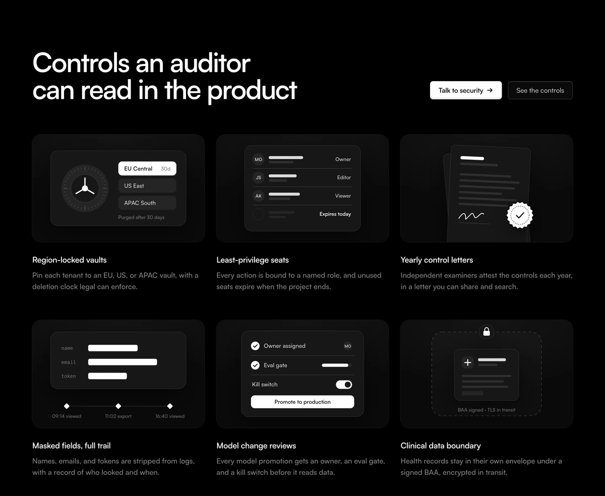 Feature Section With Security GridAdaptive security feature section with a split headline and two CTAs above six controls, each drawn as a static SVG product mockup: region vaults, expiring seats, a sealed letter, redacted logs, a release gate and a data boundary.
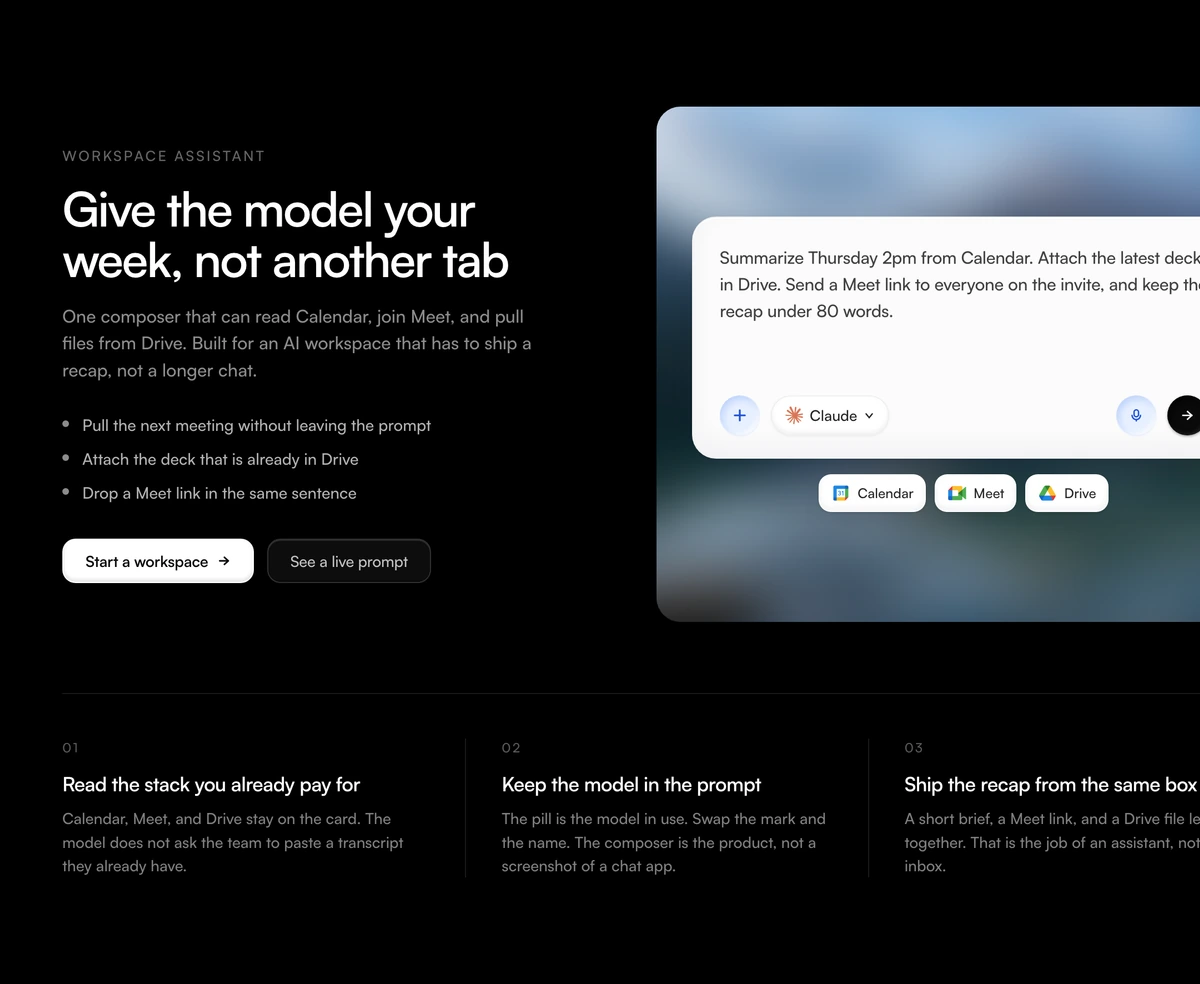 Feature Section With Workspace ComposerAdaptive AI workspace feature with copy and bullets on the left, a chat composer on one blurred still with Calendar Meet and Drive chips, and three product claims below.
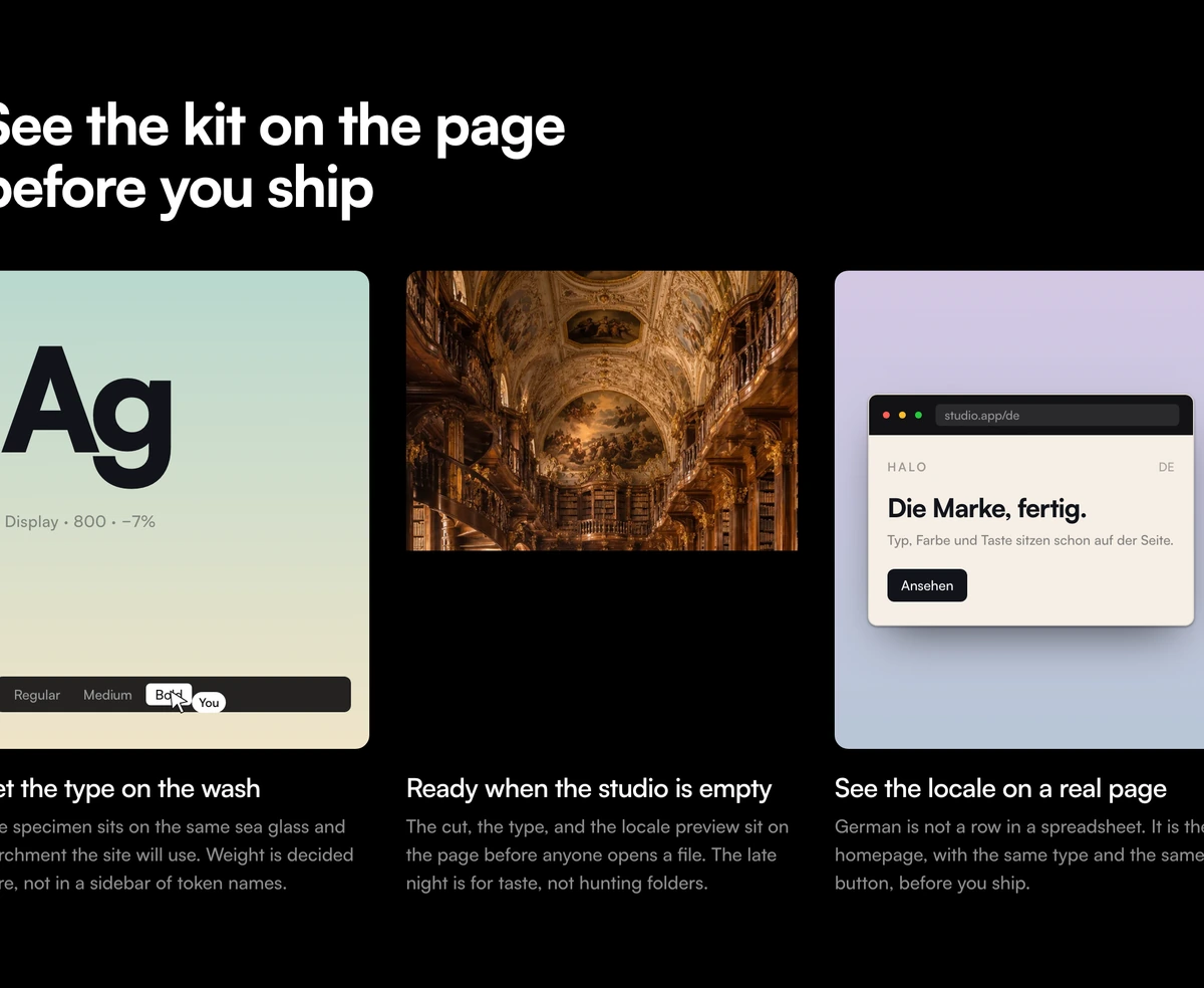 Feature Section With Gradient Product CardsAdaptive three card feature section with a left aligned headline, sea glass and lilac gradient panels of coded product UI, and a full bleed photograph in the middle card.
 Feature Section With Media Upload StageStacked ingest feature: compact empty dropzone on a blurred still, then three proof mockups for page read, plate hold, and cut index. Heading, CTAs, and claims sit around the tray.
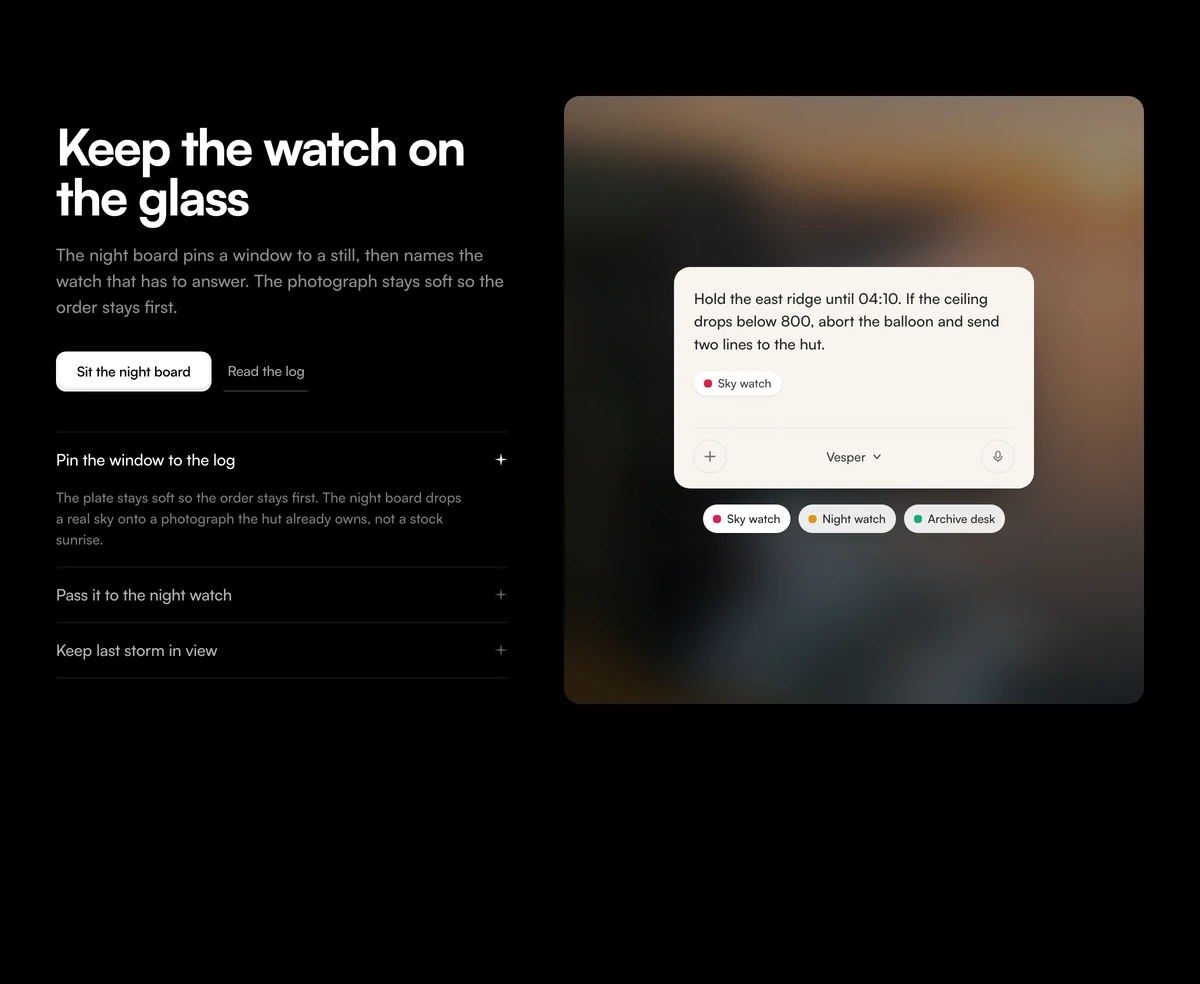
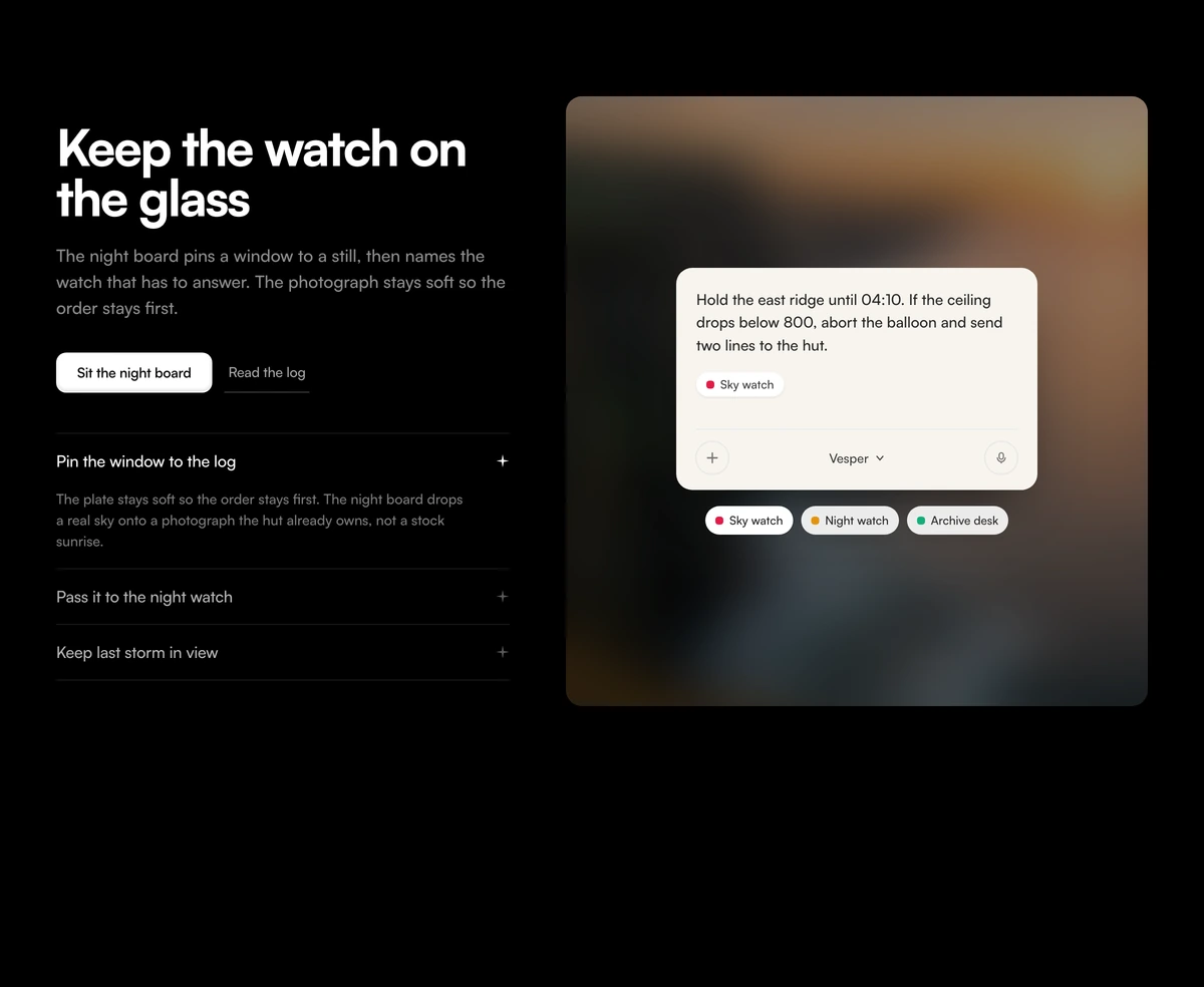 Feature Section With Blurred Prompt StageAdaptive split feature section with a bold headline, a one-open accordion of desks, and a tall blurred photograph carrying a live prompt card.
Stepper, progress and scroll walkthrough components
The parts behind a process: a multi step wizard, a progress bar with steps, and scroll driven sequences that advance as the visitor reads.
 Multi-Step Form WizardA multi-step form wizard whose card physically reshapes to wrap each new step as the content slides in behind it.
- ProgressProgressA React progress bar on Base UI with spring smoothed fills and an indeterminate sweep, plus circular, stepped, and stacked multi part bars.
 Apple-Style Sticky ScrollA pinned cinematic section that morphs in lock-step with scroll, staying perfectly in sync whichever way you travel.
 Scrubbable Video RevealAn Apple-style image sequence scrubbed frame by frame on canvas, following your hand as you scroll in either direction.
 Scroll StackCards that pin, tilt, and stack into a tidy deck as you scroll, with zero scroll hijacking anywhere in the sequence.
 Animated TabsA physical stack of photo cards shuffled to the front by clipped tabs, with a tight image inset and copy in the footer.
How it works section design: timeline, steps or scroll walkthrough
A how it works section names the stages of a job in the order they happen. That makes it closer to a timeline than to a feature grid: by the time someone reaches it they already know what the product is, and now they want to know how long it takes, what they have to do, and what happens next. If the steps are not visibly joined, the visitor reads four separate products instead of one process.
How it works section designs come in three shapes. A timeline, where dates and durations are the point. Numbered steps, where the order matters but the time does not. A scroll walkthrough, where the product itself has to be seen at each stage. Choose the shape from the question your visitor is asking, not from the how it works examples you have bookmarked.
How It Works Section With Zigzag Timeline is the timeline. Month tiles for Jul and Aug sit in the header, four step cards snake left and right, and each card carries a vertical duration tag, an icon, a numbered title and one sentence. Dashed elbows join the cards so the eye follows one path. Use it for agency work, onboarding projects and anything sold by elapsed time.
How It Works Section With Taped Sticky Notes, How It Works Section With Pinned Notebook Notes and How It Works Section With Dotted Curve Steps are numbered steps with different tempers. The taped notes tilt four cards under washi tape, with no dates at all. The notebook pins six square notes to lined paper along a dashed path, which suits a map of six page sections. The dotted curve joins three small interface drawings, a signup card, a laptop and a phone, for a three step product promise.
How It Works Section With Sticky Scroll Mockups is the walkthrough. Three step titles stay pinned on the left while three product photographs scroll on the right, and a black rule marks the live step as you go. Pass your own image for each step before it ships, and keep the pin: if both columns scroll together the layout collapses into three stacked cards.
Match the step count to the block. Three steps suit the sticky mockups and the dotted curve, four suit the zigzag and the taped notes, and six suit the notebook. If your process has five stages, merge two or split one rather than padding a layout with a step nobody needs. Each step gets a short title and a single sentence, because the section is a summary and the detail belongs on the page it links to.
All five follow light and dark. The washes and accent colours stay in dark mode, only quieter, and card frames turn near black. Keep the decoration that carries meaning, such as the dashed path, the pins and the tilt, because dropping it in dark mode removes the reason the layout exists. Every block also stacks to one column on a phone and hides its connecting path so it never crosses the copy.
Replace the demo stages before this ships. The months, durations, sticky note text, notebook labels and step sentences are all samples. A timeline that still shows last summer's dates after the work closed reads as stock, so wire the header to a project you actually delivered or remove the dates.