React Three Step Onboarding Section with a Dotted Curve
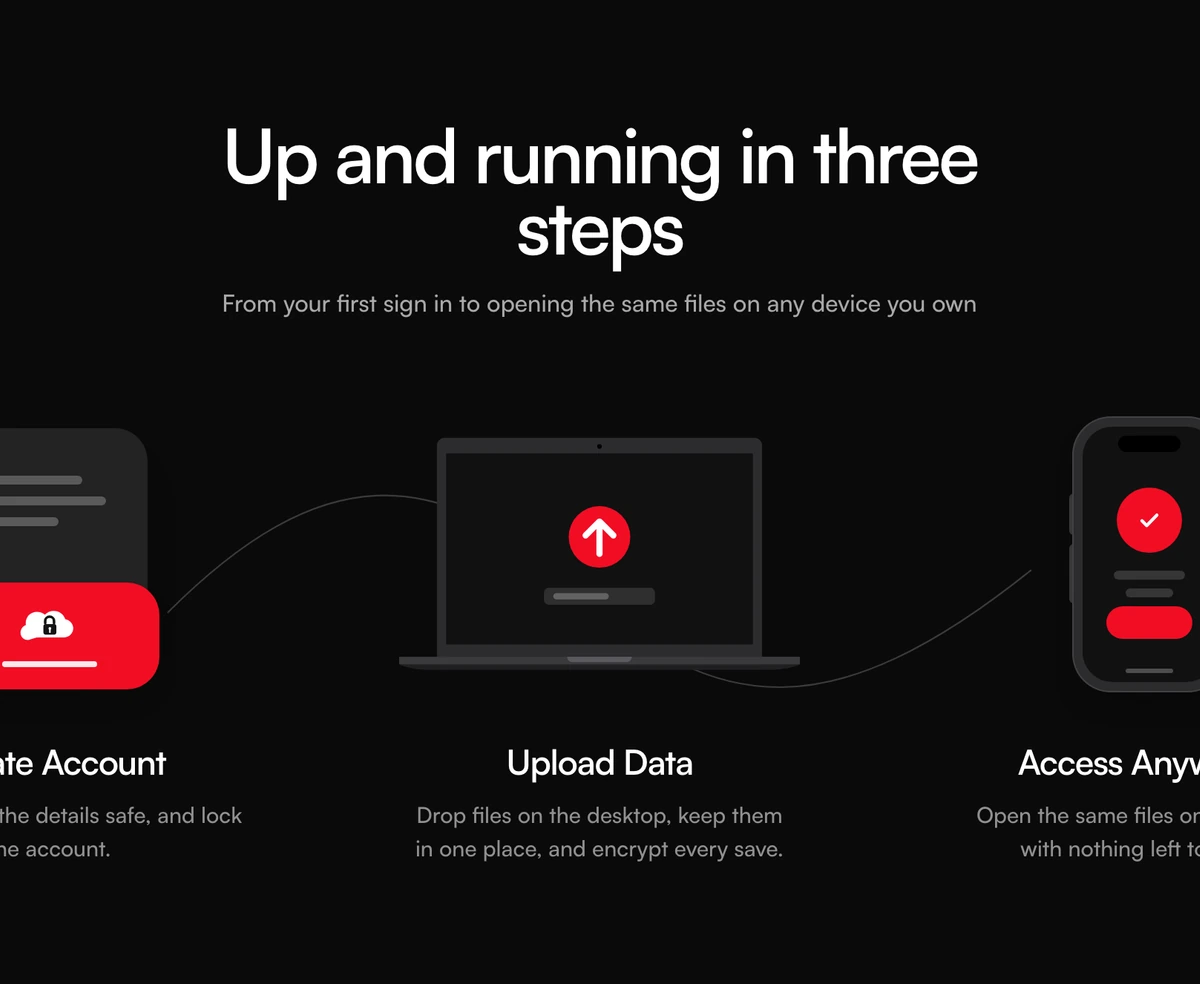
ProThree steps, three small illustrations and one dashed curve. An account card, a laptop with an upload arrow and a phone with a check mark sit in a row, and the curve between them draws itself the first time the section scrolls into view.
Signup, setup, done: a three step explainer
How It Works Section with Dotted Curve Steps is a React onboarding section that explains a product in exactly three steps, each with a built in illustration and a short title and sentence. On large screens a dashed bezier curve links the three, and Framer Motion draws it from start to finish when it enters the viewport.
The three illustrations tell the classic setup story: create an account, add your data, use it everywhere. A red cloud lock card, a laptop whose upload arrow draws in, and a phone whose check mark draws in. That makes it a strong fit for storage, sync, backup and security products, and for any app whose pitch is that setup takes three moves.
It is centred, symmetrical and quick to read, which is why it works high on a landing page, often right under the hero.
The three illustrations and the curve
Account card
A grey card with placeholder lines, overlapped by a red card holding a white cloud with a padlock.
Laptop with upload arrow
An SVG laptop whose screen shows a red circle; the white arrow inside draws itself once when the laptop scrolls into view.
Phone with check mark
A rounded phone with side buttons, a red badge and a check mark that draws in, plus placeholder lines and a red pill button.
Self drawing dashed curve
A single S shaped path behind the row, dashed 5 on 7, drawn over 1.15 seconds once 40 percent of it is visible. Hidden below the large breakpoint.
When three illustrated steps are enough
Use it when
- Your onboarding genuinely takes three steps and you want to say so near the top of the page.
- The product is about storage, sync, backup or access from any device.
- You want light, flat illustrations without commissioning artwork.
- Red sits comfortably in your palette, or you are happy to change one colour constant.
Skip it when
- You have four or more steps. Only the first three are rendered, and extras are dropped silently.
- Your steps do not match the built in pictures. Illustrations come from three fixed kinds, not from images you pass.
- You need detailed explanations per step; each has room for a title and one sentence.
Map your three steps to the built in illustrations
Each step takes an id, a title, a description and an illustration of account, laptop or ready. You can reuse an illustration or reorder them, but you cannot pass your own artwork without editing the component, so write steps that suit the pictures: sign up, add something, use it.
The red accent is a single constant at the top of the file. Change it once and the account card, the laptop badge, the phone badge and the phone button all follow.
npx wensity@latest add how-it-works-section-with-dotted-curve-steps --type block
import { DottedCurveIllustrationsHowItWorks } from "@/components/wensity/blocks/how-it-works-section-with-dotted-curve-steps";export function GetStarted() {return (<DottedCurveIllustrationsHowItWorksheading="Back up your studio in three steps"lede="Install once and every project folder is protected from then on."steps={[{ id: "signup", title: "Create your vault", description: "Pick a passphrase only you know.", illustration: "account" },{ id: "sync", title: "Choose folders", description: "Select the project folders to keep in sync.", illustration: "laptop" },{ id: "restore", title: "Restore anywhere", description: "Open any version from your phone or a new machine.", illustration: "ready" },]}/>);}
Props
| Prop | Type | Default | Description |
|---|---|---|---|
heading | string | "Up and running in three steps" | The centred h2, set large at 40 to 48px. |
lede | string | - | The line under the heading, capped at 520px. |
steps | { id; title; description; illustration }[] | 3 storage steps | Three steps. illustration is account, laptop or ready. Anything past the third is ignored. |
className | string | - | Classes on the section, for example a darker background behind the white illustration cards. |
Animation cost and reduced motion
Draws once, then stops
The curve, the arrow and the check mark animate pathLength with whileInView and once set, so they run a single time and never loop.
Reduced motion shows the finished state
With reduced motion on, the curve, arrow and check mark are drawn complete from the start and nothing animates.
Illustrations are decorative
Every illustration SVG is aria-hidden, so screen readers hear only the three titles and descriptions.
Framer Motion only for paths
The block imports Framer Motion just to draw three paths. If you remove the drawing effect, you can drop the dependency.
Block details
- Category
- How It Works Sections
- Renders
- JavaScript animation. Paints first, then animates
- Theme
- Follows the site theme in light and dark
- Dependencies
clsxframer-motiontailwind-merge- Source
- 283 lines, 10 KB in one file
- Install
wensity add how-it-works-section-with-dotted-curve-steps --type block- Tags
- light, dark, how it works, dotted, curve, illustrations
- Last updated