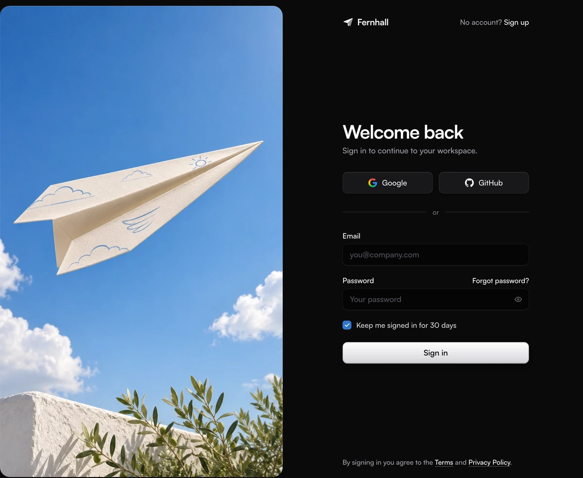
Centered Card Login Form for React
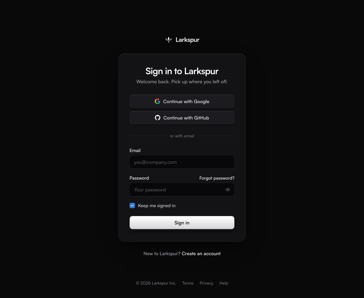
ProOne raised card in the middle of a quiet page. Your brand mark and name sit above it; inside it are a heading, Continue with Google and Continue with GitHub, an or with email divider, and an email and password form with a Sign in button. Under the card is a line that sends new people to create an account, and at the foot of the page a copyright line with Terms, Privacy and Help. The form checks what was typed, waits visibly on your auth call and says in plain words when a sign in fails.
A login form that lives on one card
Login Page With Centered Card is a React and Tailwind CSS login form set on a single card in the middle of the screen, in Next.js or any React app. It is the layout most SaaS products reach for on their sign in route: nothing competes with the form, and the same composition works at every width from a phone to a wide monitor.
Where a split screen spends half the viewport on a picture, this design keeps every pixel for the task. The card is capped at 420px, so the fields never stretch into long lines on a large display, and the page around it is one solid colour per theme. That calm frame is the point: the brand is carried by the mark above the card and by your copy, not by decoration.
It is also the easiest login form to fit into an existing product. There is no photograph to source or art direct, the footer links are props, and turning off the social buttons leaves a plain email and password card that still looks finished.
What sits on and around the card
The layout is one centered column at every breakpoint. On phones the card keeps 16px of page on each side and its inner padding drops from 36px to 24px; the page is at least the height of the screen, with a floor of 820px (900px from 1024px up) so the card is never squeezed.
Brand above the card
A three petal mark drawn as inline SVG in the text colour, beside the brand name, as one link to your home page. Placing it outside the card keeps the card itself about signing in and nothing else.
Heading and subtitle
Sign in to Larkspur, centered and set bold with tight tracking, then a single muted sentence. The heading is an h2 unless you pass headingAs h1, which you should when this screen is the whole page.
Provider buttons
Continue with Google and Continue with GitHub, stacked at full card width so each label reads in full. They are raised buttons with a lit top edge; the one you press shows a spinner while the other dims.
Divider
A thin rule broken by the words or with email, which tells people the form below is the other way in. It only renders when at least one provider is shown.
Fields and checkbox
Email and password fields recessed into the card face, a Forgot password link on the password label row, an eye button that reveals the password, a Caps Lock note, and a Keep me signed in checkbox that starts ticked.
Below the card
New to Larkspur? Create an account, followed at the bottom of the page by the copyright line and a small Legal navigation with Terms, Privacy and Help. Both the copyright and the links can be hidden.
Pick the centered card, or something else
Use it when
- You want a sign in screen that looks deliberate with no photography or illustration to commission.
- The same route is visited on phones and desktops in roughly equal numbers, and both should see the identical layout.
- Google and GitHub cover the accounts your users already have, with email and password as the fallback.
- The page needs legal and help links close to the form, for example in a B2B product where support is part of the sign in story.
Skip it when
- The sign in screen is where your brand should make its strongest impression. A split layout with a picture does that better.
- You sign people in with a magic link or a code only. This form always asks for a password.
- You need Apple, Microsoft or SAML buttons. The provider list accepts google and github, and anything else means editing the file.
- The form has to open in a dialog over another page. The block draws its own full height page background.
Wire the login form to your auth provider
You hand the card two functions and it takes care of the rest. onSignIn runs only after the email matches an address pattern and the password field is filled in, and it receives email, password and remember. While its promise is pending the button reads Signing in and the fields lock; when it resolves the button reads Signed in, and if your app has not navigated away the form clears its password and returns after 2.4 seconds. Throwing an Error puts your message in a red alert above the button and selects the password for a quick retype.
onProviderSignIn receives google or github. Most OAuth setups redirect inside that call, so the spinner simply runs until the browser leaves. If the call throws, the card shows your error message, or a fallback sentence naming the provider it could not reach.
Out of the box both functions are demos so the preview behaves like the real thing: any password shorter than eight characters fails after about a second. Pass your own handlers before launch. Everything visible is a prop, from the brand name and heading to the footer links, and the brand name also fills the New to line under the card.
npx wensity@latest add login-page-with-centered-card --type block
import { LoginPageCenteredCard } from "@/components/wensity/blocks/login-page-with-centered-card";import { useRouter } from "next/navigation";import { authClient } from "@/lib/auth-client";export default function SignInPage() {const router = useRouter();return (<LoginPageCenteredCardheadingAs="h1"brandName="Acme"brandHref="/"heading="Sign in to Acme"signUpHref="/sign-up"forgotPasswordHref="/forgot-password"copyright="© 2026 Acme Inc."footerLinks={[{ label: "Terms", href: "/terms" },{ label: "Privacy", href: "/privacy" },{ label: "Support", href: "/support" },]}onSignIn={async ({ email, password, remember }) => {const { error } = await authClient.signIn.email({ email, password, rememberMe: remember });if (error) throw new Error("That email and password don't match.");router.push("/dashboard");}}onProviderSignIn={(provider) => authClient.signIn.social({ provider })}/>);}
Props
| Prop | Type | Default | Description |
|---|---|---|---|
onSignIn | (values) => Promise<void> | void | - | Receives email, password and remember after validation. Throw an Error to show its message. |
onProviderSignIn | (provider) => Promise<void> | void | - | Called with google or github. The pressed button spins until the promise settles. |
providers | ("google" | "github")[] | ["google", "github"] | Which provider buttons appear, top to bottom. An empty array also removes the divider. |
brandName | string | "Larkspur" | Shown beside the mark above the card and in the create account line below it. |
heading | string | "Sign in to Larkspur" | The card title. description sets the sentence under it. |
footerLinks | { label; href }[] | Terms, Privacy, Help | Links in the page footer. Pass an empty array to drop them. |
copyright | string | "© 2026 Larkspur Inc." | The footer line before the links. An empty string hides it. |
signUpHref | string | "#" | Target of Create an account. forgotPasswordHref and brandHref work the same way. |
Built for keyboards, screen readers and both themes
Plain CSS, one icon package
There is no motion library: styling is Tailwind and state is React. @tabler/icons-react supplies the eye, check and alert icons, the GitHub and brand marks are inline SVG, and the Google mark is an image from assets.wensity.com.
Validation people can hear
Field errors are tied to their inputs with aria-describedby and aria-invalid, and once you have submitted once they update as you type, so an error disappears the moment it is fixed. Server errors use role alert.
Progress announced
A polite live region reads out Signing in, Signed in, or Connecting to Google or GitHub, so a screen reader user knows the click did something without looking for a spinner.
Nothing steals focus
During a request the buttons use aria-disabled rather than disabled and the fields go read only, which keeps keyboard focus in place. A failed submit focuses the first field with a problem.
Saved passwords work
autocomplete email and current-password let browsers and password managers fill the card. The reveal button reports its state with aria-pressed and a label that changes between Show password and Hide password.
Reduced motion and theming
With prefers-reduced-motion set, the spinner holds still and colour transitions are removed. Each surface has its own opaque colour in light and dark, so the card, fields and buttons never pick up the wrong theme.
Block details
- Category
- Login Pages
- Renders
- CSS only. Paints as soon as the stylesheet arrives
- Theme
- Follows the site theme in light and dark
- Dependencies
@tabler/icons-reactclsxtailwind-merge- Source
- 574 lines, 27 KB in one file
- Install
wensity add login-page-with-centered-card --type block- Tags
- light, dark, login, sign in, form, auth, card, centered
- Last updated